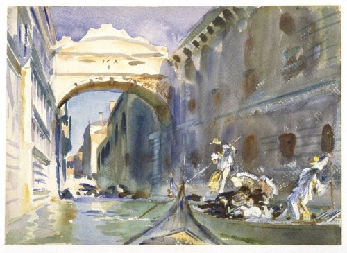
 Artist: John Singer Sargent (1856–1925)
Title: The Bridge of Sighs
Date: between 1905 and 1908
Medium: watercolor on paper
Dimensions: height: 25.4 cm (10 in); width: 35.6 cm (14 in)
Collection: Brooklyn Museum
Current location: American Art collection
What I love about this picture:
I love the work of John Singer Sargent. He was known for his portraits and the scandals that sometimes followed him, but it is his watercolors that fascinate me.
This painting of Venice’s Bridge of Sighs is one of my favorites. Done in every shade of blue and brown, Sargent conveys the heat of afternoons in Venice. He shows us the bridge as a passenger sees it from a gondola, with a view of well-heeled ladies sheltered beneath parasols and passing in the opposite direction.
I especially like the way he shows us the gondoliers as they labor, how their bodies move as they work to propel their passengers to whatever place they are going. Sargent made several watercolors depicting gondoliers while he was in Venice.
The bridge is the true center of the piece. By his choice of colors, Sargent paints the atmosphere of a poignant, tragic place and contrasts it with the freedom and wealth of the sightseers.
They are like me, people with an interest in history but who have no true concept of the reality, the tragedy of the famous place they have come to see.
About this picture, via Wikipedia:
The Bridge of Sighs (Italian: Ponte dei Sospiri, Venetian: Ponte de i Sospiri) is a bridge in Venice, Italy. The enclosed bridge is made of white limestone, has windows with stone bars, passes over the Rio di Palazzo, and connects the New Prison (Prigioni Nuove) to the interrogation rooms in the Doge’s Palace.
The view from the Bridge of Sighs was the last view of Venice that convicts saw before their imprisonment. The bridge’s English name was bequeathed by Lord Byron in the 19th century as a translation from the Italian “Ponte dei sospiri”, from the suggestion that prisoners would sigh at their final view of beautiful Venice through the window before being taken down to their cells. [1]
About The Artist via Wikipedia:
John Singer Sargent (January 12, 1856 – April 14, 1925) was an American expatriate artist, considered the “leading portrait painter of his generation” for his evocations of Edwardian-era luxury. He created roughly 900 oil paintings and more than 2,000 watercolors, as well as countless sketches and charcoal drawings. His oeuvre documents worldwide travel, from Venice to the Tyrol, Corfu, the Middle East, Montana, Maine, and Florida.
Born in Florence to American parents, he was trained in Paris before moving to London, living most of his life in Europe. He enjoyed international acclaim as a portrait painter. An early submission to the Paris Salon in the 1880s, his Portrait of Madame X, was intended to consolidate his position as a society painter in Paris, but instead resulted in scandal. During the next year following the scandal, Sargent departed for England where he continued a successful career as a portrait artist.
From the beginning, Sargent’s work is characterized by remarkable technical facility, particularly in his ability to draw with a brush, which in later years inspired admiration as well as criticism for a supposed superficiality. His commissioned works were consistent with the grand manner of portraiture, while his informal studies and landscape paintings displayed a familiarity with Impressionism. In later life Sargent expressed ambivalence about the restrictions of formal portrait work and devoted much of his energy to mural painting and working en plein air. Art historians generally ignored society artists such as Sargent until the late 20th century.
With his watercolors, Sargent was able to indulge his earliest artistic inclinations for nature, architecture, exotic peoples, and noble mountain landscapes. And it is in some of his late works where one senses Sargent painting most purely for himself. His watercolors were executed with a joyful fluidness. He also painted extensively family, friends, gardens, and fountains. In watercolors, he playfully portrayed his friends and family dressed in Orientalist costume, relaxing in brightly lit landscapes that allowed for a more vivid palette and experimental handling than did his commissions (The Chess Game, 1906). His first major solo exhibit of watercolor works was at the Carfax Gallery in London in 1905. In 1909, he exhibited eighty-six watercolors in New York City, eighty-three of which were bought by the Brooklyn Museum. Evan Charteris wrote in 1927:
To live with Sargent’s water-colours is to live with sunshine captured and held, with the luster of a bright and legible world, ‘the refluent shade’ and ‘the Ambient ardours of the noon.’
Although not generally accorded the critical respect given Winslow Homer, perhaps America’s greatest watercolorist, scholarship has revealed that Sargent was fluent in the entire range of opaque and transparent watercolor technique, including the methods used by Homer. [2]
Credits and Attributions:
[1] Wikipedia contributors, “Bridge of Sighs,” Wikipedia, The Free Encyclopedia, https://en.wikipedia.org/w/index.php?title=Bridge_of_Sighs&oldid=1096829521 (accessed November 13, 2025).
[2] Wikipedia contributors, “John Singer Sargent,” Wikipedia, The Free Encyclopedia, https://en.wikipedia.org/w/index.php?title=John_Singer_Sargent&oldid=1099859237 (accessed November 13, 2025).
[Image] Wikimedia Commons contributors, “File:John Singer Sargent – The bridge of sighs.jpg,” Wikimedia Commons, the free media repository, https://commons.wikimedia.org/w/index.php?title=File:John_Singer_Sargent_-_The_bridge_of_sighs.jpg&oldid=660236372 (accessed November 13, 2025).

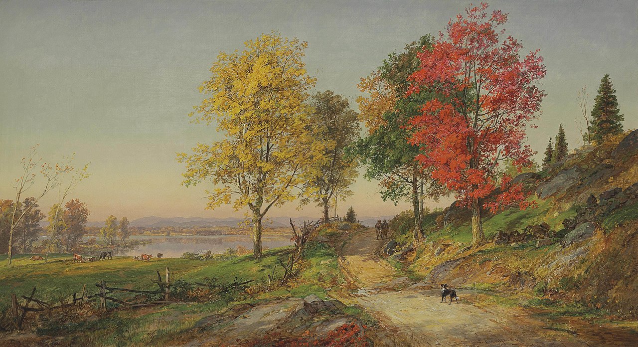
 Title: The Sycamores by Alexandre Calame


