Tag Archives: Fine Art Friday

#FineArtFriday: a closer look at “Boys in a Dory” by Winslow Homer 1873

Artist: Winslow Homer (1836–1910)

Title: Boys in a Dory

Date: 1873

Medium: Watercolor washes and gouache over graphite underdrawing on medium rough textured white wove paper

Dimensions: 9 3/4 x 13 7/8 in. (24.8 x 35.2 cm)

Collection: Metropolitan Museum of Art

Inscription: signed Homer 1873

What I love about this image:

I first featured this painting a year ago. When I was searching Wikimedia for an image to discuss today, I kept coming back to this one.  Perhaps I like it so much because it reminds me of my childhood, of taking my dad’s powerboat out with my little sister and our cousins.

My oldest cousin, Skip, was fourteen and in charge, and we were his crew. Skip ran a tight ship and never drove the boat faster than my father had decreed.

Those were the days when summers lasted forever and the future held nothing but promise. A golden moment of time before life intervened and my cousins moved away, their lives changed by the stormy seas of their parents’ divorce.

Here we have four boys out for a summer’s day on the water. Are they brothers? They all wear similar long-sleeved lightweight cotton shirts and straw hats as protection against the sun.

The two youngest ride while the older boys row. The water is calm, perfect for a sunny afternoon of freedom. Do they plan to fish or are they just out for the fun of it?

I especially like how Homer paints the water. He depicts the reflections perfectly, showing us how they mirror on the soft movement of the water’s surface. He shows us the sailing craft in the distance with minimal strokes, clearly showing the other boats heading out for a day’s fishing or pleasure boating.

About this painting via Wikipedia:

Boys in a Dory is one of Homer’s first watercolors. According to the Met’s description of the painting, the artist’s initial style of watercolors resulted in Boys being simple and direct.

The painting was rendered by Homer while he was in Gloucester, Massachusetts. [1]

About the dory, via Wikipedia:

The dory can be defined as a small boat which has:

  • a flat bottom, with the bottom planks fastened lengthwise (bow to stern).
  • a hull shape defined by the natural curve of a sawn plank (never steam-bent).
  • planks overlapping the stem at the front of the boat and an outer “false” stem covering the hood ends of the planks.
  • (with some exceptions) a fairly narrow transom often referred to as the “tombstone” due to its unique shape.

The hull’s bottom is transversely flat and usually bowed fore-and-aft. (This curvature is known as “rocker”.) The stern is frequently a raked narrow transom that tapers sharply toward the bottom forming a nearly double-ended boat. The traditional bottom is made from planks laid fore and aft and not transverse, although some hulls have a second set of planks laid over the first in a pattern that is crosswise to the main hull for additional wear and strength.

As the need for working dories diminished, the Swampscott or beach dory types were modified for pleasure sailing. These sailing dories became quite popular at the beginning of the 20th century around the town of Marblehead, Massachusetts. They were generally longer yet remained narrow with low freeboard and later were often decked over. Another common distinctive feature of the sailing dory was a long boom on the rig that angled up with a mainsail that was larger along the foot than the luff.  [2]

About the Artist via Wikipedia:

Winslow Homer (February 24, 1836 – September 29, 1910) was an American landscape painter and illustrator, best known for his marine subjects. He is considered one of the foremost painters of 19th-century America and a preeminent figure in American art in general.

Largely self-taught, Homer began his career working as a commercial illustrator. He subsequently took up oil painting and produced major studio works characterized by the weight and density he exploited from the medium. He also worked extensively in watercolor, creating a fluid and prolific oeuvre, primarily chronicling his working vacations. [3]


Credits and Attributions:

IMAGE: Boys in a Dory by Winslow Homer. Wikimedia Commons contributors, “File:Boys in a Dory MET DT5026.jpg,” Wikimedia Commons,  https://commons.wikimedia.org/w/index.php?title=File:Boys_in_a_Dory_MET_DT5026.jpg&oldid=928781177 (accessed April 3, 2025).

[1] Wikipedia contributors, “Boys in a Dory,” Wikipedia, The Free Encyclopedia, https://en.wikipedia.org/w/index.php?title=Boys_in_a_Dory&oldid=1249874568 (accessed April 3, 2025).

[2] Wikipedia contributors, “Dory (boat),” Wikipedia, The Free Encyclopedia, https://en.wikipedia.org/w/index.php?title=Dory_(boat)&oldid=1281846716 (accessed April 3, 2025).

[3] Wikipedia contributors, “Winslow Homer,” Wikipedia, The Free Encyclopedia, https://en.wikipedia.org/w/index.php?title=Winslow_Homer&oldid=1277975900 (accessed April 3, 2025).

Leave a comment

Filed under #FineArtFriday, writing

#FineArtFriday: Palazzo Corner Spinelli by John Singer Sargent, ca, 1902

Artist: John Singer Sargent (1856–1925)

Title: Palazzo Corner Spinelli

Date: circa 1902.

Medium: watercolor, gouache and pencil on paper

Dimensions: 10 x 14 in. (25.4 x 35.6 cm.)

Inscriptions: signed and inscribed ‘to Miss Gertie/from her friend/John S. Sargent’ (upper left)

What I like about this painting:

John Singer Sargent’s love of Italy, and Venice in particular, is clear when you look at the number of stellar watercolor paintings he made while living there.

Sargent’s watercolors are as fine as any of his work done in oils and show us a bit of his personal life. It seems as if he paints in watercolors for fun, and oils for cash.

The day he shows us is warm and hazy. Several gondolas are moored, waiting to ferry passengers around town. The imposing architecture is balanced by water and sky.

He shows us the scene in nuanced shades of blue, cream, gray, tan and brown. This is a pleasant scene, a glimpse of a place that was clearly important to him.

About The Artist via Wikipedia:

John Singer Sargent (January 12, 1856 – April 14, 1925) was an American expatriate artist, considered the “leading portrait painter of his generation” for his evocations of Edwardian-era luxury. He created roughly 900 oil paintings and more than 2,000 watercolors, as well as countless sketches and charcoal drawings. His oeuvre documents worldwide travel, from Venice to the TyrolCorfu, the Middle East, Montana, Maine, and Florida.

Born in Florence to American parents, he was trained in Paris before moving to London, living most of his life in Europe. He enjoyed international acclaim as a portrait painter. An early submission to the Paris Salon in the 1880s, his Portrait of Madame X, was intended to consolidate his position as a society painter in Paris but instead resulted in scandal. During the next year following the scandal, Sargent departed for England where he continued a successful career as a portrait artist.

From the beginning, Sargent’s work is characterized by remarkable technical facility, particularly in his ability to draw with a brush, which in later years inspired admiration as well as criticism for a supposed superficiality. His commissioned works were consistent with the grand manner of portraiture, while his informal studies and landscape paintings displayed a familiarity with Impressionism. In later life Sargent expressed ambivalence about the restrictions of formal portrait work and devoted much of his energy to mural painting and working en plein air. Art historians generally ignored society artists such as Sargent until the late 20th century.

With his watercolors, Sargent was able to indulge his earliest artistic inclinations for nature, architecture, exotic peoples, and noble mountain landscapes. And it is in some of his late works where one senses Sargent painting most purely for himself. His watercolors were executed with a joyful fluidness. He also painted extensively family, friends, gardens, and fountains. In watercolors, he playfully portrayed his friends and family dressed in Orientalist costume, relaxing in brightly lit landscapes that allowed for a more vivid palette and experimental handling than did his commissions (The Chess Game, 1906). His first major solo exhibit of watercolor works was at the Carfax Gallery in London in 1905. In 1909, he exhibited eighty-six watercolors in New York City, eighty-three of which were bought by the Brooklyn MuseumEvan Charteris wrote in 1927:

To live with Sargent’s watercolors is to live with sunshine captured and held, with the luster of a bright and legible world, ‘the refluent shade’ and ‘the Ambient ardors of the noon.’

Although not generally accorded the critical respect given Winslow Homer, perhaps America’s greatest watercolorist, scholarship has revealed that Sargent was fluent in the entire range of opaque and transparent watercolor technique, including the methods used by Homer. [1]


Credits and Attributions:

IMAGE: Wikimedia Commons contributors, “File:Palazzo Corner Spinelli SN00666431 001 1 001.jpg,” Wikimedia Commons, https://commons.wikimedia.org/w/index.php?title=File:Palazzo_Corner_Spinelli_SN00666431_001_1_001.jpg&oldid=1013372496 (accessed April 30, 2026).

[1] Wikipedia contributors, “John Singer Sargent,” Wikipedia, The Free Encyclopedia, https://en.wikipedia.org/w/index.php?title=John_Singer_Sargent&oldid=1347366201 (accessed April 30, 2026).

Leave a comment

Filed under #FineArtFriday

#FineArtFriday: ‘The Louvre, Morning’ by Camille Pissarro 1902

1902_Camille_Pissarro_Le_Louvre,_matin,_printemps
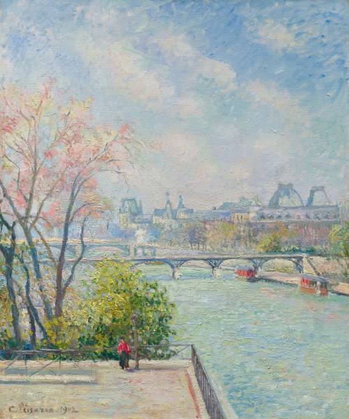
Artist: Camille Pissarro (1830–1903)

Title: French: Le Louvre, Matin, Printemps (English: The Louvre, morning, spring)

Date:1902

Medium: oil on canvas

Dimensions: height: 54 cm (21.2 in), width: 64.8 cm (25.5 in)

References: https://www.sothebys.com/en/buy/auction/2023/modern-evening-auction-5/le-louvre-matin-printemps

What I love about this picture:

This is one of my favorite paintings. I first featured it in 2022, when I was desperate for a glimpse of spring. I did the same last year when it seemed as if spring couldn’t come too soon.

This has been a lovely April, with more sunny days than we normally see, many gray and dry days, and overall, not enough rain. The trees are covered with blossoms, and even the later bloomers are bursting with colors we don’t usually see for another month.

The current lack of precipitation means little snow in the mountains and looming water shortages. It really doesn’t bode well for summer, as dry summers are known hereabouts as Wildfire Season.

But we all agree, we need to enjoy the brilliant blue skies and glorious shades of purple, pink, and white while we can.

This painting shows us the way spring begins. It’s tentative and holding back as if gauging the audience before leaping to center stage. Pissarro’s style of brushwork lends itself to the misty quality of the pastel blossoms.

This was one of Pissarro’s final works. It is a pretty picture, a simple scene not unlike one I might see here in the Pacific Northwest this weekend. The flowering plum trees in my town have burst forth, and the other flowering trees too. The streets and gardens in my town are alive with color.

Pissarro has given us a pretty picture. It’s not profound or revolutionary, not highbrow in any way. It has no deeper meaning, other than to urge us to enjoy the world and the moment.

No matter what some art critics might say, there’s nothing wrong with simply taking the time to enjoy a pretty picture.

Sometimes, what the soul needs is a pretty picture, something featuring the beauty and serenity of a sunny day.

About the artist, via Wikipedia:

Jacob Abraham Camille Pissarro (10 July 1830 – 13 November 1903) was a Danish-French Impressionist and Neo-Impressionist painter born on the island of St Thomas (now in the US Virgin Islands, but then in the Danish West Indies). His importance resides in his contributions to both Impressionism and Post-Impressionism. Pissarro studied from great forerunners, including Gustave Courbet and Jean-Baptiste-Camille Corot. He later studied and worked alongside Georges Seurat and Paul Signac when he took on the Neo-Impressionist style at the age of 54.

In 1873 he helped establish a collective society of fifteen aspiring artists, becoming the “pivotal” figure in holding the group together and encouraging the other members. Art historian John Rewald called Pissarro the “dean of the Impressionist painters”, not only because he was the oldest of the group, but also “by virtue of his wisdom and his balanced, kind, and warmhearted personality”. Paul Cézanne said “he was a father for me. A man to consult and a little like the good Lord”, and he was also one of Paul Gauguin‘s masters. Pierre-Auguste Renoir referred to his work as “revolutionary”, through his artistic portrayals of the “common man”, as Pissarro insisted on painting individuals in natural settings without “artifice or grandeur”.

Pissarro is the only artist to have shown his work at all eight Paris Impressionist exhibitions, from 1874 to 1886. He “acted as a father figure not only to the Impressionists” but to all four of the major Post-Impressionists, Cézanne, Seurat, Gauguin, and van Gogh.

Founder of a Dynasty:

Camille’s son Lucien was an Impressionist and Neo-impressionist painter as were his second and third sons Georges Henri Manzana Pissarro and Félix Pissarro. Lucien’s daughter Orovida Pissarro was also a painter. Camille’s great-grandson, Joachim Pissarro, became Head Curator of Drawing and Painting at the Museum of Modern Art in New York City and a professor in Hunter College’s Art Department. Camille’s great-granddaughter, Lélia Pissarro, has had her work exhibited alongside her great-grandfather. Another great-granddaughter, Julia Pissarro, a Barnard College graduate, is also active in the art scene. From the only daughter of Camille, Jeanne Pissarro, other painters include Henri Bonin-Pissarro (1918–2003) and Claude Bonin-Pissarro (born 1921), who is the father of the Abstract artist Frédéric Bonin-Pissarro (born 1964).

The grandson of Camille Pissarro, Hugues Claude Pissarro (dit Pomié), was born in 1935 in the western section of Paris, Neuilly-sur-Seine, and began to draw and paint as a young child under his father’s tutelage. During his adolescence and early twenties he studied the works of the great masters at the Louvre. His work has been featured in exhibitions in Europe and the United States, and he was commissioned by the White House in 1959 to paint a portrait of U.S. President Dwight Eisenhower. He now lives and paints in Donegal, Ireland, with his wife Corinne also an accomplished artist and their children. [1]


Credits and Attributions:

IMAGE: Wikimedia Commons contributors, “File:1902 Camille Pissarro Le Louvre, matin, printemps.jpeg,” Wikimedia Commons, https://commons.wikimedia.org/w/index.php?title=File:1902_Camille_Pissarro_Le_Louvre,_matin,_printemps.jpeg&oldid=948378278 (accessed April 21, 2026).

[1] Wikipedia contributors, “Camille Pissarro,” Wikipedia, The Free Encyclopedia, https://en.wikipedia.org/w/index.php?title=Camille_Pissarro&oldid=1278793537 (accessed April 21, 2026).

Leave a comment

Filed under #FineArtFriday

#FineArtFriday: Castle Bentheim by Jacob van Ruisdael, ca 1650

Artist: Jacob van Ruisdael (1628/1629–1682)

Title: Bentheim Castle

Genre: landscape painting

Description: Castle Bentheim. The castle located on a hilltop, seen from below by a stream with a small waterfall, rocks, and tree trunks.

Date: between 1650 and 1682

Medium: oil on canvas

Dimensions: height: 68 cm (26.7 in)

Collection: Rijksmuseum

What I like about this painting:

Jacob van Ruisdael gives us a view of Castle Bentheim in the late afternoon. The sun is low in the sky behind us and to our right, casting a warm glow on the sandstone walls of the ancient keep. Skies are one of van Ruisdael’s fortes, but in this painting, the sky with its clouds of gray and white doesn’t quite dominate. The fortress on its hill rises high, as if to say “You have no power over me. I’ve withstood the centuries and risen from the ashes more than once. I am not going away.”

This painting is an excellent visual for fantasy writers. We see how it seems to grow from the rocky hill, how it towers over the countryside. There are many stories here, both historical and imagined.

About Ruisdael’s visit to Bentheim Castle, via Wikipedia:

There has been speculation that Ruisdael accompanied an expedition to acquire Bentheimer sandstone for building the new Amsterdam Town Hall, an ambitious project by mayor Nicolaes Tulp that employed many artists, including the Haarlem architect Jacob van Campen as master builder. Bentheimer sandstone was a popular product being used to build canal mansions along the new canals of Amsterdam. In Haarlem, the facade of the house of Pieter Teyler van der Hulst is cladded with Bentheimer sandstone, and though this was probably done later in the 1740s, it shows how the popularity of this material overshadowed the use of Namur stone from Belgium, the material used earlier in the 17th century for cladding of the Waag, Haarlem, which is a few doors down from Teyler’s house. However it is also entirely plausible that Ruisdael was invited to the castle to paint it, but little is known of the art collection in the castle at that time.

Ruisdael was even tempted to make a dramatic sweeping version of the castle that was copied almost in mirror image by Haarlem contemporary Nicolaes Berchem, called “his great friend” by Ruisdael biographer Arnold Houbraken. It is assumed that the artists travelled together, but no archival evidence beyond dated artworks survive which support this. [1]

For more about the history of Castle Bentheim go to Bentheim Castle – Wikipedia. Also, The Secrets of Bad Bentheim | What’s Hidden Under the Castle?

About the artist, via Wikipedia:

Jacob Isaackszoon van Ruisdael was born in Haarlem in 1628 or 1629 into a family of painters, all landscapists. The number of painters in the family, and the multiple spellings of the van Ruisdael name, have hampered attempts to document his life and attribute his works. The name Ruisdael is connected to a castle, now lost, in the village of Blaricum. The village was the home of Jacob’s grandfather, the furniture maker Jacob de Goyer. When de Goyer moved away to Naarden, three of his sons changed their name to van Ruysdael or van Ruisdael, probably to indicate their origin. Two of De Goyer’s sons became painters: Jacob’s father Isaack van Ruisdael and his well-known uncle Salomon van Ruysdael. Jacob himself always spelled his name with an “i”, while his cousin, Salomon’s son Jacob Salomonszoon van Ruysdael, also a landscape artist, spelled his name with a “y”. Jacob’s earliest biographer, Arnold Houbraken, called him Jakob Ruisdaal.

It is not known whether Ruisdael’s mother was Isaack van Ruisdael’s first wife, whose name is unknown, or his second wife, Maycken Cornelisdochter. Isaack and Maycken married on 12 November 1628.

Ruisdael’s teacher is also unknown.  It is often assumed Ruisdael studied with his father and uncle, but there is no evidence for this.  He appears to have been strongly influenced by other contemporary local Haarlem landscapists, most notably Cornelis Vroom and Allart van Everdingen. [2]


Credits and Attributions:

IMAGE: Wikimedia Commons contributors, “File:Kasteel Bentheim Rijksmuseum SK-A-347.jpeg,” Wikimedia Commons, https://commons.wikimedia.org/w/index.php?title=File:Kasteel_Bentheim_Rijksmuseum_SK-A-347.jpeg&oldid=1176106258 (accessed April 16, 2026).

[1] Wikipedia contributors, “View of Bentheim Castle,” Wikipedia, The Free Encyclopedia, https://en.wikipedia.org/w/index.php?title=View_of_Bentheim_Castle&oldid=1332491171 (accessed April 16, 2026).

[2] Wikipedia contributors, “Jacob van Ruisdael,” Wikipedia, The Free Encyclopedia, https://en.wikipedia.org/w/index.php?title=Jacob_van_Ruisdael&oldid=1346810374 (accessed April 16, 2026).

Leave a comment

Filed under #FineArtFriday

#FineArtFriday: A closer look at “The Peasant and the Nest Robber” by Pieter Bruegel the Elder 1568

The_Peasant_and_the_Birdnester_Pieter_Bruegel_the_Elder_1568Artist: Pieter Brueghel the Elder (1526/1530–1569)

Title:  “The Peasant and the Nest Robber”

Date: 1568

Medium: oil on oak wood

Dimensions: 59.3 × 68.3 cm (23.3 × 26.8 in)

Collection: Kunsthistorisches Museum

What I love about this painting

I first featured this painting in September of 2024. It made me smile then and still does. I still love the sarcastic wit that Pieter Breughel the Elder instilled in it. He was a man with a sharp eye for the humorous and the ability to wield allegory and symbolism like a knife. He cuts to the heart of things, pointing out the hubris and vanities of people from all walks of life.

Most painters at the time painted either religious scenes or portraits for the wealthy. Pieter Brueghel the Elder painted plenty of religious scenes which sold well, but his favorite subjects were the common people of his village. He was earthy and honest in his depictions of village life as he saw it. Brueghel the Elder celebrated the ups and downs of the human condition.

Today, his art is an important source of evidence about the social mores and values governing the life of ordinary people during the 16th-century.

This painting details his favorite subject, human frailty, but he’s taken a different approach, narrowing his usual cast of thousands to just two.

In this case, he is pointing out that people are opportunists. We either have the knowledge and nerve to take what we need or the knowledge and sly desire to point out the failings of others.

Both men in this scene are taking the opportunity to advance themselves. One gains eggs and a good meal, and the other gains a sense of moral superiority.

Neither man feels guilty.

About this painting, via Wikipedia:

This unusual subject apparently illustrates a Netherlandish proverb:

Dije den nest Weet dijen weeten, dijen Roft dij heeten
He who knows where the nest is, has the knowledge, he who robs, has the nest.

The painting presents a moralising contrast between the active, wicked individual and the passive man who is virtuous in spite of adversity (a similar theme appears in his drawing The Beekeepers)] And lastly it could be suggested that the pointing man is making judgement on the robber whilst not aware that he is nearly stepping into the water in front of him.

It has been suggested that, with his knowledge of Italian art, Bruegel intended the peasant’s gesture as a profane parody of the gesture of Leonardo‘s St John. [1]

About the Artist, via Wikipedia:

Pieter Bruegel (also Brueghel or Breughelthe Elder c. 1525–1530 – 9 September 1569) was the most significant artist of Dutch and Flemish Renaissance painting, a painter and printmaker from Brabant, known for his landscapes and peasant scenes (so-called genre painting); he was a pioneer in making both types of subject the focus in large paintings.

He was a formative influence on Dutch Golden Age painting and later painting in general in his innovative choices of subject matter, as one of the first generation of artists to grow up when religious subjects had ceased to be the natural subject matter of painting. He also painted no portraits, the other mainstay of Netherlandish art. After his training and travels to Italy, he returned in 1555 to settle in Antwerp, where he worked mainly as a prolific designer of prints for the leading publisher of the day. Only towards the end of the decade did he switch to make painting his main medium, and all his famous paintings come from the following period of little more than a decade before his early death, when he was probably in his early forties, and at the height of his powers.

Around 1563, Bruegel moved from Antwerp to Brussels, where he married Mayken Coecke, the daughter of the painter Pieter Coecke van Aelst and Mayken Verhulst. As registered in the archives of the Cathedral of Antwerp, their deposition for marriage was registered 25 July 1563. The marriage itself was concluded in the Chapel Church, Brussels in 1563.

Pieter the Elder had two sons: Pieter Brueghel the Younger and Jan Brueghel the Elder (both kept their name as Brueghel). Their grandmother, Mayken Verhulst, trained the sons because “the Elder” died when both were very small children. The older brother, Pieter Brueghel copied his father’s style and compositions with competence and considerable commercial success. Jan was much more original, and very versatile. He was an important figure in the transition to the Baroque style in Flemish Baroque painting and Dutch Golden Age painting in a number of its genres. He was often a collaborator with other leading artists, including with Peter Paul Rubens on many works including the Allegory of Sight.

Other members of the family include Jan van Kessel the Elder (grandson of Jan Brueghel the Elder) and Jan van Kessel the Younger. Through David Teniers the Younger, son-in-law of Jan Brueghel the Elder, the family is also related to the whole Teniers family of painters and the Quellinus family of painters and sculptors, through the marriage of Jan-Erasmus Quellinus to Cornelia, daughter of David Teniers the Younger. [2]


Credits and Attributions:

[1] IMAGE and Quote about this picture: Wikipedia contributors, “The Peasant and the Nest Robber,” Wikipedia, The Free Encyclopedia, https://en.wikipedia.org/w/index.php?title=The_Peasant_and_the_Nest_Robber&oldid=1265248481 (accessed February 26, 2026).

[2] Wikipedia contributors, “Pieter Bruegel the Elder,” Wikipedia, The Free Encyclopedia, https://en.wikipedia.org/w/index.php?title=Pieter_Bruegel_the_Elder&oldid=1340544806 (accessed February 26, 2026).

3 Comments

Filed under #FineArtFriday

#FineArtFriday: A second look at “Gathering Wood for Winter” by George Henry Durrie 1855

Title: Gathering Wood for Winter

Artist: George Henry Durrie (1820–1863)

Date: 1855

Medium: oil on canvas

Dimensions: height: 26 in (66 cm); width: 36 in (91.4 cm)

Collection: Private collection

Why I love this painting:

I love the comforting hominess of George Heny Durrie’s works. in fact, I love everything the snobbier critics hate most about his work – it is meant for ordinary people (like me) to enjoy.

I thought about this painting because winter has lingered this year. Long ago when I was holding down two jobs and living through Reaganomics, I lived in a house that was heated with a woodstove. Every year it was a struggle to buy or cut enough wood to last through the winter.

In this painting, Durrie shows us a day in late autumn. His characteristic use of reds and browns juxtaposed against lighter shades of white portrays the stark beauty of late autumn in New England.

The first snow has fallen, and the season is turning to winter. It’s more important than ever to gather as much wood as possible. Fortunately for our wood gatherers, a giant has fallen victim to a storm, snapping off halfway up.

This is not necessarily the end of the tree. Leaves still cling to the branches below the wound and will continue to provide shade and habitat for as long as it can. Someday, it may be cut down, as the fact it broke in half shows that it is nearing the end of its life and may present a hazard to those who walk beneath it.

Regardless of the tree’s future, the farmer and his son are taking advantage of the bounty so close to their home. They will stack it in the woodshed in “cords” and allow it to dry out or “season” before they must burn it, hopefully not before the end of spring.

The more wood they gather now, the warmer they will be when winter’s grip tightens.

And one cord of wood won’t do it. When I was heating my house, it took five to seven cords to make it through a mild winter. And we were not cooking with it, only heating a small house.

A “cord” of wood is a standard measurement of split and stacked logs that measures 4 feet high × 4 feet wide × 8 feet long. How Big is a Cord of Wood? Exact Measurements & Visual Guide 

About the author, via Wikipedia:

George Henry Durrie (June 6, 1820 – October 15, 1863) was an American landscape artist noted especially for his rural winter snow scenes, which became very popular after they were reproduced as lithographic prints by Currier and Ives.

For many years, Durrie made a living primarily as a portrait painter, executing hundreds of commissions. After marriage, he made frequent trips, traveling to New York, Massachusetts, New Jersey,  and Virginia, fulfilling commissions and looking for new ones. His diary reveals that he was an enthusiastic railroad traveler, in the early days of the railroads. Durrie also painted what he called “fancy pieces”, whimsical studies of still lives or stage actors, as well as painting scenes on window-shades and fireplace covers. But portrait painting commissions became scarcer when photography came on the scene, offering a cheaper alternative to painted portraits, and, as his account-book shows, Durrie rarely painted a portrait after 1851.

Durrie’s interest shifted to landscape painting, and while on the road, or at home, made frequent sketches of landscape elements that caught his eye. Around 1844 Durrie began painting water and snow scenes, and took a second place medal at the 1845 New Haven State Fair for two winter landscapes. Although he had some training in portrait work, Durrie was self-taught as a landscape artist. He was undoubtedly influenced both by the American Hudson River School, and also by European artists, by studying exhibitions of their work at the New Haven Statehouse, the Trumbull Gallery, and at the Wadsworth Atheneum in Hartford, as well as in New York City. Durrie himself exhibited regularly, both locally, and in New York City at the National Academy of Design and the American Artists’ Union, and his reputation grew. Durrie was especially known for his snow pieces, and would often make copies or near-copies of his most popular pieces, with modifications to order.  The landscapes painted by Durrie offered a more intimate view than the panoramic landscapes painted by the Hudson River School, which was the leading school of American landscape painting. Colin Simkin notes that Durrie’s paintings took in a wide angle, but still “close enough to be within hailing distance” of the people who are always included in his scenes.

Currier and Ives

Durrie’s early landscapes were often of local landmarks, such as East Rock and West Rock, and other local scenes, which were popular with his New Haven clients, and he painted numerous variations of popular subjects. As his portrait commissions declined, Durie concentrated on landscapes. He wanted a wider audience, and he seemed to have a good sense of what would sell. Durrie realized that his paintings would have a wider appeal if he made them as generic New England scenes rather than as identifiable local scenes, retaining, as Sackett said, “a sense of place without specifying where that place was.” The New York City lithographic firm of Currier & Ives knew their audience; the American public wanted nostalgic scenes of rural life, images of the good old days, and Durrie’s New England scenes fit the bill perfectly. Lithographic prints were a very democratic form of art, cheap enough that the humblest home could afford some art to hang on the wall. Durrie had been marketing his paintings in New York City, and Currier and Ives, who had popularized such prints, purchased some of Durrie’s paintings in the late 1850s or early 1860s, and eventually published ten of Durrie’s pictures beginning in 1861. Four prints were published between 1861 and the artist’s death in New Haven in 1863; six additional prints were issued posthumously.

The popularity of Durrie’s snow scenes received an additional boost in the 1930s, when the Traveler’s Insurance Company began issuing calendars featuring Currier and Ives prints. Starting in 1946, the January calendar always featured a Durrie snow scene. Historian Bernard Mergen notes that “84 of the 125 paintings attributed to him are snowscapes, more than enough to make him the most prolific snow scene painter of his time.”

In Durrie’s time, winter landscapes were not popular with most curators and critics, but nevertheless, by the time of his death, Durrie had acquired a national reputation as a snowscape painter. Durrie died in 1863, at age 43, probably from typhoid fever, not long after Currier and Ives began reproducing his paintings as prints.

Durrie was dismissed by critics as a popular artist, an illustrator rather than a fine artist. Although Durrie’s Currier and Ives prints were popular, his name was still relatively unknown. But a revival of interest in Durrie began in the 1920s with the publication in 1929 of Currier and Ives, Printmakers to the American People, by collector Harry T. Peters, Sr., who called Durrie’s prints “among the most valued In the entire gallery [of Currier and Ives prints]”, and says that Durrie was known as the “snowman” of the group. [1]


Credits and Attributions:

IMAGE: Gathering Wood for Winter by George Henry Durrie 1855. Wikimedia Commons contributors, “File:George Henry Durrie – Gathering Wood for Winter.JPG,” Wikimedia Commons, https://commons.wikimedia.org/w/index.php?title=File:George_Henry_Durrie_-_Gathering_Wood_for_Winter.JPG&oldid=853995324 (accessed May 1, 2025).

[1]Wikipedia contributors, “George Henry Durrie,” Wikipedia, The Free Encyclopedia, https://en.wikipedia.org/w/index.php?title=George_Henry_Durrie&oldid=1282714933 (accessed May 1, 2025).

2 Comments

Filed under #FineArtFriday, writing

#FineArtFriday: A Merry Company in an Arbor by Adriaen van de Venne 1615

Artist: Adriaen van de Venne (circa 1589–1662)

Title: A Merry Company in an Arbor

Date    1615

Medium: oil on panel

Dimensions: height: 164 mm (6.45 in); width: 230 mm (9.05 in)

Collection: Getty Center

What I love about this painting:

Good heavens, where should I start? This is now my second favorite Dutch Renaissance painting ever. (Pieter Brueghel the Elder’s Hunters in the Snow is my favorite). Adriaen van de Venne is now in the top five of my favorite artists simply because of his unrepentantly Dutch sense of humor. I want to be Dutch when I grow up!

So, let’s have a look at the story Adriaen is telling us. The action is happening in the left foreground. Everyone loves a good kegger … I mean … picnic in the woods, especially after being cooped up all winter. We get dressed in some nice summer finery and everyone brings food, and the hosts provide the drinks.

Of course, the uncles all get a bit deep into the free beer and suddenly a tree climbing contest is on. Unfortunately, Cousin Dirck loses the battle with gravity, as does Uncle Hans. Aunt Irma barely dodges her plummeting spouse, and Cousin Aart yells at Dirck to get up and stop acting like a fool. Cousin Berthe, Dirk’s new bride, is mortified, as she has only just met her spouse’s extended family and had hoped to make a better impression.

Everyone else pretends nothing happened, business as usual. It’s the way family gatherings are, with noisy well-fed people having a good time.

Other groups picnicking in the forest and meadow pretend not to hear the ruckus, but a few nosy neighbors gawk. The gossip will hit the streets before sundown, but other than that, it’s a fine day for a frolic in the forest, one that the Brueghels would have enjoyed.

Humor aside, this is a wonderful, well-executed painting. Adriaen van de Venne has captured one of the most hilarious family get-togethers ever.

About the artist, vis Wikipedia:

Adriaen Pietersz van de Venne (1589 – 12 November 1662), was a versatile Dutch Golden Age painter of allegories, genre subjects, and portraits, as well as a miniaturist, book illustrator, designer of political satires, and versifier.

Van de Venne was born in Delft. According to Houbraken he learned Latin in Leiden. He learned to paint from the master goldsmith and painter Simon de Valk, and afterwards learned engraving from Jeronimus van Diest, a good painter of grisailles. He then moved to Middelburg in 1614 where he was influenced by Jan Brueghel the Elder and Pieter Brueghel the Elder. [1]

To read more about this artist, go to Adriaen van de Venne – Wikipedia.


Credits and Attributions

IMAGE: Wikimedia Commons contributors, “File:Adriaen van de Venne (Dutch – A Merry Company in an Arbor – Google Art Project.jpg,” Wikimedia Commons, https://commons.wikimedia.org/w/index.php?title=File:Adriaen_van_de_Venne_(Dutch_-_A_Merry_Company_in_an_Arbor_-_Google_Art_Project.jpg&oldid=1034439061 (accessed February 12, 2026).

[1] Wikipedia contributors, “Adriaen van de Venne,” Wikipedia, The Free Encyclopedia, https://en.wikipedia.org/w/index.php?title=Adriaen_van_de_Venne&oldid=1330070271 (accessed February 12, 2026).

Comments Off on #FineArtFriday: A Merry Company in an Arbor by Adriaen van de Venne 1615

Filed under #FineArtFriday

#FineArtFriday: a second look at “Under flowering trees” by Adolf Kaufmann

Adolf_Kaufmann_Under_the_treesjpgArtist: Adolf Kaufmann (1848–1916)

Title: Under flowering trees

Date: before 1916

Medium: oil on canvas

Inscription: signed A. Kaufmann

What I love about this painting:

I first featured this painting in 2023. Adolph Kaufmann was brilliant at depicting the kind of misty rain we often get in spring. Here, he gives us a beautiful spring day with dew clinging to the grass, along with apple and cherry trees in full bloom. The weather is cool and damp with mist rising the way spring mornings often are here in the Pacific Northwest.

Chickens roam the orchard, and two women are digging, breaking the ground for a spring garden.

To the left is a weathered building. Is it a barn? Is it their home? It’s hidden behind the shrubbery so it’s difficult to tell, but it has no window, so I think it may be a barn.

Nothing is romanticized—we see it the way the artist did on that spring day over a century ago.

About the Artist, via Wikipedia:

Adolf Kaufmann (15 May 1848, in Troppau – 25 November 1916, in Vienna) was an Austrian landscape and marine artist.

He was initially self-taught, but completed his studies with the animal painter, Émile van Marcke, in Paris and undertook several study trips, throughout Europe and the Middle East. His residence alternated between Paris, Berlin, Düsseldorf and Munich.

In 1890, he decided to settle in Vienna and opened a studio in the Wieden district. In 1900, together with Carl von Merode [de] and Heinrich Lefler, he opened an “Art School for Ladies”. He continued to visit Paris frequently and, when he painted there, signed his works with the pseudonym “A. Guyot”. Other names he signed with include “A. Papouschek”, “G. Salvi”, “A. Jarptmann”, “R. Neiber”, “J. Rollin” and “M. Bandouch”. Why he did this is unclear, although his choice of signature often reflects stylistic differences.

His landscapes were influenced by the Barbizon school and the style known as “paysage intime,” both of which he was exposed to in France during the 1870s. (The paysage intimate, French for “familiar landscape,” was a style of painting that dealt with simple, simple landscapes and emerged in the mid-19th century. It was the predecessor of the Impressionist style.) [1]


Credits and Attributions:

IMAGE: Wikimedia Commons contributors, “File:Adolf Kaufmann Unter blühenden Bäumen.jpg,” Wikimedia Commons, the free media repository, https://commons.wikimedia.org/w/index.php?title=File:Adolf_Kaufmann_Unter_bl%C3%BChenden_B%C3%A4umen.jpg&oldid=623159308 (accessed February 5, 2026.)

[1] Wikipedia contributors, “Adolf Kaufmann,” Wikipedia, The Free Encyclopedia, https://en.wikipedia.org/w/index.php?title=Adolf_Kaufmann&oldid=1094252143 (accessed February 5, 2026).

2 Comments

Filed under #FineArtFriday

#FineArtFriday: Flock of Sheep with Shepherdess on a Rainy Day by Adloph Kaufmann

Artist: Adolf Kaufmann (1848–1916)

Title: Flock of Sheep with Shepherdess on a Rainy Day

Date: by 1916

Medium: oil on canvas

Dimensions: 102 × 113 cm (40.1 × 44.4 in)

What I love about this painting:

Oh those poor miserable sheep. Sure, they’re wearing wool coats, but it’s autumn, and the rain is cold. The shepherdess isn’t really enjoying the day either, but a girl’s gotta do what a girl’s gotta do, and this girl’s job is shepherding the sheep.

Seriously, this is a wonderful painting. Kaufmann shows us an exceedingly realistic rainy day in a wooded meadow, with water pooling in muddy places and bedraggled sheep getting their feet wet. Somehow he has managed to convey the sullen mood of the flock, which I can relate to. Fortunately for them, the shepherdess is most likely taking them to higher ground where they can graze without standing in water.

I feel their misery. The rains have returned in force here, and I am glad I no longer have sheep to shepherd, rain or shine. Still, I must leave my cozy apartment and drive to the grocery store, etc., grateful that I am in my warm, dry car and not walking the muddy path Kaufmann shows us in this painting.

About the Artist, via Wikipedia:

Adolf Kaufmann (15 May 1848, in Troppau – 25 November 1916, in Vienna) was a landscape and marine artist from Austria-Hungary.

He was initially self-taught, but completed his studies with the animal painter, Émile van Marcke, in Paris and undertook several study trips, throughout Europe and the Middle East. His residence alternated between Paris, Berlin, Düsseldorf and Munich.

In 1890, he decided to settle in Vienna and opened a studio in the Wieden district. In 1900, together with Carl von Merode [de] and Heinrich Lefler, he opened an “Art School for Ladies”. He continued to visit Paris frequently and, when he painted there, signed his works with the pseudonym “A. Guyot”. Other names he signed with include “A. Papouschek”, “G. Salvi”, “A. Jarptmann”, “R. Neiber”, “J. Rollin” and “M. Bandouch”. Why he did this is unclear, although his choice of signature often reflects stylistic differences. [1]


Credits and Attributions

IMAGE: Wikimedia Commons contributors, “File:Adolf Kaufmann – Flock of Sheep with Shepherdess on a Rainy Day.jpg,” Wikimedia Commons, https://commons.wikimedia.org/w/index.php?title=File:Adolf_Kaufmann_-_Flock_of_Sheep_with_Shepherdess_on_a_Rainy_Day.jpg&oldid=1114083148 (accessed January 29, 2026).

[1] Wikipedia contributors, “Adolf Kaufmann,” Wikipedia, The Free Encyclopedia, https://en.wikipedia.org/w/index.php?title=Adolf_Kaufmann&oldid=1332903934 (accessed January 29, 2026).


2 Comments

Filed under #FineArtFriday

#FineArtFriday: Spring Landscape by Ellen Favorin ca 1900

Artist: Ellen Favorin (1853–1919)

Title: English: Spring Landscape (Suomi: Kevätmaisema)

Genre: landscape painting

Date: circa 1900

Dimensions: height: 20.7 cm (8.1 in)

Collection: HAM Helsinki Art Museum

What I love about this painting:

Ellen Favorin shows us a pleasant spring day beside a calm lake, with leaves on the birch trees just beginning to bud out. I especially like how she has portrayed the foliage and shrubbery along the lake shore, with the water high from the spring snowmelt, and the birch trees standing with their feet submerged.

Someone is enjoying a quiet day of fishing, and I would love to be them! What a perfect day.

I will find more paintings by this artist and feature them in the future.


About the artist, via Wikipedia:

Elsa “Ellen” Favorin (31 December 1853– 27 November 1919 was a Swedish-speaking Finnish painter.

Her parents were Anders Abraham Favorin and Lovisa Ingman. After attending the painting schools in Helsinki and Stockholm, she continued her studies in Munich, Düsseldorf and at the Académie Julian in Paris. She often painted landscapes and was one of the artists who joined Victor Westerholm in the artists’ colony at Önningeby on the island of Åland. She died together with her sister in a fire at their home in Lohja in 1919. [1]

As you can see, Wikipedia had little to say about her. However, you can find an excellent and comprehensive biography of Ellen Favorin at NiceArtGallery.com.


Credits and Attributions:

IMAGE: Wikimedia Commons contributors, “File:Ellen Favorin – Spring Landscape.jpg,” Wikimedia Commons, https://commons.wikimedia.org/w/index.php?title=File:Ellen_Favorin_-_Spring_Landscape.jpg&oldid=864051225 (accessed January 22, 2026).

[1] Wikipedia contributors, “Ellen Favorin,” Wikipedia, The Free Encyclopedia, https://en.wikipedia.org/w/index.php?title=Ellen_Favorin&oldid=1333359650 (accessed January 22, 2026).

2 Comments

Filed under #FineArtFriday