
 Today we are going to discuss fonts and why we use “industry standard” fonts for all our submissions. Publishers have specific, standardized formatting they want you to use, and these guidelines are posted on their websites. When a call for submissions goes out, their editors will have no time to deal with badly formatted manuscripts. If you don’t follow their guidelines, they will assume you aren’t a professional and won’t read your work.
If you have a specific contest or publication in mind that you plan to submit your manuscript to, go to the publication’s website and read the standards and requirements they have laid out.
A good guide for making a manuscript conform to industry standards can be found at William Shunn’s website: Proper Manuscript Format: Short Story Format.
That looks complicated, you say. It isn’t, but you do need to learn how to use your word processing program, and I am here to help you.
I use Word as my word processing program, but most word processing programs (Open Office, Google Docs) follow a similar process as my program does.
Running across the top of the page is something called the ribbon, and this is your toolbox. Everything you need to create a manuscript is right there, waiting for you to learn to use it. On the right-hand side, by the question mark is a tiny arrow for expanding or hiding the ribbon – and we are going to expand it so we have access to all the tools we will need.
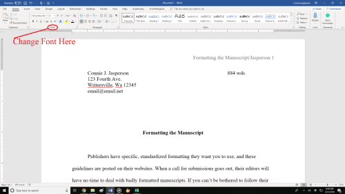
Now we must select the font. As I said before, I use Microsoft WORD, and like every other word-processing program, it has many fancy fonts you can choose from and a variety of sizes.
You don’t want fancy. Stick with the industry standard fonts: Times New Roman or Courier in 12 pt. These are called ‘Serif’ fonts and have little extensions that make them easier to read.
If you are using MS WORD, here are a few simple instructions for changing your fonts.
Open your manuscript document, and Click on the tab marked ‘Home.’ In the upper right-hand corner of the ribbon across the top of the page in the editing group, click:
select> select all. This will highlight the entire manuscript.
With the ms still highlighted, go to the font group, on the left-hand end of the ribbon. The default font, or predesigned setting, will probably say ‘Calibri (Body)’ and the size will be .11.
You can change this by opening the menu. Scroll down to Times New Roman or Courier (depending on the publisher’s guidelines). Click on that, and the font for the entire ms will be that font. If you have clicked on the wrong font, it can be undone by clicking the back-arrow (upper left hand corner). Once you are satisfied with your changes, click save.
Now, with the ms still highlighted, we are going to format our paragraphs. Having it double-spaced allows for longer comments and is easier for an editor to read. The specific details for formatting paragraphs can be found in last week’s post, Formatting Your Paragraphs. It is a process that is absolutely critical.
Most publishers and editors want the header formatted. Each page should be clearly marked with your name and/or the title of the book as well as the page number. Many publishers will still accept print copies of manuscripts, but want them UNBOUND. No staples, not in a ring binder. You may use one large binder clip if you just can’t resist, but otherwise, they want the manuscript stacked and inserted in a manila envelope.
Accidents happen: if the printout of the manuscript accidentally falls off a desk, it can easily be reassembled, and the editor will always know that you wrote that story.
To make your header:
- Open the “insert” tab.
- Click on “page number.” This opens a new menu.
- Add the page numbers using the small dropdown menu.
- Insert the title and your author name just before the page number.
That will be your header.
This is how the ribbon and menus look: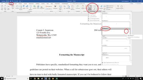 Sometimes, a publisher will specify that the first (title) page have no header or page number, but they want the header and page numbers to begin on page two.
To make the page numbers begin on page two:
- Click anywhere in the document.
- On the Page Layout tab, click the Page Setup Dialog Box Launcher, and
- then click the Layout
- Under Headers and footers, select the Different first page check box, and then click OK.
What goes on the first page? Your first page should include:
- The name of the work.
- The approximate word count, some will want it only to the nearest hundred.
- In the upper left, your contact details formatted in the same font and size as the manuscript font.
Now your manuscript:
- is aligned left.
- has 1 in. margins.
- is double-spaced.
- has formatted indented paragraphs.
- The header contains the title, author name, and page numbers, and is aligned right.
- The first page contains your mailing address and contact information in the upper left hand corner.
Good luck with your submissions. Selling work to anthologies and magazines is the best way for an indie to build a reputation as an author. You will be competing with many other authors, all of them as creative and talented as you are, so making your work look as professional as is possible will give you an edge.


More info than a four-year college degree!
Faster than a leaping hyperbole!
Strong than an Em dash! It’s Formatman!
A timely reminder for the misanthropic among us!
LikeLiked by 1 person
Hah! You crack me up, Perfesser!
LikeLike
Reblogged this on Chris The Story Reading Ape's Blog.
LikeLiked by 1 person
Thank you for the reblog,Chris ♥ you get a hug!
LikeLiked by 1 person
Hugs Back, Connie 😀
LikeLiked by 1 person
Are publishers still accepting paper manuscripts? I was thinking they’d mostly switched to electronic by now, no?
LikeLike
Hello! When you go to their website, they will have the guidelines there. Most will still accept paper, because even in this age of technology, there are people with no access to computers, but who have a story to tell. And some people simply prefer to write on a typewriter – one gal in my writing group falls into that category.
LikeLiked by 1 person
Good to know. True, many haven’t switched to computers. Sometimes I wish I never had, when my computers have issues.
LikeLike