Tag Archives: formatting headers

Submitting to Magazines and Anthologies Part 3 #amwriting

Over the last two weeks, we have talked about the nuts and bolts of formatting the body of a manuscript for submission to a contest. Most contests want “blind” submissions (work without the author’s identifying information on the document), so we haven’t yet discussed how to make a proper “header.”

WritingCraft_short-story-formattingThis is the heading at the top of each page of a word-processed or faxed document. It contains page numbers, the title, and the author’s name. You won’t need one for most contests. However, if you plan to submit work to a magazine or anthology, you will want your header to follow their guidelines.

The header is important because when an editor likes your work, they might print it out to look at it more closely. If the printout of the manuscript falls off a desk, it can easily be reassembled because the pages are numbered.

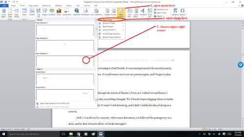
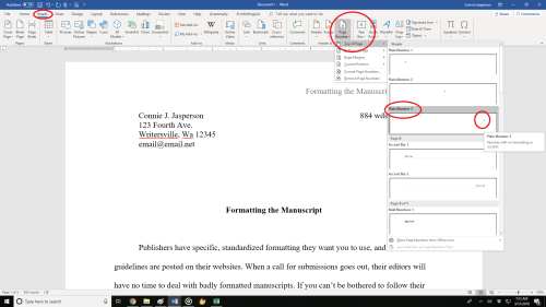
We insert the header by opening the “insert” tab and clicking on “page number.” This opens a new menu. We add the page numbers using the small dropdown menu.

This is how the ribbon and menus look:
Headers and Page numbers prnt sc 2

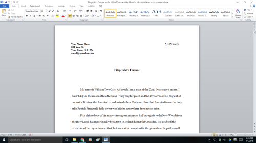
The header contains the title and your pen name. The first page contains your legal name, mailing address, contact information in the upper left-hand corner, and the word count on the right.

This may seem excessive, but if you are serious about submitting your work to agents, editors, or publishers, it must be as professionally formatted as possible.

You will insert the Title of the Book and Your Author Name just before the page number. That way, it will look tidy and be aligned to the right. You can do this on the page number tab.

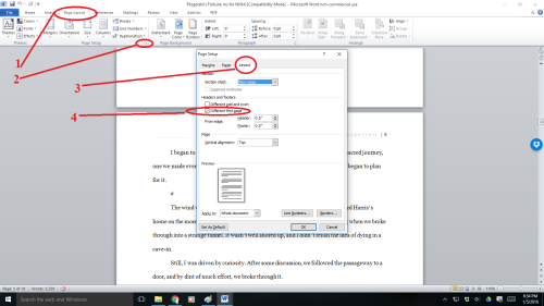
That is a simple process, but occasionally, a publisher will specify that the first (title) page should have no header or page number. Instead, they might want the header and page numbers to begin on page two.

To make the page numbers begin on page two:

  1. Click anywhere in the document.
  2. On the Page Layout tab, click the Page Setup Dialog Box Launcher and
  3. then click the Layout
  4. Under Headers and Footers, select the Different first pagecheck box, and then click OK.
Headers and Page numbers prnt sc 3

  1. The header contains the title, author name, and page numbers—all aligned right.
  2. The first page contains your mailing address and contact information in the upper left-hand corner.

So now we know how to make our submissions look professional—but where should we send them?

How do we find reputable publishers who are accepting submissions?

When I began this journey, I didn’t understand how specifically you must tailor your submissions for literary magazines, contests, and anthologies. Each publication has a specific market of readers, and their editors look for new works their target market will buy.

Magazine editors don’t have the time to teach you how to write. You have to learn that on your own. You have to ensure your work is clean and well-written before submitting it.

Cover_of_October_1952_issue_of_The_Magazine_of_Fantasy_&_Science_FictionSo, what do they do if they don’t go over your work line-by-line? Magazine editors look for and bring new and marketable stories to the reading public.

Marketable is the keyword. If your submission doesn’t fit what that magazine’s readers expect, the editor will reject it. Perhaps the quality of your work isn’t the problem. Maybe you have selected a publication that features work in your chosen genre. But your subgenre may not match what the readers of that publication want to see.

After all, both spaghetti Bolognese and bruschetta are created out of ingredients made from wheat and tomatoes. But, a person who craves spaghetti Bolognese won’t be satisfied with an offering of bruschetta despite the fact they both feature wheat and tomatoes.

The genre may be Italian, and they feature the same ingredients. But the delivery method is a subgenre that may not appeal to every diner.

Another point I want to make is this. Once your story makes it through the publisher’s door and into the first part of their process, their editor may ask you for minor revisions. They may ask you to clear up small things you missed when self-editing.

But they won’t offer you technical advice.

Harpers_Magazine_1905This is because they shouldn’t have to. Before submitting your work to an agent or submissions editor, you must have the technical skills down.

You must ensure you have a clean manuscript that is marketable to the readers of the publication you are courting. Ask someone in your writing group to proofread it before submitting it.

Professionals do the required work and don’t think twice about it—self-editing and proofreading are just part of the job.

Prominent publications have wide readerships, which helps the indie author as much as those who are traditionally published. The more people who read and enjoy your short story, the more potential readers you have for your novels. These people likely read books, and guess what? They might look for your novels when shopping for books at Amazon, Barnes & Noble, and other digital booksellers.

lasceax prizeWhen you have a story that you believe in, you must find the venue that publishes your sort of work. Read the magazines you hope to submit work to. That way, you will know what publishers are buying in your genre.

  • In other words, if you write fantasy, google magazines featuring fantasy and sci-fi and buy them. Read the work that publishers are buying so you aren’t wasting your time.

An excellent place to start would be the website Worlds Without End, an author resource site listing magazines that publish fantasy and science fiction.

Not all publications will be accepting new work, but some will. Be warned—finding magazines with open calls for submissions is a lot of work.

Anthologies with open calls might be more plentiful, but you must know how to find them. You can connect with writers’ groups through the many forums on Facebook and other social media platforms.

Pw06Those who can’t afford to buy magazines can go to websites like Literary Hub and read excellent pieces culled from various literary magazines for free. This will give you an idea of what you want to achieve in a story and where you might consider sending your work.

And may you have good luck with your submissions. Speaking as a reader, there is no such thing as too many stories. In fact, I’m going to curl up with a good book right now!

2 Comments

Filed under writing

Writing the short story part 4: making it submission-ready #amwriting

You have written a short story and edited it. You have decided what publication you want to submit it to. Now you must format the manuscript to make it submission-ready. Your next steps will show the prospective publisher your level of professionalism.

WritingCraft_short-story-formattingEditors at magazines, contests, and publishing houses have no time to deal with poorly formatted manuscripts. Their inboxes are full of properly formatted work, so they will reject the amateurs without further consideration.

You must learn to use your word-processing program. I use Microsoft Word, but Google Docs and Open Office are very similar.

FIRST: Read the submission guidelines your prospective publisher has posted on their website and follow them.

Publishers who accept electronic submissions will most likely want them formatted similarly. For the most part, this formatting is basically the same from company to company, so once you know what the industry standard is, it’s easy to make your manuscript submission-ready, at least in the area of formatting.

Running across the top of the page in your word-processing program is the ribbon (toolbar). Everything you need to create a manuscript is right there, waiting for you to learn to use it. Sometimes you can’t see it, and this is because it is hidden.

On the far right-hand side in Word is a tiny arrow for expanding or hiding the ribbon. We are going to expand it so we have access to all the tools we will need. If you are using a different program than mine, don’t be afraid to google how to unhide the toolbar/ribbon for your program.

Formatting_final_Fonts_2_LIRF03292020First, we must select the font. Every word-processing program has many fancy fonts you can choose from and a variety of sizes.

Use the industry-standard fonts: Times New Roman or Courier in 12 pt. These are called ‘Serif’ fonts and have little extensions that make them easier to read when in a wall of words.

If you are using MS WORD, here are a few simple instructions: to change your fonts, open your manuscript document, and click on the tab marked ‘Home.’ In the upper right-hand corner of the ribbon across the top of the page in the Editing group, click: select> select all. This will highlight the entire manuscript.

With the manuscript still highlighted, go to the font group on the ribbon’s left-hand end. The default font, or predesigned value or setting, will probably say ‘Calibri (Body),’ and the size will be .11.

You can change this by clicking on the menu. Scroll down to Times New Roman or Courier (depending on the publisher’s guidelines). Click on that, and the font for the entire ms will be that font. If you have clicked on the wrong font, it can be undone by clicking the back-arrow. Once you are satisfied with your changes, click Save.

Now we are going to format our paragraphs and line spacing. Editors and publishers want their copies double-spaced so they can insert comments as needed in the reviewing pane, which will be on the right side of the page when you receive your work back for revisions. Having it double-spaced allows for longer comments and is easier for an editor to read.

Do NOT ever use the tab key or the space bar to indent your paragraphs. If you used the tab key to indent your paragraphs, the indents might fail when the manuscript is electronically uploaded. This creates a wall of words with no way to tell where one paragraph ends and another begins.

If you have done that, you can fix it by using one of the two following ways.

To remove tabs from a manuscript in Word or most other word-processing programs, open the “Find” box (right side of the ribbon on the home tab). In the “Find” field, type in ^t. (Caret + lowercase t) (press the alt key 94 to make ^ and key the t). This only works if you have a ten-key (number pad) at the right side of your keyboard: ^t.

Then click “Replace.” In this field, type nothing. One click on “Replace all” will remove every tab.

That will leave you with no indents whatsoever. This will temporarily make your manuscript look like a wall of words, but you will resolve that the proper way.

If you don’t have a ten-key pad on your keyboard, you will have to remove each one by hand. Beginning with the first paragraph on the first page, scroll down and use the backspace key to remove the tab indenting every paragraph.

Once the tabs are all removed, use the following instructions to format paragraphs.

FIRST: SELECT ALL. This will highlight your entire manuscript.

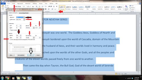
select-all-printscreenStep 1: On the Home tab, look in the group labeled ‘Paragraph.’ On the lower right-hand side of that group is a small grey square. Click on it. A pop-out menu will appear, and this is where you format your paragraphs.
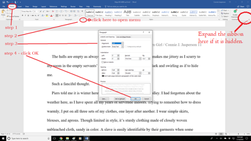
Step 2: On the indents and spacing tab of the menu: Use standard alignment, align LEFT. The reason we use this format is we are not looking at a finished product here. We are looking at a rough draft that will be sliced, diced, and otherwise mutilated many times before we get to the final product.

Step 3: Indentation: leave that alone or reset both numbers to ‘0’ if you have inadvertently altered it.

Step 4: Where it says ‘Special’: on the dropdown menu, select ‘first line.’ On the ‘By’ menu, select ‘0.5.’ (Some publishers will specify a different number, 0.3 or 0.2, but 0.5 is standard.)

Step 5: ‘Spacing’: set both before and after to ‘0.’

Step 6: ‘Line Spacing’: set to ‘double.’

To summarize, standard paragraph format has:

  • margins of 1 inch all the way around
  • indented paragraphs with no extra space between
  • double-spaced text
  • Align Left. This is critical.

formatting_paragraphs_in_MSWord_Do not justify the text. In justified text, the spaces between words and letters (known as “tracking”) are stretched or compressed. Justified text gives you straight margins on both sides. However, this type of alignment only comes into play when a manuscript is published. At that point, the publisher will handle the formatting.

Now we need to make the “Header.” This is the heading at the top of each page of a word-processed or faxed document, consisting of page numbers, title, and author name. If an editor likes your work, they might print it out to look at it more closely. If the printout of the manuscript falls off a desk, it can easily be reassembled because the pages are numbered.

We insert the header by opening the “insert” tab and clicking on “page number.” This opens a new menu. We add the page numbers using the small dropdown menu.

This is how the ribbon and menus look:

Headers and Page numbers prnt sc 2Now your manuscript is submission-ready. It is in Times New Roman or Courier .12 font, is aligned left, has1 in. margins, is double-spaced, has formatted indented paragraphs.

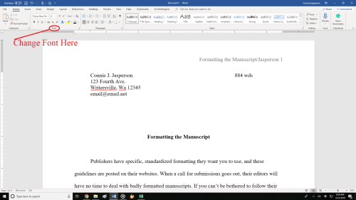
The header contains the title and your pen name. The first page contains your legal name, mailing address, contact information in the upper left-hand corner, and the word count on the right.

First_page_topThis may seem like overkill to you. If you are serious about submitting your work to agents, editors, or publishers, it must be as professionally formatted as is possible.
I hope these general instructions will help you find success, but be sure to check the publisher’s website as each publisher may have different requirements. If you don’t follow your prospective publisher’s submission guidelines, you have wasted your time submitting it.


3 Comments

Filed under writing

Fonts and Headers #amwriting

Today we are going to discuss fonts and why we use “industry standard” fonts for all our submissions. Publishers have specific, standardized formatting they want you to use, and these guidelines are posted on their websites. When a call for submissions goes out, their editors will have no time to deal with badly formatted manuscripts. If you don’t follow their guidelines, they will assume you aren’t a professional and won’t read your work.

If you have a specific contest or publication in mind that you plan to submit your manuscript to, go to the publication’s website and read the standards and requirements they have laid out.

A good guide for making a manuscript conform to industry standards can be found at William Shunn’s website: Proper Manuscript Format: Short Story Format.

That looks complicated, you say. It isn’t, but you do need to learn how to use your word processing program, and I am here to help you.

I use Word as my word processing program, but most word processing programs (Open Office, Google Docs) follow a similar process as my program does.

Running across the top of the page is something called the ribbon, and this is your toolbox. Everything you need to create a manuscript is right there, waiting for you to learn to use it. On the right-hand side, by the question mark is a tiny arrow for expanding or hiding the ribbon – and we are going to expand it so we have access to all the tools we will need.

Now we must select the font. As I said before, I use Microsoft WORD, and like every other word-processing program, it has many fancy fonts you can choose from and a variety of sizes.

You don’t want fancy. Stick with the industry standard fonts: Times New Roman or Courier in 12 pt. These are called ‘Serif’ fonts and have little extensions that make them easier to read.

If you are using MS WORD, here are a few simple instructions for changing your fonts.

Open your manuscript document, and Click on the tab marked ‘Home.’  In the upper right-hand corner of the ribbon across the top of the page in the editing group, click:

select> select all. This will highlight the entire manuscript.

With the ms still highlighted, go to the font group, on the left-hand end of the ribbon. The default font, or predesigned setting, will probably say ‘Calibri (Body)’ and the size will be .11.

You can change this by opening the menu. Scroll down to Times New Roman or Courier (depending on the publisher’s guidelines). Click on that, and the font for the entire ms will be that font. If you have clicked on the wrong font, it can be undone by clicking the back-arrow (upper left hand corner).  Once you are satisfied with your changes, click save.

Now, with the ms still highlighted, we are going to format our paragraphs. Having it double-spaced allows for longer comments and is easier for an editor to read. The specific details for formatting paragraphs can be found in last week’s post, Formatting Your Paragraphs. It is a process that is absolutely critical.

Most publishers and editors want the header formatted. Each page should be clearly marked with your name and/or the title of the book as well as the page number. Many publishers will still accept print copies of manuscripts, but want them UNBOUND. No staples, not in a ring binder. You may use one large binder clip if you just can’t resist, but otherwise, they want the manuscript stacked and inserted in a manila envelope.

Accidents happen: if the printout of the manuscript accidentally falls off a desk, it can easily be reassembled, and the editor will always know that you wrote that story.

To make your header:

  • Open the “insert” tab.
  • Click on “page number.”  This opens a new menu.
  • Add the page numbers using the small dropdown menu.
  • Insert the title and your author name just before the page number.

That will be your header.

This is how the ribbon and menus look:Sometimes, a publisher will specify that the first (title) page have no header or page number, but they want the header and page numbers to begin on page two.

To make the page numbers begin on page two:

  1. Click anywhere in the document.
  2. On the Page Layout tab, click the Page Setup Dialog Box Launcher, and
  3. then click the Layout
  4. Under Headers and footers, select the Different first page check box, and then click OK.

What goes on the first page? Your first page should include:

  • The name of the work.
  • The approximate word count, some will want it only to the nearest hundred.
  • In the upper left, your contact details formatted in the same font and size as the manuscript font.

Now your manuscript:

  1. is aligned left.
  2. has 1 in. margins.
  3. is double-spaced.
  4. has formatted indented paragraphs.
  5. The header contains the title, author name, and page numbers, and is aligned right.
  6. The first page contains your mailing address and contact information in the upper left hand corner.

Good luck with your submissions. Selling work to anthologies and magazines is the best way for an indie to build a reputation as an author. You will be competing with many other authors, all of them as creative and talented as you are, so making your work look as professional as is possible will give you an edge.

8 Comments

Filed under writing

Formatting Short Stories for Submission #amwriting

If you are serious about writing and submitting short stories, you must learn to use the features that come with your word processing program.

Publishers have specific, standardized formatting they want you to use, and these guidelines are posted on their websites. When a call for submissions goes out, their editors will have no time to deal with badly formatted manuscripts.

If you can’t be bothered to follow their guidelines, they won’t be bothered to read your work.

For the most part, the requirements are basically the same from company to company with minor differences. To make sure your work conforms to the intended recipient’s requirements go to the publication’s website and read the standards they have laid out.

William Shunn has established a standard format that is acceptable to most publishers. All of the following steps will come into play when you make your document look like his. The link for his website where the example can be viewed is here: William Shunn: Proper Manuscript Format : Short Story Format

To get your paragraphs and line spacing right, you need to know a few simple tricks for using your word processing program. These tools come with the software and are there to make your documents look as professional as is possible.

First, you must open the toolbox.

Open your document. I use Word, but most word processing programs (Open Office, Google Docs) follow a similar process as my program does. Running across the top of the page is something called the ribbon, and this is your toolbox. Everything you need to create a manuscript is right there, waiting for you to learn to use it. On the right-hand side, by the question mark is a tiny arrow for expanding or hiding the ribbon – and we are going to expand it so we have access to all the tools we will need.

Now we must select the font. As I said before, I use Microsoft WORD, and like every other word-processing program, it has many fancy fonts you can choose from and a variety of sizes.

You don’t want fancy. Stick with the industry standard fonts: Times New Roman or Courier in 12 pt. These are called ‘Serif’ fonts and have little extensions that make them easier to read when in a wall of words.

If you are using MS WORD, here are a few simple instructions: to change your fonts, open your manuscript document, and Click on the tab marked ‘Home.’  In the upper right-hand corner of the ribbon across the top of the page in the editing group, click:

select> select all. This will highlight the entire manuscript.

With the ms still highlighted, go to the font group, on the left-hand end of the ribbon. The default font, or predesigned setting, will probably say ‘Calibri (Body)’ and the size will be .11.

You can change this by opening the menu. Scroll down to Times New Roman or Courier (depending on the publisher’s guidelines). Click on that, and the font for the entire ms will be that font. If you have clicked on the wrong font, it can be undone by clicking the back-arrow (upper left hand corner).  Once you are satisfied with your changes, click save.

Now we are going to format our paragraphs and line spacing. Editors and publishers want their copies double-spaced so they can insert comments as needed in the reviewing pane, which will be on the right side of the page when you receive your work back for revisions. Having it double-spaced allows for longer comments and is easier for an editor to read.

Do NOT ever use the tab key or the space bar to indent your paragraphs.

You have no idea what a mess that makes out of an electronic manuscript. Too many extra spaces in an electronic document cause the formatting to fail when converted to electronic publishing formats (mobi, epub, etc.) so keep extra spaces to a minimum. Most publishers require manuscripts to be submitted electronically, so you will have to go in and remove these tabs by hand, and it’s a tedious job, but do it now, if you have been using the tab key.

You can format the paragraphs by either opening the home tab and choosing ‘normal’ from the styles tab on the ribbon. This is simplest, but what is ‘normal’ on your software may not be what your publisher requires. The best way is to format by using the formatting tool, which requires 6 steps, detailed below.

Step 1: Once again, select all to highlight the entire document. Then, on the home tab, look in the group labeled ‘Paragraph.’ On the lower right-hand side of that group is a small grey square. Click on it.  A pop-out menu will appear, and this is where you format your paragraphs.

Step 2: On the indents and spacing tab of the menu: Use standard alignment, align LEFT. The reason we use this format is we are not looking at a finished product here. We are looking at a rough draft that will be sliced, diced, and otherwise mutilated many times before we get to the final product.

Step 3: Indentation: leave that alone or reset both numbers to ‘0’ if you have inadvertently altered it.

Step 4: Where it says ‘Special’: on drop-down menu select ‘first line.’ On the ‘By’ menu, select ‘0.5.’ (Some publishers will specify a different number, 0.3 or 0.2, but 0.5 is standard.)

Step 5: ‘Spacing’: set both before and after to ‘0.’

Step 6: ‘Line Spacing’: set to ‘double.’

To summarize, standard paragraph format has:

  • margins of 1 inch all the way around
  • indented paragraphs with no extra space between
  • double-spaced text
  • Align Left. This is critical.

Do not justify the text. In justified text, the spaces between words, and letters (known as “tracking”) are stretched or compressed. Justified text aligns with both the left and right margins. It gives you straight margins on both sides, but this type of alignment only comes into play when a manuscript is published, and at that point, the publisher will handle the formatting.

Now we need to make the “Header.”  This is the heading at the top of each page of a word-processed or faxed document, consisting of the title and your name, followed by the page number.

Many publishers and editors want this because when they receive a print copy, each page is clearly marked with your name and/or the title of the book as well as the page number. Remember, they want print copies UNBOUND. Accidents happen: if the printout of the manuscript accidentally falls off a desk, it can easily be reassembled, and the editor will always know that you wrote that brilliant work.

We insert this by opening the “insert” tab, and clicking on “page number.”  This opens a new menu. We add the page numbers using the small dropdown menu. We insert our title and author name just before the page number, and that will be our header.

This is how the ribbon and menus look:

Now you know how to use your software to make your manuscript submission ready. You have changed the font to Times New Roman or Courier .12 font and  the body of the manuscript is

  1. Aligned left
  2. 1 in. margins
  3. Double-spaced
  4. Has formatted indented paragraphs
  5. Header contains title and author name
  6. The first page contains the author’s mailing address and contact information in upper left hand corner

This may seem like overkill to you, but I assure you, if you are serious about submitting your work to agents, editors, or publishers, it must be in as professional a format as is possible.

I hope these instructions will help you find the way to format properly in other word-processing programs. MS WORD is the one I use because it is easy and has all the tools I need. Just don’t get too fancy with formatting your work before you submit it. No matter how pretty you make that manuscript, if it doesn’t follow the submission guidelines for the place you are submitting it, you have wasted your time.

18 Comments

Filed under writing

#amwriting: headers and page numbers

Book- onstruction-sign copyI’ve blogged before on this subject, but it is time to talk about it again: making your manuscript ready for submission to an editor, agent, or a publisher. All agents, editors and publishing companies have specific, standardized formatting they want you to use, and these guidelines are posted on their websites.

The submissions page for TOR Forge, one of the Big Boys in the publishing world, clearly says: “Standard manuscript format means margins of at least 1 inch all the way around; indented paragraphs; double-spaced text; and Times New Roman in 12 pitch. Please use one side of the page only. Do not justify the text. Do not bind the manuscript in any way. Make sure the header of the ms. includes your name and/or the title of the book as well as the page number (on every page).”

For the most part this formatting is basically the same from company to company, so once you know what the industry standard is, it’s easy to make your manuscript submission-ready, at least in the area of formatting.

stopI’ve said this before, and I will say it again: Do NOT ever use the tab key or the space bar to indent your paragraphs. Many times publishers want electronic submissions and you have no idea what a crapped up mess (sorry for the editor-speak) using the tab key makes out of an electronic manuscript.  You most likely will have to go in and remove these tabs by hand and it’s a tedious job, but do it now, if you have been using the tab key.

You might say, “Well I only submit to traditional publishers who all want hard-copy.” That, my friends, it not true. The entire publishing industry is undergoing modernization, and while they do still accept hard-copy, electronic submissions are rapidly becoming the preferred method, even with the larger publishers. Don’t limit your options by refusing to learn a simple trick.

To format your paragraphs indents, first highlight the entire manuscript: on the far right side of the home-tab at the top of your page, click select all. Next,  still on the home tab,  click on the little box at the lower right of the box that says ‘Paragraph.’  This will open a whole new menu:

  1. On the indents and spacing tab of the menu: Use standard alignment, align LEFT. The reason we use this format is we are not looking at a finished product here. We are looking at a rough draft that will be sliced, diced and otherwise mutilated many times before we get to the final product. The following pictures are for WORD 2010, as I have not yet upgraded my MS Office program, but the basic ideas are the same.

paragraphs post 2 pof word series

  1. Indentation: leave that alone or reset both numbers to ‘0’ if you have inadvertently altered it.
  2. Where it says ‘Special’: on drop-down menu select ‘first line’. On the ‘By’ menu, select ‘0.5’
  3. ‘Spacing’: set both before and after to ‘0’.
  4. ‘Line Spacing’: set to ‘double’

Do not forget to click OK at the bottom of the menu.

But today we are going to talk about headers and page numbers:

The “Header” is the writing in the margin at the top of each page of a word-processed or faxed document, usually automatically inserted and, in this case, consisting of the title of the book and your name.

Publishers and editors want this because when they receive a print copy, they want them UNBOUND. Each page should be clearly marked with your name and/or the title of the book as well as the page number. Also, publishers and editors who ask for electronic submissions may need to print sections of your work for closer examination. Accidents happen: if the ms falls off a desk, it can easily be reassembled and the editor will always know that brilliant work was written by you.

We begin by opening the “insert” tab, and clicking on “page number.”  This opens up a new menu. We add the page numbers using this menu.

Headers and Page numbers prnt sc 2

You will insert the Title of the Book and Your Author Name  just before the page number, so it will look neat and be aligned to the right. You can do this on the page number tab.

Sometimes, a publisher will specify that the first (title) page have no header or page number, but they want the header and page numbers to begin on page two.

Headers and Page numbers prnt sc 1

To make the page numbers begin on page two:

  1. Click anywhere in the document.
  2. On the Page Layout tab, click the Page Setup Dialog Box Launcher, and
  3. then click the Layout tab.
  4. Under Headers and footers, select the Different first page check box, and then click OK.

Headers and Page numbers prnt sc 3

Now your manuscript:

  1. is aligned left
  2. has 1 in. margins
  3. is double-spaced
  4. has formatted indented paragraphs
  5. The header contains title and author name and page numbers aligned right
  6. The first page contains your mailing address and contact information in upper left hand corner

For more on the subject of getting a manuscript ready for submission, check out my post of July 24, 2015, How to format your manuscript for submission.

43 Comments

Filed under Publishing, Self Publishing, writing

How to format your manuscript for submission

lasceax prizeThis post is a follow-up to the previous post on why indies need to write short stories. That article sparked some questions that I will answer to the best of my ability. All of this information was gleaned by searching the internet when I first wanted to know why my manuscripts were so regularly rejected.

First of all, a properly formatted manuscript shows that the author did her research and knows what the editor wants. That will help your ms make it past the first hurdle.

You will find that each publisher, magazine, or contest website will have a page or section called “Submission Guidelines.” That page is your friend, because within the words on that page will be the rules specific to that particular publication or contest:

  1. length of submissions in word count (Do not exceed or fudge this. Stay within their parameters.)
  2. how they want you to format your work for their best use.
  3. where to submit the work
  4. what dates submission will be open
  5. if it is a contest, fees will be listed there

If you are building a back-log of of short-fiction there are some short-cuts you can take to enable you to have submission-ready work that requires minimal adjustment to fit  various requirements. This is because most publishers use what is considered the industry standard, Shunn Manuscript Format. William Shunn didn’t invent this, but he made this knowledge available to all would-be authors via the internet.

First, if you are submitting this to a publisher that publishes hard-copy your manuscript should look typed, not typeset. If you are composing your manuscript on a computer, don’t succumb to the temptation to use fancy fonts. For hard-copy publishers use a Courier font. Every word processor and printer comes with Courier, so you have no excuse for not using it.

Use a 12-point Courier. This means it prints out at a pitch of ten characters per inch. Don’t use a 10- point Courier, which prints out at a pitch of twelve characters per inch. That is far too small and editors who have to read a lot of manuscripts won’t want to struggle to read yours and it will be summarily rejected.

On a side note, something I have learned through this publishing life is that in printing, point size refers to the height of the characters in a font; pitch refers to the width. This is critical knowledge, because the font that the publisher wants the ms submitted in is the only one that will make it past the first editor’s inbox.

If you are submitting this to a publisher that is publishing in an electronic format, they may require 12-point Times New Roman font. Times New Roman is easier on the eyes, when viewed on a monitor. As an editor I prefer submissions in Times New Roman, as I rarely work from hard copy.

The preferred font will be clearly stated in their submission guidelines.

IF YOU INTEND TO FORMAT YOUR MS FOR HARD-COPY SUBMISSION TO AN OLD-SCHOOL PUBLISHER:

  1. Set the margins for your document at 3cm (1 inch) on all four sides.
  2. Align to the left hand side only; the right hand side should remain jagged. (THIS IS CRITICAL)
  3. Use twelve point Courier in black type only. Times New Roman or Arial fonts may also be acceptable—check the submission guidelines of the magazine or anthology.
  4. Lines should be double spaced with no extra spaces between paragraphs. (THIS IS CRITICAL)
  5. Single space between sentences after periods. (this is also critical)
  6. Indent new paragraphs and each new section of dialogue, with the exception of a scene break paragraph.
  7. Indicate scene breaks by inserting a blank line and centering the hash sign (#) in the center of that line.
  8. Center a hash sign # one double-spaced blank line down at the end of the manuscript. Or simply write The End. This assures the reader that no pages are accidentally missing.
  9. Use underline for italicized words if you are using Courier font. If you are using Times New Roman you can use proper italics. (Again, check the submission guidelines)
  10. William Shunn says, “You should place a header in the upper-right corner of every page of your manuscript except the first. This header will consist of: the surname used in your byline, one important word from the title of your story, and the current page number. Do not place the header in the upper-left corner, because the typesetter will often have your manuscript clipped in that corner as he or she transcribes it and will not be able to see what the current page number is.” (end quoted text)

Your first page should include:

  1. The name of the work.
  2. The approximate word count, some will want it only to the nearest hundred.
  3. In the upper left, your contact details formatted in the same font and size as the manuscript font.

prnt scrn Fairybothering 1

MANY contests and e-magazines want your manuscript formatted in a similar fashion, but may require a different font. Some will want the header on all pages, and some will want your full author name in the header:

prnt scrn Fairybothering 2

TO Format your header in MS WORD:

  1. Go to the Insert Tab and click on: page numbers>top of page
  2. From the drop down menu select plain number three (the upper right hand corner)
  3. Type your name and title just before the number
  4. Click on the body of your document and the header/page number is set, and will appear to gray out.

TO Format your ms so the page numbers start on page two: click on this link to go to this page at MS Office Help if you are using WORD 2007 or 2010. Later versions also have help pages there. The process is a little more involved, and I don’t want to fill this post up with that, so use the resource offered by Microsoft–that is how I learned. Most hard-copy manuscripts must be formatted this way, so learning how to do this is critical.

anthology sci fiWhen you submit your work to an anthology or contest, if your work is accepted you will receive a contract. That contract will have the terms of payment, conditions of use, and all the pertinent information you, as the author, will need to know. Most are simple, and don’t require a law degree to understand. If you receive a complicated contract, seek a literary agent or attorney for advice.

Also be aware that ALL contests  and magazines will want original work that has never been published before. Many anthologies, will too, unless they are promotional anthologies put out by publications showcasing the most popular stories they printed during the previous year. Often these collections are the editors’ favorites.

Most contracts will state that you can reuse or republish the work 3 months or 90 days after the date of their publication. When you do so, you must include on the copyright page a caveat stating that it was originally published in their anthology or magazine, and what issue/year.

1 Comment

Filed under Publishing, Self Publishing, writer, writing

Formatting a submission-ready manuscript

Félix_Vallotton_Nature_morte_à_l_assiette_bleue_1922 Félix Vallotton [Public domain], via Wikimedia CommonsMost editors have a great deal of work in their in-boxes, and don’t have time to deal with badly formatted manuscripts and these submissions are not even considered.  All agents, editors and publishing companies have specific, standardized formatting they want you to use, and these guidelines are posted on their websites.

If you intend to go the traditional route and submit your manuscript to a Big Publisher such as TOR Forge, you will want to make sure your work is submission-ready, and that it conforms to the exact standards they have laid out on their website.

But what makes a manuscript submission ready? TOR Forge clearly says: Standard manuscript format means margins of at least 1 inch all the way around; indented paragraphs; double-spaced text; and Times New Roman in 12 pitch. Please use one side of the page only. Do not justify the text. Do not bind the manuscript in any way. Make sure the header of the ms. includes your name and/or the title of the book as well as the page number (on every page).

Publishers who accept electronic submissions will most likely want them formatted similarly. For the most part this formatting is basically the same from company to company, so once you know what the industry standard is, it’s easy to make your manuscript submission-ready, at least in the area of formatting.

First of all, running across the top of the page is something called the ribbon, and this is your toolbox. Everything you need to create a manuscript is right there, waiting for you to learn to use it. On the right hand side, by the question mark is a tiny arrow for expanding or hiding the ribbon – and we are going to expand it so we have access to all the tools we will need.

First, we must select the font. I use Microsoft WORD, and like every other word-processing program, it has many fancy fonts you can choose from and also has many sizes.

You don’t want fancy. Stick with the industry standard fonts: Times New Roman or Courier in 12 pt.  Most say .11 is fine – for me, in a printout .10 is too small for my elderly eyes, I prefer .12. These are called ‘Serif’ fonts, because they have little extensions that make them easier to read when in a wall of words.

If you are using MS WORD, here are a few simple instructions: to change your fonts, open your manuscript document, and Click on the tab marked ‘Home’.  In the upper right-hand corner of the ribbon across the top of the page in the editing group, click:

select> select all. This will highlight the entire manuscript.

With the ms still highlighted, go to the font group, on the left-hand end of the ribbon. The default font, or predesigned value or setting, will probably say ‘Calibri (Body)’ and the size will be .11.

You can change this by clicking on the menu and accessing the menu. Scroll down to Times New Roman, as it is the easiest on the eyes. Click on that and the font for the entire ms will be that font. Any errors can be undone by clicking the back-arrow.  Once you are satisfied with your changes, click save.

fonts post 2 of word series


Now we are going to format our paragraphs and line spacing. Editors and publishers want their copies double-spaced so they can insert comments as needed in the reviewing pane, which will be on the right side of the page when you receive your work back for revisions. Having it double-spaced allows for longer comments, and makes it easier for reading.

Remember, TOR Forge says they want a standard manuscript formatted with margins of 1 inch all the way around; indented paragraphs; double-spaced text. Do not justify the text. In justified text, the spaces between words, and, to a far lesser extent, between glyphs or letters (known as “tracking”), are stretched or sometimes compressed in order to make the text align with both the left and right margins. This gives you straight margins on both sides, but this is not the time or place for this type of alignment.

I’ve said this before, and I will say it again: Do NOT ever use the tab key or the space bar to indent your paragraphs. You have no idea what a crapped up mess that makes out of a manuscript.  You will have to go in and remove these tabs by hand and it’s a tedious job, but do it now, if you have been using the tab key.

Instead of the tab key, a professional author who is writing in MS WORD uses the simple formatting tool:

On the home tab, look in the group labeled ‘Paragraph’. On the lower right-hand side of that group is a small grey square. Click on it .  A pop-out menu will appear, and this is where you format your paragraphs.

  1. On the indents and spacing tab of the menu: Use standard alignment, align LEFT. The reason we use this format is we are not looking at a finished product here. We are looking at a rough draft that will be sliced, diced and otherwise mutilated many times before we get to the final product.

The picture below has it all clearly marked out:

paragraphs post 2 pof word series

  1. Indentation: leave that alone or reset both numbers to ‘0’ if you have inadvertently altered it.
  2. Where it says ‘Special’: on drop-down menu select ‘first line’. On the ‘By’ menu, select ‘0.5’
  3. ‘Spacing’: set both before and after to ‘0’.
  4. ‘Line Spacing’: set to ‘double’

Now we need to make the “Header.”  This is the heading at the top of each page of a word-processed or faxed document, usually automatically inserted and, in this case, consisting of the title of the book and your name. Publishers and editors want this because when they receive a print copy, each page is clearly marked with your name and/or the title of the book as well as the page number. Remember, they want it UNBOUND. Accidents happen: if the ms accidentally falls off a desk, it can easily be reassembled and the editor will always know that brilliant work was written by you.

We insert this by opening the “insert” tab, and clicking on “page number.”  This opens up a new menu. We add the page numbers using this menu:

This is how it looks:header with page numbers

Now your manuscript is submission ready, and is

  1. Aligned left
  2. 1 in. margins
  3. Double-spaced
  4. Has indented paragraphs
  5. Header contains title and author name
  6. First page contains the author’s mailing address and contact information in upper left hand corner

This may seem like overkill to you, but I assure you, if you are really serious about submitting your work to agents, editors, or publishers, it must be in as professional a format as is possible.

I hope these instruction will help you find the way to format properly in other word-processing programs. MS WORD is most commonly used, and is the one I use, because it is easy and has all the tools I need. Just don’t get too fancy with formatting your novel before you submit it  because no matter how pretty you make that manuscript, if it doesn’t follow the submission guidelines for the place you are submitting it, you have wasted your time.

2 Comments

Filed under blogging, Books, Fantasy, Humor, Literature, Publishing, Self Publishing, WordPress, writer, writing