Monthly Archives: April 2022

#FineArtFriday: Officer and Laughing Girl by Johannes Vermeer circa 1657

Johannes_Vermeer_-_Officer_and_Laughing_Girl_-_Google_Art_Project

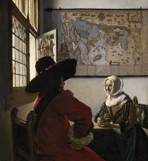
Artist: Johannes Vermeer (1632–1675)

Title: Officer and Laughing Girl

Genre: genre art

Date: circa 1657

Medium: oil on canvas

Dimensions: height: 50.5 cm (19.8 in); width: 46 cm (18.1 in)

Collection: The Frick Collection

What I love about this painting:

Vermeer paints a story for us. He shows us a courting couple, a modestly dressed young woman seated opposite a young officer. Is this the home of her parents?

It is clearly not a tavern, as she has a crystal wine glass, which taverns wouldn’t have. Another clue to her social status is the map on the wall behind her, indicating her family may be merchants. Taverns rarely displayed maps as they were expensive.

Our girl is dwarfed by the map and also by the large man, whose face we don’t see, as he is captivated by her. Yet though she is physically smaller than her companion, she is not made small in this painting. Indeed, she has a large presence; her personality and smile have power, speaking to us across the centuries.

The light falls gently though the open window, illuminating the woman, bathing the scene with that quality Vermeer recreated so brilliantly.

Some male art critics suggest that the position of her hand indicates a less savory transaction is occurring here, but I feel they are wrong. Her hair is completely covered. She is not dressed provocatively, nor are they shown in a tavern or brothel. Her hand is shown as if gesturing in conversation, a natural gesture.

I think that nasty kind of interpretation is the result of a Victorian-era male art critic prejudice against women in art, dismissing them as morally corrupt. That sort of attitude poisons art interpretation at all levels. Maybe traditional critics need to look at paintings such as this with a fresh eye and see what is actually there: a young woman talking to a young man, seated in a corner at a table, most likely in full view of her middleclass parents.

Vermeer paints us a story of courtship within the bounds of society, of two people with middleclass values who are clearly attracted to each other. Will they be married? I like to think so.

The model for the woman in this painting was most likely Vermeer’s wife, and the dress she wears appears in other domestic scenes painted by Vermeer, as does the window and the table.

About Johannes Vermeer, the Master of Light (from Wikipedia)

Johannes Vermeer (October 1632 – December 1675) was a Dutch painter who specialized in domestic interior scenes of middle-class life. He was a moderately successful provincial genre painter in his lifetime but evidently was not wealthy, leaving his wife and children in debt at his death, perhaps because he produced relatively few paintings.

Vermeer worked slowly and with great care, and frequently used very expensive pigments. He is particularly renowned for his masterly treatment and use of light in his work.

Vermeer painted mostly domestic interior scenes. “Almost all his paintings are apparently set in two smallish rooms in his house in Delft; they show the same furniture and decorations in various arrangements and they often portray the same people, mostly women.”

He was recognized during his lifetime in Delft and The Hague, but his modest celebrity gave way to obscurity after his death. He was barely mentioned in Arnold Houbraken‘s major source book on 17th-century Dutch painting (Grand Theatre of Dutch Painters and Women Artists), and was thus omitted from subsequent surveys of Dutch art for nearly two centuries. In the 19th century, Vermeer was rediscovered by Gustav Friedrich Waagen and Théophile Thoré-Bürger, who published an essay attributing 66 pictures to him, although only 34 paintings are universally attributed to him today. Since that time, Vermeer’s reputation has grown, and he is now acknowledged as one of the greatest painters of the Dutch Golden Age. [1]


Credits and Attributions:

Wikimedia Commons contributors, “File:Johannes Vermeer – De Soldaat en het Lachende Meisje – Google Art Project.jpg,” Wikimedia Commons, the free media repository, https://commons.wikimedia.org/w/index.php?title=File:Johannes_Vermeer_-_De_Soldaat_en_het_Lachende_Meisje_-_Google_Art_Project.jpg&oldid=617576363 (accessed April 29, 2022).

[1] Wikipedia contributors, “Johannes Vermeer,” Wikipedia, The Free Encyclopedia, https://en.wikipedia.org/w/index.php?title=Johannes_Vermeer&oldid=1082091616 (accessed April 29, 2022).

Comments Off on #FineArtFriday: Officer and Laughing Girl by Johannes Vermeer circa 1657

Filed under #FineArtFriday

How the Written Universe Works part 6 – modifiers, descriptors, and quantifiers #amwriting

The written universe can seem like a cold, unfriendly place to new writers. At first, it is difficult to find other writers, and we wonder if we are alone in the universe. When we finally are able to see across the void, we discover writing groups in our local area.

How the written universe works 6We are not alone. We are part of a vast cosmos of authors much like us, some far more advanced and others less so.

At times, we wonder if our star will ever shine as brightly as theirs.

We attend groups and submit our best work. In the beginning, we feel bombarded with reprimands, x-rays highlighting our beloved narrative’s flaws.

  • Show it, don’t tell it.
  • Simplify, simplify.
  • Don’t write so many long sentences.
  • Don’t be vague—get to the point.
  • Don’t use “ten-dollar words.”
  • Cut the modifiers—they muck up your narrative.

These comments are painful but necessary. This knowledge enables us to produce work our readers will find enjoyable.

However, all rules can be taken to an extreme. I’ve said this before, but it bears repeating. The most important rules are:

  • Trust yourself,
  • Trust your reader.
  • Be consistent.
  • Write what you want to read.

We must understand how to balance mechanics and grammar and other obvious rules and still write with our own voice and style.

Participating in a critique group requires delicacy and dedication. It also involves restraint and the ability to allow other authors to write their own work. A group shouldn’t micromanage a manuscript, as too much input and direction can remove the author’s unique voice from a piece.

One of the admonitions we regularly hear refers to the number of modifiers (adjectives and adverbs) we might habitually use. As writers, we all want to be accepted and have others like our work, but we must write from the heart. That means using modifiers, descriptors, or quantifiers when they are needed.

Chuck Wendig, in his post The Danger of Writing Advice from Industry Professionals, says,

And so the advice really should be, don’t use adverbs or adjectives when they sound awkward, or when they fail to tell us something that we need to know. [1]

When we read, we see that certain words and phrases don’t add to the narrative and only serve to increase wordiness. These words hamper our ability to suspend our disbelief when used too freely.

These words fall out of my fingers and into my keyboard randomly and out of my voluntary control. During NaNoWriMo, I don’t self-edit as I go because, at that point, I’m just trying to get the story down. The second and third drafts are where I shape my grammar and phrasing.

modifying-conjunctions-04262022Modifiers change, clarify, qualify, or limit a particular word in a sentence to add emphasis, explanation, or detail. We also use them as conjunctions to connect thoughts: “otherwise,” “then,” “besides.”

Descriptors: Adverbs and adjectives, known as descriptors, are helper nouns or verbs, words that help describe other words. However, they can be reviled by writing groups armed with a little dangerous knowledge.

Many descriptors are easy to spot as they often end with the letters “ly.” When I begin revising a first draft, I do a global search for the letters “ly,” and a list will pop up in my left margin. My manuscript will become a mass of yellow highlighted words.

It’s a daunting task, but I look at each instance and see how they fit into that context. If a word or phrase weakens the narrative, I change or remove it.

Quantifiers: abstract nouns (or noun phrases) meant to convey a vague number or impression, such as: very, a great deal of, a good deal of, a lot, many, much. The important word there is abstract, which shows a thought or idea that doesn’t have a physical or concrete existence.

Removing descriptors and quantifiers often strengthens the prose by eliminating the sense of vagueness. If they are necessary, I leave them. As Chuck Wendig said, words like “later,” or “everywhere,” or “never” or “alone” are also adverbs.

I don’t see myself reading a book written with no adverbs whatsoever.

Sometimes I feel married to a particular passage. Even so, certain words and phrases don’t add to the narrative and only serve to increase the wordiness. Used too freely, they make the story seem unreal, and that is something we don’t want. These are known as “weed words.”

Before I bother a professional editor with my work, I seek out the words I would flag as an editor, making what is called a “global search.”

Caution: if you are hasty or impatient, a global search can be dangerous. This is a boring, time-consuming task. Don’t take shortcuts. If you panic and choose to “Replace All,” you risk ruining your work.

The word “very” is a quantifier. It attracts abuse in writing groups and writers’ chat rooms and is considered a weed word.

Perhaps you decide to simply eliminate every instance of the word “very” because you have discovered you overuse it. You open the navigation pane and the advanced search dialog box. Next, you don’t key anything in the “Replace With” box, thinking this will eliminate the problem.

Before you click “replace all,” consider three common words that have the letters v-e-r-y in their makeup:

  • Every
  • Everyone
  • Everything

A hard truth about weed words is that they are often components of larger words.

Examine the context. Have you used the word “actually” in a conversation? You may want to keep it, as dialogue must sound natural, and people use that word when speaking.

However, if you have used “actually” to describe an object, it’s probably unnecessary.

Context is everything. Take the time to look at each example of the offending words and change them individually. You have already spent a year or more writing that novel. Why not take a few days to do the job right?

There is no quick way to do this. Every aspect of editing must be done with the human eye, patience, and attention to detail.

weak-words-LIRF04262022
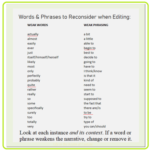
Feel free to copy the above image and save it to your files as a .png or .jpeg, and also the modifiers as connectors image, above right.

As I have mentioned before, editing programs are available, some free, and some for an annual fee. Your word processing program has spell check, which can help or hinder you. Grammarly is an editing program I use for checking my own work. Unfortunately, these programs are unable to see the context of the work they are analyzing.

We define context as the parts of a written or spoken statement that precede or follow a specific word or passage, usually influencing its meaning or effect. 

A person with limited knowledge of grammar and mechanics won’t benefit from relying on Grammarly or any other editing program for advice. This is because these programs operate by algorithms and finite rules.

The program will often strongly suggest you insert an unneeded article or change a word to one that is clearly not the right one for that situation. I recommend investing in the Chicago Guide to Grammar, Usage, and Punctuation. Look things up and learn how grammar works.

I don’t mind taking the time to visit each problem and resolve them one at a time. I see this as part of my job, just what an author does to make sure her work is finished to the best of her ability.

>>><<

PREVIOUS POSTS IN THIS SERIES:

How the Written universe works part 1: the connecting particle 

How the Written universe works part 2: the physics of conversation 

How the Written Universe Works part 3: Lay, Lie, Laid

How the Written Universe Works part 4: Relativity and Possessives 

How the Written Universe Works part 5: ellipsis, em dash, hyphen, semicolon 

Credits and Attributions:

[1] The Danger of Writing Advice from Industry Professionals, by Chuck Wendig, Terribleminds,  The Ramble, http://terribleminds.com/ramble/2017/12/12/the-danger-of-writing-advice-from-industry-professionals/  ©2017. Accessed 25 April 2022.

11 Comments

Filed under writing

How the Written Universe Works: ellipsis, em dash, hyphen, semicolon #amwriting

Much of my blog revolves around grammar and the mechanics of writing, the fundamental force that holds the written universe together. Grammar is gravity, and punctuation is the interdimensional traffic signal, ensuring our words don’t get jammed up and wreck the spacecraft that is our prose.

How the written universe works 1Authors need to understand the rules of how the language we write in works. When we are just starting out, we might have a grip on the basics, but we don’t understand how or when to use the rare punctuations.

So, what about these rare beasts? First up is the ellipsis, the mysterious symbol we all love.

I recommend against using too many ellipses because many authors use them incorrectly or inconsistently.

This is because ellipses are not punctuation and shouldn’t be used as such. They symbolize omitted words and are not punctuation. When the conversation trails off, you must add ending punctuation.

Apples…more apples, rotten, lying on the ground. But I have no apple tree, so where did they…?

Hyphens are not always necessary. If the meaning of a compound adjective is apparent when written as two separate words, a hyphen is not needed.

  • bus stop

If its meaning is understood when written as one word and common usage writes it as one word, again a hyphen is unnecessary.

  • afternoon
  • windshield

Some combinations of “self” must have a hyphen:

  • self-editing
  • self-promotion

Dashes are not hyphens and are used in several ways. One kind of dash we frequently use is the ‘en dash,’ which is the width of an ‘n.’ UK usage often employs the en dash in the place of the em dash.

En dashes join two numbers written numerically and not spelled, in US usage.

  • 1950 – 1951

To insert an en dash in a Word document: type a single hyphen between two words, with a space on either side. When you hit the space bar after the second word, the en dash will lengthen a little, making it slightly longer than a hyphen.

Em dashes are the width of an “m” and are the gateway to a terrible addiction. To make one, key a word, don’t hit the spacebar but do hit the hyphen key twice, then key another word and then hit the spacebar: (word+hyphen+hyphen+word+space) word—word.

Authors and editors become habituated to using em dashes without thinking. After a while, the author types a word, and the little finger hits that hyphen key twice whenever the mind pauses—then types another word and bam!—em dash. Too many em dashes—like salt—ruin the flavor of the prose.

It often works best to rephrase things a little and use a comma or a period. I try to only use em dashes for emphasis, and only rarely.

interrobangThis bring us to creative punctuation, such as the symbol “!?.” An exclamation point followed by a question mark, these mutant morsels of madness are called “interrobangs.”

Editors working in the publishing industry will tell you that the interrobang is not an accepted form of punctuation for anything but comic books, graphic novels, manga, and possibly, text messages to your BFF.

Think about it. Comic book authors are limited to the words they can fit onto a panel and still leave room for the art. They must show events and emotions by combining pictures with as few words as possible to tell the story.

Writers of comics frequently employ creative punctuation to express as much as possible with few words. Interrobangs are a shorthand for the reader. They convey the emotions of shock and surprise without words.

Interrobangs are inappropriate in any other genre. It’s your narrative, so you will do as you see fit. However, more than one punctuation mark at the end of a sentence is not accepted in the literature of any genre but comic books. Interrobangs are a writing habit the professional writer will avoid if they want to be taken seriously.

Semicolons memeThe semicolon. This joining punctuation is not complicated once you know the one rule about when to use semicolons:

  1. If you join two clauses with a semicolon, each clause must be a complete sentence, and they must relate to each other. In other words, they must be two short sentences expanding on ONE idea.

I drive a red Corvette, and we like it. Rover rides shotgun

I drive a red Corvette; we like it. Rover rides shotgun.

I drive a red Corvette and we like it, but Rover rides shotgun.

We don’t separate all three clauses with a comma in the first two examples because that creates a comma splice. The first sentence is one whole idea: they drive a red car that they like. The second sentence is an entirely different thought: the dog likes to sit in the passenger seat.

The comma splice is a dead giveaway that the author isn’t well versed in grammar. Microsoft’s editor app sometimes tells us to use a comma to join two independent clauses when they don’t relate to each other. Microsoft is wrong.

In my opinion, the third example is the best. Conjunctions and a comma join the three independent clauses, and they flow smoothly.

Colons are rarely used in narrative prose but are common in how-to guides. Their purpose is to lead off lists of items or tips.

So, how do we separate independent clauses, words that can stand on their own as a sentence, with proper punctuation instead of ellipses or hyphens? We use coordinating conjunctions.

A comma should be used before these conjunctions: and, but, for, nor, yet, or, and so to separate two independent clauses. They are called coordinating conjunctions because they join two elements of equal importance.

However, we don’t always automatically use a comma before the word “and.” This is where it gets confusing.

comma or apostropheCompound sentences combine two separate ideas (clauses) into one compact package. A comma should be placed before a conjunction only if it is at the beginning of an independent clause. So, use the comma before the conjunction (and, but, or) if the clauses are standalone sentences. If one of them is not a standalone sentence, it is a dependent clause, and you do not add the comma.

Take these two sentences: She is a great basketball player. She prefers swimming.

  1. If we combine them this way, we add a comma: She is a great basketball player, but she prefers swimming.
  2. If we combine them this way, we don’t: She is a great basketball player but prefers swimming.

The omission of one pronoun makes the difference. In my opinion, it’s a better sentence.

Readers expect words to flow a certain way, but no author gets it right all the time. If you choose to break a grammatical rule, be consistent about it. Authors must know the rules to break them with style.

Most readers are not editors. They will either love or hate your work based on your voice, but they won’t know why. Voice is how you break the rules, but you must understand what you are doing. You must do it deliberately and do it consistently. Readers do notice inconsistencies.

Craft your work to make it say what you mean, in the way you want it said. Sometimes you will use commas in places where they ordinarily aren’t used. You will do this to make things clear. Conversely, you will omit them for the same reason.

If the editor you hired asks you to change something you did deliberately, you are the author.

Raymond chandler quote split infinitivesExplain why you want that particular grammatical no-no to stand, and your editor will most likely understand. If you know the rule you are breaking, you will be better able to explain why you are doing so.

Most good editors will do as you ask, but you must be prepared to break that rule consistently.

Much of what we consider powerful writing violates a number of grammar rules, but the author broke that rule in every sentence. Once the reader gets the feel for the author’s style, they don’t notice it.

I always think we are better for having read their work.


Previous posts in this series:

How the Written universe works part 1: the connecting particle 

How the Written universe works part 2: the physics of conversation 

How the Written Universe Works part 3: Lay, Lie, Laid

How the Written Universe Works part 4: Relativity and Possessives #amwriting

12 Comments

Filed under writing

#FineArtFriday: Christ in the Storm on the Sea of Galilee by Rembrandt van Rijn, 1633, reprise

Today’s image is of a picture that was stolen March 18, 1990, in one of the largest art heists in history. It has never been recovered. If it could be recovered from wherever it is, it would be a day of rejoicing for me and art lovers around the world. I suspect it is now in a private collection, somewhere. Perhaps it is being passed off as a copy, or perhaps it is in a hidden room full of stolen art.

It is a terrible thing when art is looted and stolen from its rightful owners. When art is stolen from a musem, it is stolen from the world. I wish the stings of a thousand fleas on the people who paid to acquire the paintings stolen that night.

Christ in the Storm on the Sea of Galilee was painted during one of the happiest years of Rembrandt van Rijn’s turbulent life and depicts the miracle of Jesus calming the storm on the Sea of Galilee. A devout Christian, Rembrandt painted it from the description of the event as reported by the Apostle Mark, in the fourth chapter of his Gospel. As far as is known, it is the only seascape Rembrandt ever painted.

Constantijn Huygens, the father of Dutch mathematician and physicist Christiaan Huygens, had seen Rembrandt’s talent and helped him gain important commissions from the Court of The Hague. Many of his best religious paintings date from the years during which he had the favor of both Huygens and Prince Frederick Hendrick.

At the end of 1631, Rembrandt had moved to Amsterdam. The city was becoming the new business capital of the Netherlands, so there was great opportunity there for artists. In Amsterdam, Rembrandt had begun to paint portraits for the first time, and by 1633, his work was in high demand. His religious paintings and history paintings were also receiving the highest praise.

At first, he lived with an art dealer, Hendrick van Uylenburgh, which was where he met Hendrick’s cousin, Saskia van Uylenburgh. During 1633, the year in which Christ on the Sea of Galilee was painted, he was courting Saskia, hoping to marry her. He was earning a good income as a portraitist, and a bright future loomed. He must have felt in many ways as if he had the world by the tail.

What I love about this painting:

Rembrandt’s colors are vivid, standing out against the darkness of the storm. An entire story is captured in this image. The sea is terrifying, monstrous waves battering the ship, men panicking, trying to gain control. The terror of the event is clearly shown, and you feel fear for the men too. In the midst of chaos, Jesus awakes, calm despite the panic around him. Each face has a different expression, and one, a man holding a rope in one hand and pressing his cap to his head with the other, looks directly at us—Rembrandt himself.

The Gospel of Mark records the incident:

He woke up and rebuked the wind, and said to the sea, “Peace! Be still!” Then the wind ceased, and there was a dead calm. He said to them, “Why are you afraid? Have you still no faith?” And they were filled with great awe and said to one another, “Who then is this, that even the wind and the sea obey him?

Rembrandt, a frail man but a devout believer, lived the story as he painted it, as do all good storytellers.

About the theft, via Wikipedia:

On March 18, 1990, 13 works of art valued at a combined total of $500 million were stolen from the Isabella Stewart Gardner Museum in Boston. In the early hours, guards admitted two men posing as police officers responding to a disturbance call. Once inside, the thieves tied up the guards and over the next hour committed the largest-value recorded theft of private property in history. Despite efforts by the Federal Bureau of Investigation (FBI) and multiple probes around the world, no arrests have been made, and no works have been recovered.

The stolen works had originally been purchased by art collector Isabella Stewart Gardner (1840–1924) and intended to be left on permanent display at the museum with the rest of her collection. Since the collection and its layout are permanent, empty frames remain hanging both in homage to the missing works and as placeholders for their potential return. Experts are puzzled by the choice of paintings that were stolen, especially since more valuable artwork was left untouched. Among the stolen works was The Concert, one of only 34 known works by Vermeer and thought to be the most valuable unrecovered painting, valued at over $200 million.[when?] Also missing is The Storm on the Sea of GalileeRembrandt‘s only known seascape. Other works by Rembrandt, DegasManet, and Flinck were also stolen.

Christ in the Storm on the Sea of Galilee by Rembrandt van Rijn

  • Artist:   Rembrandt  (1606–1669)
  • Genre: religious art
  • Date: 1633
  • Medium: oil on canvas
  • Dimensions: Height: 160 cm (62.9 ″); Width: 128 cm (50.3 ″)
  • Current Location: Unknown

Sources and Attributions:

Wikimedia Commons contributors, “File:Rembrandt Christ in the Storm on the Lake of Galilee.jpg,” Wikimedia Commons, the free media repository, https://commons.wikimedia.org/w/index.php?title=File:Rembrandt_Christ_in_the_Storm_on_the_Lake_of_Galilee.jpg&oldid=341966464 (accessed April 4, 2019).

Wikipedia contributors, “Calming the storm,” Wikipedia, The Free Encyclopedia, https://en.wikipedia.org/w/index.php?title=Calming_the_storm&oldid=882782126 (accessed April 4, 2019).

The Isobel Stewart Gardner Museum, CHRIST IN THE STORM ON THE SEA OF GALILEE, 1633, https://www.gardnermuseum.org/experience/collection/10953 (accessed April 4, 2019).

2 Comments

Filed under #FineArtFriday

When Good Novels go Bad #amreading

On Monday, I reviewed a lovely memoir by Judy Kiehart, a book I heartily enjoyed. Today I want to talk about a book by one of my favorite authors, who shall remain nameless. I don’t love every book that comes my way, but I don’t do negative reviews.

magicHowever, we can learn a great deal from books embodying poorly executed plots and badly scripted dialogue.

The book in question is the third installment in what may become a five-part subseries set in the early days of his 22-book universe. I have been a fan of this author’s work since the opening pages of book 1 in this epic series.

I immensely enjoy the way he explores the concept of good vs. evil and gives the side that began in the first five books as antagonists a role that makes them heroes. His protagonists are usually likable, easily relatable people. I care about their happiness and want them to succeed.

In his universe, neither side is good. Both sides manipulate events to make their case, and both are convinced of the purity of their motives. This author has devised a magic system where some people are born with the ability to manipulate certain kinds of subatomic particles.

scienceThe first books of the series establish a science of magic. One can either use chaotic magic or ordered magic. Although some mages can only use one side or the other, the most powerful mages can manipulate both sides of the magic. The entire series explores this concept well. It is a well-planned magic system, with good rules.

These books are military fantasies. Politics and the abuse of power are frequent themes in his novels, as are the age-old conflict between men and women. The overall lesson of the entire series is that absolute power corrupts absolutely. Absolute order is death, and so is absolute chaos. Still, both are necessary for life, so maintaining the balance of order and chaos is crucial.

One of the crucial points of the 22-book series is that every great and powerful civilization begins with the purest of motives—to create a better place for humanity. Throughout the 22-book series, greed and an unquenchable lust for power eventually prove the ruin of the greatest empires.

So, let’s discuss what disappoints me about the subseries that begins with book 19. The protagonist is a naïve, untried young mage forced from his home. His uncle is a powerful chaos mage and raises him to use chaos, but our protagonist is bad at it. After the local ruler murders his uncle, our main character is forced into hiding and discovers he is an order mage.

This subseries deals with the origins of a city of mages, who in generations to come, will ultimately base their power on chaos magic. The twist the author explores in these books is that the city is founded by an order mage as a haven for all mages. It is a fact that future generations will choose to forget.

The prior subseries, books 17 and 18, was brilliant, two of my favorites. However, book 19 begins a decline in quality. The idea for the plot was strong in 19. However, the story arc weakened in 20 and was stretched too thin in 21.

DangerStructurally, the books in this subseries feel like he knew how to end it but struggled to fill in the arc. Past events and conversations get repeated verbatim to every new character. Long passages of remembering and agonizing over what is done and dusted fluffs up the narrative.

This is an author who has always championed both racial and gender equality. While he writes straight protagonists, he includes LGBTQ characters. Most of the time, he gets it right. But in book 19, he lost the way when it came to his female characters. We are supposed to think the women are strong and admire them, but they are two-dimensional, arrogant, and always have the last word.

I disliked the women intensely and felt that if a good editor had seen the work before it was published, the snidely superior way their dialogue reads could have been toned down. As it is now, they all come off as bitches.

And that is only the visible part of the iceberg that is sinking this subseries.

Unlikeable side characters don’t derail a book. However, the pacing stutters along, and that will ruin any novel.

The plots of the three books 19, 20, and 21 form one complete arc that would total around 300,000 words. However, the filler events feel forced, like the author would have set this project aside at several points but was contracted to churn out three books whether he was inspired to write or not.

The arc completely flattens in book 21. It feels like the author had the inspiration for one good book of a decent length but was required to peck out enough words to cut the manuscript into three novel-length sections.

ok to write garbage quote c j cherryhTo me, book 21 reads as if (while books 19 and 20 were in the publishing gauntlet) he still had to fluff up the ending to make book 21 long enough to be considered a novel. The evidence of a lack of genuine inspiration is the absurd “scar” the protagonist is left with after winning an unbelievable victory and nearly dying.

My disbelief refused to be suspended.

In the early days of this series, the author managed to put out one book a year, and they were well-structured. Line editing and proofreading in this author’s books have never been a strong point. I have always felt like he was the only one who saw his work before publication but was able to ignore the flaws.

This subseries is different. I suspect once he had plowed to the end of his first draft, my favorite author checked the manuscript for typos using Word’s ReadAloud function and ProWriting Aid or Grammarly and handed it in at the last minute.

Then, the Big Traditional Publisher published it as is, assuming the manuscript was clear of obvious flaws and gave it scant editorial input. They knew they could sell the series just on the author’s name.

That kind of arrogance irks me and does the author no favors. This could have been a brilliant subseries. The concept of an origin story allows for so much opportunity—and because of Big Traditional Publisher’s churn-and-burn policy, it just fell flat.

The Flaws:

  • Two-dimensional characters
  • Repetitive dialogue
  • Thin plot
  • Absurd events are inserted to justify previous actions and keep things moving
  • Did I mention the repetitive dialogue?

The Positives:

  • Great worldbuilding overall
  • A wonderful exploration of power and the lengths people will go to acquire it
  • A believable magic system.
  • Good exploration of the layers of society
  • Good historical explanation of future societal tensions

I wanted to love those three books. I really enjoyed books 17 and 18 and had hopes for a good, satisfying read. What I got instead was a hard lesson in the truth about writing:

f scott fitzgerald quoteEveryone, even your favorite author, writes a stinker now and then.

I’m ¼ of the way into book 22 in this series, which is a follow-up. It takes place fifteen years later, with the daughter of a side character as the protagonist. So far, she is more believable than the women in the prior three novels, and most of the dialogue is less annoying.

My inner editor is behaving herself, and it feels like we may enjoy this book.

7 Comments

Filed under writing

#BookReview: Calico Lane by Judy Kiehart #amreading

Writers are readers. We were readers long before we became writers, and reading is a habit we can’t break. It is a habit that broadens minds and introduces us to new worlds.

magicOr, in some cases, as in the book I am focusing on today, it takes us back to the world we thought we left behind.

I read in every genre. Memoirs were high on my mother’s reading list, so I borrowed them off her shelf and read them too. The way people think and view their life experiences fascinates me. I enjoy the contrast of the turning points in their lives, juxtaposing them with what I see as the rather mundane moments of mine.

So now, let’s get down to the book, Calico Lane.

But first, the Blurb:

Calico Lane by Judy KiehartHow do we survive when who we are is not the person our family expects us to be?

Judy Kiehart’s Calico Lane deals with universal themes of family, acceptance, faith, and love; it is a memoir of confusion and muddled thoughts that slowly untangle as a sturdy heritage endures.

In a small Pennsylvania town, a neighborhood called The Lane is surrounded by dense woods, creeks, and rutted mining tracks. Not even the rumored child-eating spiders inside an old structure scare Judy. What frightens the ten-year-old is that someone may discover her secret.
Set in a time before sexual identity became a household phrase, Judy develops confusing emotions for an older girl, and, year after year, girl after girl, the feelings continue. Judy’s friends want to kiss the boys. No one talks about girls kissing girls. Over time she fears her emotions are not typical, and if continued, will bring shame to her family and the town’s Russian Orthodox Church. But harboring a secret is paralyzing.

Armed with an affable sense of humor and her mother’s housekeeping principle, “everything in its place and a place for everything,” Judy begins a life of pretense; after all, the best way to survive being different is to hide the truth, isn’t it?

My Review:

Calico Lane is a gentle journey into the troubles and confusions of knowing you are different from your friends in a truly fundamental way. Judy’s struggle to maintain the strong family ties that sustained her early childhood and still negotiate the troubled seas of her teenage years is endearing.

The world she paints for us is both comforting and terrifying in many ways, familiar to anyone who grew up in a strict religious/cultural tradition.

We all can relate to the fear of losing your parents’ love over something you can’t change. I was born just after Judy Kiehart, and while we were raised in widely different parts of the US, many of our experiences, both in school and out of it, were similar. We both grew up in families with strong religious and cultural traditions, beneath the intense spotlight of the post-WWII focus on visible morality.

We of the lower middle class were happy, prosperous, and above all, we always looked morally good no matter what really happened behind closed doors. We faithfully attended church in our respective denominations every week and participated in all the activities that went along with it.

Family secrets were kept from the children. We were raised with the firm belief that heterosexuality was the only sexuality—you were a woman or a man and, of course, heterosexual.

If you were different, you kept that secret, or you could be jailed, brutally beaten, or even killed. You, or even your family, could lose their jobs. There was no blurring of the lines, no gender identity other than male or female, and who you were allowed to love was defined by strict laws that didn’t allow for any other way of life.

My best friend in school was gay, a secret I kept for him until he came out after the Stonewall riots. This is why I found Judy Kiehart’s memoir of growing up knowing she was attracted to girls and not boys so interesting. It brought me closer to an understanding of my friend’s struggle.

I grew up in a Lutheran family, so many of my family’s traditions differed from Judy’s Russian Orthodox background. But the outward, visible values of middle-class America that she grew up with were the same as mine.

The book flows as if she is sitting with you, sharing her story over a cup of coffee. I highly recommend this memoir to anyone who loves a good story about good people.

>>><<<

About Judy Kiehart:

Judy Kiehart head shotJudy’s writing achievements include two one-act plays that paced among the top three winners in national competitions and were staged in Colorado in 2005 and 2015. She was commissioned to write a ninety-minute program for Stage Left Theater in Salida for the 2010 winter holiday season. She describes herself as a glass-half-full, gay Christian and enjoys traveling—whether exploring faraway places or nearby towns. Judy and her wife managed a real estate appraisal business for eighteen years in the Rocky Mountains of Colorado and following retirement, relocated to Olympia.

An excerpt from Calico Lane was a semifinalist in the 2021 Tucson Festival of Books Literary Competition.

You can find her at:

www.judykiehart.com

www.facebook.com/judy.kiehart

https://www.goodreads.com/author/show/22166296.Judy_Kiehart

Purchase Calico Lane at:

https://Amazon.com/dp/0578340836

or at Browsers in downtown Olympia

7 Comments

Filed under Book Reviews, writing

#FineArtFriday: Shrovetide Revelers by Frans Hals ca. 1616

Frans_Hals,_Merrymakers_at_Shrovetide,_The_Metropolitan_Museum_of_Art
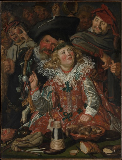
Artist: Frans Hals  (1582/1583–1666)

Title: Shrovetide Revelers

Genre: genre painting

Date: circa 1616–17

Medium: oil on canvas

Dimensions: 51 ¾ × 39 ¼ in. (131.4 × 99.7 cm)

Collection: Metropolitan Museum of Art

What I think about this painting:

This was a lurid scene at the time it was painted and is still lurid today. The sole female portrayed is a girl dressed in the finest of garments, surrounded by men. She is well-fed, has abundant blonde hair, and represents the concept of “plenty.” The party will go on for as long as she lasts–when she is gone, the party is over.

The color of her hair is gold, an allegory for an abundance of coins. The men posed around her represent the human tendency toward gluttony, drunkenness, and greed.

Frans Hals depicted the embroideries on the fabric of her dress and the intricate lace at her neck and cuffs with exquisite care and attention to detail. The sheen of her satin sleeves gleams in the candlelight, showing off the strings of beads at her neck and wrist. Perhaps the beads are carnelians. Her brightly flushed cheeks give evidence to her inebriation.

All the characters, including the serving man, are shown as having overindulged. The foods on the table are those any person could acquire, but they are shown being wasted, used as decorations for fools.

Food was an incredibly popular subject for paintings during the renaissance–still lifes were exceedingly good sellers for most artists. Food of all varieties was carefully staged and shown with superb realism and minute detail. Those artists we now call the Dutch and Flemish masters used food as an allegory, and even in genre paintings, they loved to paint lavish food displays.

As in the scene above, the foods depicted in scenes of drunkenness and revelry conveyed symbolic meanings, often implying immorality and debauchery.

Mostly, the imagery was intended to be a reminder that great wealth can vanish overnight. Also, they show us that gluttony is both unappealing to look at and unhealthy for the glutton.

But when I see an image such as this painting, I have to think these artists, whose own morals were often quite elastic, were exercising their broad senses of humor.

About this painting, via The Met Museum:

Shrovetide, now better known as Mardi Gras, is the traditional period of indulgence before the fasting and self-discipline of Lent. In the seventeenth-century Netherlands, it was also the occasion for theatrical performances by the painters’ guilds.

Here, Hals depicts two stock figures from these plays, Hans Wurst, with a sausage dangling from his cap, and Pekelharing, who sports a garland of salted fish and eggs.

They flank a richly dressed girl (probably a boy in drag, as women were not permitted to perform on these occasions).

Still life elements litter the foreground, evoking both the traditional foods of the festival and an abundance of erotic innuendo. [1]

About this painting, via Wikipedia:

Shrovetide Revellers, also known as Merrymakers at Shrovetide, is a painting by the Dutch Golden Age painter Frans Hals, painted in around 1616–17. It is one of the earliest surviving works by Hals, and has been held by the Metropolitan Museum of Art, New York City since 1913. The painting shows people festivities at Shrovetide (DutchCarnaval), an annual carnival of food and jollity which takes place before the Christian fasting season of Lent.

The painting shows the face of an elegantly dressed smiling woman raising her right finger to make a point, while a man grabs her shoulder to whisper in her ear: he has a string of herring, eggs and mussels around his neck, with a pig’s trotter and a fox tail, symbols of gluttony and foolishness respectively. Another amused gentleman, with a wurst hanging from his cap, leans on the first man’s shoulder and listens to their banter. Some claim these are the Baroque theatre characters Peeckelhaeringh and Hans Wurst. Behind them other people are talking and laughing. The flagon Bears the initials “fh”. [2]


Credits and Attributions:

[1] Shrovetide Revellers or Merrymakers at Shrovetide by Frans Hals, Met Museum Contibutors © 2000–2022 The Metropolitan Museum of Art. Frans Hals | Merrymakers at Shrovetide | The Metropolitan Museum of Art (metmuseum.org) (Accessed April 14, 2022).

[2] Wikipedia contributors, “Shrovetide Revellers,” Wikipedia, The Free Encyclopedia, https://en.wikipedia.org/w/index.php?title=Shrovetide_Revellers&oldid=1070869013 (accessed April 14, 2022).

4 Comments

Filed under #FineArtFriday, writing

How the Written Universe Works part 4: Relativity and Possessives #amwriting

The theory of General Relativity is the geometric theory of gravitation published by Albert Einstein in 1916. According to the internet, it is the current description of gravitation in modern physics.

who whose whomIt deals with things like the mass of objects, the speed at which they travel, how speed and mass are converted to energy, and how mass warps the fabric of space and time.

In layman’s terms, “Gravity works well in some places and especially well in others.” It works especially well in my kitchen, which is why we don’t have matching cups.

But I digress.

Today we are here to discuss relativity in regard to pronouns. In the English language, the following are the most common relative pronouns: which, that, whose, whoever, whomever, who, and whom.

They are also known as possessives and genitives. We use these words every day in casual conversation, so on the surface, they seem simple. But when we write, relative pronouns can be complicated.

Most people know that an apostrophe denotes possession (and I’m not talking demonic here) or indicates a contraction.

Things to remember:

  1. Who’s is the contraction of “who is” or, less commonly, “who has.”
  2. Whose is the possessive of “who” or (controversially and only rarely) “which.”
  3. Their(s) is the possessive of “they.” (They’re proud to own it, it’s theirs, and it’s not there.)
  4. Its is the possessive of “it,” and “it’s” is a contraction of it is. Note that there is no apostrophe in the possessive form for both they and it. We will get to that later.

[1] Grammar-Monster says:

“Possessive adjectives and possessive personal pronouns are forms of the genitive case.” Examples:

  • our carpet (our – a genitive form of we)

  • Can I use yours? (yours – a genitive form of you) [1]

Who, whose, whom?

When referring to living beingswhose denotes possession and who’s is a contraction that refers to existence: who is.

[2] What about whom? Merriam-Webster says: Who performs the action of a verb (e.g. “Who sent us this gift?”), while whom receives the action (“We got this gift from whom?”). In grammar terms, that makes who a subject, and whom an object. When following a preposition, whom is the preferred choice (“To whom should we address our thank you note?”). [2]

Merriam-Webster also says the times are changing, and no one really cares except grammar nerds.

So now we have some idea of “whose” vs. “who’s” and “who” vs. “whom.”

aprostophes its theyBut what about “It?” Here, we are dealing with possession by the inanimate. We don’t need an exorcist, although a good maid service would resolve a great deal here at Casa del Jasperson. But in this case, we are referencing something owned by the inanimate:

I scratched myself on its surface.

Its … it’s … which is what and when to use it? The trouble is found in the apostrophe.

In probably 99% of English words, an apostrophe indicates possession, but it also signifies a contraction.

Both it and they are frequently part of contracted words (it is = it’s, they are = they’re). So, two hundred years ago, linguists chose to eliminate the apostrophe in the possessive form in the (vain) hope of ending confusion.

  1. It’s is the contraction of “it is”and sometimes “it has.”
  2. Its denotes possession: It owns it.

[3] According to Dictionary.com:

  • Way back when in English, we used his for the possessive form of it. (That wasn’t perplexing at all.)

  • The use of its for the possessive form of it takes off in the 1500s.

  • After, we did commonly write it’s to show possession for it, but that became nonstandard in the 1800s, probably due to the influence of pronouns like yourshers, etc. [3]

I love how our ancestors assumed inanimate objects were male. I took a hammer to the wall and dented his surface. The males I’m acquainted with resent being compared to inanimate objects, so we never refer to Uncle Jim as a bump on a log, to his face.

That and which are two commonly misused words. Most times, we don’t need the word that, but before you eliminate every instance, please look at each case where it is used.

Don’t gut your prose just because some online guru tells you ‘that’ is an unnecessary pronoun. Sometimes, “that” is the only word for a given situation. If you remove every instance of the word “that” you’ll end up with a mess on your hands.

Something you need to know: “that” and “which” are not interchangeable so you can’t just use a global search to change every instance of “that” to “which.”

“That” is a pronoun used to identify a specific person or thing observed by the speaker. It is a determiner, an adverb, and a conjunction.

  1. “That’s his dog on the curb.” (Identifier)
  2. “Look at that red car.” (Determiner)
  3. “I wouldn’t go that far.” (Adverb)
  4. “She claimed that she was married.” (Conjunction)

Epic Fails meme2In the case of number 4, the sentence would be stronger without it. Most of the time, the prose is made stronger when the word “that” is cut and not replaced with anything. I say most, but not all the time.

There are cases where only “that” will suffice. When do we use the word “that?” We use it when we have something called a ‘Restrictive Clause,’ the part of a sentence that you can’t get rid of because it specifically restricts some other part of the sentence. We watched the stars that gleamed red and ignored those that shone white. They watched specific stars and ignored others. Sometimes you can’t get rid of that, because the phrasing would be too awkward without it.

“Which” is a pronoun asking for information. It specifies one or more people (or things) from a particular set, and it is also a determiner:

  1. “Which are the best diapers for newborns?” (Pronoun)
  2. “I’m looking at a house which is for sale on Black Lake.” (Determiner)

Go lightly with “which” and “that,” but use them when required.

The same common-sense approach goes for “very.” I seldom need to use it, but I do when required. However, some people employ it too frequently, and it’s rarely needed, fluffing up the word count.

Use common sense. Don’t run amok in your manuscript and cut every relative pronoun.

Examine each instance and try to see why the members of your writing group are pointing it out. Cut it or leave it in based on whether the phrasing would be awkward without it.

words with wayward apostrophes

How the written universe works part 1: the connecting particle 

How the written universe works part 2: the physics of conversation 

How the Written Universe Works part 3: Lay, Lie, Laid


Credits and Attributions:

[1] GrammarMonster.com, What Is the Genitive Case? http://www.grammar-monster.com/glossary/genitive_case.htm, accessed April 12, 2022.

[2] How to Use ‘Who’ vs. ‘Whom © 2022 Merriam-Webster, Incorporated How to Use Who vs. Whom | Merriam-Webster, accessed April 12, 2022.

[3] Dictionary.com, What is the difference between its and it’s? What Is The Difference Between “It’s” And “Its”? (dictionary.com), accessed April 12, 2022.

6 Comments

Filed under writing

How the Written Universe Works part 3: Lay, Lie, Laid #amwriting

Every now and then, the most paradoxical mystery in the written universe rears its head—the question, “Is it lay, lie, or what?” Today we will revisit one of the more misused verbs in the English language: the many tenses and uses of the verb ‘lay.’

How the written universe works 3In the written narrative, the many forms of this verb are what antimatter is to ordinary matter. When used improperly, things unravel. The problem is, we routinely use the words lay and lie and all their forms incorrectly as a matter of habit in our daily speech.

We are accustomed to hearing the wrong use of verb forms in conversation. However, we notice incorrect usage when reading. This paradox causes confusion for our readers when we misuse the verb “lay” and all its tenses in a narrative.

Don’t feel alone in this. Even editors struggle with the words lay, lie, and laid and regularly refer to grammar guides to remind themselves of the correct usage.

I often have to stop in my own work and make sure I am using it correctly.

Do I mean to lay down or lie down?

It boils down to a simple concept: is the object of the verb RECLINING, or was it PLACED THERE?

transitive verb“Lay” is a transitive verb that refers to putting something in a horizontal position. At the same time, “lie” is an intransitive verb that refers to being in a flat position.

“Lay” is a verb meaning to put or place something somewhere. It has a direct object. Its principal parts are “lay,” “laid,” “laid,” and “laying.”

The words refer to the action: If you place it (object) there, it is laying there. Lay it there. Lay it on the pillow.

If it is resting or reclining, it is lying there.

  • Lie down.
  • Lying down.
  • Lie down, Sally. (Clapton had it wrong? Say it isn’t so!)

The internet is your friend. The following is a quote from the website, Get it Write: 

[1] The verbs to lie and to lay have very different meanings. Simply put, to lie means “to rest,” “to assume or be situated in a horizontal position,” and to lay means “to put or place.” (Of course, a second verb to lie, means “to deceive,” “to pass off false information as if it were the truth,” but here we are focusing on the meaning of to lie that gives writers the most grief.)

Languages change, and we are certainly moving toward a time when style and grammar books no longer distinguish between lay and lie, but we aren’t there yet.

intransitive verbTo lie is an intransitive verb: it shows action, and the subject of the sentence engages in that action, but nothing is being acted upon (the verb has no direct object).

Put another way, the verb to lie does not express the kind of action that can be done to anything. Remember that it means “to recline” or “to rest.”

It is conjugated this way:

  • lie here every day. (Everyone lies here. They lie here.)
  • am lying here right now.
  • lay here yesterday.
  • will lie here tomorrow.
  • have lain here every day for years. [1]

Lay, Lie, Laid chart

This is where things get tense: present, past, and future.

A ring lay on the pillow. 

  • Present tense: I lay an object on the pillow.
  • Future tense: I will lay an object on the pillow.
  • Past tense: I laid an object on the pillow.

But I needed to rest. In this context, lie is a verb meaning to recline. It requires no direct object, and its principal parts are lie, lay, lain, and lying.

  • I’m going to lie in bed for another hour.
  • I feel safe lying in my bed.
  • I had lain in bed long enough, so I got up.

So, what this all boils down to is:

matter antimatter LIRF04102022 
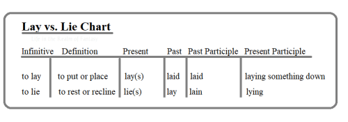
The verb that means “to recline” is “to lie,” not “to lay.” If we are talking about the act of reclining, we use “lie,” not “lay.” “When I have a headache, I lie down.”

The verb laid must have a direct object. Something is put or placed: “I laid my papers on your desk after the meeting.” In our modern dialect, the verb laid is used far less often than put, set, or placed, so it has become confusing.

But just to confuse things a lot more:

A living body lies down and rests.

A dead body is cleaned up and laid out by other people if the said corpse is important to them. However, after being laid out, the corpse is lying in state to allow mourners to pay their respects.

 >>><<<

Previous posts in the series, How the Written Universe Works:

How the written universe works part 1: the connecting particle 

How the written universe works part 2: the physics of conversation 

This post: How the Written Universe Works part 3: Lay, Lie, Laid


ATTRIBUTIONS AND CREDITS:

[1] Quote from: To Lie, or To Lay, by Nancy Tuten, Get it Write online, To Lie or To Lay? | Get It Write Online, accessed April 10, 2022.

16 Comments

Filed under writing

#FineArtFriday: Undergrowth with Two Figures, Vincent van Gogh 1890

Vincent_van_Gogh_-_Undergrowth_with_Two_Figures_(F773)Artist: Vincent van Gogh (1853–1890)

Title: Undergrowth with Two Figures

Date: late June 1890

Medium: oil on canvas

Dimensions: height: 50 cm (19.6 in); width: 100.5 cm (39.5 in)

Collection: Cincinnati Art Museum

Today, Thursday, I was privileged to attend an immersive exhibit of Vincent van Gogh’s life through his work. I had hoped to write a post on my impressions of that exhibit when I arrived home, but frankly, words fail me, and so I hope you will forgive my settling for one of my favorites of his paintings.

We were inside an everchanging exhibit that flowed through many of his most famous works and zoomed in on bits one wouldn’t ordinarily notice. I managed a few shots with my cell phone that offer some idea of the exhibition, and here is the one that best shows what we experienced:

Van Gogh immersive 1 connie j jasperson LIRF04072022

The exhibit was such a moving, emotional experience. It brings you into touch with the man as well as his art.

We were in, above, and surrounded by his work. The powerful soundtrack of classical music was paired perfectly to the images, complementing them like fine wine does good food.

The link to that exhibit is here: Van Gogh, The Immersive Experience.

What I love about Undergrowth with Two Figures:

This very late work was painted at the end of June 1890, a few weeks before Van Gogh’s death. It was one of several paintings in Auvers-sur-Oise, a commune on the northwestern outskirts of Paris, France. This was also the place where Vincent van Gogh died from injuries suffered in an attempted suicide.

This painting is one of several he made in the last weeks of his life, in an unusually elongated double-square format. The double-square painting is a painting made on uncommonly large canvases, which have one dimension that is twice the size of the other. His need to express his art couldn’t be contained on an ordinary canvas—he saw the world with a panoramic view.

One of the things I love about this painting is the use of violet and blue in the trunks of the poplars. They are tall, immense, like bars in a window framing the courting pair. The trees stand out against the black backdrop. They have power and are the soul of the painting, even more so than the flowers and undergrowth through which the couple walks.

It is a pleasing composition, with strong brush strokes and deep, dark colors. He saw the beauty in life and painted it.

[1] About this painting, via Google Arts and Culture:

In a letter to his younger brother, Theo, dated June 30, 1890, van Gogh explained the structure and brilliant colors of “Undergrowth with Two Figures”: “The trunks of the violet poplars cross the landscape perpendicularly like columns,” adding “the depth of Sous Bois is blue, and under the big trunks the grass blooms with flowers in white, rose, yellow, and green.”

“Undergrowth with Two Figures” has a silvery tonality characteristic of van Gogh’s works from Auvers. His brushwork may be swift and visceral, his colors strong and biting, his emotion raw and visible, but the composition reveals no hint of psychological torment.

It is painted on a double square canvas, twice as wide as it is high. Van Gogh explored the artistic possibilities of this panoramic format in several of his last paintings. [1]


Credits and Attributions:

[1] Google Arts and Culture Contributors, Undergrowth with two Figures, Vincent van Gogh 1890, Accessed April 7, 2022.

Wikimedia Commons contributors, “File:Vincent van Gogh – Undergrowth with Two Figures (F773).jpg,” Wikimedia Commons, the free media repository, https://commons.wikimedia.org/w/index.php?title=File:Vincent_van_Gogh_-_Undergrowth_with_Two_Figures_(F773).jpg&oldid=618842665 (accessed April 8, 2022).

View of Vincent’s Starry Night, © 2022 Connie J. Jasperson, own work,

4 Comments

Filed under #FineArtFriday