Category Archives: #FineArtFriday

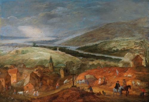
#FineArtFriday: Mountain River Landscape, Jan Brueghel the younger and Joos de Momper the Younger

A collaborative work by:

Jan Brueghel the Younger  (1601–1678)

Joos de Momper the Younger  (1564–1635)

Title:    An extensive mountainous river landscape with travellers near a village

Date:   by 1678

Medium: oil on panel

Dimensions: Height: 46.5 cm (18.3 in); Width: 66 cm (25.9 in)

Collection: Private collection

What I like about this painting:

There is an intensity, a richness of color in the foreground, and a subtle chastisement the subject matter of this picture.

In the center we have a beggar on his knees and praying before a cross, with his worldly possessions stacked beside him and his dog patiently waiting. All around him, the world is going about its business. Shepherds are moving their flocks from one field to another, a merchant urges his horse-drawn cart down the hill. Further down the hill, another merchant unloads a wagon. At the right of the beggar, two travelers on horseback ignore the outstretched hand of yet another beggar, this one an old woman.

This painting is relatively less known, a scene composed and executed by two prolific artists, both of whom were the sons of two of the more famous artists of the 17th century.

At first glance this seems like an ordinary bucolic view of a village and surrounding countryside. Yet, I think the lesson they offer us is clear—we go through life relatively comfortably, unaware of the opportunities for charity that are all around us.

Both artists made their livings from their work so there was a market for what they produced. For both Brueghel and de Momper, their fathers (and in Brueghel’s case, his grandfather ) were hard acts to follow.

About the Artists, via Wikipedia:

Joos de Momper the Younger  primarily painted landscapes, the genre for which he was highly regarded during his lifetime. Only a small number of the 500 paintings attributed to de Momper are signed and just one is dated. The large output points to substantial workshop participation. He often collaborated with figure painters such as Frans Francken II, Peter Snayers, Jan Brueghel the Elder and Jan Brueghel the Younger, usually on large, mountainous landscapes, whereby the other painters painted the staffage (people) and de Momper the landscape. His works were often featured in the prestigious gallery paintings of collections (real and imagined) from the early seventeenth century.

Jan Brueghel the Younger was born and died in the 17th century in Antwerp. He was trained by his father and spent his career producing works in a similar style. Along with his brother Ambrosius, he produced landscapes, allegorical scenes and other works of meticulous detail. Brueghel also copied works by his father and sold them with his father’s signature. His work is distinguishable from that of his parent by being less well executed and lighter.

In an episode of BBC’s Britain’s Lost Masterpieces broadcast in November 2019, a very badly damaged picture of a village scene, whose panel has spilt into two pieces, was located at Birmingham Art Gallery. Following a complete restoration by Simon Gillespie, the landscape was attributed to Joos de Momper and the figures were attributed to Jan the Younger.


Credits and Attributions:

Wikimedia Commons contributors, “File:Jan Brueghel II and Joos de Momper II – An extensive mountainous river landscape with travellers near a village.jpg,” Wikimedia Commons, the free media repository, https://commons.wikimedia.org/w/index.php?title=File:Jan_Brueghel_II_and_Joos_de_Momper_II_-_An_extensive_mountainous_river_landscape_with_travellers_near_a_village.jpg&oldid=345270137 (accessed November 19, 2020).

Wikipedia contributors, “Jan Brueghel the Younger,” Wikipedia, The Free Encyclopedia, https://en.wikipedia.org/w/index.php?title=Jan_Brueghel_the_Younger&oldid=988772158 (accessed November 19, 2020).

Wikipedia contributors, “Joos de Momper,” Wikipedia, The Free Encyclopedia, https://en.wikipedia.org/w/index.php?title=Joos_de_Momper&oldid=988664019 (accessed November 19, 2020).
Comments Off on #FineArtFriday: Mountain River Landscape, Jan Brueghel the younger and Joos de Momper the Younger

Filed under #FineArtFriday

#FineArtFriday: Communion by Steven DaLuz, 2018

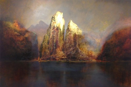
Title: Communion by Steven DaLuz, 2018

Medium:  oil, metal leaf on panel

Size: 40″ x 60″

What I love about this painting:

Where do I begin? This simple scene speaks to me on a spiritual level. The calmness and serenity, the intensely rich colors, and the way the sky and water are depicted make this one my favorite contemporary paintings. There is power here, but  it is quiet and doesn’t need to go out of its way to impress the viewer.

I am impressed just by being in its presence. Power lies in the intimacy, the unity and companionship of the two main subjects, split rock spires who lean toward each other. Power also lies in the way light and shadow cloak the surrounding scene and reveal the spires.

DaLuz breathes life into the stone, showing us the living mountains. The use of metal leaf and oil paints to create the light and shadow is a wonderful technique.

About Luminism, via Wikipedia:

Luminism is an American landscape painting style of the 1850s to 1870s, characterized by effects of light in landscape, through the use of aerial perspective and the concealment of visible brushstrokes. Luminist landscapes emphasize tranquility, and often depict calm, reflective water and a soft, hazy sky.

Ingredients of luminism – such as majestic skies, calm waters, rarefied light, and other representations of magnificence – have been also appreciated in contemporary American painting.

About the artist, via Wikipedia:

Steven DaLuz (born 1953) is a contemporary American Neoluminist artist known for using chemically induced patinas on metal leaf and mixed media to produce figurative works and imagined landscapes often reflecting upon the sublime as a pictorial theme.

DaLuz was born in Hanford, California. His works have been published in art periodicals, such as American Art Collector, Fine Art Connoisseur,, The Artist,  Professional Artist, The Huffington Post  and Poets and Artists magazine, where he received the cover for the Nov 2009 Issue.  Considered “ethereal and transcendent,” his artwork has been said to combine “a spectacular dissertation on light and shadow with a brilliant collection of colors.” DaLuz holds degrees in Social Psychology (BA, Park University 1979), Management ((MA, Central Michigan University, 1981)), Graphic Design (AAS, San Antonio College, 2001), and Fine Arts (BFA, University of Texas at San Antonio, 2003).

He donates works of art and part of the proceeds from the sale of his work in favor of many charitable actions.


Credits and Attributions:

Communion; oil, metal leaf on panel; 40″ x 60″; 2018; by Steven DaLuz

Wikimedia Commons contributors, “File:Communion 40 x 60.jpg,” Wikimedia Commons, the free media repository, https://commons.wikimedia.org/w/index.php?title=File:Communion_40_x_60.jpg&oldid=508468900 (accessed November 12, 2020).

Wikipedia contributors, “Luminism (American art style),” Wikipedia, The Free Encyclopedia, https://en.wikipedia.org/w/index.php?title=Luminism_(American_art_style)&oldid=983664068 (accessed November 12, 2020).


Sdaluz, CC BY-SA 4.0 <https://creativecommons.org/licenses/by-sa/4.0&gt;, via Wikimedia Commons

1 Comment

Filed under #FineArtFriday

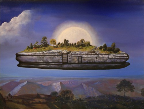
#FineArtFriday: Utopien 04 by Makis E. Warlamis 2007

Artist: Makis E. Warlamis

Title: Utopien 04

Medium: painting

Collection: Kunstmuseum Waldviertel

Source/Photographer: Own work, Daskunstmuseum, 2007-01-05

About the word “Utopia,” via Wikipedia:

The word utopia was coined from Ancient Greek by Sir Thomas More in 1516. “Utopia” comes from Greek: οὐ (“not”) and τόπος (“place”) which translates as “no-place” and literally means any non-existent society, when ‘described in considerable detail’. However, in standard usage, the word’s meaning has shifted and now usually describes a non-existent society that is intended to be viewed as considerably better than contemporary society.

In his original work, More carefully pointed out the similarity of utopia to eutopia, which is from Greek: εὖ (“good” or “well”) and τόπος (“place”), hence eutopia means “good place”, which ostensibly would be the more appropriate term for the concept the word “utopia” has in modern English. The pronunciations of eutopia and utopia in English are identical, which may have given rise to the change in meaning.

What I love about this painting:

This Utopia is unreachable, as all true Utopias are. It floats high above the mundane world, visible but just out of reach. The colors are intense, vibrantly moody. The landscape above which this perfect island floats is serene, a beautiful place.

Every idea of perfection is different. Warlamis’ Utopia is not the golden city many storytellers and writers of speculative fiction might imagine, but is instead an island of undisturbed landscape, looking almost like the untrammeled headland one might find beside the sea.

His Utopia is a step back to nature, to a simpler time.

In truth, it isn’t too different from the land over which it flies. And, if that is the case, why strive to reach it?

What story lurks within this painting? What a great visual prompt to jumpstart Nation Novel Writing Month.

About the Author via Wikipedia DE:

Efthymios “Makis” Warlamis (also: Efthymis, Efthymios Varlamis; born 1942 in Veria, in Central Macedonia, Greece; died 27 December 2016) was a Greek-Austrian architect, painter, poet, writer, educator and museum founder.

Warlamis was a versatile artist. In addition to his basic profession as an architect, he worked as a sculptor, painter, designer and writer. He had exhibitions in museums and exhibition centres in Europe, USA, Asia and Egypt. His works are represented in international public and private collections such as the Graphic Collection of the Albertina Vienna, Museum moderner Kunst Wien, DAM Deutsches Architekturmuseum Frankfurt, Collection Alexander Jolas, Collection of the State of Austria, Collection Liaunig.

In 1992, together with his wife Heide, he founded the International Center for Art and Design I.DE. A. in Schrems. He planned and built the Kunstmuseum Waldviertel, which opened in Schrems in 2009.


Credits and Attributions:

Wikimedia Commons contributors, “File:2010 Utopien arche04.jpg,” Wikimedia Commons, the free media repository, https://commons.wikimedia.org/w/index.php?title=File:2010_Utopien_arche04.jpg&oldid=501416249 (accessed October 30, 2020).

Wikipedia contributors, “Utopia,” Wikipedia, The Free Encyclopedia, https://en.wikipedia.org/w/index.php?title=Utopia&oldid=986041921 (accessed October 30, 2020).

Wikipedia DE Contributors, Efthymios Warlamis, Wikipedia the Free Encyclopedia, https://de.wikipedia.org/wiki/Efthymios_Warlamis (accessed October 30, 2020).

2 Comments

Filed under #FineArtFriday

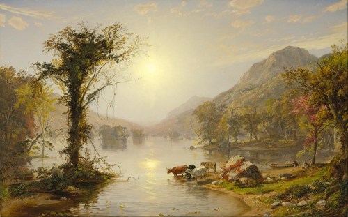
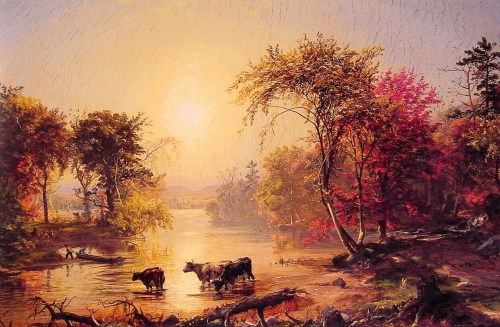
#FineArtFriday: Autumn On Greenwood Lake – two landscapes by Jasper Francis Cropsey (revisited)

This post first appeared here in October of 2018. It features two beautiful images of Autumn in New England in the mid-nineteenth century. I like both these paintings for the way the water is depicted, and the hazy hills.

Jasper Francis Cropsey created many paintings of Greenwood Lake, a freshwater lake on the border between New York State and New Jersey, beginning in 1843. Over the next few decades, Cropsey painted numerous scenes of the area, many from the same viewpoint on the lake as today’s featured paintings, each with varying intensities of color.

What I love about these two paintings, done years apart, is  difference in the quality of  the light. One is done in an early autumn, the other later in the season. The subject matter is similar, cows drinking at waters edge, fishers and their rowboat, but the trees are different, more mature in the second, and it is later in the evening. The autumn haze completely hides the hills.

Clearly, this was a place that was beloved by the artist, as he returned year after year, and made many landscapes of this beach and the surrounding area.

About the artist (Via Wikipedia):

Jasper Francis Cropsey (February 18, 1823 – June 22, 1900) was an important American landscape artist of the Hudson River School. He was best known for his lavish use of color and, as a first-generation member from the Hudson River School, painted autumn landscapes that startled viewers with their boldness and brilliance. As an artist, he believed landscapes were the highest art form and that nature was a direct manifestation of God. He also felt a patriotic affiliation with nature and saw his paintings as depicting the rugged and unspoiled qualities of America.

Jasper Cropsey died in anonymity but was rediscovered by galleries and collectors in the 1960s.


Credits and Attributions:

Autumn on Greenwood Lake, ca. 1861, by Jasper Francis Cropsey [Public domain], via Wikimedia Commons

Autumn in America, by Jasper Francis Cropsey [Public domain], via Wikimedia Commons

Wikipedia contributors, “Jasper Francis Cropsey,” Wikipedia, The Free Encyclopedia, https://en.wikipedia.org/w/index.php?title=Jasper_Francis_Cropsey&oldid=842742891 (accessed October 19, 2018).

Comments Off on #FineArtFriday: Autumn On Greenwood Lake – two landscapes by Jasper Francis Cropsey (revisited)

Filed under #FineArtFriday

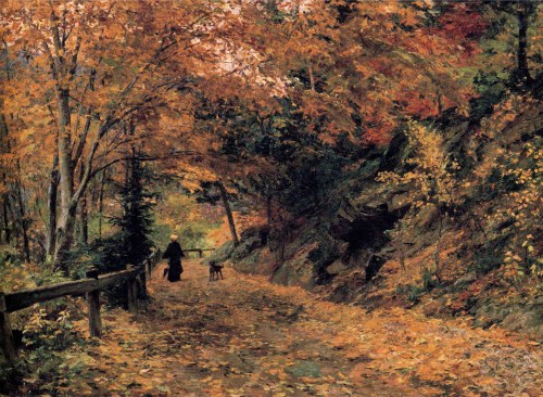
#FineArtFriday: Falling Leaves, by Olga Wisinger-Florian (reprise)

Falling Leaves, by Olga Wisinger-Florian, circa 1899, first appeared here in October of 2018.  It is one of my favorite depictions of autumn. The scene could be happening here in my lovely Pacific Northwestern forests. The colors of the leaves, the dirt road–this is very like where I grew up.

The painting depicts a woman and her dog enjoying a quiet walk in the serenity of an autumn day. Using light and shadow, the artist employs an impressionistic style to convey the forest. Nothing is drawn with precision, yet everything is shown in its entirety. The feeling of this pieces is a little dreamlike–she carries an umbrella, so she’s prepared for rain. She is dressed all in black except for her yellow hat. Leaves in all the many shades of green, gold, and red cling to their trees; the damp, aging rails of the wooden fence offers a flimsy barrier to the carriages and motor vehicles that may travel the roadside. Leaves cover the dirt road, and more are falling down, and the dog trots happily along beside her mistress—the story is there for us to see.

About the Artist:

According to Wikipedia, Olga Wisinger-Florian’s early paintings can be assigned to what is known as Austrian Mood Impressionism. In her landscape paintings she adopted Schindler’s sublime approach to nature. The motifs she employed, such as views of tree-lined avenues, gardens and fields, were strongly reminiscent of her teacher’s work. After breaking with Schindler in 1884, however, the artist went her own way. Her conception of landscapes became more realistic. Her late work is notable for a lurid palette, with discernible overtones of Expressionism. With landscape and flower pictures that were already Expressionist in palette by the 1890s, she was years ahead of her time.


Credits and Attributions:

Falling Leaves, by Olga Wisinger-Florian, ca 1899 [Public domain], via Wikimedia Commons

Wikipedia contributors, “Olga Wisinger-Florian,” Wikipedia, The Free Encyclopedia, https://en.wikipedia.org/w/index.php?title=Olga_Wisinger-Florian&oldid=852607929 (accessed October 11, 2018).

Wikimedia Commons contributors, “File:Olga Wisinger-Florian – Falling Leaves.JPG,” Wikimedia Commons, the free media repository, https://commons.wikimedia.org/w/index.php?title=File:Olga_Wisinger-Florian_-_Falling_Leaves.JPG&oldid=273565541 (accessed October 11, 2018).

Comments Off on #FineArtFriday: Falling Leaves, by Olga Wisinger-Florian (reprise)

Filed under #FineArtFriday

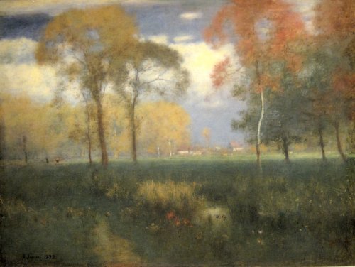
#FineArtFriday: Sunny Autumn Day by George Inness, 1892

Sunny Autumn Day, by George Inness

Date: 1892

Medium: oil on canvas

Dimensions: Height: 81 cm (31.8 in); Width: 106 cm (41.7 in)

Collection: Cleveland Museum of Art 


What I love about this painting:

This was painted toward the end of the artist’s life. We are given the impression of a beautiful day in September, with the leaves just beginning to turn color, still clinging to their trees. It’s warm enough to go without a jacket, one of the last good days before the weather turns cold. A dreamlike quality softens the edges, as if it depicts a scene viewed through the mystical glass of memory.

About the Artist, via Wikipedia:

George Inness (May 1, 1825 – August 3, 1894) was a prominent American landscape painter.

One of the most influential American artists of the nineteenth century, Inness was influenced, in turn, by the Old Masters, the Hudson River school, the Barbizon school, and, finally, the theology of Emanuel Swedenborg, whose spiritualism found vivid expression in the work of Inness’s maturity (1879–1894).

A master of light, color, and shadow, he became noted for creating highly ordered and complex scenes that often juxtaposed hazy or blurred elements with sharp and refined details to evoke an interweaving of both the physical and the spiritual nature of experience. In Inness’s words, he attempted through his art to demonstrate the “reality of the unseen” and to connect the “visible upon the invisible.”

After Inness settled in Montclair, New Jersey in 1885, and particularly in the last decade of his life, this mystical component manifested in his art through a more abstracted handling of shapes, softened edges, and saturated color (October, 1886, Los Angeles County Museum of Art), a profound and dramatic juxtaposition of sky and earth (Early Autumn, Montclair, 1888, Montclair Art Museum),  an emphasis on the intimate landscape view (Sunset in the Woods, 1891, Corcoran Gallery of Art), and an increasingly personal, spontaneous, and often violent handling of paint. It is this last quality in particular which distinguishes Inness from those painters of like sympathies who are characterized as Luminists.

In a published interview, Inness maintained that “The true use of art is, first, to cultivate the artist’s own spiritual nature.” His abiding interest in spiritual and emotional considerations did not preclude Inness from undertaking a scientific study of color, nor a mathematical, structural approach to composition: “The poetic quality is not obtained by eschewing any truths of fact or of Nature…Poetry is the vision of reality.”


Credits and Attributions:

Wikimedia Commons contributors, “File:’Sunny Autumn Day’ by George Inness, 1892.JPG,” Wikimedia Commons, the free media repository, https://commons.wikimedia.org/w/index.php?title=File:%27Sunny_Autumn_Day%27_by_George_Inness,_1892.JPG&oldid=428214252  (accessed October 2, 2020).

Wikipedia contributors, “George Inness,” Wikipedia, The Free Encyclopedia, https://en.wikipedia.org/w/index.php?title=George_Inness&oldid=975996784 (accessed October 2, 2020).

2 Comments

Filed under #FineArtFriday

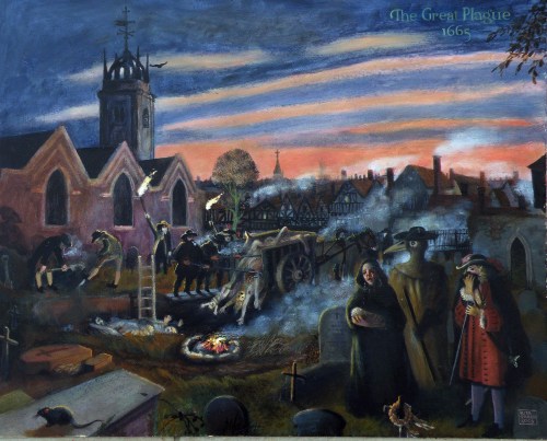
#FineArtFriday: The Great Plague 1665 by Rita Greer 2009

Title: The Great Plague 1665, by Rita Greer 2009

Description (via Wikimedia Commons): Like many who could afford to, Robert Hooke left London for six months during the worst of the bubonic plague. All cats and dogs were destroyed as a preventive measure. This allowed rats to flourish and spread the disease which was carried by their fleas. The image shows a scene of horror. After sunset carts were driven through the streets to collect the dead. They were taken to the nearest graveyard to be buried in plague pits. Fires burned to make smoke. Pipes of tobacco were smoked, posies of herbs worn, and faces covered with masks. This was thought to be protection against contagion. London was overwhelmed with fear, terror and grief. It is thought that as many as 100,000 perished in London alone.

Date: 2009

Source/Photographer: The original is an oil painting on board by Rita Greer, history painter, 2009. This was digitized by Rita and sent via email to the Department of Engineering Science, Oxford University, where it was subsequently uploaded to Wikimedia.

What I love about this painting:

Rita Greer paints history as if she lived it, with meticulous detail. In this street scene, she manages to capture the despair and hopelessness that pervaded London with the advent of the plague. This scene is dark, and filled with emotion. Death walks the smoke-hazed streets, feeding on tragedy. Grief and fear are the driving forces, and no one’s family is spared.

This year, 2020, feels like an apocalypse year, in many ways. It helps to keep in mind that for London and all the great cities of Europe, 1665 was worse.

About the artist:

Rita Greer is a history artist, goldsmith, graphic designer, food scientist and author/writer. On retirement in 2003 Rita began the Robert Hooke project, “to put him back into history.” Much her work is available to be viewed at Wikimedia Commons, Category: Paintings by Rita Greer.


Credits and Attributions:

Wikimedia Commons contributors, “File:20 The Great Plague.JPG,” Wikimedia Commons, the free media repository, https://commons.wikimedia.org/w/index.php?title=File:20_The_Great_Plague.JPG&oldid=450173019 (accessed September 24, 2020).

Comments Off on #FineArtFriday: The Great Plague 1665 by Rita Greer 2009

Filed under #FineArtFriday

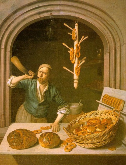
#FineArtFriday: The Baker by Job Adriaenszoon Berckheyde, circa 1681

Title: The Baker

Genre: self-portrait

Artist: Job Adriaenszoon Berckheyde

Date: 1681

Medium: oil on canvas

Collection: Worcester Art Museum

What I like about this painting:

Berckheyde painted several pictures of bakery shops. These genre paintings of bakeries were popular as a subject for Dutch artists from around 1650.

When I first saw this image, I wondered why our baker is blowing a horn. I discovered that was how some bakers announced the morning’s freshly baked bread.

Like most merchants in 17th century Holland, bakers often worked out of their own homes. However, their ovens were well-known fire threats. Entire cities would go up in a raging conflagration that no one could out run or stop, often burning for days. For this reason, many neighbors didn’t really want a baker going into business next door to them.

To minimize the fire risk, some towns and cities required bakers to live and do business in stone buildings. This law explains the artist’s rather monumental choice of architecture as the background for The Baker. It looks the the entrance to a cathedral.

Berckheyde chose to make this a self-portrait. I like this decision, for he was honest in how he presented himself, He is not too handsome, but is surrounded by a wide, tempting assortment of goods, including pretzels. The wooden rack they’re displayed on would be at home in any bakery shop today.

I would definitely buy my family’s bread from this baker.


About the Artist, via Wikipedia:

Job Berckheyde, baptized 27 January 1630 and died 23 November 1693, was born in Haarlem and was the older brother of the painter Gerrit who he later taught to paint.

He was apprenticed on 2 November 1644 to Jacob Willemszoon de Wet. His master’s influence is apparent in his first dated canvas, “Christ Preaching to the Children” (1661), one of his few biblical scenes.

Golden-age historian Arnold Houbraken claimed that Job had been trained as a bookbinder by his father, and could not discover who taught him to paint.

What is not in doubt is that Gerrit learned from his older brother. Job’s teacher must have been a Haarlem master, and some claim it was Frans Hals, but Houbraken claimed he travelled as a journeyman between Leiden and Utrecht offering his services as a portrait painter and learned by doing.

During the 1650s the two brothers, Job and Gerrit, made an extended trip along the Rhine to Germany, stopping off at Cologne, Bonn, Mannheim and finally Heidelberg, following the example of their fellow guild member Vincent van der Vinne.

The brothers worked in Heidelberg for Charles I Louis, Elector Palatine (with Job producing portraits and hunting scenes, and receiving a gold chain from the Elector in reward) but were ultimately unable to adapt to court life and so returned to Haarlem, where they shared a house and perhaps a studio.

He became a member of the Haarlem rederijkersgilde ‘De Wijngaardranken’ in 1666–1682. He is registered in Amsterdam 1682–1688, where he became a member of the Guild of St Luke there in 1685–1688. Berckheyde was buried in Haarlem.

He could paint landscapes in the same style as his brother, but seems to have preferred interiors and genre works, whereas his brother’s oeuvre consists mostly of outdoor scenes. The Elector’s gold chain may be the one he wears in his early Self-portrait (1655), his only documented work from the 1650s.

Job is better known for his later work, which consists mainly of interior views of the Sint-Bavokerk in Haarlem and simple genre scenes recalling those of his Haarlem contemporaries Adriaen van Ostade and Jan Steen.

Less prolific than his brother, but more varied in his output, Job produced bible and genre scenes as well as cityscapes. Confusion between their works may have resulted from the similarity of their signatures, where Job’s j resembles Gerrit’s g. Job also signed his work with an H (for Hiob or Job) and with the monogram HB.


Credits and Attributions:

Wikimedia Commons contributors, “File:Berckheyde, Job – The Baker – 1681.jpg,” Wikimedia Commons, the free media repository, https://commons.wikimedia.org/w/index.php?title=File:Berckheyde,_Job_-_The_Baker_-_1681.jpg&oldid=463054921 (accessed September 17, 2020).

Wikipedia contributors, “Job Adriaenszoon Berckheyde,” Wikipedia, The Free Encyclopedia, https://en.wikipedia.org/w/index.php?title=Job_Adriaenszoon_Berckheyde&oldid=947928424 (accessed September 17, 2020).

Wikipedia contributors, “Gerrit Berckheyde,” Wikipedia, The Free Encyclopedia, https://en.wikipedia.org/w/index.php?title=Gerrit_Berckheyde&oldid=933563068 (accessed September 17, 2020).

Comments Off on #FineArtFriday: The Baker by Job Adriaenszoon Berckheyde, circa 1681

Filed under #FineArtFriday

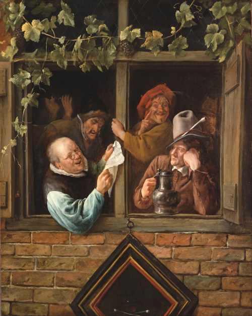
#FineArtFriday: Rhetoricians at a Window by Jan Steen ca. 1666

Artist: Jan Steen  (1625/1626–1679)

Title: Rhetoricians at a Window

Genre: genre art

Date: c. 1661-66

Medium: oil on canvas

English: Oil on canvas

Dimensions: Height: 759.46 mm (29.90 in); Width: 586.23 mm (23.07 in)

Collection: Philadelphia Museum of Art

What I love about this painting:

The reading of a poem or play was clearly the opportunity for the performers to have a good time. From the drinker in the shadows of the background to the grapevines growing around the window, Steen tells us that wine and rhetoric are clearly entwined.

I love the inclusion of both “the critic” who leans his head on his hand and listens analytically, and the man behind him, who is clearly “a little over the limit,” and supports himself by grasping the window frame and heartily agreeing with some point.

The reader is clearly enjoying himself, as are the others.

About the Artist (Via Wikipedia):

Jan Havickszoon Steen (c. 1626 – buried 3 February 1679) was a Dutch Golden Age painter, one of the leading genre painters of the 17th century. His works are known for their psychological insight, sense of humour and abundance of colour.

Daily life was Jan Steen’s main pictorial theme. Many of the genre scenes he portrayed, as in The Feast of Saint Nicholas, are lively to the point of chaos and lustfulness, even so much that “a Jan Steen household”, meaning a messy scene, became a Dutch proverb (een huishouden van Jan Steen). Subtle hints in his paintings seem to suggest that Steen meant to warn the viewer rather than invite him to copy this behaviour. Many of Steen’s paintings bear references to old Dutch proverbs or literature. He often used members of his family as models, and painted quite a few self-portraits in which he showed no tendency of vanity.

Steen did not shy from other themes: he painted historical, mythological and religious scenes, portraits, still lifes and natural scenes. His portraits of children are famous. He is also well known for his mastery of light and attention to detail, most notably in Persian rugs and other textiles.

Steen was prolific, producing about 800 paintings, of which roughly 350 survive. His work was valued much by contemporaries and as a result he was reasonably well paid for his work. He did not have many students—only Richard Brakenburgh is recorded—but his work proved a source of inspiration for many painters. [2]

About this painting, Via Wikipedia:

Chambers of rhetoric (Dutch: rederijkerskamers) were dramatic societies in the Low Countries. Their members were called Rederijkers (singular Rederijker), from the French word ‘rhétoricien’, and during the 15th and 16th centuries were mainly interested in dramas and lyrics. These societies were closely connected with local civic leaders and their public plays were a form of early public relations for the city. [1]

In 1945, Sturla Gudlaugsson, a specialist in Dutch seventeenth-century painting and iconography and Director of the Netherlands Institute for Art History and the Mauritshuis in The Hague, wrote The Comedians in the work of Jan Steen and his Contemporaries, which revealed that a major influence on Jan Steen’s work was the guild of the Rhetoricians or Rederijkers and their theatrical endeavors.

It is often suggested that Jan Steen’s paintings are a realistic portrayal of Dutch 17th-century life. However, not everything he did was a purely realistic representation of his day-to-day environment. Many of his scenes contain idyllic and bucolic fantasies and a declamatory emphasis redolent of theater.

Jan Steen’s connection to theater is easily verifiable through his connection to the Rederijkers. There are two kinds of evidence for this connection. First, Jan Steen Steen’s uncle belonged to the Rhetoricians in Leiden, where Steen was born and lived a substantial part of his life. Second, Jan Steen portrayed many scenes from the lives of the Rederijkers, an example being the painting Rhetoricians at a Window of 1658–65. The piece is currently held in the Philadelphia Museum of Art which was established in February 1876. The humanity, humor and optimism of the figures suggest that Jan Steen knew these men well and wanted to portray them positively.

With his lavish and moralising style, it is logical that Steen would employ the stratagems from theater for his purposes. There is conclusive evidence that the characters in Steen’s paintings are predominantly theatrical characters and not ones from reality. [2]


Credits and Attributions:

[1] Wikipedia contributors, “Jan Steen,” Wikipedia, The Free Encyclopedia, https://en.wikipedia.org/w/index.php?title=Jan_Steen&oldid=950709901 (accessed September 10, 2020).

[2] Wikipedia contributors, “Chamber of rhetoric,” Wikipedia, The Free Encyclopedia, https://en.wikipedia.org/w/index.php?title=Chamber_of_rhetoric&oldid=975283829 (accessed September 10, 2020).

Wikimedia Commons contributors, “File:Jan Steen, Dutch (active Leiden, Haarlem, and The Hague) – Rhetoricians at a Window – Google Art Project.jpg,” Wikimedia Commons, the free media repository, https://commons.wikimedia.org/w/index.php?title=File:Jan_Steen,_Dutch_(active_Leiden,_Haarlem,_and_The_Hague)_-_Rhetoricians_at_a_Window_-_Google_Art_Project.jpg&oldid=355150081 (accessed September 10, 2020).

2 Comments

Filed under #FineArtFriday

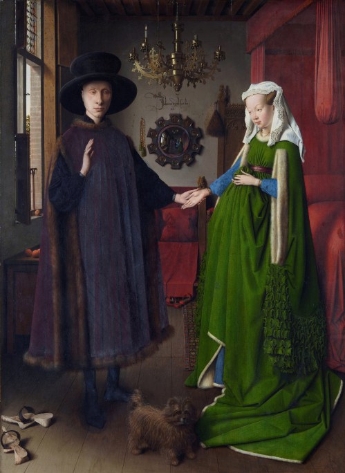
#FineArtFriday: The Arnolfini Portrait by Jan van Eyck 1434

Artist: Jan van Eyck  (circa 1390 –1441)

Title: The Arnolfini Portrait

Genre: portrait

Date: 1434

Medium: oil on panel

Dimensions: Height: 82 cm (32.2 in); Width: 59.5 cm (23.4 in)

Collection: National Gallery

About this painting, via Wikipedia:

The Arnolfini Portrait (or The Arnolfini Wedding, The Arnolfini Marriage, the Portrait of Giovanni Arnolfini and his Wife, or other titles) is a 1434 oil painting on oak panel by the Early Netherlandish painter Jan van Eyck. It forms a full-length double portrait, believed to depict the Italian merchant Giovanni di Nicolao Arnolfini and his wife, presumably in their residence at the Flemish city of Bruges.

What I love about this painting:

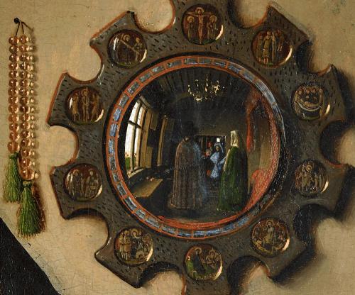
The painting is signed, inscribed, and dated on the wall above the mirror: “Johannes de eyck fuit hic 1434” (Jan van Eyck was here 1434).  This signature, made to look as if it were an inscription explaining the mirror over which it is centered, is a shining example of the sharp wit the later Netherlandish painters frequently inserted into their pictures.

I suspect his inclusion of subtle humor in his works gave permission to those painters who followed in his footsteps, such as the great Bruegel dynasty.

The colors of the garments are deep and rich. These were expensive clothes, completely befitting a wealthy merchant and his wife. In regard to the controversy which is explained below – yes, this painting is steeped in allegory and symbolism, down to the clogs in the left hand corner placed as if they are going out of the picture. In some cultures, a pair of shoes placed like that symbolizes an imminent departure, usually death.

All van Eyck’s work was heavily symbolic. But she appears to be in the late stages of a pregnancy. To me, given the societal norms of the Netherlands in the year 1434, this means the picture shows a married couple. If they were not actually married, it seems unlikely they would have commissioned a portrait showing her in that condition. In fact, and this will probably expose my self-taught ignorance of art history, it makes me wonder why there is a controversy about their marital status at all.

And the mirror…oh my. That mirror is brilliant.

The Controversy, via Wikipedia:

In 1934 Erwin Panofsky published an article entitled Jan van Eyck’s ‘Arnolfini’ Portrait in the Burlington Magazine, arguing that the elaborate signature on the back wall, and other factors, showed that it was painted as a legal record of the occasion of the marriage of the couple, complete with witnesses and a witness signature. Panofsky also argues that the many details of domestic items in the painting each have a disguised symbolism attached to their appearance. While Panofsky’s claim that the painting formed a kind of certificate of marriage is not accepted by all art historians, his analysis of the symbolic function of the details is broadly agreed, and has been applied to many other Early Netherlandish paintings, especially a number of depictions of the Annunciation set in richly detailed interiors, a tradition for which the Arnolfini Portrait and the Mérode Altarpiece by Robert Campin represent the start (in terms of surviving works at least).

Since then, there has been considerable scholarly argument among art historians on the occasion represented. Edwin Hall considers that the painting depicts a betrothal, not a marriage. Margaret D. Carroll argues that the painting is a portrait of a married couple that alludes also to the husband’s grant of legal authority to his wife. Carroll also proposes that the portrait was meant to affirm Giovanni Arnolfini’s good character as a merchant and aspiring member of the Burgundian court. She argues that the painting depicts a couple, already married, now formalizing a subsequent legal arrangement, a mandate, by which the husband “hands over” to his wife the legal authority to conduct business on her own or his behalf (similar to a power of attorney). The claim is not that the painting had any legal force, but that van Eyck played upon the imagery of legal contract as a pictorial conceit. While the two figures in the mirror could be thought of as witnesses to the oath-taking, the artist himself provides (witty) authentication with his notarial signature on the wall.


Credits and Attributions:

Wikimedia Commons contributors, “File:Van Eyck – Arnolfini Portrait.jpg,” Wikimedia Commons, the free media repository, https://commons.wikimedia.org/w/index.php?title=File:Van_Eyck_-_Arnolfini_Portrait.jpg&oldid=446521642 (accessed September 4, 2020).

Wikimedia Commons contributors, “File:The Arnolfini Portrait, détail (2).jpg,” Wikimedia Commons, the free media repository, https://commons.wikimedia.org/w/index.php?title=File:The_Arnolfini_Portrait,_d%C3%A9tail_(2).jpg&oldid=428220496 (accessed September 4, 2020).

Wikimedia Commons contributors, “File:Arnolfini Portrait 3.jpg,” Wikimedia Commons, the free media repository, https://commons.wikimedia.org/w/index.php?title=File:Arnolfini_Portrait_3.jpg&oldid=428554231 (accessed September 4, 2020).

2 Comments

Filed under #FineArtFriday, writing