Category Archives: #FineArtFriday

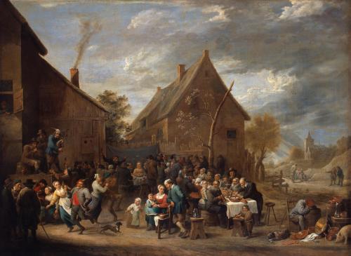
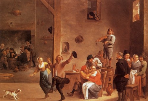
#FineArtFriday: Tavern with a pair of dancers by David Teniers II

About the Artist, from Wikipedia:

David Teniers II was known as a hard worker who was extremely prolific. About two thousand paintings are thought to have been painted by the artist. He was extremely versatile and tried his hand at all the genres then practiced in Flanders including history, genre, landscape, portrait and still life.

Teniers is particularly known for developing the peasant genre, the tavern scene and scenes with alchemists and physicians. He also painted many religious scenes among which stand out his many compositions treating the subjects of the Temptation of St Anthony and hermit saints in grottoes or deserts.

A major influence on David Teniers the Younger’s early work was the work of the Flemish painter Adriaen Brouwer.

The personal style of Teniers was visible from the outset. An important distinction was that, unlike Brouwer who placed these genre scenes mainly indoors, Teniers gradually moved his scenes into the open air and started to give the landscape a major place in his work from the 1640s. This was a common development in Flemish painting at the time. The smoky and monochrome tonality of the interiors from the 1630s was replaced by a luminous, silvery atmosphere, in which the peasants sit at their ease, conversing or playing cards. These paintings show a radical move towards a more positive attitude towards country life and the peasantry than was reflected in his earlier satirical pieces influenced by Brouwer.

In the 18th century, Parisian collectors eagerly competed to lay their hands on Teniers’ works. They knew the artist chiefly for his idealized scenes of rural life, paintings of village feasts, interiors with peasants and guardroom scenes. Teniers’ work was very much admired by French painters of that time.


Credits and Attributions

“Tavern with a pair of dancers” by David Teniers II. Oil on canvas. Munich, Germany. Bavarian State Picture Gallery via Wikimedia Commons

Wikimedia Commons contributors, “File:David Teniers II Taverna s paroi Tanz (1645).jpg,” Wikimedia Commons, the free media repository, https://commons.wikimedia.org/w/index.php?title=File:David_Teniers_II_Taverna_s_paroi_Tanz_(1645).jpg&oldid=222921557 (accessed December 28, 2018).

Comments Off on #FineArtFriday: Tavern with a pair of dancers by David Teniers II

Filed under #FineArtFriday

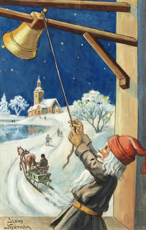
#FineArtFriday on a Monday: Vintage Christmas Card, by Jenny Nystrom

Merry Christmas from my home to yours! The above image is a quintessential Swedish Christmas card, illustrated by Jenny Nystrom, (1854 – 1946).

Jenny Eugenia Nyström (13 or 15 June 1854 in KalmarSweden – 17 January 1946 in Stockholm) was a painter and illustrator  who is mainly known as the person who created the Swedish image of the jultomte on numerous Christmas cards and magazine covers, thus linking the Swedish version of Santa Claus to the gnomes of Scandinavian folklore. [1]

While in Paris, she discovered the booming postcard market, and tried to persuade the Swedish publishing house Bonnier to start producing postcards, but they declined. Lille Viggs äventyr på julafton (“Little Vigg’s Adventures on Christmas Eve”), written by the author Viktor Rydberg inspired Jenny Nyström. She made drawings accompanying this tale. Viktor Rydberg saw them and suggested the Bonniers publishing company to release the book. After they declined, publisher S. A. Hedlund released it in 1871. The short Christmas tale for all ages was widely printed and has since become a Christmas classic in Sweden. Jenny Nyström eventually became Sweden’s most productive painter and illustrator. For many years, her illustrations were distributed by Strålin & Persson AB in Falun .


Credits and Attributions

Wikipedia contributors, “Jenny Nyström,” Wikipedia, The Free Encyclopedia, https://en.wikipedia.org/w/index.php?title=Jenny_Nystr%C3%B6m&oldid=837676901 (accessed December 24, 2018).

Wikimedia Commons contributors, “File:Nystrom God-Jul 21.jpg,” Wikimedia Commons, the free media repository, https://commons.wikimedia.org/w/index.php?title=File:Nystrom_God-Jul_21.jpg&oldid=260790882 (accessed December 24, 2018).

4 Comments

Filed under #FineArtFriday

#FineArtFriday: A Christmas Carol, revisited

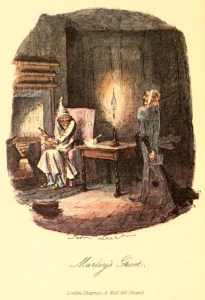
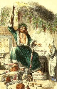
Today’s images are two illustrations by John Leech from the first edition of A Christmas Carol, by Charles Dickens,  published in book form in 1843.  The body of this post first appeared here on Dec, 23, 2015. This is the first time I have included the original art of John Leech, which Dickens himself chose to include in the book.

From Wikipedia: John Leech (29 August 1817 – 29 October 1864 in London) was a British caricaturist and illustrator.[1] He is best known for his work for Punch, a humorous magazine for a broad middle-class audience, combining verbal and graphic political satire with light social comedy. Leech catered to contemporary prejudices, such as anti-Americanism and antisemitism and supported acceptable social reforms. Leech’s critical yet humorous cartoons on the Crimean War help shape public attitudes toward heroism, warfare, and Britons’ role in the world.[2][3]

Four of John Leech’s etchings were included in the first edition of A Christmas Carol.


Another Christmas is about to join the Ghosts of Christmas Past–although, until December 26th, it is still the Ghost of Christmas Present. And as always, I want to talk about my favorite Christmas story of all time, A Christmas Carol, by Charles Dickens.
Charles Dickens was a master when it came to creating marvelous hooks and using heavy foreshadowing. Let’s have a look at the first lines of this tale:

“Marley was dead, to begin with. There is no doubt whatever about that. The register of his burial was signed by the clergyman, the clerk, the undertaker, and the chief mourner. Scrooge signed it. And Scrooge’s name was good upon ‘Change for anything he chose to put his hand to. Old Marley was as dead as a doornail.”

In that first paragraph, Dickens  tosses out the bait, sinking the hook, and landing the fish (the reader) by foreshadowing the first plot point of the story–the visitation by Marley’s ghost. We want to know why Marley’s definite state of decay was so important that the conversation between you the reader, and Dickens the author, was launched with that topic.

He picks it up and does it again several pages later, with the little scene involving the door-knocker, where Scrooge sees the face of his late business partner superimposed over the knocker.

At this point we’ve followed Scrooge through several scenes introducing the subplots. We have met the man who, as yet, is named only as ‘the clerk’ in the original manuscript, but whom we will later know to be Bob Cratchit, and we’ve met Scrooge’s nephew, Fred.

These subplots are critical, as our man Scrooge’s redemption revolves around the ultimate resolution of these two separate mini-stories–he must witness the joy and love in Cratchit’s family, who are suffering but happy in the midst of grinding poverty for which Scrooge bears a responsibility. We see that his nephew, Fred, though orphaned is well off in his own right, but craves a relationship with his uncle with no thought or care of what he might gain from it financially.

All the characters are in place. We’ve seen the city, cold and dark, with danger lurking in the shadows. We’ve observed the way Scrooge interacts with everyone around him, strangers and acquaintances alike. Now we come to the first plot point in Dickens’ story arc–Marley’s visitation. This is where the set-up ends and the story begins to take off.

I love tales of redemption–and A Christmas Carol by Charles Dickens remains one of the most beloved tales of redemption in the Western canon. Written in  1843 as a serialized novella, A Christmas Carol continues to inspire adaptations, in both movies and books.
This is a short tale, but it is a deeply moving allegory of the Christian concept of redemption that remains pertinent in modern society.

In this tale, Dickens asks you to recognize the plight of those whom the Industrial Revolution has displaced and driven into poverty, and the obligation of society to provide for them humanely. This is a concept our society continues to struggle with, and perhaps will for a long time to come.

It is that deep, underlying call for compassion that resonates down through the centuries, a call that is, unfortunately, timeless.


Credits and Attributions:

The Art of Foreshadowing: Charles Dickens, first appeared here on Life in the Realm of Fantasy, on Dec. 23, 2015.

Wikipedia contributors, “John Leech (caricaturist),” Wikipedia, The Free Encyclopedia, https://en.wikipedia.org/w/index.php?title=John_Leech_(caricaturist)&oldid=871947694 (accessed December 21, 2018).

Wikimedia Commons contributors, “File:Christmascarol1843 — 040.jpg,” Wikimedia Commons, the free media repository, https://commons.wikimedia.org/w/index.php?title=File:Christmascarol1843_–_040.jpg&oldid=329166198 (accessed December 21, 2018)

A colourised edit of an engraving of Charles Dickens’ “Ghost of Christmas Present” character, by John Leech in 1843. Wikimedia Commons contributors, “File:Ghost of Christmas Present John Leech 1843.jpg,” Wikimedia Commons, the free media repository, https://commons.wikimedia.org/w/index.php?title=File:Ghost_of_Christmas_Present_John_Leech_1843.jpg&oldid=329172654 (accessed December 21, 2018).

 

2 Comments

Filed under #FineArtFriday, writing

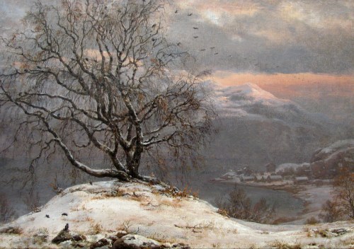
#FineArtFriday: Slindebirken Vinter by J. C. Dahl 1838

Slindebjørka or Slindebirken was a birch tree that stood at Inner Slinde in Sogn, Norway, until it was blown down in a storm in 1874. The tree was beloved, considered a Norwegian national treasure. People came from all over Western Norway to see the tree and picnic beneath its branches.

What I love about this painting is the personality embodied in the birch tree itself as Dahl depicts it. The tree stands proudly, offering a place for birds to rest. It seems to represent the Norwegian spirit of independence, taking what nature throws at it with humor and stoicism.

Dahl’s portrayal is powerful, showing the bent and bowed branches held high despite the barrenness of winter. The image shows a tree that intends to be there when spring comes, as do the people of the village it overlooks.

About the Artist (from Wikipedia)

Johan Christian Claussen Dahl (24 February 1788 – 14 October 1857), often known as J. C. Dahl or I. C. Dahl, was a Norwegian artist who is considered the first great romantic painter in Norway, the founder of the “golden age” of Norwegian painting, and one of the greatest European artists of all time.[1] He is often described as “the father of Norwegian landscape painting”[2] and is regarded as the first Norwegian Painter ever to reach a level of artistic accomplishment comparable to that attained by the greatest European artists of his day. He was also the first to acquire genuine fame and cultural renown abroad.[3] As one critic has put it, “J.C. Dahl occupies a central position in Norwegian artistic life of the first half of the 19th century.[4]

As a boy, Dahl was educated by a sympathetic mentor at the Bergen Cathedral who at first thought that this bright student would make a good priest, but then, recognizing his remarkably precocious artistic ability, arranged for him to be trained as an artist. From 1803 to 1809 Dahl studied with the painter Johan Georg Müller [no], whose workshop was the most important one in Bergen at the time. Still, Dahl looked back on his teacher as having kept him in ignorance in order to exploit him, putting him to work painting theatrical sets, portraits, and views of Bergen and its surroundings. Another mentor, Lyder Sagen, showed the aspiring artist books about art and awakened his interest in historical and patriotic subjects. It was also Sagen who took up a collection that made it possible for Dahl to go to Copenhagen in 1811 to complete his education at the academy there.

As important as Dahl’s studies at the academy in Copenhagen were his experiences in the surrounding countryside and in the city’s art collections. In 1812 he wrote to Sagen that the landscape artists he most wished to emulate were Ruisdahl and Everdingen, and for that reason he was studying “nature above all,” Dahl’s artistic program was, then, already in place: he would become a part of the great landscape tradition, but he would also be as faithful as possible to nature itself.


Credits and Attributions:

Slindebirken, Vinter by Johan Christian Dahl 1838 [Public domain] via Wikimedia Commons

Wikipedia contributors, “Johan Christian Dahl,” Wikipedia, The Free Encyclopedia, https://en.wikipedia.org/w/index.php?title=Johan_Christian_Dahl&oldid=866337453 (accessed December 14, 2018).

Comments Off on #FineArtFriday: Slindebirken Vinter by J. C. Dahl 1838

Filed under #FineArtFriday

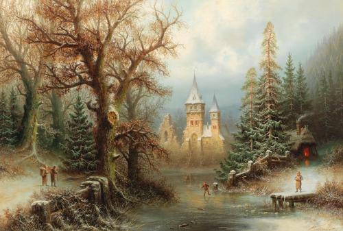
#FineArtFriday: Romantic Winter Landscape with Ice Skaters by a Castle, by Albert Bredow

I love the dreamscape quality of this painting – it’s practically a Christmas card. Peasants, ordinary people living in the shadow of the ruined castle, freely enjoying the day. To look at this picture is to see a fairy tale that wants to be told. Who are these people and why do they live there? What is their connection to the ruined castle? And what is their connection to each other?

The trees, the ice, the snow–the detail is all there, even the warmth of the peasant’s hut. It’s a comforting picture, a moment of contentment.

About the Artist:

Little is known of Albert Bredow’s life. Born Apr 23, 1828 in Germany, and died May 5, 1899 in Moscow, he was well known as a landscape painter, lithographer and stage designer.

From this painting, which is dated near the end of his life, we know he was a romantic, fond of fantasy and fairy tales.

His birthplace in Germany and where he first studied art and set design are unknown. Records do show that he lived and worked in Riga as a stage designer from around 1852 and then in Tallinn. In 1856 he went to Moscow at the invitation of the Directorate of the Imperial Theater. He worked from 1856 to 1862 as a set designer for the Moscow Theater and from 1862 to 1871 the Petersburg Theater.

He is known for his ethereal landscape paintings, which may have been a hobby he pursued more intently later in life since he was actively employed in the theater during his working years. His style of landscape painting must have produced some amazing backdrops for the sets he designed.

In 1863, illustrations of his stage sets for Glinka’s opera “A Life for the Tsar” were considered worthy enough to be published as an album. In 1868 he began his studies at the Petersburg Imperial Art Academy. At the Academy’s art exhibitions, he exhibited his landscapes from Germany and Russia.

The designs of Albert Bredow’s stage sets are in the collection of the Moscow Bachruschin Theater Museum.


Credits and Attributions

Wikimedia Commons contributors, “File:Albert Bredow – Romantic Winter Landscape with Ice Skaters by a Castle.jpg,” Wikimedia Commons, the free media repository, https://commons.wikimedia.org/w/index.php?title=File:Albert_Bredow_-_Romantic_Winter_Landscape_with_Ice_Skaters_by_a_Castle.jpg&oldid=282656583 (accessed December 7, 2018).

1 Comment

Filed under #FineArtFriday

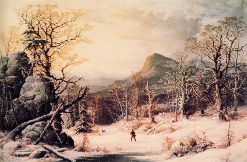
#FineArtFriday: Hunter in Winter Wood, George Henry Durrie

Hunter in Winter Wood, by George Henry Durrie 1860 is one of my favorite images of 19th century Americana. The snow on the bare trees and rocky outcroppings gives the impression of weight, yet it is only a light dusting. The way the light shines golden on the snow—this is how a snowy winter looked in the woods surrounding the rural lake where I grew up. The grandeur of the view shows the 19th century vision of a wide, boundless country. Anything is possible in a country where the land and resources are as limitless as shown in this painting.

Hunter in Winter Wood was painted near the end of Durrie’s life. His most famous works were made into prints by Currier and Ives after his death at the age of 43.

About the Artist, quoted from the National Gallery of Art:

Born in New Haven in 1820, the son of a Connecticut stationer, George Henry Durrie remained in that city virtually his entire life. Married to a choirmaster’s daughter, Sarah Perkins, in 1841, he immersed himself in the quiet pursuits of family and church. While he never achieved the fame of the most renowned nineteenth century American landscape painters, he appears to have had a fulfilling, productive career. His letters show that he never felt the need to move beyond his community, although he once briefly took a studio in New York and exhibited there regularly at the National Academy of Design.

Almost all of his compositions are relatively small in scale, few exceeding 18 x 24 inches, and his views are quiet and intimate. He knew and admired the works of Thomas Cole, and may have tried to emulate certain aspects of Cole’s style, yet he eschewed the Hudson River School’s compositional complexity and expansiveness. Because his paintings combined extensive genre elements with landscape they had a story-telling content that made them pleasant, accessible images to the average viewer.

The lithographic firm of Currier & Ives successfully reproduced ten of Durrie’s scenes and these, in turn, became popular calendar illustrations in the twentieth century. As a result, Durrie’s depictions of rural life in the mid-nineteenth century are now among the most familiar images in all of American art. As Martha Hutson has noted, however, these printed pictures do not convey the keen sensitivity to and understanding of conditions of atmosphere and light that are so pronounced in Durrie’s paintings.

From Wikipedia:

In his teens the self-taught artist painted portraits in the New Haven area. In 1839 he received artistic instruction from Nathaniel Jocelyn, a local engraver and portrait painter. After 1842 he settled in New Haven, but made painting trips to New Jersey, New York, and Virginia. Around 1850, he began painting genre scenes of rural life, as well as the winter landscapes that became popular when Currier and Ives published them as lithographs. Four prints were published between 1860 and the artist’s death in New Haven in 1863; six additional prints were issued posthumously. The painter Jeanette Shepperd Harrison Loop studied with him.


Credits and Attributions:

Hunter in Winter Wood, by George Henry Durrie 1860 [Public Domain] via Wikimedia Commons

Wikipedia contributors, “George Henry Durrie,” Wikipedia, The Free Encyclopedia, https://en.wikipedia.org/w/index.php?title=George_Henry_Durrie&oldid=861433469 (accessed November 23, 2018).

National Gallery of Art contributors, “George Henry Durrie,” biography, © 2018 National Gallery of Art, https://www.nga.gov/collection/artist-info.6397.html

Comments Off on #FineArtFriday: Hunter in Winter Wood, George Henry Durrie

Filed under #FineArtFriday, writing

#FineArtFriday: Peasant Wedding, David Teniers II

I love today’s painting. The Peasant Wedding by the Flemish painter, print maker, David Teniers the Younger, is full of movement and life, and shows real people having a great party. The musicians are playing, some people are singing, some are talking, and some are dancing. Most are eating and just enjoying themselves. A few of the men are becoming a little familiar with the ladies, who are not really having any, and a few people have indulged a little too much.

Even the dog is having a good time.

Teniers was a prolific and skilled artist, a man remembered today as much for his lofty social ambitions as he is for the quantity and excellence of his work. He wanted to be a nobleman; indeed he once falsely laid claim to being descended from a noble line. Several times he nearly succeeded in this ambition, but nobility was one accolade he never achieved.

About David Teniers II, from Wikipedia:

Teniers married into the famous Brueghel artist family when Anna Brueghel, daughter of Jan Brueghel the Elder, became his wife on 22 July 1637. Rubens, who had been the guardian of Anna Brueghel after her father’s death, was a witness at the wedding.

Through his marriage Teniers was able to cement a close relationship with Rubens who had been a good friend and frequent collaborator with his wife’s father. This is borne out by the fact that at the baptism of the first of the couple’s seven children David Teniers III, Rubens’ second wife, Hélène Fourment was the godmother.

Teniers’ wife died on 11 May 1656. On 21 October of the same year the artist remarried. His second wife was Isabella de Fren, the 32-year-old daughter of Andries de Fren, secretary of the Council of Brabant. It has been suggested that Teniers’ main motive for marrying the ‘spinster’ was her rather elevated position in society. His second wife also brought him a large dowry. The couple had four children, two sons and two daughters. His second wife’s attitude to Teniers’ children from his first marriage would later divide the family in legal battles.

At the behest of his Antwerp colleagues of the Guild of Saint Luke, Teniers became the driving force behind the foundation of the Academy in Antwerp, only the second of such type of institution in Europe after the one in Paris. The artist used his connections and sent his son David to Madrid to assist in the negotiation to successfully obtain the required licence from the Spanish King. There were great celebrations in Antwerp when, on 26 January 1663, Teniers came from Brussels with the royal charter creating the Antwerp Royal Academy of Fine Arts, the existence of which was due entirely to his persistence.

Teniers petitioned the king of Spain to be admitted to the aristocracy but gave up when the condition imposed was that he should give up painting for money.

He was an innovator in a wide range of genres such as history,  genrelandscapeportrait and still life. He is now best remembered as the leading Flemish genre painter of his day


Credits and Attributions:

Wikimedia Commons contributors, “File:David Teniers de Jonge – Peasant Wedding (1650).jpg,” Wikimedia Commons, the free media repository, https://commons.wikimedia.org/w/index.php?title=File:David_Teniers_de_Jonge_-_Peasant_Wedding_(1650).jpg&oldid=225700063 (accessed November 2, 2018).

Wikipedia contributors, “David Teniers the Younger,” Wikipedia, The Free Encyclopedia, https://en.wikipedia.org/w/index.php?title=David_Teniers_the_Younger&oldid=858638339 (accessed November 2, 2018).

2 Comments

Filed under #FineArtFriday

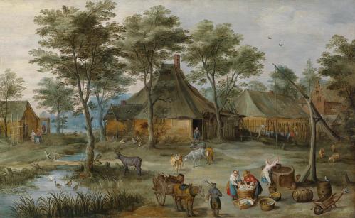
#FineArtFriday: Village scene with village well, by Josse de Momper, Jan Brueghel II

What I love about today’s image, Village scene with village well, by Joos de Momper (Josse) and credited also to Jan Brueghel II as a collaboration, is the sneaky sense of humor shown by the artists. When one looks closely, the cows are sturdy and lean with sweet eyes, and the birds flying above are fat, incredibly happy birds, as are the geese and ducks in the small pond.

The people, on the other hand, are clearly peasants, homely and sun-brown from a life spent working hard. They’re not nearly as lovely as their cattle. One can tell men from women only by their clothes.

The women do their laundry with determined efficiency, irritated at being interrupted in their work. What has the man asked for? We will never know, but the woman is going to let him have it, along with a piece of her mind.

I have spent much of the last two years immersing myself in 16th and 17th century Flemish and Netherlandish art and the culture of the times. They had an immense capacity for irreverent humor, inspired by the rough and tumble tavern culture the artists often gravitated to. They were known for sneaking their opinions and jokes into their work. I have a great fondness for the Brueghel family in particular and have studied their work at length—but I admit I am an amateur art-looker, not a trained expert.

Still, in my opinion, if Jan Brueghel II was involved in this painting, it was minimal. He was extraordinarily detail oriented and there are few fine details in this painting – but they are there, and I will show you where to look. The faces of the people are lumpy and nearly featureless, as if their faces didn’t matter. Overall, the impression of detail is there from a distance, but when looked at closely, the detail disappears.

The shapes of the cow’s eyes and the swirls that form the geese were done with a light, almost flippant brush – also not JB II’s later style. When I look at the pretty cattle, the lushness of the fat birds, and the hard, weather-browned homeliness of the peasants, I can only think that subtle comedic juxtaposition was intentional.

As I said above, upon closer inspection, this painting is whimsical and not one I would have ascribed to Jan Brueghel II, even though he is listed as one of the artists. This painting is most definitely not his usual heavy, highly detailed baroque style. I can find little in it that I would associate with his deliberate, precise brushwork and rich, saturated colors.

Instead, overall we have a happy, friendly view of a village, impressionistic in a way that Monet might recognize.

I believe the art historians have a reason for their assumption. If JB II did collaborate here, it was very early in his career, before he developed his own style and is based on this evidence: The barrels and the wheelbarrow are different, clear and not impressionistic. Beside them, the well is a blob, an unfinished shape indicating a well. The pans, barrels, and wheelbarrow are defined and perfect in their detail, alien objects dropped into this dreamscape. They were done by a different hand than the rest of the painting.

The trees and the landscape look much like those that appear in his father’s work, and we know de Momper collaborated frequently with Jan Brueghel the Elder in his workshop.

It maybe that the boy, Jan Brueghel the Younger, collaborated with de Momper on this piece in his father’s workshop, painting the small things  in the lower right-hand corner as part of his training. But I suspect this is largely the work of one artist, an elderly artist, no longer in his prime and nearing the end of his working life, Joos (Josse) de Momper.

About the Artist: (Via Wikipedia) Joos (Josse) de Momper, (1564–1635) was one of the foremost Flemish landscape painters between Pieter Brueghel the Elder  and Peter Paul Rubens. Brueghel’s influence is clearly evident in many of de Momper’s paintings

He primarily painted landscapes, the genre for which he was highly regarded during his lifetime. Only a small number of the 500 paintings attributed to de Momper are signed and just one is dated. The large output points to substantial workshop participation. He often collaborated with figure painters such as Frans Francken IIPeter SnayersJan Brueghel the Elder and Jan Brueghel the Younger, usually on large, mountainous landscapes, whereby the other painters painted the staffage (humans and animals) and de Momper the landscape.

He painted both fantasy landscapes, viewed from a high vantage point and employing a conventional Mannerist color transition of brown in the foreground to green and finally blue in the background, and more realistic landscapes with a lower viewpoint and more natural colors. His wide panoramas also feature groups of small figures.


Credits and Attributions:

Village scene with village well, by Josse de Momper, Jan Brueghel II, PD|100, via Wikimedia Commons https://commons.wikimedia.org/wiki/File:D%C3%B6rfliche_Szene_am_Ziehbrunnen_(Josse_de_Momper,_Jan_Brueghel_II).jpg  (accessed October 26, 2018).

Wikipedia contributors, “Joos de Momper,” Wikipedia, The Free Encyclopedia, https://en.wikipedia.org/w/index.php?title=Joos_de_Momper&oldid=861006304 (accessed October 26, 2018).

Comments Off on #FineArtFriday: Village scene with village well, by Josse de Momper, Jan Brueghel II

Filed under #FineArtFriday

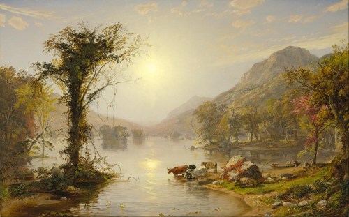
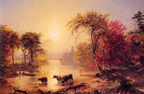
#FineArtFriday: Autumn On Greenwood Lake – two landscapes by Jasper Francis Cropsey

Jasper Francis Cropsey created many paintings of Greenwood Lake, a freshwater lake on the border between New York State and New Jersey, beginning in 1843. Over the next few decades, Cropsey painted numerous scenes of the area, many from the same viewpoint on the lake as today’s featured paintings, each with varying intensities of color.

What I love about these two paintings, done years apart, is  difference in the quality of  the light. One is done in an early autumn, the other later in the season. The subject matter is similar, cows drinking at waters edge, fishers and their rowboat, but the trees are different, more mature in the second, and it is later in the evening.

Clearly, this was a place that was beloved by the artist, as he returned year after year, and made many landscapes of this beach and the surrounding area.

About the artist (Via Wikipedia):

Jasper Francis Cropsey (February 18, 1823 – June 22, 1900) was an important American landscape artist of the Hudson River School. He was best known for his lavish use of color and, as a first-generation member from the Hudson River School, painted autumn landscapes that startled viewers with their boldness and brilliance. As an artist, he believed landscapes were the highest art form and that nature was a direct manifestation of God. He also felt a patriotic affiliation with nature and saw his paintings as depicting the rugged and unspoiled qualities of America.

Jasper Cropsey died in anonymity but was rediscovered by galleries and collectors in the 1960s.


Credits and Attributions:

Autumn on Greenwood Lake, ca. 1861, by Jasper Francis Cropsey [Public domain], via Wikimedia Commons

Autumn in America, by Jasper Francis Cropsey [Public domain], via Wikimedia Commons

Wikipedia contributors, “Jasper Francis Cropsey,” Wikipedia, The Free Encyclopedia, https://en.wikipedia.org/w/index.php?title=Jasper_Francis_Cropsey&oldid=842742891 (accessed October 19, 2018).

Comments Off on #FineArtFriday: Autumn On Greenwood Lake – two landscapes by Jasper Francis Cropsey

Filed under #FineArtFriday

#FineArtFriday: Falling Leaves, by Olga Wisinger-Florian

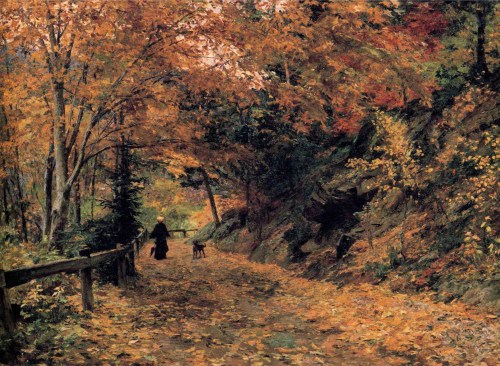
Falling Leaves, by Olga Wisinger-Florian, circa 1899, depicts a woman and her dog enjoying a quiet walk in the serenity of an autumn day. Using light and shadow, the artist employs an impressionistic style to convey the forest. Nothing is drawn with precision, yet everything is shown in its entirety. The feeling of this pieces is a little dreamlike–she carries an umbrella, so she’s prepared for rain. She is dressed all in black except for her yellow hat. Leaves in all the many shades of green, gold, and red cling to their trees; the damp, aging rails of the wooden fence offers a flimsy barrier to the carriages and motor vehicles that may travel the roadside. Leaves cover the dirt road, and more are falling down, and the dog trots happily along beside her mistress—the story is there for us to see.

About the Artist:

According to Wikipedia, Olga Wisinger-Florian’s early paintings can be assigned to what is known as Austrian Mood Impressionism. In her landscape paintings she adopted Schindler’s sublime approach to nature. The motifs she employed, such as views of tree-lined avenues, gardens and fields, were strongly reminiscent of her teacher’s work. After breaking with Schindler in 1884, however, the artist went her own way. Her conception of landscapes became more realistic. Her late work is notable for a lurid palette, with discernible overtones of Expressionism. With landscape and flower pictures that were already Expressionist in palette by the 1890s, she was years ahead of her time.


Credits and Attributions:

Falling Leaves, by Olga Wisinger-Florian, ca 1899 [Public domain], via Wikimedia Commons

Wikipedia contributors, “Olga Wisinger-Florian,” Wikipedia, The Free Encyclopedia, https://en.wikipedia.org/w/index.php?title=Olga_Wisinger-Florian&oldid=852607929 (accessed October 11, 2018).

Wikimedia Commons contributors, “File:Olga Wisinger-Florian – Falling Leaves.JPG,” Wikimedia Commons, the free media repository, https://commons.wikimedia.org/w/index.php?title=File:Olga_Wisinger-Florian_-_Falling_Leaves.JPG&oldid=273565541 (accessed October 11, 2018).

2 Comments

Filed under #FineArtFriday