Monthly Archives: April 2019

#FineArtFriday: Christ in the Storm on the Sea of Galilee by Rembrandt van Rijn, 1633

Today’s image is of a picture that was stolen in 1990 and has never been recovered.

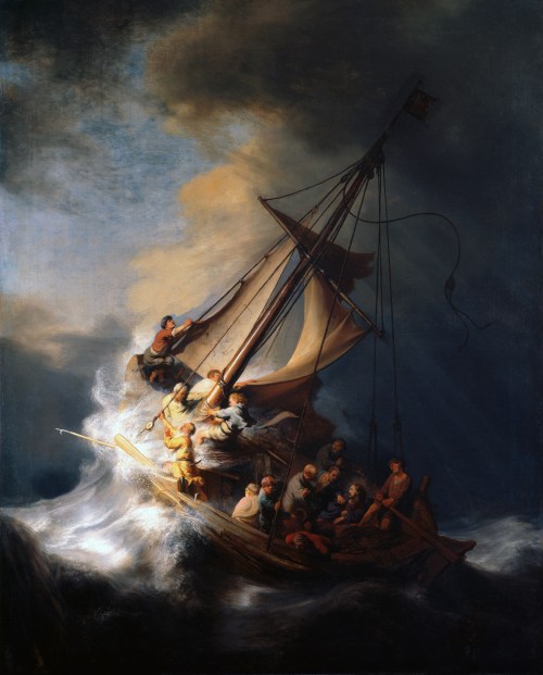
Christ in the Storm on the Sea of Galilee was painted during one of the happiest years of Rembrandt van Rijn’s turbulent life and depicts the miracle of Jesus calming the storm on the Sea of Galilee. A devout Christian, Rembrandt painted it from the description of the event as reported by the Apostle Mark, in the fourth chapter of his Gospel. As far as is known, it is the only seascape Rembrandt ever painted.

Constantijn Huygens, the father of Dutch mathematician and physicist Christiaan Huygens, had seen Rembrandt’s talent and helped him gain important commissions from the Court of The Hague. Many of his best religious paintings date from the years during which he had the favor of both Huygens and Prince Frederick Hendrick.

At the end of 1631, Rembrandt had moved to Amsterdam. The city was becoming the new business capital of the Netherlands, so there was great opportunity there for artists. In Amsterdam, Rembrandt had begun to paint portraits for the first time, and by 1633, his work was in high demand. His religious paintings and history paintings were also receiving the highest praise.

At first, he lived with an art dealer, Hendrick van Uylenburgh, which was where he met Hendrick’s cousin, Saskia van Uylenburgh. During 1633, the year in which Christ on the Sea of Galilee was painted, he was courting Saskia, hoping to marry her. He was earning a good income as a portraitist, and a bright future loomed. He must have felt in many ways as if he had the world by the tail.

What I love about this painting:

Rembrandt’s colors are vivid, standing out against the darkness of the storm. An entire story is captured in this image. The sea is terrifying, monstrous waves battering the ship, men panicking, trying to gain control. The terror of the event is clearly shown, and you feel fear for the men too. In the midst of chaos, Jesus awakes, calm despite the panic around him. Each face has a different expression, and one, a man holding a rope in one hand and pressing his cap to his head with the other, looks directly at us—Rembrandt himself.

The Gospel of Mark records the incident:

He woke up and rebuked the wind, and said to the sea, “Peace! Be still!” Then the wind ceased, and there was a dead calm. He said to them, “Why are you afraid? Have you still no faith?” And they were filled with great awe and said to one another, “Who then is this, that even the wind and the sea obey him?

Rembrandt, a frail man but a devout believer, lived the story as he painted it, as do all good storytellers.

About the theft, via Wikipedia:

On March 18, 1990, 13 works of art valued at a combined total of $500 million were stolen from the Isabella Stewart Gardner Museum in Boston. In the early hours, guards admitted two men posing as police officers responding to a disturbance call. Once inside, the thieves tied up the guards and over the next hour committed the largest-value recorded theft of private property in history. Despite efforts by the Federal Bureau of Investigation (FBI) and multiple probes around the world, no arrests have been made, and no works have been recovered.

The stolen works had originally been purchased by art collector Isabella Stewart Gardner (1840–1924) and intended to be left on permanent display at the museum with the rest of her collection. Since the collection and its layout are permanent, empty frames remain hanging both in homage to the missing works and as placeholders for their potential return. Experts are puzzled by the choice of paintings that were stolen, especially since more valuable artwork was left untouched. Among the stolen works was The Concert, one of only 34 known works by Vermeer and thought to be the most valuable unrecovered painting, valued at over $200 million.[when?] Also missing is The Storm on the Sea of GalileeRembrandt‘s only known seascape. Other works by Rembrandt, DegasManet, and Flinck were also stolen.

Christ in the Storm on the Sea of Galilee by Rembrandt van Rijn

  • Artist:   Rembrandt  (1606–1669)
  • Genre: religious art
  • Date: 1633
  • Medium: oil on canvas
  • Dimensions: Height: 160 cm (62.9 ″); Width: 128 cm (50.3 ″)
  • Current Location: Unknown

Sources and Attributions:

Wikimedia Commons contributors, “File:Rembrandt Christ in the Storm on the Lake of Galilee.jpg,” Wikimedia Commons, the free media repository, https://commons.wikimedia.org/w/index.php?title=File:Rembrandt_Christ_in_the_Storm_on_the_Lake_of_Galilee.jpg&oldid=341966464 (accessed April 4, 2019).

Wikipedia contributors, “Calming the storm,” Wikipedia, The Free Encyclopedia, https://en.wikipedia.org/w/index.php?title=Calming_the_storm&oldid=882782126 (accessed April 4, 2019).

The Isobel Stewart Gardner Museum, CHRIST IN THE STORM ON THE SEA OF GALILEE, 1633, https://www.gardnermuseum.org/experience/collection/10953 (accessed April 4, 2019).

2 Comments

Filed under #FineArtFriday

How to use the Track Changes Function #amwriting

Part of being a writer is going through the experience of having your work edited by a professional editor. Submissions that have been accepted by anthologies and publications may require a little editing prior to publication. We do our best to submit a clean manuscript, but none of us are perfect.

Editors often use a function of Word that is called “Track Changes” along with inserting comments in the right-hand column. When you are new to this process, it can be confusing. It may make you think he has “mucked up your manuscript” because he may have made changes that are marked in red and which surprised you.

Trust me, you have the final say on all changes that have been made, and you can “accept” or “reject” each suggested change. If you reject a suggestion, the text reverts back to your original prose.

Just a note: before you submit your work to an editor, you must do what I think of as “Due Diligence.” If you have hired an editor for a novel-length manuscript that was poorly proofed, tracked changes can be distracting, looking like a wall of red. If that is the case, the manuscript probably wasn’t ready for editing. Editors can only do so much – you must submit work that is as clean as you can make it, and they will help you clean up the rest.

A good way to catch the majority of typos and dropped or missing words is to use the “Read Aloud” function (on the review tab) or read it aloud yourself.

When a manuscript is too rough, some editors will choose to edit only the first few chapters and put most of their suggestions into the comment column rather than using tracking. Editing via keying suggestions in the comment column can be quite time-consuming. They will ask you to consider the suggestions they have made and make revisions in the whole manuscript accordingly, and then resend the ms once those changes have been made.

MS Word has four ways to show tracked changes:

  • Simple Markup: This shows the final version without inline markups. Red or black markers will appear in the left margin to indicate where a change has been made.
  • All Markup: This shows the final version with inline markups.
  • No Markup: This shows the final version and hides all markups.
  • Original: This shows the original version and hides all markups.

When I am editing for a client, I use “All Markup” and add comments as needed.

Places where I insert a suggested change will be in red and have a line beneath them. Deleted items will be in red and have a line through them, or in the case of commas, above them.

To accept or reject changes:

  1. Select the change you want to accept or reject.
  2. From the Review tab, click the Accept or Reject
  3. The markup will disappear, and Word will automatically jump to the next change. You can continue accepting or rejecting each change until you have reviewed all of them.
  4. When you’re finished, click the Track Changes command to turn off Track Changes. Just click on it, and the dark gray will return to the same shade of gray as the rest of the ribbon.

The automatic comments generated by “track changes” will disappear when you resolve the suggested changes. Those will say “Inserted” or “Deleted” followed by the word or punctuation that was changed.

If your editor has made separate comments regarding larger issues, such as suggestions to move a section to a different place for continuity, they won’t disappear from the comment column when you accept or reject tracked changes. You’ll have to delete them separately.

  1. On the Review tab, in the Comments section, click Next to select a comment.
  2. On the Review tab, click Delete.

To delete all comments at once, click the arrow next to Delete, and then click Delete All Comments in Document.

This is how a document might look when it comes back from the editor. The left column shows a line indicating a change was made, the change itself is in red, and a comment was automatically generated explaining what that change was.
Some authors get exceedingly angry when the editor of an anthology requests some changes in the story they have submitted. Editors have a vision of how the whole book will flow when it is complete, and they may ask for some small changes so that the stories transition well.

If the changes are reasonable (and most are), do make them. If you strongly disagree, wait until you cool down before responding.

Once you have a handle on your irritation, write a note explaining why you don’t feel those changes are right for that piece. It could be that the editor just didn’t understand where you were going with it, and a few minor tweaks along with a calm discussion will resolve the problem.

Google Docs has a track changes function, and I am sure all other word processing programs do too. Their processes will likely be similar to what I have described, and you can go online to find out what the differences are. But Word is the program I use, so I am most familiar with that.

2 Comments

Filed under writing

Fonts and Headers #amwriting

Today we are going to discuss fonts and why we use “industry standard” fonts for all our submissions. Publishers have specific, standardized formatting they want you to use, and these guidelines are posted on their websites. When a call for submissions goes out, their editors will have no time to deal with badly formatted manuscripts. If you don’t follow their guidelines, they will assume you aren’t a professional and won’t read your work.

If you have a specific contest or publication in mind that you plan to submit your manuscript to, go to the publication’s website and read the standards and requirements they have laid out.

A good guide for making a manuscript conform to industry standards can be found at William Shunn’s website: Proper Manuscript Format: Short Story Format.

That looks complicated, you say. It isn’t, but you do need to learn how to use your word processing program, and I am here to help you.

I use Word as my word processing program, but most word processing programs (Open Office, Google Docs) follow a similar process as my program does.

Running across the top of the page is something called the ribbon, and this is your toolbox. Everything you need to create a manuscript is right there, waiting for you to learn to use it. On the right-hand side, by the question mark is a tiny arrow for expanding or hiding the ribbon – and we are going to expand it so we have access to all the tools we will need.

Now we must select the font. As I said before, I use Microsoft WORD, and like every other word-processing program, it has many fancy fonts you can choose from and a variety of sizes.

You don’t want fancy. Stick with the industry standard fonts: Times New Roman or Courier in 12 pt. These are called ‘Serif’ fonts and have little extensions that make them easier to read.

If you are using MS WORD, here are a few simple instructions for changing your fonts.

Open your manuscript document, and Click on the tab marked ‘Home.’  In the upper right-hand corner of the ribbon across the top of the page in the editing group, click:

select> select all. This will highlight the entire manuscript.

With the ms still highlighted, go to the font group, on the left-hand end of the ribbon. The default font, or predesigned setting, will probably say ‘Calibri (Body)’ and the size will be .11.

You can change this by opening the menu. Scroll down to Times New Roman or Courier (depending on the publisher’s guidelines). Click on that, and the font for the entire ms will be that font. If you have clicked on the wrong font, it can be undone by clicking the back-arrow (upper left hand corner).  Once you are satisfied with your changes, click save.

Now, with the ms still highlighted, we are going to format our paragraphs. Having it double-spaced allows for longer comments and is easier for an editor to read. The specific details for formatting paragraphs can be found in last week’s post, Formatting Your Paragraphs. It is a process that is absolutely critical.

Most publishers and editors want the header formatted. Each page should be clearly marked with your name and/or the title of the book as well as the page number. Many publishers will still accept print copies of manuscripts, but want them UNBOUND. No staples, not in a ring binder. You may use one large binder clip if you just can’t resist, but otherwise, they want the manuscript stacked and inserted in a manila envelope.

Accidents happen: if the printout of the manuscript accidentally falls off a desk, it can easily be reassembled, and the editor will always know that you wrote that story.

To make your header:

  • Open the “insert” tab.
  • Click on “page number.”  This opens a new menu.
  • Add the page numbers using the small dropdown menu.
  • Insert the title and your author name just before the page number.

That will be your header.

This is how the ribbon and menus look:Sometimes, a publisher will specify that the first (title) page have no header or page number, but they want the header and page numbers to begin on page two.

To make the page numbers begin on page two:

  1. Click anywhere in the document.
  2. On the Page Layout tab, click the Page Setup Dialog Box Launcher, and
  3. then click the Layout
  4. Under Headers and footers, select the Different first page check box, and then click OK.

What goes on the first page? Your first page should include:

  • The name of the work.
  • The approximate word count, some will want it only to the nearest hundred.
  • In the upper left, your contact details formatted in the same font and size as the manuscript font.

Now your manuscript:

  1. is aligned left.
  2. has 1 in. margins.
  3. is double-spaced.
  4. has formatted indented paragraphs.
  5. The header contains the title, author name, and page numbers, and is aligned right.
  6. The first page contains your mailing address and contact information in the upper left hand corner.

Good luck with your submissions. Selling work to anthologies and magazines is the best way for an indie to build a reputation as an author. You will be competing with many other authors, all of them as creative and talented as you are, so making your work look as professional as is possible will give you an edge.

8 Comments

Filed under writing