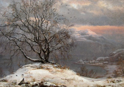
Category Archives: #FineArtFriday

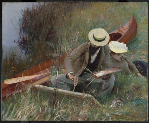
#FineArtFriday: An Out-of-Doors Study by John Singer Sargent (revisited)

Artist: John Singer Sargent  (1856–1925)

Title: An Out-of-Doors Study

Description: English: Paul César Helleu Sketching with his wife Alice

Signature bottom right: John S. Sargent

Date: 1889

Medium: oil on canvas

Dimensions: Height: 65.9 cm (25.9 ″); Width: 80.7 cm (31.7 ″)

The weather has been dark and dreary here in the Pacific Northwest. I need sunny day, and I remembered this image. An Out-of-Doors Study, 1889, is by expatriate American artist, John Singer Sargent. It depicts fellow artist and great friend, Paul César Helleu sketching with his wife Alice Guérin. What a lovely day it was, for them to be sitting on the grass, enjoying a carefree moment in life.

What I love about this painting:

This painting depicts a day in the life of two great artists. The grass looks very like that which grows beside streams in my part of the world. The colors are that mix of green and brown that long grass has when summer is just beginning. The blue sky is reflected in the water. They had taken advantage of a fine day in late May or June perhaps, fortunate to have an outing before high summer turns the meadow grass crisp and brown.

The quality of light that day was perfect for a picnic beside the water. One can imagine the two artists working on their individual projects and chatting, having a relaxing lunch, and then taking a quiet walk. We can even wonder if, later, they might have taken the canoe out.

January has been overcast and rainy with little chance of seeing sunshine. I could use a day like this, a picnic beneath blue skies, and a gathering of friends beside a quiet pond.

About the artist, via Wikipedia:

Sargent’s early enthusiasm was for landscapes, not portraiture, as evidenced by his voluminous sketches full of mountains, seascapes, and buildings. Carolus-Duran’s expertise in portraiture finally influenced Sargent in that direction. Commissions for history paintings were still considered more prestigious, but were much harder to get. Portrait painting, on the other hand, was the best way of promoting an art career, getting exhibited in the Salon, and gaining commissions to earn a livelihood.

In a time when the art world focused, in turn, on ImpressionismFauvism, and Cubism, Sargent practiced his own form of Realism, which made brilliant references to VelázquezVan Dyck, and Gainsborough.


Credits and Attributions:

Wikimedia Commons contributors, “File:Sargent – Paul Helleu Sketching with his Wife.jpg,” Wikimedia Commons, the free media repository, https://commons.wikimedia.org/w/index.php?title=File:Sargent_-_Paul_Helleu_Sketching_with_his_Wife.jpg&oldid=273586527 (accessed December 5, 2019).

Wikipedia contributors, “John Singer Sargent,” Wikipedia, The Free Encyclopedia, https://en.wikipedia.org/w/index.php?title=John_Singer_Sargent&oldid=927728162 (accessed December 5, 2019).

2 Comments

Filed under #FineArtFriday

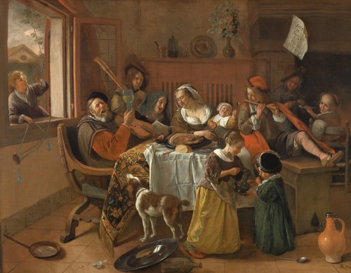
#FineArtFriday: The Merry Family, by Jan Steen (revisited)

Jan Steen was fond of painting peasants and ordinary people, and this picture is a good example of that.

What I love about this image is the chaos. Is this a New Year’s party? I hope so.

The clutter of pans and dishes heedlessly fallen to the floor, the boisterous enjoyment of wine and song, and the obvious lack of parental restraint is wonderfully depicted. The numerous children are smoking and drinking to excess, vices that weren’t acceptable diversions for youngsters in those days any more than they are now. The baby is exceedingly chubby, which was uncommon and represents the vice of gluttony–in one hand it holds bread and in the other it waves a spoon.

I suspect the children grew up with a similar love of wine and song as their parents.

The note on the wall contains the moral of the story. According to the Rijksmuseum website, “The note hanging from the mantelpiece gives away the moral of the story: ‘As the old sing, so shall the young twitter.’ What will become of the children if their parents set the wrong example?”

The Age of the Puritan had swept across Europe and while it was waning in the mid-seventeenth century, puritanism had influenced life in Holland as much as elsewhere. This painting is a wonderful visual exhortation reminding the good people to live a sober life. Steen himself was not a puritan, as he was born into a family of brewers and ran taverns and breweries off and on throughout his life. But he did need to sell his paintings as he was never a successful businessman, and his allegorical paintings were quite popular.

Quote from Wikipedia: Daily life was Jan Steen’s main pictorial theme. Many of the genre scenes he portrayed, as in The Feast of Saint Nicholas, are lively to the point of chaos and lustfulness, even so much that “a Jan Steen household,” meaning a messy scene, became a Dutch proverb (een huishouden van Jan Steen). Subtle hints in his paintings seem to suggest that Steen meant to warn the viewer rather than invite him to copy this behaviour. Many of Steen’s paintings bear references to old Dutch proverbs or literature. He often used members of his family as models, and painted quite a few self-portraits in which he showed no tendency of vanity.


Credits and Attributions:

The Merry Family, Jan Steen, 1668 PD|100 via Wikimedia Commons

Moral (English translation) quoted from Rijksmuseum website,  https://www.rijksmuseum.nl/en/collection/SK-C-229, accessed 17 May 2018.

Wikipedia contributors. “Jan Steen.” Wikipedia, The Free Encyclopedia. Wikipedia, The Free Encyclopedia, 3 Jan. 2018. Web. 17 May. 2018.

Comments Off on #FineArtFriday: The Merry Family, by Jan Steen (revisited)

Filed under #FineArtFriday

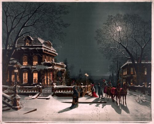
#FineArtFriday: Christmas Eve, Chromolithograph by Joseph C. Hoover & Sons (revisited)

No_Known_Restrictions_Christmas_Eve_by_J._Hoover,_no_date_LOC_2122063062

Description: Christmas Eve, chromolithograph by J. C. Hoover and Sons

Date: 1880

This is a quintessential calendar or Christmas card picture, and I love it. It appeals to every sentiment a viewer might have of home and community and Christmas traditions.

This painting has many nostalgic style elements, which is why I find it so appealing. It has a Courier and Ives feel to it, and is reminiscent of George Henry Durie’s work, although it was painted seventeen years after his death. I don’t know who the artist was that painted this picture as he or she isn’t credited. It could have been one of the sons, or one of the many women artists employed in the industry at the time.

A significant number of artists employed in the publishing industry during the 19th and early 20th century were women. They painted illustrations for greeting cards, books, magazines, and newspapers. Often women were not acknowledged as the original creators, although some, like Mary Cassatt, did achieve fame and credit for their work.

About the publisher, via Art and Antiques Gallery’s website:

Hoover & Sons issued popular prints for the masses in the last decade of the 19th century and the first decade of the 20th century. This was a business much like Currier & Ives, though Hoover & Sons issued chromolithographs. Joseph Hoover was one of the few native-born Americans who achieved success with chromolithography. Hoover started by making elaborate wood frames in Philadelphia in 1856, but within a decade or so he began to produce popular prints. Initially he mostly worked for other publishers, including Duval & Hunter, and he worked with noted Philadelphia artist James F. Queen. He also issued a few hand-colored, popular prints of considerable charm. During the Centennial, Hoover won a medal for excellence for his chromolithographs after Queens renderings.

In the 1880s, Hoover began to print chromolithographs, installing a complete printing plant by 1885. By the end of the century, his firm was one of the largest print publishers in the county, with an average annual production of between 600,000 to 700,000 pictures. Using chromolithography, Hoover was able to produce attractive, colorful prints that were still affordable for anyone to use as decoration for home and office. The audience for Hoover’s prints was quite wide, extending throughout the United States, and overseas to Canada, Mexico, England and Germany. The subjects issued by the firm are extensive, including genre scenes, still life images, views of American locations, and generic landscapes, including a series of charming winter scenes. [1]

About Chromolithography, via Wikipedia:

Chromolithography is a chemical process. The process is based on the rejection of water by grease. The image is applied to stone, grained zinc or aluminium surfaces, with a grease-based crayon or ink. Limestone and zinc are two commonly used materials in the production of chromolithographs, as aluminium corrodes easily. After the image is drawn onto one of these surfaces, the image is gummed-up with a gum arabic solution and weak nitric acid to desensitize the surface. Before printing, the image is proofed before finally inking up the image with oil-based transfer or printing ink. In the direct form of printing, the inked image is transferred under pressure onto a sheet of paper using a flat-bed press. The offset indirect method uses a rubber-covered cylinder that transfers the image from the printing surface to the paper.

Alois Senefelder, the inventor of lithography, introduced the subject of colored lithography in his 1818 Vollstaendiges Lehrbuch der Steindruckerey (A Complete Course of Lithography), where he told of his plans to print using colour and explained the colours he wished to be able to print someday. Although Senefelder recorded plans for chromolithography, printers in other countries, such as France and England, were also trying to find a new way to print in colour. Godefroy Engelmann of Mulhouse in France was awarded a patent on chromolithography in July 1837, but there are disputes over whether chromolithography was already in use before this date, as some sources say, pointing to areas of printing such as the production of playing cards. [2]


Credits and Attributions:

[1] Quote from Art and Antiques Gallery https://www.pbase.com/artandantiquesgallery/joseph_hoover_and_sons_prints (accessed December 24, 2021).

[2] Wikipedia contributors, “Chromolithography,” Wikipedia, The Free Encyclopedia, https://en.wikipedia.org/w/index.php?title=Chromolithography&oldid=1058870233 (accessed December 24, 2021).

Image Credit: Public Domain. Library of Congress via pingnews. Additional information from source: TITLE: Christmas Eve CALL NUMBER: PGA – Hoover, J.–Christmas Eve (D size) [P&P] REPRODUCTION NUMBER: LC-DIG-01601 (digital file from original print) LC-USZ62-49683 (b&w film copy neg.) RIGHTS INFORMATION: No known restrictions on publication. MEDIUM: 1 print. CREATED/PUBLISHED: [no date recorded on shelflist card]

2 Comments

Filed under #FineArtFriday, writing

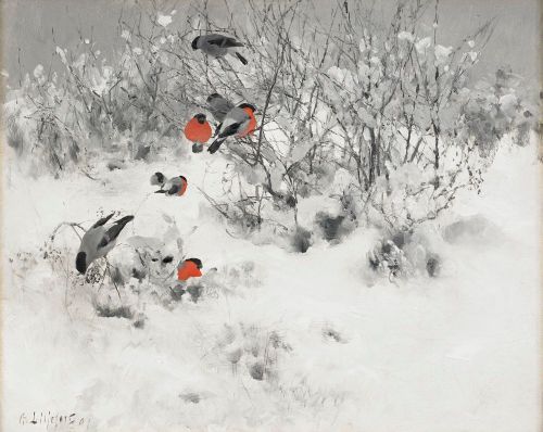
#FineArtFriday: Winter landscape with bullfinches by Bruno Liljefors 1891

Bruno_Liljefors_-_Winter_landscape_with_bullfinches_1891Artist: Bruno Liljefors  (1860–1939)

Title: English: Winter landscape with bullfinches

Date: 1891

Medium: oil on canvas

Dimensions: height: 40 cm (15.7 in); width: 50 cm (19.6 in)

What I love about this painting:

This is a Christmas card kind of scene, and I’m sure I have seen it featured on many cards over the years. However, the birds are what attracted me to this painting. Birds of all varieties enthrall me, and these birds are gorgeous.

I love the colors of these bullfinches, love the natural way they are shown roosting in the shrubbery. These birds are European and are different from the bright yellow goldfinches I know here in the Pacific Northwest.

My childhood home had begun its life as a one room hunting cabin that had been converted to a mid-century rambler and turned into a family home in the 1950s. It was situated on a large stretch of beach on the southeastern shore of Black Lake near Olympia, Washington. Our property was centered in a thick forest of Douglas fir, western red cedars, and hemlock trees.

My parents were avid gardeners, and besides the large veggie garden and flower beds, we had many ornamental shrubs. Native Oregon Grape, salmon berries, and salal bordered the edges of our property.

One of my earliest memories is that of watching the winter birds. First, they perched in shrubs, then they flew off, and then they were back again.

Dark-eyed juncos, sparrows, and chickadees gathered in the shrubs. Larger birds, such as crows, owls, and ospreys roosted in the trees. On the lake, ducks, Canada geese, and grebes swam along with the occasional swan or loon.

Birdwatching provided endless entertainment during a time when our television antenna only picked up the signals from two stations. While we did see shows like Star Trek, Batman, Get Smart, and the Addams Family in the evenings, TV overall was a wash, as storms had cut the power to our home many times. Some winters were worse than others, and sometimes, we were without power for several weeks, waiting for the linemen to hook us back up.

To this day, birdwatching is one of my family’s favorite things to do.

About the Artist, via Wikipedia:

Bruno Andreas Liljefors, 14 May 1860 – 18 December 1939) was a Swedish artist. He is perhaps best known for his nature and animal motifs, especially with dramatic situations. He was the most important and probably most influential Swedish wildlife painter of the late nineteenth and early twentieth century. He also drew some sequential picture stories, making him one of the early Swedish comic creators. [1]

To read more about the artist, go to Bruno Liljefors – Wikipedia.


Credits and Attributions:

IMAGE: Wikimedia Commons contributors, “File:Bruno Liljefors – Winter landscape with bullfinches 1891.jpg,” Wikimedia Commons, https://commons.wikimedia.org/w/index.php?title=File:Bruno_Liljefors_-_Winter_landscape_with_bullfinches_1891.jpg&oldid=812150991 (accessed December 14, 2023).

[1] Wikipedia contributors, “Bruno Liljefors,” Wikipedia, The Free Encyclopedia, https://en.wikipedia.org/w/index.php?title=Bruno_Liljefors&oldid=1170413866 (accessed December 14, 2023).

Comments Off on #FineArtFriday: Winter landscape with bullfinches by Bruno Liljefors 1891

Filed under #FineArtFriday

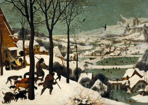
#FineArtFriday: Hunters in the Snow by Pieter Brueghel the Elder 1565

Pieter_Bruegel_the_Elder_-_Hunters_in_the_Snow_(Winter)_-_Google_Art_ProjectArtist: Pieter Brueghel the Elder (1526/1530–1569)
Title: English: Hunters in the Snow (German: Jäger im Schnee) (Winter)

Date: 1565

Medium: oil on oak wood

Dimensions: height: 1,170 mm (46.06 in); width: 1,620 mm (63.77 in)

Collection: Kunsthistorisches Museum

What I love about this painting:

This is one of Pieter Brueghel the Elder’s most famous paintings. Even if one doesn’t know who originally painted it, they have very likely seen it at some point, perhaps on a calendar or a Christmas card.

Critics didn’t praise his work, as it is unabashedly primitive, created for the common person’s enjoyment. Nonetheless, his work is still highly prized by collectors. Even now, four centuries after his era, ordinary people can relate to his work because he had such a sense of humor and the ability to show the truth about humanity and inhumanity in his work.

He lived during a time of religious revolution in the Netherlands, and walking the line between both factions must have been difficult. Some have said that Bruegel (and possibly his patron) were attempting to portray an ideal of what country life used to be or what they wish it to be.

I disagree. On the surface and from a distance, this is a bucolic scene depicting ordinary peasants enjoying the winter. But when you look deeper, really look at it, you can see the irony of it, the honesty that Brueghel hid in plain sight.

Brueghel used symbolism to convey paradox and gallows humor in every painting. Winter was harsh and for the average person, survival required a lot of work, sometimes for nothing.

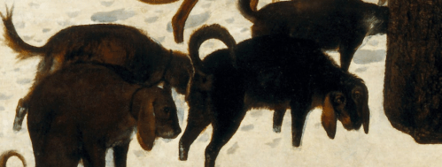
He shows us the hunters returning with empty game bags, the lone corpse of a skinny fox, and little else. One dog looks at us with starving eyes, as if hoping for scraps.

detai_Dogs_hunters_in_the_snow_Brueghel

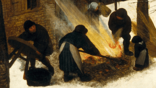
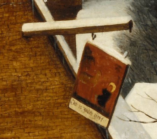
The tavern’s sign is about to fall down, a large hint that all is not well. That symbolic broken sign tells us the owners are bankrupt.

detai_sign_hunters_in_the_snow_Brueghel

The owners are cooking outside, directly in front of the door. A woman brings a bundle of straw out of the inn to use as fuel, while in the distance an ox-drawn wagon is heavily laden with firewood. Where is it going? Not to their inn, that is for sure. And most intriguingly, a man is carrying a table away. Is he the tax collector? A thief?

detai_innkeeprs_cooking_hunters_in_the_snow_Brueghel

A rabbit has crossed the hunters’ path and evaded their snares.

detai_rabbit_tracks_hunters_in_the_snow_Brueghel

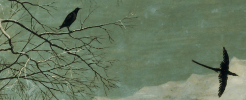
Birds of ill omen roost in the trees above the inn and the hunters and fly above the revelers, a portent of worse days to come.

detai_birds_hunters_in_the_snow_Brueghel

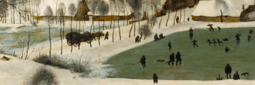
But Brueghel’s people have hope and faith that things will improve. In the distance (the future) people are playing winter games.

detai_skaters_hunters_in_the_snow_BrueghelBut they are indistinct and far away, shown in a fantastic, mountainous landscape, rather than the flat terrain of the Netherlands. It is almost as if they are visions of what winter could be when the harvest had been good, rather than the truth of the lone fox, hounds with empty bellies, a bankrupt tavern, and the rabbit that got away.

About this painting, via Wikipedia, the Fount of All Knowledge:

The Hunters in the Snow (Dutch: Jagers in de Sneeuw), also known as The Return of the Hunters, is a 1565 oil-on-wood painting by Pieter Bruegel the Elder. The Northern Renaissance work is one of a series of works, five of which still survive, that depict different times of the year. The painting is in the collection of the Kunsthistorisches Museum in ViennaAustria. This scene is set in the depths of winter during December/January.

The painting shows a wintry scene in which three hunters are returning from an expedition accompanied by their dogs. By appearances the outing was not successful; the hunters appear to trudge wearily, and the dogs appear downtrodden and miserable. One man carries the “meager corpse of a fox” illustrating the paucity of the hunt. In front of the hunters in the snow are the footprints of a rabbit or hare—which has escaped or been missed by the hunters. The overall visual impression is one of a calm, cold, overcast day; the colors are muted whites and grays, the trees are bare of leaves, and wood smoke hangs in the air. Several adults and a child prepare food at an inn with an outside fire. Of interest are the jagged mountain peaks which do not exist in Belgium or Holland. [1]


Credits and Attributions:

Wikimedia Commons contributors, “File:Pieter Bruegel the Elder – Hunters in the Snow (Winter) – Google Art Project.jpg,” Wikimedia Commons, https://commons.wikimedia.org/w/index.php?title=File:Pieter_Bruegel_the_Elder_-_Hunters_in_the_Snow_(Winter)_-_Google_Art_Project.jpg&oldid=723208718 (accessed December 6, 2023).

[1] Wikipedia contributors, “The Hunters in the Snow,” Wikipedia, The Free Encyclopedia, https://en.wikipedia.org/w/index.php?title=The_Hunters_in_the_Snow&oldid=1186886152 (accessed December 6, 2023).

Comments Off on #FineArtFriday: Hunters in the Snow by Pieter Brueghel the Elder 1565

Filed under #FineArtFriday, writing

#FineArtFriday: African Violet Skies by Clark Thomas Carlton

African_Violet_Skies_by_Clark_Thomas_CarltonTITLE: African Violet Skies

BY: Clark Thomas Carlton

MEDIUM: Acrylics on canvas

DATE: ca. 2016

What I love about this painting:

Today we’re dipping into 21st century fantasy landscape art. African Violet Skies by Clark Thomas Carlton is an explosion of color and form. The colors are so intense, I feel as if I could taste them.

I love how delicate the trees and foliage are as compared to the fierce thrust of the landscape. The mountains seem to burst through the earth at high speed, reaching for the incredible night sky, as if they would touch the moon.

This is true mastery of storytelling in an image as well as form and color. He gives us drama, and romance, and violence, and above it all, the moon softly gliding behind the delicate clouds, reflected on the serene stream below.

This painting is exactly what I need after four days of thick fog that refused to lift, followed by eternal rain.

About the Artist, via Wikipedia, the free encyclopedia

Clark Thomas Carlton is a novelist, playwright, and a screen and television writer living in Los Angeles. He has also worked as a producer of reality television. Carlton is best known for his science fiction/fantasy novel Prophets of the Ghost Ants published by HarperCollins Voyager in 2016.

Carlton is the author of Prophets of the Ghost Ants, Book 1 of the Antasy Series published by HarperCollins Voyage on December 13, 2016.  The indie version of the book was named a Best of 2011 by Kirkus Reviews.

In 1997, Carlton was awarded the Drama-Logue Critics Award for his play Self Help or the Tower of Psychobabble along with playwrights Neil Simon and Henry Ong. The play, a satire of the psychotherapy industry, was performed in Santa Monica, Palm Springs, Los Angeles and West Hollywood and directed by Michael Kearns and was also produced in Chicago.

Carlton is a painter who embraces the description of his work as “Grandma Moses on acid”. His work has been displayed through the Palm Springs Art Museum Annex through the Palm Springs Arts Council.

In December 1999, Carlton released an album of songs titled Salt Water through CD baby where he accompanied himself on acoustic guitar.  At present he is at work on Gardens of Babylon, a synth pop opera about the building of the Hanging Gardens of Babylon. The opera was written with his partner, Mike Dobson, an Emmy award winning music supervisor and composer on the daytime drama, the Young and the Restless. [1]


Credits and Attributions:

IMAGE: African Violet Skies by Clark Thomas Carlton. Wikimedia Commons contributors, “File:African Violet Skies by Clark Thomas Carlton.jpg,” Wikimedia Commons, https://commons.wikimedia.org/w/index.php?title=File:African_Violet_Skies_by_Clark_Thomas_Carlton.jpg&oldid=785979611 (accessed November 30, 2023).

[1] Wikipedia contributors, “Clark Thomas Carlton,” Wikipedia, The Free Encyclopedia, https://en.wikipedia.org/w/index.php?title=Clark_Thomas_Carlton&oldid=1171925222 (accessed November 30, 2023).

1 Comment

Filed under #FineArtFriday

#FineArtFriday: Peasant Wedding, David Teniers II (revisited)

Today is the day after Thanksgiving here in the US. Many people are out doing their Christmas shopping or looking for Black Friday bargains.

But not my husband and me. We will rest up, enjoy leftovers, and visit the storage unit to pick up our bin full of Christmas decorations. Maybe we’ll decorate the balcony, offer a little cheer to the neighbors across the way.

I love today’s painting, and yesterday’s family gathering made me think of revisiting it. The Peasant Wedding by the Flemish painter, print maker, David Teniers the Younger, is full of movement and life, and shows real people having a great party, not unlike we do in our modern world.

The musicians are playing, some people are singing, some are talking, and some are dancing. Most are eating and just enjoying themselves. A few of the men are becoming a little familiar with the ladies, who are not really having any of that, thank you. A few people have indulged a little too much.

Even the dog is having a good time.

Teniers was a prolific and skilled artist, a man remembered today as much for his lofty social ambitions as he is for the quantity and excellence of his work. He wanted to be a nobleman; indeed he once falsely laid claim to being descended from a noble line. Several times he nearly succeeded in this ambition, but nobility was one accolade he never achieved.

This world can be a hard place for some people to live. I am fortunate to be safe and well-fed, luxuries I thank God for every day. Wherever you are in this big world, I hope you have plenty to give thanks for.

About David Teniers II, from Wikipedia:

Teniers married into the famous Brueghel artist family when Anna Brueghel, daughter of Jan Brueghel the Elder, became his wife on 22 July 1637. Rubens, who had been the guardian of Anna Brueghel after her father’s death, was a witness at the wedding.

Through his marriage Teniers was able to cement a close relationship with Rubens who had been a good friend and frequent collaborator with his wife’s father. This is borne out by the fact that at the baptism of the first of the couple’s seven children David Teniers III, Rubens’ second wife, Hélène Fourment was the godmother.

Teniers’ wife died on 11 May 1656. On 21 October of the same year the artist remarried. His second wife was Isabella de Fren, the 32-year-old daughter of Andries de Fren, secretary of the Council of Brabant. It has been suggested that Teniers’ main motive for marrying the ‘spinster’ was her rather elevated position in society. His second wife also brought him a large dowry. The couple had four children, two sons and two daughters. His second wife’s attitude to Teniers’ children from his first marriage would later divide the family in legal battles.

At the behest of his Antwerp colleagues of the Guild of Saint Luke, Teniers became the driving force behind the foundation of the Academy in Antwerp, only the second of such type of institution in Europe after the one in Paris. The artist used his connections and sent his son David to Madrid to assist in the negotiation to successfully obtain the required licence from the Spanish King. There were great celebrations in Antwerp when, on 26 January 1663, Teniers came from Brussels with the royal charter creating the Antwerp Royal Academy of Fine Arts, the existence of which was due entirely to his persistence.

Teniers petitioned the king of Spain to be admitted to the aristocracy but gave up when the condition imposed was that he should give up painting for money.

He was an innovator in a wide range of genres such as history, genre, landscapeportrait and still life. He is now best remembered as the leading Flemish genre painter of his day


Credits and Attributions:

Wikimedia Commons contributors, “File:David Teniers de Jonge – Peasant Wedding (1650).jpg,” Wikimedia Commons, the free media repository, https://commons.wikimedia.org/w/index.php?title=File:David_Teniers_de_Jonge_-_Peasant_Wedding_(1650).jpg&oldid=225700063 (accessed November 2, 2018).

Wikipedia contributors, “David Teniers the Younger,” Wikipedia, The Free Encyclopedia, https://en.wikipedia.org/w/index.php?title=David_Teniers_the_Younger&oldid=858638339 (accessed November 2, 2018).

1 Comment

Filed under #FineArtFriday

#FineArtFriday: Two Watermills and an Open Sluice by Jacob van Ruisdael 1653

Jacob_Isaacksz._van_Ruisdael_-_Two_Watermills_and_an_Open_Sluice_-_WGA20479Artist: Jacob van Ruisdael  (1628/1629–1682)

Title: Two Watermills and an Open Sluice

Genre: landscape art

Date: 1653

Medium: oil on canvas

Dimensions: height: 664 mm (26.1 in)

Collection: Getty Center

What I Love about this painting:

This painting is the perfect writing prompt. Peaceful and serene, the scene shows us two watermills opposite each other on the stream, sharing the power of the water. These mills were examples of the highest technology of that time, and the families who owned them were prosperous middle-class people. Very likely they were literate, well-respected members of the local community.

Were these mills owned by the same family?

Or were they owned by rivals, competing to grind the grain produced by the local farmers? Is one a grist mill and the other a lumber mill? Or a weaver’s mill housing looms?

Was there a love story behind their being so close to each other, perhaps a Romeo and Juliet-style romance? (Tragedy averted, of course, or it wouldn’t be a romance.)

This is a wonderful painting, a window into the past.

About the artist, via Wikipedia, the free encyclopedia:

Jacob Isaackszoon van Ruisdael (Dutch pronunciation: [ˈjaːkɔp fɑn ˈrœyzˌdaːl] ; c. 1629 – 10 March 1682) was a Dutch painter, draughtsman, and etcher. He is generally considered the pre-eminent landscape painter of the Dutch Golden Age, a period of great wealth and cultural achievement when Dutch painting became highly popular.

Prolific and versatile, Ruisdael depicted a wide variety of landscape subjects. From 1646 he painted Dutch countryside scenes of remarkable quality for a young man. After a trip to Germany in 1650, his landscapes took on a more heroic character. In his late work, conducted when he lived and worked in Amsterdam, he added city panoramas and seascapes to his regular repertoire. In these, the sky often took up two-thirds of the canvas. In total he produced more than 150 Scandinavian views featuring waterfalls.

Ruisdael’s only registered pupil was Meindert Hobbema, one of several artists who painted figures in his landscapes. Hobbema’s work has at times been confused with Ruisdael’s. Ruisdael always spelt his name thus: Ruisdael, not Ruysdael.

Ruisdael’s work was in demand in the Dutch Republic during his lifetime. Today it is spread across private and institutional collections around the world; the National Gallery in London, the Rijksmuseum in Amsterdam, and the Hermitage Museum in St. Petersburg hold the largest collections. Ruisdael shaped landscape painting traditions worldwide, from the English Romantics to the Barbizon school in France, and the Hudson River School in the US, and influenced generations of Dutch landscape artists. [1]

To read more about this artist, go to Jacob van Ruisdael – Wikipedia

About this painting via Wikipedia, the free encyclopedia:

Two Water Mills with an Open Sluice, also known as Two Watermills and an Open SluiceTwo Undershot Water Mills with an Open Sluice is a 1653 painting by the Dutch Golden Age painter Jacob van Ruisdael. It is in the collection of the Getty Museum in Los Angeles.

The painting shows two working undershot water mills, with the major one being half-timbered with a cob-facade construction, tie beams, and vertical plank gable. This is characteristic of the water mills in the Bentheim area in Germany, to where Ruisdael had travelled in the early 1650s. This painting is one of six known variations on this theme and the only one that is dated.

Although other Western artists had depicted water mills before, Ruisdael was the first to make it the focal subject in a painting. Meindert Hobbema, Ruisdael’s pupil, started working on the water mills subject in the 1660s. Today Hobbema is more strongly associated with water mills than his teacher.

The painting is known by various names. The painting is called Two Water Mills with an Open Sluice in Seymour Slive‘s 2001 catalogue raisonné of Ruisdael, catalogue number 119. In his 2011 book on Ruisdael’s mills and water mills Slive calls it Two Undershot Water Mills with an Open Sluice. The Getty Museum calls it Two Watermills and an Open Sluice on their website, object number 82.PA.18. [2]


Credits and Attributions:

Wikipedia contributors, “Two Water Mills with an Open Sluice,” Wikipedia, The Free Encyclopedia, https://en.wikipedia.org/w/index.php?title=Two_Water_Mills_with_an_Open_Sluice&oldid=1160869306 (accessed November 16, 2023).

[2] Wikipedia contributors, “Jacob van Ruisdael,” Wikipedia, The Free Encyclopedia, https://en.wikipedia.org/w/index.php?title=Jacob_van_Ruisdael&oldid=1181677660 (accessed November 16, 2023).

2 Comments

Filed under #FineArtFriday

#FineArtFriday: Hudson River at Croton Point by Julie Hart Beers 1869

JulieBeers-Hudson_River_at_Croton_Point_1869Artist: Julie Hart Beers  (1834–1913)

Title: Hudson River at Croton Point

Genre: landscape art

Date: 1869

Medium: oil on canvas

Dimensions: height: 12.2 in (31.1 cm); width: 20.2 in (51.4 cm)

What I love about this image:

I love the way this scene is framed. We look downhill towards the Hudson River, seeing the rock outcroppings and stony land that is this part of New York State. Julie Hart Beers places a woman and child in this scene, rather than the usual men at work or draft and dairy animals that the male artists of the time usually placed in their work.

The trees at the edge of the meadow, birch and maples, are just beginning to turn red and gold—autumn is nearly here. I love the serenity of this scene, the peace of a day not too long after the end of the Civil War. It was a day of calm during a time when politics were still turbulent.

I love that Julie Hart Beers, a woman artist who was denied formal training solely because she was female, had brothers who gave her the education she needed. I love that they respected her as she made her way in an art world dominated by men jealous of their position, and achieved a grudging respect from the critics.

About the Artist, via Wikipedia:

Julie Hart Beers Kempson (1835 – August 13, 1913) was an American landscape painter associated with the Hudson River School who was one of the very few commercially successful professional women landscape painters of her day.

Born Julie Hart in Pittsfield, Massachusetts, she was the daughter of James Hart and Marion (Robertson) Hart, who had immigrated from Scotland in 1831. Her older brothers William Hart and James McDougal Hart were also important landscape painters of the Hudson River School, and her nieces Letitia Bonnet Hart and Mary Theresa Hart became well-known painters as well. Another niece, Annie L. Y. Orff, became an editor and publisher.

In 1853, she married journalist George Washington Beers. After his death in 1856 she and her two daughters moved to New York City, where her brothers had their studios. Like most women artists of the day, she had no formal art education, but it is thought that she was trained by her brothers.

Well into her forties, with her second husband, Peter Kempson, she moved to Metuchen, New Jersey, where she set up her own studio. She continued to use the surname Beers when signing her artwork.

At the time of her death she was living in Trenton.

By 1867, Beers was exhibiting her paintings. Although she had her own studio in New Jersey, she continued to use William’s studio on 10th Street in New York City as a showroom. She was one of very few women to become a professional landscape painter in the America of her day, in part because women were excluded from formal art education and exhibition opportunities.

Beers’s mature style balances sweeping, well-balanced compositions with telling details. In the 1870s and 1880s, she exhibited frequently at the National Academy of Design as well as at the Brooklyn Art Association, the Boston Athenæum, and the Pennsylvania Academy of Fine Arts. She was able to sell a good deal of work through the Brooklyn Art Association,  but she also took groups of women on sketching trips to the mountains of New York and New England to supplement her income.

She also painted some still lifes. [1]


Credits and Attributions

IMAGE: Hudson River at Croton Point by Julie Hart Beers. Wikimedia Commons contributors, “File:JulieBeers-Hudson River at Croton Point 1869.jpg,” Wikimedia Commons, https://commons.wikimedia.org/w/index.php?title=File:JulieBeers-Hudson_River_at_Croton_Point_1869.jpg&oldid=659236570 (accessed November 9, 2023).

[1] Wikipedia contributors, “Julie Hart Beers,” Wikipedia, The Free Encyclopedia, https://en.wikipedia.org/w/index.php?title=Julie_Hart_Beers&oldid=1163696436 (accessed November 9, 2023).

Comments Off on #FineArtFriday: Hudson River at Croton Point by Julie Hart Beers 1869

Filed under #FineArtFriday

#FineArtFriday: Mountain River Landscape, Jan Brueghel the younger and Joos de Momper the Younger (revisited)

A collaborative work by:

Jan Brueghel the Younger  (1601–1678)

Joos de Momper the Younger  (1564–1635)

Title:    An extensive mountainous river landscape with travellers near a village

Date:   by 1678

Medium: oil on panel

Dimensions: Height: 46.5 cm (18.3 in); Width: 66 cm (25.9 in)

Collection: Private collection

I first found this painting in November of 2020. Something about this image spawned a short story featuring the beggar, and also two (absurdly bucolic) poems about the countryside. But it was the pandemic, so there you go–I went a bit stir crazy.

Ah, those were the days, when the weekly masking up and going to pick up the groceries felt like a real day out.

What I like about this painting:

There is an intensity, a richness of color in the foreground, and a subtle chastisement the subject matter of this picture.

In the center we have a beggar on his knees and praying before a cross, with his worldly possessions stacked beside him and his dog patiently waiting. All around him, the world is going about its business. Shepherds are moving their flocks from one field to another, a merchant urges his horse-drawn cart down the hill. Further down the hill, another merchant unloads a wagon. At the right of the beggar, two travelers on horseback ignore the outstretched hand of yet another beggar, this one an old woman.

This painting is relatively less known, a scene composed and executed by two prolific artists, both of whom were the sons of two of the more famous artists of the 17th century.

At first glance this seems like an ordinary bucolic view of a village and surrounding countryside. Yet, I think the lesson they offer us is clear—we go through life relatively comfortably, unaware of the opportunities for charity that are all around us.

Both artists made their livings from their work so there was a market for what they produced. For both Brueghel and de Momper, their fathers (and in Brueghel’s case, his grandfather ) were hard acts to follow.

About the Artists, via Wikipedia:

Joos de Momper the Younger  primarily painted landscapes, the genre for which he was highly regarded during his lifetime. Only a small number of the 500 paintings attributed to de Momper are signed and just one is dated. The large output points to substantial workshop participation. He often collaborated with figure painters such as Frans Francken II, Peter Snayers, Jan Brueghel the Elder and Jan Brueghel the Younger, usually on large, mountainous landscapes, whereby the other painters painted the staffage (people) and de Momper the landscape. His works were often featured in the prestigious gallery paintings of collections (real and imagined) from the early seventeenth century.

Jan Brueghel the Younger was born and died in the 17th century in Antwerp. He was trained by his father and spent his career producing works in a similar style. Along with his brother Ambrosius, he produced landscapes, allegorical scenes and other works of meticulous detail. Brueghel also copied works by his father and sold them with his father’s signature. His work is distinguishable from that of his parent by being less well executed and lighter.

In an episode of BBC’s Britain’s Lost Masterpieces broadcast in November 2019, a very badly damaged picture of a village scene, whose panel has spilt into two pieces, was located at Birmingham Art Gallery. Following a complete restoration by Simon Gillespie, the landscape was attributed to Joos de Momper and the figures were attributed to Jan the Younger.


Credits and Attributions:

Wikimedia Commons contributors, “File:Jan Brueghel II and Joos de Momper II – An extensive mountainous river landscape with travellers near a village.jpg,” Wikimedia Commons, the free media repository, https://commons.wikimedia.org/w/index.php?title=File:Jan_Brueghel_II_and_Joos_de_Momper_II_-_An_extensive_mountainous_river_landscape_with_travellers_near_a_village.jpg&oldid=345270137 (accessed November 19, 2020).

Wikipedia contributors, “Jan Brueghel the Younger,” Wikipedia, The Free Encyclopedia, https://en.wikipedia.org/w/index.php?title=Jan_Brueghel_the_Younger&oldid=988772158 (accessed November 19, 2020).

Wikipedia contributors, “Joos de Momper,” Wikipedia, The Free Encyclopedia, https://en.wikipedia.org/w/index.php?title=Joos_de_Momper&oldid=988664019 (accessed November 19, 2020).

2 Comments

Filed under #FineArtFriday