
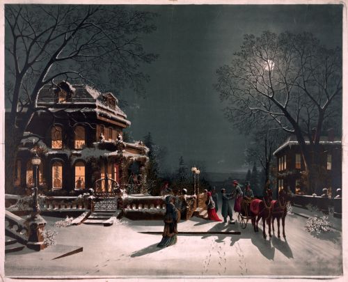
Description: Christmas Eve, chromolithograph by J. C. Hoover and Sons
Date: 1880
This is a quintessential calendar or Christmas card picture, and I love it. It appeals to every sentiment a viewer might have of home and community and Christmas traditions.
This painting has many nostalgic style elements, which is why I find it so appealing. It has a Courier and Ives feel to it, and is reminiscent of George Henry Durie’s work, although it was painted seventeen years after his death. I don’t know who the artist was that painted this picture as he or she isn’t credited. It could have been one of the sons, or one of the many women artists employed in the industry at the time.
A significant number of artists employed in the publishing industry during the 19th and early 20th century were women. They painted illustrations for greeting cards, books, magazines, and newspapers. Often women were not acknowledged as the original creators, although some, like Mary Cassatt, did achieve fame and credit for their work.
About the publisher, via Art and Antiques Gallery’s website:
Hoover & Sons issued popular prints for the masses in the last decade of the 19th century and the first decade of the 20th century. This was a business much like Currier & Ives, though Hoover & Sons issued chromolithographs. Joseph Hoover was one of the few native-born Americans who achieved success with chromolithography. Hoover started by making elaborate wood frames in Philadelphia in 1856, but within a decade or so he began to produce popular prints. Initially he mostly worked for other publishers, including Duval & Hunter, and he worked with noted Philadelphia artist James F. Queen. He also issued a few hand-colored, popular prints of considerable charm. During the Centennial, Hoover won a medal for excellence for his chromolithographs after Queens renderings.
In the 1880s, Hoover began to print chromolithographs, installing a complete printing plant by 1885. By the end of the century, his firm was one of the largest print publishers in the county, with an average annual production of between 600,000 to 700,000 pictures. Using chromolithography, Hoover was able to produce attractive, colorful prints that were still affordable for anyone to use as decoration for home and office. The audience for Hoover’s prints was quite wide, extending throughout the United States, and overseas to Canada, Mexico, England and Germany. The subjects issued by the firm are extensive, including genre scenes, still life images, views of American locations, and generic landscapes, including a series of charming winter scenes. [1]
About Chromolithography, via Wikipedia:
Chromolithography is a chemical process. The process is based on the rejection of water by grease. The image is applied to stone, grained zinc or aluminium surfaces, with a grease-based crayon or ink. Limestone and zinc are two commonly used materials in the production of chromolithographs, as aluminium corrodes easily. After the image is drawn onto one of these surfaces, the image is gummed-up with a gum arabic solution and weak nitric acid to desensitize the surface. Before printing, the image is proofed before finally inking up the image with oil-based transfer or printing ink. In the direct form of printing, the inked image is transferred under pressure onto a sheet of paper using a flat-bed press. The offset indirect method uses a rubber-covered cylinder that transfers the image from the printing surface to the paper.
Alois Senefelder, the inventor of lithography, introduced the subject of colored lithography in his 1818 Vollstaendiges Lehrbuch der Steindruckerey (A Complete Course of Lithography), where he told of his plans to print using colour and explained the colours he wished to be able to print someday. Although Senefelder recorded plans for chromolithography, printers in other countries, such as France and England, were also trying to find a new way to print in colour. Godefroy Engelmann of Mulhouse in France was awarded a patent on chromolithography in July 1837, but there are disputes over whether chromolithography was already in use before this date, as some sources say, pointing to areas of printing such as the production of playing cards. [2]
Credits and Attributions:
[1] Quote from Art and Antiques Gallery https://www.pbase.com/artandantiquesgallery/joseph_hoover_and_sons_prints (accessed December 24, 2021).
[2] Wikipedia contributors, “Chromolithography,” Wikipedia, The Free Encyclopedia, https://en.wikipedia.org/w/index.php?title=Chromolithography&oldid=1058870233 (accessed December 24, 2021).
Image Credit: Public Domain. Library of Congress via pingnews. Additional information from source: TITLE: Christmas Eve CALL NUMBER: PGA – Hoover, J.–Christmas Eve (D size) [P&P] REPRODUCTION NUMBER: LC-DIG-01601 (digital file from original print) LC-USZ62-49683 (b&w film copy neg.) RIGHTS INFORMATION: No known restrictions on publication. MEDIUM: 1 print. CREATED/PUBLISHED: [no date recorded on shelflist card]
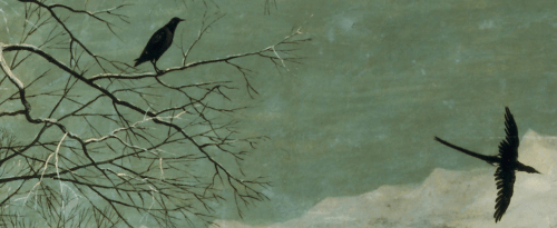
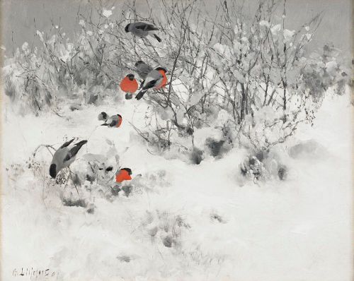 Artist: Bruno Liljefors (1860–1939)
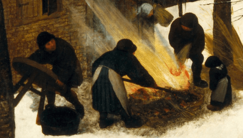
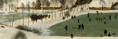
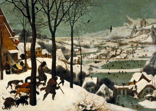 Artist: Pieter Brueghel the Elder (1526/1530–1569)
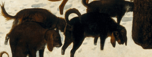
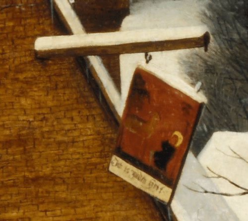

 But they are indistinct and far away, shown in a fantastic, mountainous landscape, rather than the flat terrain of the Netherlands. It is almost as if they are visions of what winter could be when the harvest had been good, rather than the truth of the lone fox, hounds with empty bellies, a bankrupt tavern, and the rabbit that got away.
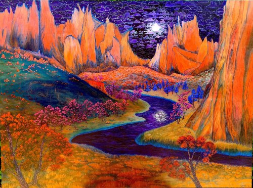 TITLE: African Violet Skies
 Artist: Jacob van Ruisdael (1628/1629–1682)
 Artist:
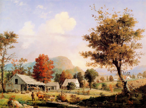 Cider Pressing by George Henry Durrie 1855


.jpg&oldid=225700063)