Tag Archives: Fine Art Friday

#FineArtFriday: Snow Storm: Steam-Boat off a Harbour’s Mouth J.M.W. Turner 1842

J.M.W. Turner

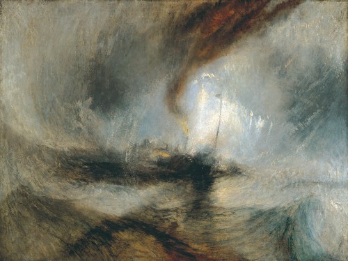
Title: Snow Storm: Steam-Boat off a Harbour’s Mouth

Artist: J. M. W. Turner

Year: 1842

Medium: oil on canvas

Dimensions: 91 cm × 122 cm (36 in × 48 in)

Location: Tate, London, Great Britain

About this Picture, Via Wikipedia:

The painting depicts a paddle steamer caught in a snow storm. This marine painting is showing a Romantic era’s painter’s depiction of a snowstorm on water at its best, fully developing the bold, daring Romantic fantasy of Turner. Turner was unrivaled in depicting the natural world unmastered by mankind and exploring the effects of the elements and the battle of the forces of the nature. Turner worked first as a watercolorist, and he started to work much later with oils. He later applied the techniques he learned in watercolour onto oil paintings.

It is typical of the late style of Turner. Turner’s tints and shades of colours are painted in different layers of colour, the brushstrokes adding texture to the painting. The colours are monochromatic, only a few shades of grey, green and brown are present, having the same tone of colours. The silvery pale light that surrounds the boat creates a focal point, drawing the viewer into the painting. The smoke from the steamboat spreads out over the sky, creating abstract shapes of the same quality like the waves.

An inscription on the painting relates that The Author was in this Storm on the Night the “Ariel” left Harwich. Turner later recounted a story about the background of the painting:

“I did not paint it to be understood, but I wished to show what such a scene was like; I got the sailors to lash me to the mast to observe it; I was lashed for four hours, and I did not expect to escape, but I felt bound to record it if I did.”

He was 67 years old at the time. Some later commentators doubt the literal truth of this account. Other critics accept Turner’s account, and one wrote, “He empathized completely with the dynamic form of sovereign nature.”  This inscription allows us to better understand the scene represented and the confusion of elements.

Turner had investigated the interactions between nature and the new technology of steamboats in at least five paintings in the previous decade. Throughout his career, Turner engaged with issues of urbanism, industry, railroads and steam power. [1]

About the Artist, Via Wikipedia:

Joseph Mallord William Turner RA (23 April 1775 – 19 December 1851), known in his time as William Turner, was an English Romantic painter, printmaker and watercolourist. He is known for his expressive colourisations, imaginative landscapes and turbulent, often violent marine paintings. He left behind more than 550 oil paintings, 2,000 watercolours, and 30,000 works on paper. He was championed by the leading English art critic John Ruskin from 1840, and is today regarded as having elevated landscape painting to an eminence rivalling history painting.

Turner was born in Maiden Lane, Covent Garden, London, to a modest lower-middle-class family. He lived in London all his life, retaining his Cockney accent and assiduously avoiding the trappings of success and fame. A child prodigy, Turner studied at the Royal Academy of Arts from 1789, enrolling when he was 14, and exhibited his first work there at 15. During this period, he also served as an architectural draftsman. He earned a steady income from commissions and sales, which due to his troubled, contrary nature, were often begrudgingly accepted. He opened his own gallery in 1804 and became professor of perspective at the academy in 1807, where he lectured until 1828. He travelled to Europe from 1802, typically returning with voluminous sketchbooks.

Intensely private, eccentric and reclusive, Turner was a controversial figure throughout his career. He did not marry, but fathered two daughters, Eveline (1801–1874) and Georgiana (1811–1843), by his housekeeper Sarah Danby. He became more pessimistic and morose as he got older, especially after the death of his father, when his outlook deteriorated, his gallery fell into disrepair and neglect, and his art intensified. In 1841, Turner rowed a boat into the Thames so he could not be counted as present at any property in that year’s census. He lived in squalor and poor health from 1845, and died in London in 1851 aged 76. Turner is buried in Saint Paul’s Cathedral, London. [2]


Credits and Attributions:

[1] Wikipedia contributors, “Snow Storm: Steam-Boat off a Harbour’s Mouth,” Wikipedia, The Free Encyclopedia, https://en.wikipedia.org/w/index.php?title=Snow_Storm:_Steam-Boat_off_a_Harbour%27s_Mouth&oldid=1000619190 (accessed March 3, 2022).

[2] Wikipedia contributors, “J. M. W. Turner,” Wikipedia, The Free Encyclopedia, https://en.wikipedia.org/w/index.php?title=J._M._W._Turner&oldid=1075008053 (accessed March 3, 2022).

Wikimedia Commons contributors, “File:Joseph Mallord William Turner – Snow Storm – Steam-Boat off a Harbour’s Mouth – WGA23178.jpg,” Wikimedia Commons, the free media repository, https://commons.wikimedia.org/w/index.php?title=File:Joseph_Mallord_William_Turner_-_Snow_Storm_-_Steam-Boat_off_a_Harbour%27s_Mouth_-_WGA23178.jpg&oldid=618892271 (accessed March 3, 2022).

2 Comments

Filed under #FineArtFriday, writing

#FineArtFriday: A Sunday on La Grande Jatte by Georges Seurat circa 1884 (revisited)

A Sunday Afternoon on the Island of La Grande Jatte by Georges Seurat (1884–1886) is a landmark painting. Art historians agree that with this image, Seurat changed the direction of modern art and began the era of Neo-impressionism. It is one of the most recognizable of late 19th-century paintings.

About this painting from Wikipedia: In summer 1884, Seurat began work on A Sunday Afternoon on the Island of La Grande Jatte.

The painting shows members of each of the social classes participating in various park activities. The tiny juxtaposed dots of multi-colored paint allow the viewer’s eye to blend colors optically, rather than having the colors physically blended on the canvas. It took Seurat two years to complete this 10-foot-wide (3.0 m) painting, much of which he spent in the park sketching in preparation for the work (there are about 60 studies). It is now in the permanent collection of the Art Institute of Chicago.

What I love about this painting is the preciseness of each component. This painting proudly declares it is not “real”—it is instead an impression of a moment in time, a summer day spent on the River Seine. It is both sharply delineated and dreamlike. That is a neat trick.

Seurat used individual dots of only primary colors (Red, green, yellow, blue) but the way he places them, they seem muted and blended into shades of rose and purple, and even pale pink. I’m captivated by a technicality – obsessed by the way the primary colors of each dot are juxtaposed with other primary colors, tricking the eye into believing it sees light and dark, and all shades between.

About the Artist, via Wikipedia: (Seurat) is noted for his innovative use of drawing media and for devising the painting techniques known as chromoluminarism and pointillism. Seurat’s artistic personality was compounded of qualities which are usually supposed to be opposed and incompatible: on the one hand, his extreme and delicate sensibility; on the other, a passion for logical abstraction and an almost mathematical precision of mind.

This technique is one I hadn’t given much thought to until I ran across a postcard with an image of Seurat’s painting on it. Other notable artists who explored this method were Paul Signac and Vincent van Gogh.

For me, studying these images of masterpieces for the Friday posts on art teaches me how to be creative with my words. Artists both push the limits of their color palettes and yet force external constraints on themselves to create images that fool the eye.

Authors must do the same with how we shape our words to show ideas and form stories.

About the Pointillist technique of painting, from Wikipedia: If red, blue, and green light (the additive primaries) are mixed, the result is something close to white light. Painting is inherently subtractive, but Pointillist colors often seem brighter than typical mixed subtractive colors. This may be partly because subtractive mixing of the pigments is avoided, and partly because some of the white canvas may be showing between the applied dots.

The painting technique used for Pointillist color mixing is at the expense of the traditional brushwork used to delineate texture.

The majority of Pointillism is done in oil paint. Anything may be used in its place, but oils are preferred for their thickness and tendency not to run or bleed.


Sources and Attributions:

Wikimedia Commons contributors, “File:Georges Seurat – A Sunday on La Grande Jatte — 1884 – Google Art Project.jpg,” Wikimedia Commons, the free media repository, https://commons.wikimedia.org/w/index.php?title=File:Georges_Seurat_-_A_Sunday_on_La_Grande_Jatte_–_1884_-_Google_Art_Project.jpg&oldid=90112845 (accessed January 10, 2019).

Wikipedia contributors, “A Sunday Afternoon on the Island of La Grande Jatte,” Wikipedia, The Free Encyclopedia,https://en.wikipedia.org/w/index.php?title=A_Sunday_Afternoon_on_the_Island_of_La_Grande_Jatte&oldid=875941354 (accessed January 10, 2019).

Wikipedia contributors, “Georges Seurat,” Wikipedia, The Free Encyclopedia, https://en.wikipedia.org/w/index.php?title=Georges_Seurat&oldid=877532379 (accessed January 10, 2019).

Wikipedia contributors, “Pointillism,” Wikipedia, The Free Encyclopedia, https://en.wikipedia.org/w/index.php?title=Pointillism&oldid=874469961(accessed January 10, 2019).

1 Comment

Filed under writing

#FineArtFriday: A Guardroom by Abraham Teniers (revisited)

Today we are revisiting A Guardroom, an allegorical painting attributed to Abraham Teniers. This painting is worthy of a second look, for both the allegory and the quality of the composition.

I have often said that to write about medieval and pre-industrial revolution societies, you must go to art to get the facts. This painting is a symbolic piece showing the transience of life and the certainty of death.

He shows us a guardroom. Abraham Teniers served as a captain of the local civil militia of Antwerp and was fond of painting guardroom scenes.

This particular scene is intriguing to me, because of the way the jumble of disjointed metal armor completely dominates the painting. In the foreground, in the light, we see flintlock pistols, muskets, breast plates, leg guards, vambraces, a drum, swords and other steel weaponry, and several helmets—all cast into a corner.

Almost unnoticed in the background, peasant soldiers are shown smoking and drinking before a fireplace. They are deliberately kept in the background of the picture, an allegory for the fleetingness of life.

One reason renaissance painters liked to paint armor was the way the light fell on all the angles. Getting the light just right is the sign of an observant painter.  All the various shapes and sheens–armor offered an artist so many interesting surfaces, so many opportunities to show their skill.

The armor depicted in the picture was of a style no longer in use at the time it was painted. Metal armor was falling out of use by the time Abraham Teniers was born. Plate had lost its effectiveness as guns became the weaponry of choice.

In most paintings of this era, armor is an allegory, a symbol representing death. The deliberately chaotic positioning of the many pieces portrays the violence of the battlefield. A lone suit of armor, empty of life, stands guard over the dead.

Abraham is not the most famous of the Teniers family, but he was a talented and skilled painter. In this scene, he makes good use of chiaroscuro, strong contrasts between light and dark.

About the artist (from Wikipedia):

Abraham Teniers (1 March 1629 – 26 September 1670) was a Flemish painter and engraver who specialized in genre paintings of villages, inns and monkey scenes. He was a member of artist family Teniers which came to prominence in the 17th century. He was also active as a publisher. He was responsible for the publication of the Theatrum Pictorium (‘Theatre of Paintings’), the project initiated by his brother David to make a set of engravings of the entire art collection of Archduke Leopold Wilhelm.

Like his brother David before him, Abraham found appreciation at the court in Brussels and the art-loving Archduke Leopold Wilhelm of Austria – then the governor of the Southern Netherlands and a resident of Brussels – appointed him as court painter.


Credits and Attributions:

Wikimedia Commons contributors, “File:Abraham Teniers – Een wachtlokaal, 1 (Prado).jpg,” Wikimedia Commons, the free media repository, https://commons.wikimedia.org/w/index.php?title=File:Abraham_Teniers_-_Een_wachtlokaal,_1_(Prado).jpg&oldid=267098550 (accessed January 3, 2019).

Wikipedia contributors, “Abraham Teniers,” Wikipedia, The Free Encyclopedia, https://en.wikipedia.org/w/index.php?title=Abraham_Teniers&oldid=871305163 (accessed January 3, 2019).

7 Comments

Filed under #FineArtFriday

#FineArtFriday: Road from Market by Thomas Gainsborough ca. 1768 (revisited)


Title: Road from Market by Thomas Gainsborough  (1727–1788)

Date: between 1767 and 1768

Medium: oil on canvas

Dimensions: Height: 1,213 mm (47.75 ″); Width: 1,702 mm (67 ″

What I love about this painting:

Thomas Gainsborough is one of Great Britain’s most famous portrait artists. His best-known painting is the “Blue Boy.”  But while portraits may have paid his bills (handsomely), Thomas Gainsborough loved painting landscapes and did so whenever he was able.

This painting shows us a road, and while it looks to our modern eyes to be nothing more than a dirt track fading into the forest, it was typical of the main roads one had to travel in both Great Britain and America. They were dirt tracks, barely passable at certain times. Traveling these roads while riding in a carriage was both dangerous and arduous.

Four people are depicted in this painting, three men and a woman. All but one of the farmers is seated sideways on the horses. This tells us that side-saddle was a common way for all people to ride at the time of the American Revolution, not just women.

Gainsborough did manage to romanticize the bucolic countryside in this pleasant, homey painting.

His horses are heroic, the peasants look well-fed, and even the cattle look prosperous. The fields just beyond the trees are lush and green.

Thomas Gainsborough is credited, along with Richard Wilson, as one of the originators of the 18th-century British landscape school. Gainsborough was a founding member of the Royal Academy of Arts.


Credits and Attributions:

Wikimedia Commons contributors, “File:Thomas Gainsborough – Road from Market – Google Art Project.jpg,” Wikimedia Commons, the free media repository, https://commons.wikimedia.org/w/index.php?title=File:Thomas_Gainsborough_-_Road_from_Market_-_Google_Art_Project.jpg&oldid=354218025 (accessed October 11, 2019).

6 Comments

Filed under writing

#FineArtFriday: Saint Cecilia (revisited) by Edward Burne-Jones

Saint Cecilia, by Edward Burne-Jones

Date: circa 1900

Medium: Stained and painted glass

Dimensions: Height: 213.5 cm (84 in); Width: 75.5 cm (29.7 in) frame: Height: 235 cm (92.5 in); Width: 88.7 cm (34.9 in); Depth: 4 cm (1.5 in)

Collection: Princeton University Art Museum

About this image:

Today we are revisiting an image of a masterpiece in glass: Saint Cecilia, by Edward Burne-Jones. She is the patroness of musicians, and her feast day is traditionally celebrated on November 22. The above image is my favorite rendering of her, as it is so vividly colored.

One of the most beautiful forms of art is stained glass, and the many works of Sir Edward Burne-Jones are without peer.

I may have said before that I’m not a fan of some of the art produced by the Pre-Raphaelite Brotherhood. I understand the heroic and dramatic stories they attempted to tell. Unfortunately, the more hyper-romanticized, physically impossible contortions in which they sometimes posed their heroes and heroines don’t engage my imagination in a good way.

Burne-Jones, however, ranks high on my list of favorite artists because (in my untutored opinion) his best medium was stained glass. The concept and execution of Burne-Jones’s artistic visions in glass are stunning. Vivid, intense colors, romantic subjects – his windows are glorious and seem illuminated even when not backlit by the sun.

About Saint Cecilia, From Wikimedia Commons:

One of nearly thirty versions of a window designed by Burne-Jones and executed by the company founded by William Morris (1834–1896), Saint Cecilia is a product of the Arts and Crafts movement they initiated. Friends at Oxford, Morris and Burne-Jones became disciples of John Ruskin and the Pre-Raphaelite movement and put into practice his vision for the renewal of art. They sought to counter the effects of the machine age by reviving medieval crafts, abolishing distinctions between fine and decorative arts, and beautifying objects of everyday life. Morris wrote on the philosophy of art and founded a company to execute textiles, wallpaper, and other objects, while Burne-Jones, in addition to painting and sculpting, studied with the Pre-Raphaelite painter Dante Gabriel Rossetti and designed murals, tapestries, and stained glass for Morris’s company.

The Gothic Revival style in architecture created a market for stained glass, especially in the 1870s, when Burne-Jones was a particularly prolific designer of windows. The first Saint Cecilia window, at Christ Church, Oxford (1875), shows the influence of the early Renaissance art he had seen in central Italy, most recently in 1871. The flat, abstracted, linear style and the wilting pose of the impossibly tall, graceful woman make reference to the work of Botticelli (Florentine, ca. 1445–1510), while the tapestry-like screen of pomegranate trees and fruits and the richly patterned brocade fabric recall the latest Gothic phase of Italian art, about 1400.

Saint Cecilia, an early Christian Roman virgin martyr, became the patron saint of music and was portrayed with an organ — here, a portable organ of the fifteenth century. Although water organs existed in the ancient world, pipe organs date from the fourteenth century, so we must assume Cecilia is singing the praises of God in heaven, not during her earthly life. In the window at Christ Church, she is flanked by lancet windows with music-making angels; scenes from the life of a fellow martyr saint, Valerian, and her own martyrdom are shown below. In Chicago, a Saint Cecilia window was included in the stained glass of the Second Presbyterian Church (1904); there, the fabric behind the saint is blue, and the tree bears lemons, demonstrating the permutations that could occur among these windows.

About the artist, from Wikipedia:

Sir Edward Coley Burne-Jones, 1st Baronet ARA (28 August 1833 – 17 June 1898) was an English artist and designer closely associated with the later phase of the Pre-Raphaelite movement, who worked closely with William Morris on a wide range of decorative arts as a founding partner in Morris, Marshall, Faulkner & Co. Burne-Jones was closely involved in the rejuvenation of the tradition of stained glass art in Britain.


Credits and Attributions:

Saint Cecilia, Edward Burne-Jones [Public domain], Stained and painted glasss, ca. 1900

Wikipedia contributors, “Edward Burne-Jones,” Wikipedia, The Free Encyclopedia, https://en.wikipedia.org/w/index.php?title=Edward_Burne-Jones&oldid=868174553 (accessed November 16, 2018).

Wikimedia Commons contributors, “File:Burne-Jones, Sir Edward, Saint Cecilia, ca. 1900.jpg,” Wikimedia Commons, the free media repository, https://commons.wikimedia.org/w/index.php?title=File:Burne-Jones,_Sir_Edward,_Saint_Cecilia,_ca._1900.jpg&oldid=303427881 (accessed November 16, 2018).

2 Comments

Filed under #FineArtFriday, writing

#FineArtFriday: The Great Fish Market by Jan Brueghel the Elder 1603 (revisited)

Title: Great Fish Market

Artist: Jan Brueghel the Elder  (1568–1625)

Date: 1603

Medium: oil on canvas

Dimensions:  Height: 59 cm (23.2 in); Width: 92 cm (36.2 in)

Collection: Alte Pinakothek  Current location: room 19

Inscriptions: Signature and date, bottom left: BRVEGHEL 1603

What I love about this painting:

This is one of my all-time favorite paintings. Here we see a composite of all the places Jan Brueghel the Elder had visited. The scene is a fusion of his Flemish homeland and impressions of places he’d sketched on his travels.

In the middle of the picture is the Neapolitan Castel dell’ Ovo, on the right, in the distance, is St. Peter’s Basilica in Rome. We have a little of Italy thrown in with the Flemish, his effort to create the feeling of a busy, prosperous market. He shows his imaginary city from a high perspective, the god-like view.

In writing, this would be the omniscient point of view.

The elements presented in this painting, the harborscape, the ruins, and even the sections that are simply landscapes are all features that later became genres in their own right.

The scene contains many elements of Mannerist landscape painting. According to the Tate website, mannerist is a sixteenth-century style of art and design characterized by artificiality, elegance, and an aesthetic portrayal of the human figure.

In other words, they painted fantasy. And why not?

Flemish genre painting is strongly tied to the traditions of Pieter Bruegel the Elder. It was a style that continued directly into the 17th century through copies and new compositions made by his sons Pieter Brueghel the Younger and Jan Brueghel the Elder.

In this painting, the story opens with a view across a downward-sloping foreground. It teems with life, hundreds of figures of many races, grouped around the stalls and booths of a fish market. The group at the center of the foreground is thought to be a self-portrait of the artist and his family. It was common for artists to insert self-portraits in their works, and Jan often included his family.

One of Jan Brueghel’s most significant contributions to the craft of painting landscapes was how he depicted perspective. The eye is drawn towards the harbor in the background. We look out across the bay, along the coastline, and see entire towns, with ruins, wharves, and castles. Beyond that, we see distant mountains, painted with a blue that merges with the blue of the sea.

This blending of shape and color into the distance is how a landscape appears in real life.

These painters, and the Brueghel family in particular, were the generation who paved the way for artists like Rembrandt. Their works were the foundation upon which the masterpieces of the middle-to-late 17th century were built.

About the Artist, via Wikipedia:

Jan Brueghel was the son of the eminent Flemish Renaissance painter Pieter Brueghel the Elder.  A close friend and frequent collaborator with Peter Paul Rubens, the two artists were the leading Flemish painters in the first three decades of the 17th century.

He was born in Brussels as the son of Pieter Brueghel the Elder and Maria Coecke van Aelst. His mother was the daughter of the prominent Flemish Renaissance artists Pieter Coecke van Aelst and Mayken Verhulst. His father died about a year after Jan’s birth in 1569. It is believed that after the death of his mother in 1578, Jan, together with his brother Pieter Brueghel the Younger and sister Marie, went to live with their grandmother Mayken Verhulst, who was by then widowed. Mayken Verhulst was an artist in her own right. The early Flemish biographer Karel van Mander wrote in his Schilder-boeck published in 1604 that Mayken was the first art teacher of her two grandsons. She taught them drawing and watercolor painting of miniatures. Jan and his brother may also have trained with local artists in Brussels who were active as tapestry designers.

Jan Brueghel the Elder is regarded as an important innovator of landscape art. By introducing greater naturalism in his Alpine mountain settings, his father had expanded on the world landscape tradition that had been founded mainly by Joachim Patinir. Some of Pieter the Elder’s works also foreshadowed the forest landscape that would start to dominate landscape painting around the turn of the 16th century. Pieter the Elder also developed the village and rural landscape, placing Flemish hamlets and farms in exotic prospects of mountains and river valleys.

Jan developed on the formula he learned from his father of arranging country figures traveling a road, which recedes into the distance. He emphasized the recession into space by carefully diminishing the scale of figures in the foreground, middle-ground, and far distance. To further the sense of atmospheric perspective, he used varying tones of brown, green, and blue progressively to characterize the recession of space. His landscapes with their vast depth are balanced through his attention to the peasant figures and their humble activities in the foreground.

Like his father, Jan Brueghel also painted various village landscapes. He used the surrounding landscapes as the stage for the crowds of anecdotal, colorfully dressed peasants who engage in various activities in the market, the country roads and during the rowdy kermesses. Jan Brueghel’s landscape paintings with their strong narrative elements and attention to detail had a significant influence on Flemish and Dutch landscape artists in the second decade of the 17th century. His river views were certainly known to painters working in Haarlem, including Esaias van de Velde and Willem Buytewech, whom Brueghel may have met there when he accompanied Peter Paul Rubens on a diplomatic mission to the Dutch Republic in 1613.

Jan Brueghel was, along with artists such as Gillis van Coninxloo one of the prime developers of the dense forest landscape in the 17th century. Jan Breughel in fact experimented with such works before Coninxloo’s first dated wooded landscape of 1598. In his forest landscapes Brueghel depicted heavily wooded glades in which he captured the verdant density, and even mystery, of the forest. Although on occasion inhabited by humans and animals, these forest scenes contain dark recesses, virtually no open sky and no outlet for the eye to penetrate beyond the thick trees.


Credits and Attributions:

Wikimedia Commons contributors, “File:Jan Brueghel the Elder-Great Fish market.jpg,” Wikimedia Commons, the free media repository, https://commons.wikimedia.org/w/index.php?title=File:Jan_Brueghel_the_Elder-Great_Fish_market.jpg&oldid=406069557 (accessed July 9, 2020).

Wikipedia contributors, “Jan Brueghel the Elder,” Wikipedia, The Free Encyclopedia, https://en.wikipedia.org/w/index.php?title=Jan_Brueghel_the_Elder&oldid=963723468 (accessed July 9, 2020).

Comments Off on #FineArtFriday: The Great Fish Market by Jan Brueghel the Elder 1603 (revisited)

Filed under #FineArtFriday

#FineArtFriday: Fishermen at Sea by J. M. W. Turner 1796

Joseph_Mallord_William_Turner_-_Fishermen_at_Sea_-_Google_Art_ProjectArtist: J. M. W. Turner (1775–1851)

Title: Fishermen at Sea

Genre: marine art

Depicted place: The Needles, off the Isle of Wight

Date: 1796

Medium: oil on canvas

Dimensions: Height: 914 mm (35.98 in); Width: 1,222 mm (48.11 in)

What I love about this painting:

I love seascapes, in all their many forms. This particular painting is dark in many ways beyond the obvious. It is a night scene, and it tells us a story of the dangers that fishermen face. Fish don’t care about the weather and some fish can only be caught at night.

If you must go out in the stormy dark, sometimes the catch is death.

We see an event unfolding by moonlight, observed by three seagulls sailing on the wind. Two boats, one a small vessel and the other a larger boat, tossing upon the rough sea, both with their sails furled. This tells us they fear being driven onto the rocks known as the Needles.

A line has been cast toward the larger boat, but no one is tending it. Nearly all the art scholars say it is a fishing line, but it seems rather stout for a fishing line, and there is only one line in the water although two ships are braving the storm. Waves threaten to wash everything overboard on both boats.

I’m a storyteller; to my imagination this scene looks less like a fishing expedition and more like a rescue, as if the rope has been cast toward the other vessel to bring it close.

This is the beauty of great art. It inspires the imagination to think beyond the obvious, to look outside the accepted view and to find new ways of looking at things.

The warm glow of lantern in the stern of the smaller boat casts little light and is the only warmth in this scene. The moon has emerged from behind the clouds and illuminates the action.

Whether this is merely a rough night of fishing or a rescue at sea, this a powerful moment of fear and bravery.

About this painting via Wikipedia:

Fishermen at Sea, sometimes known as the Cholmeley Sea Piece, is an early oil painting by English artist J. M. W. Turner. It was exhibited at the Royal Academy in 1796 and has been owned by the Tate Gallery since 1972. The painting measures 36 by 48.125 inches (91.44 cm × 122.24 cm). It was the first painting by Turner to be exhibited at the Royal Academy. It was praised by contemporary critics and founded Turner’s reputation, as both an oil painter and a painter of maritime scenes. Art historian Andrew Wilton has commented that the image: “Is a summary of all that had been said about the sea by the artists of the 18th century.”

The painting depicts a moonlit view of fishermen on rough seas near the Needles, of the Isle of Wight. It juxtaposes the fragility of human life, represented by the small boat with its flickering lamp, and the sublime power of nature, represented by the dark clouded sky, the wide sea, and the threatening rocks in the background. The cold light of the Moon at night contrasts with the warmer glow of the fishermen’s lantern. [1]

About the Artist, via Wikipedia:

Joseph Mallord William Turner RA (23 April 1775 – 19 December 1851), known in his time as William Turner,[a] was an English Romantic painter, printmaker and watercolourist. He is known for his expressive colourisations, imaginative landscapes and turbulent, often violent marine paintings. He left behind more than 550 oil paintings, 2,000 watercolours, and 30,000 works on paper. He was championed by the leading English art critic John Ruskin from 1840, and is today regarded as having elevated landscape painting to an eminence rivalling history painting.

Turner was born in Maiden Lane, Covent Garden, London, to a modest lower-middle-class family. He lived in London all his life, retaining his Cockney accent and assiduously avoiding the trappings of success and fame. A child prodigy, Turner studied at the Royal Academy of Arts from 1789, enrolling when he was 14, and exhibited his first work there at 15. During this period, he also served as an architectural draftsman. He earned a steady income from commissions and sales, which due to his troubled, contrary nature, were often begrudgingly accepted. He opened his own gallery in 1804 and became professor of perspective at the academy in 1807, where he lectured until 1828. He travelled to Europe from 1802, typically returning with voluminous sketchbooks.

Intensely private, eccentric and reclusive, Turner was a controversial figure throughout his career. He did not marry, but fathered two daughters, Eveline (1801–1874) and Georgiana (1811–1843), by his housekeeper Sarah Danby. He became more pessimistic and morose as he got older, especially after the death of his father, after which his outlook deteriorated, his gallery fell into disrepair and neglect, and his art intensified. In 1841, Turner rowed a boat into the Thames so he could not be counted as present at any property in that year’s census. He lived in squalor and poor health from 1845, and died in London in 1851 aged 76. Turner is buried in Saint Paul’s Cathedral, London. [2]


Credits and Attributions:

Fishermen at Sea, J. M. W. Turner, Public domain, via Wikimedia Commons

[1] Wikipedia contributors, “Fishermen at Sea,” Wikipedia, The Free Encyclopedia, https://en.wikipedia.org/w/index.php?title=Fishermen_at_Sea&oldid=1000617338 (accessed January 21, 2022).

[2] Wikipedia contributors, “J. M. W. Turner,” Wikipedia, The Free Encyclopedia, https://en.wikipedia.org/w/index.php?title=J._M._W._Turner&oldid=1062349164 (accessed January 21, 2022).

2 Comments

Filed under #FineArtFriday, writing

#FineArtFriday: Red hollyhocks in the garden of the Ancher family at Markvej in Skagen by Anna Ancher ca. 1916

Anna_Ancher_-_Røde_stokroser_i_haven_ved_Ancher-familiens_hus_på_Markvej_i_SkagenArtist: Anna Ancher  (1859–1935)

Title: English: Red hollyhocks in the garden of the Ancher family at Markvej in Skagen.

Date: circa 1916

Medium: oil on canvas

Dimensions: Height: 63 cm (24.8 in); Width: 47 cm (18.5 in)

Collection: Unknown

Inscriptions: Signature bottom right: A. Ancher

What I love about this painting:

January tends to be dark and rainy here in the Pacific Northwest. We were snowed and iced in for two weeks, and then four inches of rain fell in one day and the floods came—boy, do I need a summer day! So, I found us this one—a perfect day in Skagen a century ago.

She is mostly known for her interiors, but Anna Ancher captured the essence of summer in this painting. Along with foxgloves, hollyhocks are my favorite summer flowers. Hers are beautiful, juxtaposed against the blue sky. Her eye for color was amazing. The yellow and red flowers perfectly complement the color of the building behind the garden.

I feel so much better for having had this glorious day in Anna’s serene garden.

About the Artist via Wikimedia: Anna Ancher preferred to paint interiors and simple themes from the everyday lives of the Skagen people, especially fishermen, women, and children. She was intensely preoccupied with exploring light and color, as in Interior with Clematis (1913). She also created more complex compositions such as A Funeral (1891). Anna Ancher’s works often represented Danish art abroad. Ancher has been known for portraying similar civilians from the Skagen art colony in her works, including an old blind woman.

While she studied drawing for three years at the Vilhelm Kyhn College of Painting in Copenhagen, she developed her own style and was a pioneer in observing the interplay of different colors in natural light. She also studied drawing in Paris at the atelier of Pierre Puvis de Chavannes along with Marie Triepcke, who would marry Peder Severin Krøyer, another Skagen painter.

In 1880 she married fellow painter Michael Ancher, whom she met in Skagen. They had one child, daughter Helga Ancher. Despite pressure from society that married women should devote themselves to household duties, she continued painting after marriage. [1]


Credits and Attributions:

Anna Ancher, Public domain, via Wikimedia Commons. Wikimedia Commons contributors, “File:Anna Ancher – Røde stokroser i haven ved Ancher-familiens hus på Markvej i Skagen.jpg,” Wikimedia Commons, the free media repository, https://commons.wikimedia.org/w/index.php?title=File:Anna_Ancher_-_R%C3%B8de_stokroser_i_haven_ved_Ancher-familiens_hus_p%C3%A5_Markvej_i_Skagen.jpg&oldid=616771666 (accessed January 14, 2022).

[1] Wikipedia contributors, “Anna Ancher,” Wikipedia, The Free Encyclopedia, https://en.wikipedia.org/w/index.php?title=Anna_Ancher&oldid=1041257716 (accessed January 14, 2022).

Comments Off on #FineArtFriday: Red hollyhocks in the garden of the Ancher family at Markvej in Skagen by Anna Ancher ca. 1916

Filed under #FineArtFriday, writing

#FineArtFriday: Sunshine in the Blue Room. Helga Ancher Knitting in Grandmother’s Parlour by Anna Ancher 1891

Anna_Ancher_-_Sunlight_in_the_blue_room_-_Google_Art_ProjectArtist: Anna Ancher:

Title: Sunshine in the Blue Room. Helga Ancher Knitting in Grandmother’s Parlour

Alternate TitleSunlight in the Blue Room

Date: 1891

Medium: oil on canvas

Dimensions: w58.8 x h65.2 cm (Without frame)

Collection: Skagens Museum

Inscriptions: A. Ancher 1891

What I love about this painting:

It is a painting that must be viewed from a distance, as only then does it come into focus. I love the way the light falls on the wall, the shadow of a plant silhouetted there. Helga’s golden hair stands out in contrast to the blue of the walls and matching blue of her dress. Who is the woman in the image on the wall? Is it a picture of grandmother?

This is definitely a blue room, a shade of blue with a kind of depth and boldness to it. It must have been a colorful home.

I love all of Anna Ancher’s work. She painted the humanity in the small everyday things, such a daughter sitting near a window, crocheting. She melded art with homemaking, proving that even in an era of oppression women could be artists to be reckoned with.

About this painting, via Wikipedia:

As indicated by its full title: Sunshine in the Blue Room. Helga Ancher Knitting in Grandmother’s Parlour (Solskin i den blå stue. Helga Ancher ved strikketøjet i bedstemoders stue), the painting depicts Anna’s daughter Helga knitting in her grandmother’s room. With her back to the observer, the child is busy crocheting. Despite its everyday subject, the painting is one of Anna Ancher’s most captivating masterpieces with its many shades of blue and the sense of tranquility it conveys. Devoid of action, the theme is essentially the play of light in the room. The only indication of the outside world is the light streaming through the window. Mette Bøgh Jensen, curator of Skagens Museum, explains that Anna Ancher’s interior paintings are “more about the colour and light than anything else”. The artist’s main interest is “not in replicating the reality of the room or wall, or even the light, but rather what is left when these things are stripped away and all that remains are colour and form”. Bøgh Jensen continues, “Anna Ancher’s art is unlike that of anyone else. In its essence it is tied to the special world of motifs in Skagen: the fishermen’s families, the harvesters, the heathers, the special colours, and the brilliant summer light.”

In her Concise Dictionary of Women Artists, Delia Gaze assesses Anna Ancher’s achievements as remarkable “in the modernity of her idiom, with its reduced, abstracting forms and bold expressive colours, singling her out as one of the most innovative painters of her generation, exceeding most of her male colleagues, including her husband” [1]

About the artist, via Wikipedia:

Anna Ancher (18 August 1859 – 15 April 1935) was a Danish artist associated with the Skagen Painters, an artist colony on the northern point of Jylland, Denmark. She is considered to be one of Denmark’s greatest visual artists.

Anna Kirstine Brøndum was born in Skagen, Denmark, the daughter of Ane Hedvig Møller (1826–1916) and Erik Andersen Brøndum (1820–1890). She was the only one of the Skagen Painters who was born and grew up in Skagen, where her father owned the Brøndums Hotel. The artistic talent of Anna Ancher became obvious at an early age and she became acquainted with pictorial art via the many artists who settled to paint in Skagen, in the north of Jylland.

While she studied drawing for three years at the Vilhelm Kyhn College of Painting in Copenhagen, she developed her own style and was a pioneer in observing the interplay of different colors in natural light. She also studied drawing in Paris at the atelier of Pierre Puvis de Chavannes along with Marie Triepcke, who would marry Peder Severin Krøyer, another Skagen painter.

In 1880 she married fellow painter Michael Ancher, whom she met in Skagen. They had one child, daughter Helga Ancher. Despite pressure from society that married women should devote themselves to household duties, she continued painting after marriage. [2]


Credits and Attributions:

Image: Sunlight in the Blue Room by Anna Ancher, Public domain, via Wikimedia Commons

[1] Wikipedia contributors, “Sunlight in the Blue Room,” Wikipedia, The Free Encyclopedia, https://en.wikipedia.org/w/index.php?title=Sunlight_in_the_Blue_Room&oldid=1047381792 (accessed January 6, 2022).

[2] Wikipedia contributors, “Anna Ancher,” Wikipedia, The Free Encyclopedia, https://en.wikipedia.org/w/index.php?title=Anna_Ancher&oldid=1041257716 (accessed January 6, 2022).

Comments Off on #FineArtFriday: Sunshine in the Blue Room. Helga Ancher Knitting in Grandmother’s Parlour by Anna Ancher 1891

Filed under #FineArtFriday, writing

#FineArtFriday: Tavern of the Crescent Moon by Jan Miense Molenaer (revisited)

Artist: Jan Miense Molenaer (1609/1610–1668)

Title: Tavern of the Crescent Moon

Genre: genre art

Date: mid-17th century

Medium: oil on canvas

Dimensions: 87.8 × 102 cm (34.5 × 40.1 in)

Collection: Budapest Museum of Fine Arts

The sign hanging in front of the Tavern of the Crescent Moon shows it was a wayside inn catering to the traveling public and some locals.  Molenaer’s inn seems to have been a friendly place where the food was most important. A piper is playing, and people are singing. Others are hanging out the windows and watching from a balcony, enjoying the music.

The patrons are a mixed group but look like happy middle-class people, who seem fairly prosperous. What I love about this painting is the fact that the patrons are sitting outdoors. The inside of most taverns and wayside inns were dark, smoky places. Patrons must have moved outdoors as soon as the weather allowed. The day this painting was composed, weather was fine, although one well-dressed man (perhaps a merchant?) has his foot resting on a foot-warmer, which was a luxury item in that time period.

Whole families are there, out for an evening of music and enjoyment. They are breaking and sharing fresh-baked bread. Other than the man whose best friend is the dog, no one has overindulged in drink—over all, the happy group looks as if they came to the tavern solely for the company and the music.

About the Artist: From the National Gallery Website:

Jan Miense Molenaer was born in Haarlem and lived there or in nearby Heemstede. In 1634 he was listed as member of the Guild of St. Luke in Haarlem. In 1636 he married the painter Judith Leyster. Both Molenaer and Leyster may have been pupils of Frans Hals and were certainly influenced by both his style and subject matter. Dirck Hals’ influence was also very important for him, for it inspired Molenaer to paint merry company scenes.

Jan Miense Molenaer was a more prolific artist than his wife, Judith Leyster, who worked on similar subjects. Motherhood and running a household most likely cut into Judith’s time for artistic endeavors.  Molenaer  and Leyster had five children, only two of whom survived to adulthood.


Sources and Attributions:

Quote from biography of Jan Miense Molenaer, The National Gallery Website, https://www.nationalgallery.org.uk/artists/jan-miense-molenaer The National Gallery, Trafalgar Square, London, WC2N 5DN (accessed November 9, 2018)

Wikimedia Commons contributors, “File:Jan Miense Molenaer 003.jpg,” Wikimedia Commons, the free media repository, https://commons.wikimedia.org/w/index.php?title=File:Jan_Miense_Molenaer_003.jpg&oldid=302686494 (accessed November 9, 2018).

Wikipedia contributors, “Judith Leyster,” Wikipedia, The Free Encyclopedia, https://en.wikipedia.org/w/index.php?title=Judith_Leyster&oldid=820769951 (accessed November 9, 2018).

Comments Off on #FineArtFriday: Tavern of the Crescent Moon by Jan Miense Molenaer (revisited)

Filed under writing