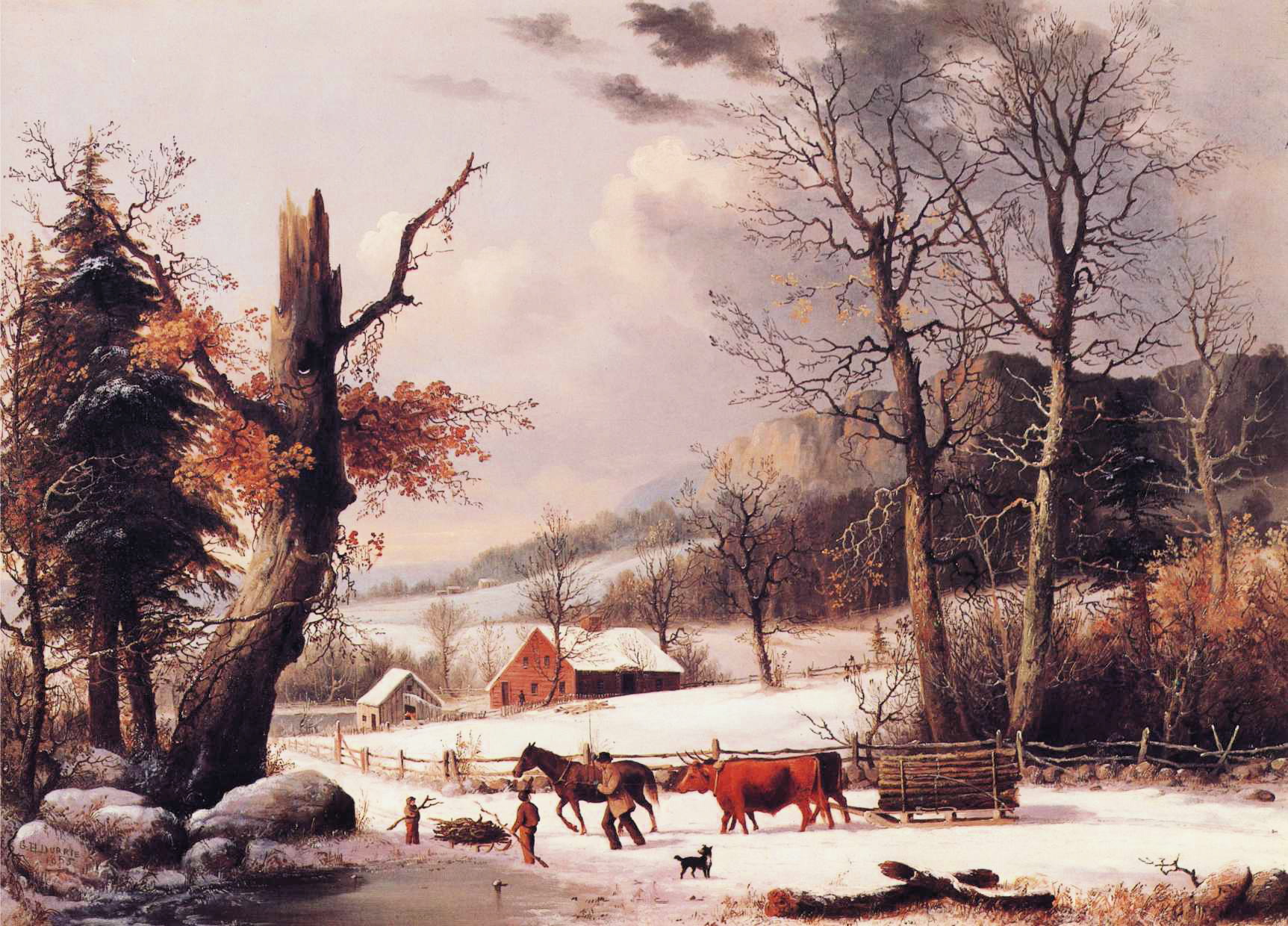
 Title: Gathering Wood for Winter
Artist: George Henry Durrie (1820–1863)
Date: 1855
Medium: oil on canvas
Dimensions: height: 26 in (66 cm); width: 36 in (91.4 cm)
Collection: Private collection
Why I love this painting:
I love the comforting hominess of George Heny Durrie’s works. in fact, I love everything the snobbier critics hate most about his work – it is meant for ordinary people (like me) to enjoy.
I thought about this painting because winter has lingered this year. Long ago when I was holding down two jobs and living through Reaganomics, I lived in a house that was heated with a woodstove. Every year it was a struggle to buy or cut enough wood to last through the winter.
In this painting, Durrie shows us a day in late autumn. His characteristic use of reds and browns juxtaposed against lighter shades of white portrays the stark beauty of late autumn in New England.
The first snow has fallen, and the season is turning to winter. It’s more important than ever to gather as much wood as possible. Fortunately for our wood gatherers, a giant has fallen victim to a storm, snapping off halfway up.
This is not necessarily the end of the tree. Leaves still cling to the branches below the wound and will continue to provide shade and habitat for as long as it can. Someday, it may be cut down, as the fact it broke in half shows that it is nearing the end of its life and may present a hazard to those who walk beneath it.
Regardless of the tree’s future, the farmer and his son are taking advantage of the bounty so close to their home. They will stack it in the woodshed in “cords” and allow it to dry out or “season” before they must burn it, hopefully not before the end of spring.
The more wood they gather now, the warmer they will be when winter’s grip tightens.
And one cord of wood won’t do it. When I was heating my house, it took five to seven cords to make it through a mild winter. And we were not cooking with it, only heating a small house.
A “cord” of wood is a standard measurement of split and stacked logs that measures 4 feet high × 4 feet wide × 8 feet long. How Big is a Cord of Wood? Exact Measurements & Visual Guide
About the author, via Wikipedia:
George Henry Durrie (June 6, 1820 – October 15, 1863) was an American landscape artist noted especially for his rural winter snow scenes, which became very popular after they were reproduced as lithographic prints by Currier and Ives.
For many years, Durrie made a living primarily as a portrait painter, executing hundreds of commissions. After marriage, he made frequent trips, traveling to New York, Massachusetts, New Jersey, and Virginia, fulfilling commissions and looking for new ones. His diary reveals that he was an enthusiastic railroad traveler, in the early days of the railroads. Durrie also painted what he called “fancy pieces”, whimsical studies of still lives or stage actors, as well as painting scenes on window-shades and fireplace covers. But portrait painting commissions became scarcer when photography came on the scene, offering a cheaper alternative to painted portraits, and, as his account-book shows, Durrie rarely painted a portrait after 1851.
Durrie’s interest shifted to landscape painting, and while on the road, or at home, made frequent sketches of landscape elements that caught his eye. Around 1844 Durrie began painting water and snow scenes, and took a second place medal at the 1845 New Haven State Fair for two winter landscapes. Although he had some training in portrait work, Durrie was self-taught as a landscape artist. He was undoubtedly influenced both by the American Hudson River School, and also by European artists, by studying exhibitions of their work at the New Haven Statehouse, the Trumbull Gallery, and at the Wadsworth Atheneum in Hartford, as well as in New York City. Durrie himself exhibited regularly, both locally, and in New York City at the National Academy of Design and the American Artists’ Union, and his reputation grew. Durrie was especially known for his snow pieces, and would often make copies or near-copies of his most popular pieces, with modifications to order. The landscapes painted by Durrie offered a more intimate view than the panoramic landscapes painted by the Hudson River School, which was the leading school of American landscape painting. Colin Simkin notes that Durrie’s paintings took in a wide angle, but still “close enough to be within hailing distance” of the people who are always included in his scenes.
Currier and Ives
Durrie’s early landscapes were often of local landmarks, such as East Rock and West Rock, and other local scenes, which were popular with his New Haven clients, and he painted numerous variations of popular subjects. As his portrait commissions declined, Durie concentrated on landscapes. He wanted a wider audience, and he seemed to have a good sense of what would sell. Durrie realized that his paintings would have a wider appeal if he made them as generic New England scenes rather than as identifiable local scenes, retaining, as Sackett said, “a sense of place without specifying where that place was.” The New York City lithographic firm of Currier & Ives knew their audience; the American public wanted nostalgic scenes of rural life, images of the good old days, and Durrie’s New England scenes fit the bill perfectly. Lithographic prints were a very democratic form of art, cheap enough that the humblest home could afford some art to hang on the wall. Durrie had been marketing his paintings in New York City, and Currier and Ives, who had popularized such prints, purchased some of Durrie’s paintings in the late 1850s or early 1860s, and eventually published ten of Durrie’s pictures beginning in 1861. Four prints were published between 1861 and the artist’s death in New Haven in 1863; six additional prints were issued posthumously.
The popularity of Durrie’s snow scenes received an additional boost in the 1930s, when the Traveler’s Insurance Company began issuing calendars featuring Currier and Ives prints. Starting in 1946, the January calendar always featured a Durrie snow scene. Historian Bernard Mergen notes that “84 of the 125 paintings attributed to him are snowscapes, more than enough to make him the most prolific snow scene painter of his time.”
In Durrie’s time, winter landscapes were not popular with most curators and critics, but nevertheless, by the time of his death, Durrie had acquired a national reputation as a snowscape painter. Durrie died in 1863, at age 43, probably from typhoid fever, not long after Currier and Ives began reproducing his paintings as prints.
Durrie was dismissed by critics as a popular artist, an illustrator rather than a fine artist. Although Durrie’s Currier and Ives prints were popular, his name was still relatively unknown. But a revival of interest in Durrie began in the 1920s with the publication in 1929 of Currier and Ives, Printmakers to the American People, by collector Harry T. Peters, Sr., who called Durrie’s prints “among the most valued In the entire gallery [of Currier and Ives prints]”, and says that Durrie was known as the “snowman” of the group. [1]
Credits and Attributions:
IMAGE: Gathering Wood for Winter by George Henry Durrie 1855. Wikimedia Commons contributors, “File:George Henry Durrie – Gathering Wood for Winter.JPG,” Wikimedia Commons, https://commons.wikimedia.org/w/index.php?title=File:George_Henry_Durrie_-_Gathering_Wood_for_Winter.JPG&oldid=853995324 (accessed May 1, 2025).
[1]Wikipedia contributors, “George Henry Durrie,” Wikipedia, The Free Encyclopedia, https://en.wikipedia.org/w/index.php?title=George_Henry_Durrie&oldid=1282714933 (accessed May 1, 2025).

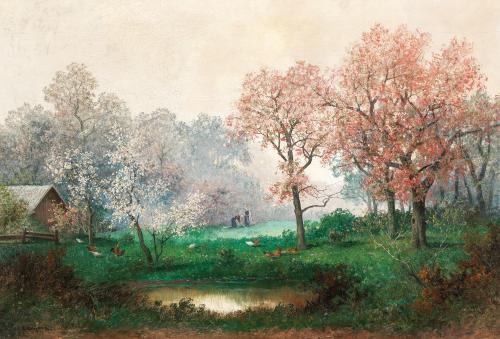
 Artist: Adolf Kaufmann (1848–1916)
 Artist: Pieter Brueghel the Elder (1526/1530–1569)
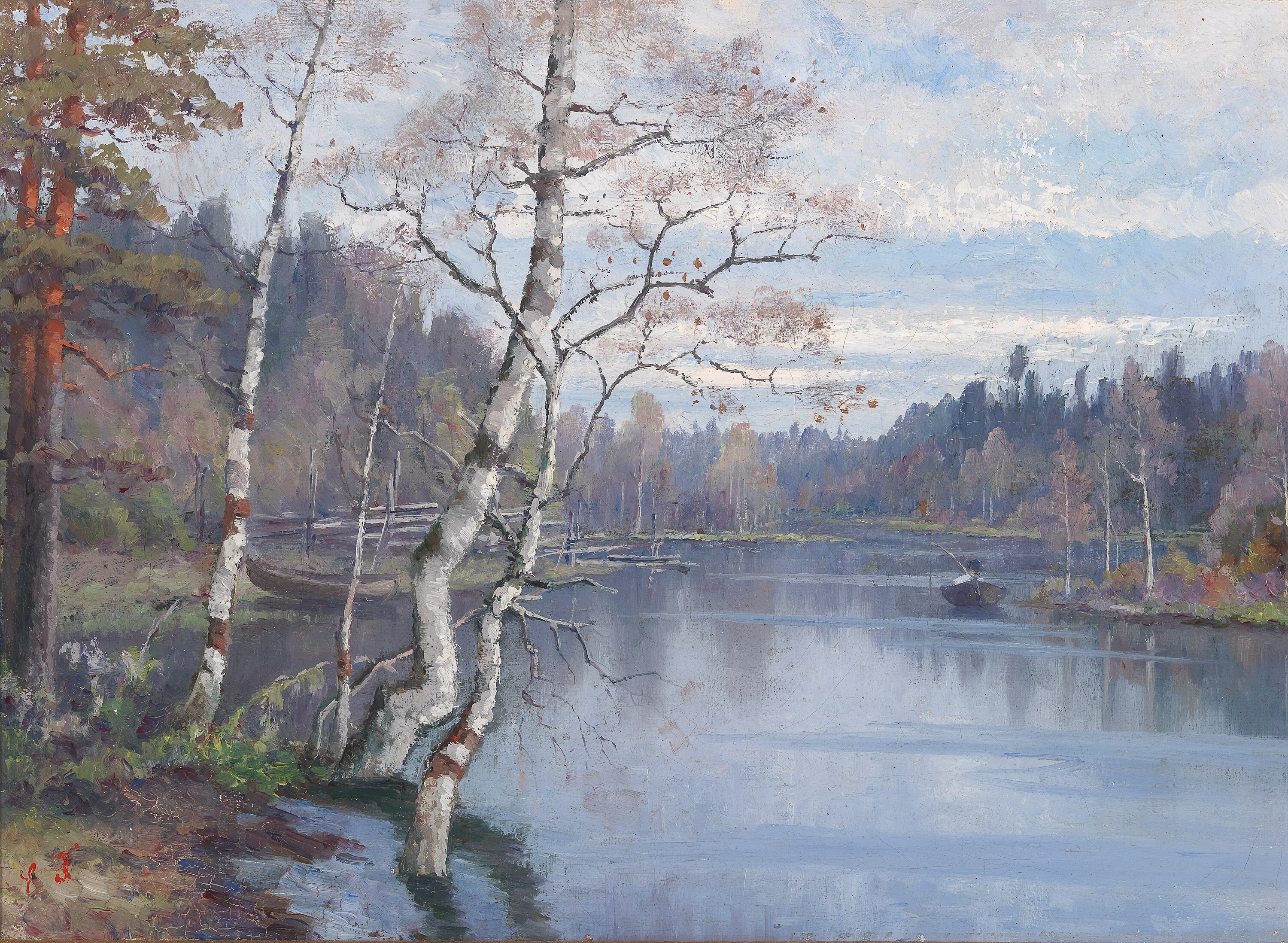
 Artist: Adolf Kaufmann (1848–1916)
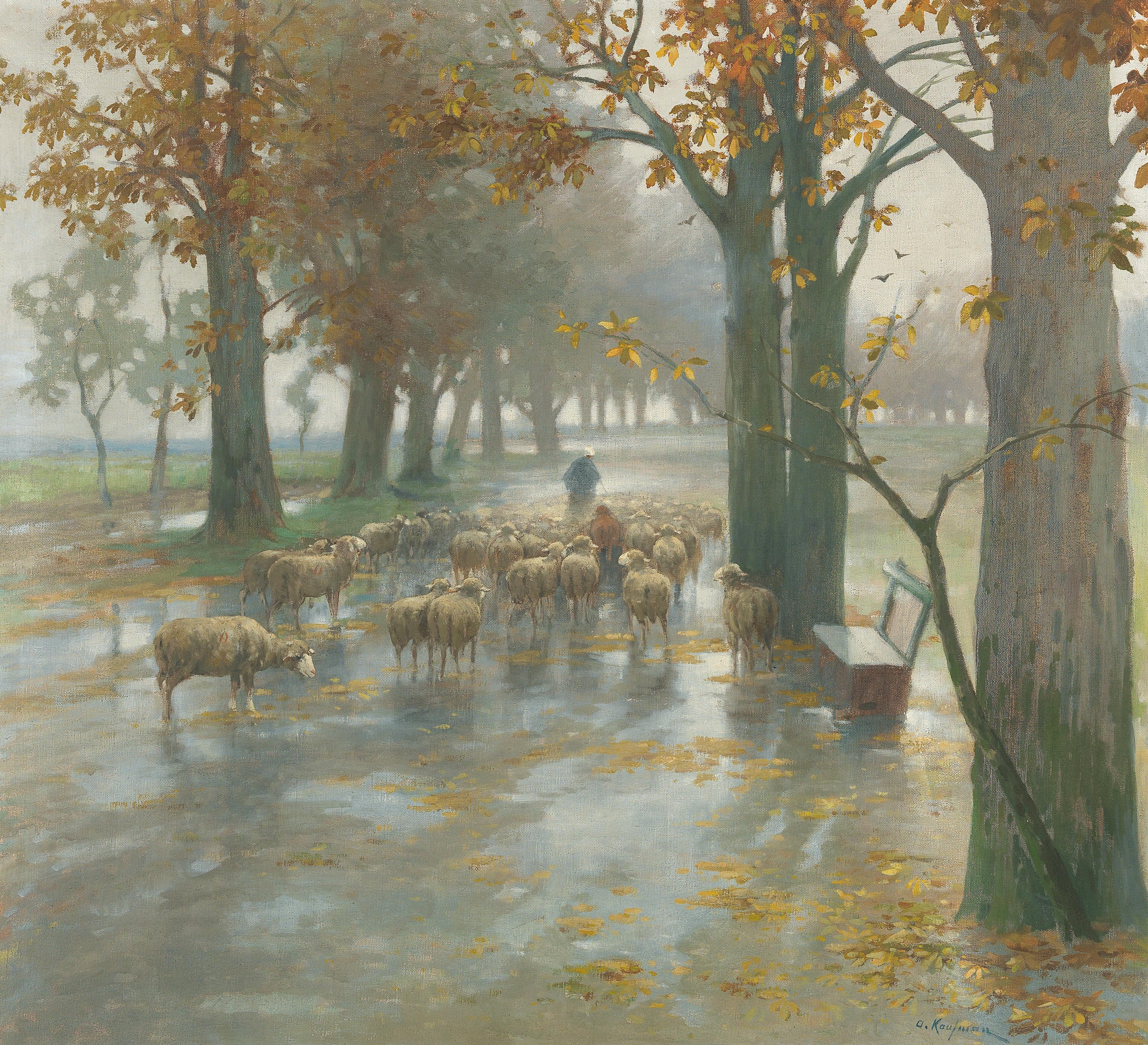


