

I first posted this image in December of 2018. As I considered what painting to look at for today’s post, it seemed to me that the brief bout of snowy weather here in the Pacific Northwest called for a snowy picture, and what could be snowier than Norway in the winter? I love paintings that depict historical places–they fuel my inner author.
Slindebjørka or Slindebirken was a birch tree that stood at Inner Slinde in Sogn, Norway, until it was blown down in a storm in 1874. The tree was beloved, considered a Norwegian national treasure. People came from all over Western Norway to see the tree and picnic beneath its branches.
What I love about this painting is the personality embodied in the birch tree itself as Dahl depicts it. The tree stands proudly, offering a place for birds to rest. It seems to represent the Norwegian spirit of independence, taking what nature throws at it with humor and stoicism.
Dahl’s portrayal is powerful, showing the bent and bowed branches held high despite the barrenness of winter. The image shows a tree that intends to be there when spring comes, as do the people of the village it overlooks.
About the Artist (from Wikipedia)
Johan Christian Claussen Dahl (24 February 1788 – 14 October 1857), often known as J. C. Dahl or I. C. Dahl, was a Norwegian artist who is considered the first great romantic painter in Norway, the founder of the “golden age” of Norwegian painting, and one of the greatest European artists of all time.[1] He is often described as “the father of Norwegian landscape painting”[2] and is regarded as the first Norwegian Painter ever to reach a level of artistic accomplishment comparable to that attained by the greatest European artists of his day. He was also the first to acquire genuine fame and cultural renown abroad.[3] As one critic has put it, “J.C. Dahl occupies a central position in Norwegian artistic life of the first half of the 19th century.[4]
As a boy, Dahl was educated by a sympathetic mentor at the Bergen Cathedral who at first thought that this bright student would make a good priest, but then, recognizing his remarkably precocious artistic ability, arranged for him to be trained as an artist. From 1803 to 1809 Dahl studied with the painter Johan Georg Müller [no], whose workshop was the most important one in Bergen at the time. Still, Dahl looked back on his teacher as having kept him in ignorance in order to exploit him, putting him to work painting theatrical sets, portraits, and views of Bergen and its surroundings. Another mentor, Lyder Sagen, showed the aspiring artist books about art and awakened his interest in historical and patriotic subjects. It was also Sagen who took up a collection that made it possible for Dahl to go to Copenhagen in 1811 to complete his education at the academy there.
As important as Dahl’s studies at the academy in Copenhagen were his experiences in the surrounding countryside and in the city’s art collections. In 1812 he wrote to Sagen that the landscape artists he most wished to emulate were Ruisdahl and Everdingen, and for that reason he was studying “nature above all,” Dahl’s artistic program was, then, already in place: he would become a part of the great landscape tradition, but he would also be as faithful as possible to nature itself.
Credits and Attributions:
Slindebirken, Vinter by Johan Christian Dahl 1838 [Public domain] via Wikimedia Commons
Wikipedia contributors, “Johan Christian Dahl,” Wikipedia, The Free Encyclopedia, https://en.wikipedia.org/w/index.php?title=Johan_Christian_Dahl&oldid=866337453 (accessed December 14, 2018).
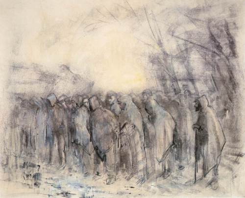 Author: László Mednyánszky (1852–1919)
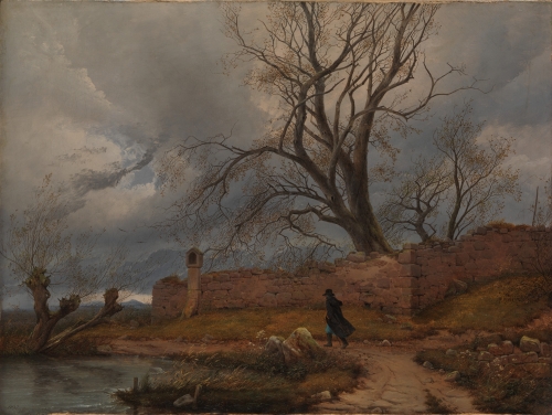 Artist: Carl Julius von Leypold (1806–1874)
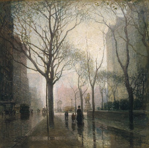 Artist: Paul Cornoyer (1864–1923)
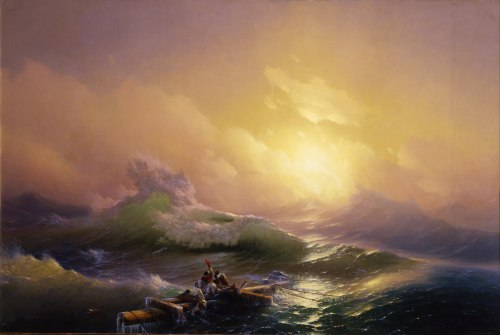 Artist: Ivan Aivazovsky (baptized Hovhannes Aivazovsky) (1817 – 1900)
 Artist: Bruno Liljefors (1860–1939)
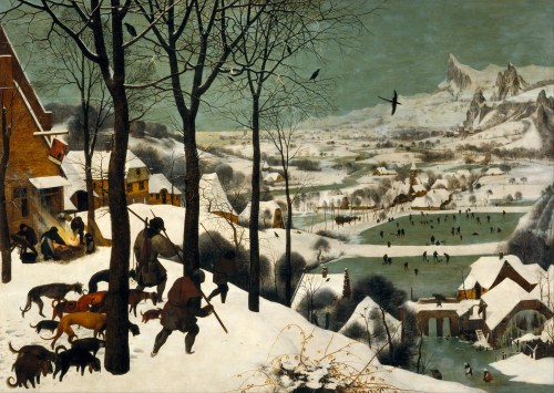 Artist: Pieter Brueghel the Elder (1526/1530–1569)
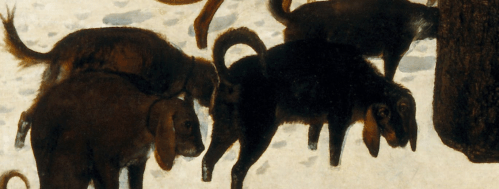
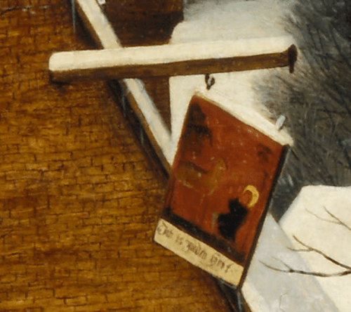

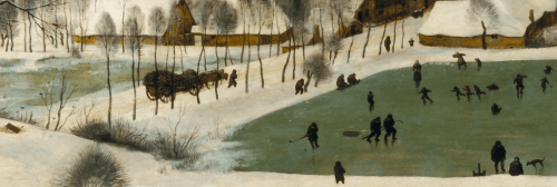 But they are indistinct and far away, shown in a fantastic, mountainous landscape, rather than the flat terrain of the Netherlands. It is almost as if they are visions of what winter could be when the harvest had been good, rather than the truth of the lone fox, hounds with empty bellies, a bankrupt tavern, and the rabbit that got away.


