#FineArtFriday: Chalk Cliffs on Rügen, by Caspar David Friedrich, 1818

Chalk Cliffs on Rügen, by Caspar David Friedrich circa 1818

What I love about this image:

Friedrich’s precision is spectacular. He pays as much attention to the leaves on the overhanging trees as he does to the cliffs and red dress his wife wears. His color choices are also wonderful—the vividness of Caroline’s red dress against the white cliffs is stunning.

The movement, the power of the cliffs above the sea, the small boats below–one feels humbled by the sheer power of nature.

I can never pass up an allegory, and this picture is packed with them. For more on that, we will turn to the Fount of All knowledge, Wikipedia:

The painting depicts the view from the chalk cliffs of the Stubbenkammer, at that time one of the most famous lookout points on the island. It is frequently but incorrectly believed that the Wissower Klinken outcrops in particular were a model for the painting; however, these did not exist at the time of the painting’s creation, but appeared later because of erosion. Friedrich often composed his landscapes from carefully chosen elements of different sketches, so that a specific location is not necessarily discernible.

Two trees, whose leaves cover the upper third of the painting, frame the scenery. Two men and a woman in town clothes gaze in wonder at the view. The thin figure in the middle is usually interpreted as Caspar David Friedrich himself.  His hat lies beside him as a sign of humility. He seeks for a foothold in the grass as a symbol of the transience of life and looks into the abyss opening before him—the abyss of death. On the right, the man with crossed arms leans against the trunk of a dying tree and looks far out to the sea. The two tiny sailboats stand as symbols for the soul which opens to eternal life and correspond to the figures of the two men.  On the left, the woman in a red dress (who is usually identified as Friedrich’s wife Caroline) sits beside an almost dried-up shrub: only the twigs around her face are leafing out. With her right hand she points either at the abyss or at the flowers bordering it. In contrast to the men, who gaze either at the abyss or into the distance, she communicates with the other figures—whether she feels threatened by the abyss or compelled by the natural beauty is unclear.

The colors of the figure’s clothes are also symbolic. The middle figure is blue, the color of faith; the left figure is red, that of love; and the right figure is green, that of hope. Thus they can be interpreted as embodiments of the three Christian theological virtues: faith, hope and love. The art historian Helmut Börsch-Supan sees in the picture a representation of Friedrich’s relation to death, and the threat to life by death: “clear […] as almost never before, but at the same time also in an unusually serene mood.”


Credits and Attributions:

Wikimedia Commons contributors, “File:Caspar David Friedrich’s Chalk Cliffs on Rügen.jpg,” Wikimedia Commons, the free media repository, https://commons.wikimedia.org/w/index.php?title=File:Caspar_David_Friedrich%27s_Chalk_Cliffs_on_R%C3%BCgen.jpg&oldid=311800403 (accessed April 12, 2019).

Wikipedia contributors, “Chalk Cliffs on Rügen,” Wikipedia, The Free Encyclopedia, https://en.wikipedia.org/w/index.php?title=Chalk_Cliffs_on_R%C3%BCgen&oldid=878315164 (accessed April 12, 2019).

Comments Off on #FineArtFriday: Chalk Cliffs on Rügen, by Caspar David Friedrich, 1818

Filed under writing

When creativity fails #amwriting

Every writer has moments when creativity fails them. We sit before our computer and the words refuse to come, or when they do, they seem awkward. At times like this, we feel alone and isolated. After all, an idea is jammed in our head and words should fall from our fingers like water from the tap.

I have suffered this, the same as every author does. However, it never gets too firm a grip on me because I have several exercises that help me write my way through the block. Something we sometimes forget is that the act of writing every day builds mental muscle tone and keeps you fit and in the habit of writing.

Every author suffers a dry spell now and then. Even so, this job requires us to practice, just like music or dancing. Doing well at anything artistic or sports related requires discipline. Just like a retired football player, when we stop writing for any reason, we lose our momentum and our purpose.

We lose our passion.

If you are in the middle of a manuscript and you lose your ability to go forward, save the file and close it. Walk away from that manuscript for a while.

Before we go any further, you must delete nothing. You will come back to your manuscript later with a fresh viewpoint and will be able to use some or all of it, so file it properly.

Occasionally, we get distracted by a different project that wants to be written. When that is the case, I always suggest you go ahead and work on the project that is on your mind. Let that creative energy flow, and you will eventually be able to become reconnected with the first project.

But what about those times when you need to write, you have to write, but the words won’t come? Trust me, it isn’t the end of your career. This is true writers’ block.

First, we have the element of fear to overcome. You are suddenly afraid that you have written everything good that you will ever write, and anything you write now is garbage.

It isn’t the end of everything. You will prove to yourself that you can write. This is a small exercise, very short. It should take you perhaps ten or fifteen minutes each day. My solution for this problem is a combination of mind-wandering and a a few simple writing exercises.

I got the idea for this while in a seminar on the craft of writing essays offered by the bestselling author of Blackbird, Jennifer Lauck.

In that class, Jennifer gave us prompts and asked us to write to them. I have never been good at writing to someone else’s prompts. My ideas don’t flow that way. To make it worse, we were going to have to share them with someone else in the class.

I felt panicky, terrified I wouldn’t be able to write, and would embarrass myself. My mind was blank.

When I saw what Jennifer’s prompt was, it occurred to me that I could do that. I had one of those bolt-of-lightning moments, a tangent to nowhere that didn’t pertain to her class. But it seemed important so I wrote it down. When I got home, I pondered a little more about it and put my thoughts into a short essay.

In that class, I realized that most of the time, writer’s block is a result of not being able to visualize what you want to write about. If you can’t visualize it, you can’t articulate it.

It hits us in two stages, two emotions that are so closely related, it feels like one horrible emotion.

  1. If you can’t visualize it, you can’t describe it. This can create a brief flash of panic.
  2. Once you have experienced that moment of complete inability, fear that it will happen again magnifies the problem until it paralyzes us.

This is the writing prompt Jennifer Lauck used as the first exercise in her class:

  1. Open a new document. At the top of this document type: Where I Am Today:

This is going to be a literal interpretation and description of your surroundings:

  • Look around you and see the place where you are.
  • Briefly describe the environment you are sitting in, what you see.
  • Describe how you feel sitting in that place.

Just give it two or three paragraphs. For me, sitting here at this moment and writing this post, it runs like this:

I sit in the small third bedroom of my home. It’s my office, a cluttered storeroom, known here as the Room of Shame. A cup of cooling coffee sits beside my elbow, as does my cell phone. My desk holds many books on the craft of writing and also my computer.  

Stacks of cardboard boxes filled with things that were, at one time, deemed important to keep, surround me. Filing cabinets full of legal papers, tax forms, and research take up space, all stuffed with the debris of our business life.

I could easily clean this space. It would take no time at all, perhaps a day at most. It’s a mountain I put off climbing.

See? At the end of this exercise, you have written a small short story.

But, more importantly, you have written the setting for a scene. Those paragraphs are around 120 words and are nothing special. But they were words and I wrote them, which keeps my mind functioning in a writing mode.

  1. For your next exercise, go somewhere else and take your notebook. Write three more paragraphs detailing what you are looking at, and how you fit into it, and how it makes you feel.

You could do that on your porch, in a coffee shop, or the parking lot at the supermarket, but go away from your normal writing space. Just write a few paragraphs about the space you have come to, what you see, and what you sense.

The third exercise is more abstract:

  1. Where do you want to be? Visualize and describe it the same way as you described the places you could see, a few short paragraphs. For me, I want to be flying my kite on Cannon Beach.

Your practice work is for your eyes alone. No one has to see it if you don’t want to share it.

If you do these three exercises at the same time every day, describing the environments and your perceptions in a different space each time, even when you have nothing to say that is worth reading, you are writing.

It’s a weird thing but writing about nothing in particular is like doodling. It is a form of mind-wandering. It can jar your creative mind loose. With perseverance, you will be writing your other work again.

The important thing is to write every day, even if it is only a few paragraphs. These are the exercises that work for me and which I recommend for working through writer’s block.

Remember, if you are suffering from a temporary dry spell, you are not alone. We all go through those times. When you want to talk about it, you will find friends here.

16 Comments

Filed under writing

Plotting and Agency #amwriting

Sometimes when I am writing the first draft of a novel, the characters take over, and the plot veers far away from what I had intended when I first began writing it. Even though I am a plotter, this happens because my work is character driven and sometimes, they’re erratic drivers.

When that happens, I have to sit down and look at my outline, then make adjustments. Usually, the ultimate ending never changes, but the path to that place can go quite far afield from what was originally intended. My task at that point is to keep the plot moving in such a way that it flows naturally. The characters must still act and speak as individually as I envision them.

This is called giving your characters “agency” and is an integral aspect of the craft of writing. Allowing your characters to make decisions that don’t necessarily follow the original plot outline gives them a chance to become “real.”

Many times, the way to avoid predictability in a plot is to introduce a sense of danger early, a response to an unavoidable, looming threat. How our characters react to that threat should feel unpredictable. When you let them act naturally, they will emerge as real, solid characters.

In literary terms, “agency” is the ability of a character to surprise the author, and therefore, the reader. If, when you are writing them you know their every response, it can feel canned, boring. Their reactions must surprise you occasionally.

For me, there are times when my characters drive the keyboard, making their own choices. Other times, they go along as I, their creator, has planned for them. Ultimately, they do what I intend for them, but always they do it their own way and with their own style.

Plotting, for me, means setting out an arc of events that I will then create connections to. Because my characters act independently, the order of events changes. New events are added. My plot outline must continually evolve with them so that I don’t lose control of the arc, and go off on a bunny trail to nowhere. This evolution of the outline happens because as I get to really know my characters, they make choices that surprise me.

They have agency.

When I begin planning a new novel, plotting is important because introducing an unavoidable threat early limits the habit I have of writing too much backstory. Plot outlines don’t allow much time for the characters to go about “life as normal” rather than going on an adventure. “Normal” is boring.

As they move through the events leading toward the final showdown each character will be left with several consequential choices to make in each situation. Allowing the characters to react to each incident that takes them out of their comfort zone is good.

The final event will happen in a situation where they have no choice but to go forward. By that point, their personalities are fully formed. How they react feels natural, because they have been growing as human beings over the course of the story.

Consequences are the most important aspect of any story when it comes to the choices my characters must make. I say this because if there are no consequences for bad decisions a character might make, everyone goes home unscathed and I won’t have much of a story.

So, while I am an outliner and plotter, I do fly-by-the-seat-of-my-pants to a certain extent. Those moments are beautiful, flashes of creativity that make this job the best job I ever had.

8 Comments

Filed under writing

#FineArtFriday: Christ in the Storm on the Sea of Galilee by Rembrandt van Rijn, 1633

Today’s image is of a picture that was stolen in 1990 and has never been recovered.

Christ in the Storm on the Sea of Galilee was painted during one of the happiest years of Rembrandt van Rijn’s turbulent life and depicts the miracle of Jesus calming the storm on the Sea of Galilee. A devout Christian, Rembrandt painted it from the description of the event as reported by the Apostle Mark, in the fourth chapter of his Gospel. As far as is known, it is the only seascape Rembrandt ever painted.

Constantijn Huygens, the father of Dutch mathematician and physicist Christiaan Huygens, had seen Rembrandt’s talent and helped him gain important commissions from the Court of The Hague. Many of his best religious paintings date from the years during which he had the favor of both Huygens and Prince Frederick Hendrick.

At the end of 1631, Rembrandt had moved to Amsterdam. The city was becoming the new business capital of the Netherlands, so there was great opportunity there for artists. In Amsterdam, Rembrandt had begun to paint portraits for the first time, and by 1633, his work was in high demand. His religious paintings and history paintings were also receiving the highest praise.

At first, he lived with an art dealer, Hendrick van Uylenburgh, which was where he met Hendrick’s cousin, Saskia van Uylenburgh. During 1633, the year in which Christ on the Sea of Galilee was painted, he was courting Saskia, hoping to marry her. He was earning a good income as a portraitist, and a bright future loomed. He must have felt in many ways as if he had the world by the tail.

What I love about this painting:

Rembrandt’s colors are vivid, standing out against the darkness of the storm. An entire story is captured in this image. The sea is terrifying, monstrous waves battering the ship, men panicking, trying to gain control. The terror of the event is clearly shown, and you feel fear for the men too. In the midst of chaos, Jesus awakes, calm despite the panic around him. Each face has a different expression, and one, a man holding a rope in one hand and pressing his cap to his head with the other, looks directly at us—Rembrandt himself.

The Gospel of Mark records the incident:

He woke up and rebuked the wind, and said to the sea, “Peace! Be still!” Then the wind ceased, and there was a dead calm. He said to them, “Why are you afraid? Have you still no faith?” And they were filled with great awe and said to one another, “Who then is this, that even the wind and the sea obey him?

Rembrandt, a frail man but a devout believer, lived the story as he painted it, as do all good storytellers.

About the theft, via Wikipedia:

On March 18, 1990, 13 works of art valued at a combined total of $500 million were stolen from the Isabella Stewart Gardner Museum in Boston. In the early hours, guards admitted two men posing as police officers responding to a disturbance call. Once inside, the thieves tied up the guards and over the next hour committed the largest-value recorded theft of private property in history. Despite efforts by the Federal Bureau of Investigation (FBI) and multiple probes around the world, no arrests have been made, and no works have been recovered.

The stolen works had originally been purchased by art collector Isabella Stewart Gardner (1840–1924) and intended to be left on permanent display at the museum with the rest of her collection. Since the collection and its layout are permanent, empty frames remain hanging both in homage to the missing works and as placeholders for their potential return. Experts are puzzled by the choice of paintings that were stolen, especially since more valuable artwork was left untouched. Among the stolen works was The Concert, one of only 34 known works by Vermeer and thought to be the most valuable unrecovered painting, valued at over $200 million.[when?] Also missing is The Storm on the Sea of GalileeRembrandt‘s only known seascape. Other works by Rembrandt, DegasManet, and Flinck were also stolen.

Christ in the Storm on the Sea of Galilee by Rembrandt van Rijn

  • Artist:   Rembrandt  (1606–1669)
  • Genre: religious art
  • Date: 1633
  • Medium: oil on canvas
  • Dimensions: Height: 160 cm (62.9 ″); Width: 128 cm (50.3 ″)
  • Current Location: Unknown

Sources and Attributions:

Wikimedia Commons contributors, “File:Rembrandt Christ in the Storm on the Lake of Galilee.jpg,” Wikimedia Commons, the free media repository, https://commons.wikimedia.org/w/index.php?title=File:Rembrandt_Christ_in_the_Storm_on_the_Lake_of_Galilee.jpg&oldid=341966464 (accessed April 4, 2019).

Wikipedia contributors, “Calming the storm,” Wikipedia, The Free Encyclopedia, https://en.wikipedia.org/w/index.php?title=Calming_the_storm&oldid=882782126 (accessed April 4, 2019).

The Isobel Stewart Gardner Museum, CHRIST IN THE STORM ON THE SEA OF GALILEE, 1633, https://www.gardnermuseum.org/experience/collection/10953 (accessed April 4, 2019).

2 Comments

Filed under #FineArtFriday

How to use the Track Changes Function #amwriting

Part of being a writer is going through the experience of having your work edited by a professional editor. Submissions that have been accepted by anthologies and publications may require a little editing prior to publication. We do our best to submit a clean manuscript, but none of us are perfect.

Editors often use a function of Word that is called “Track Changes” along with inserting comments in the right-hand column. When you are new to this process, it can be confusing. It may make you think he has “mucked up your manuscript” because he may have made changes that are marked in red and which surprised you.

Trust me, you have the final say on all changes that have been made, and you can “accept” or “reject” each suggested change. If you reject a suggestion, the text reverts back to your original prose.

Just a note: before you submit your work to an editor, you must do what I think of as “Due Diligence.” If you have hired an editor for a novel-length manuscript that was poorly proofed, tracked changes can be distracting, looking like a wall of red. If that is the case, the manuscript probably wasn’t ready for editing. Editors can only do so much – you must submit work that is as clean as you can make it, and they will help you clean up the rest.

A good way to catch the majority of typos and dropped or missing words is to use the “Read Aloud” function (on the review tab) or read it aloud yourself.

When a manuscript is too rough, some editors will choose to edit only the first few chapters and put most of their suggestions into the comment column rather than using tracking. Editing via keying suggestions in the comment column can be quite time-consuming. They will ask you to consider the suggestions they have made and make revisions in the whole manuscript accordingly, and then resend the ms once those changes have been made.

MS Word has four ways to show tracked changes:

  • Simple Markup: This shows the final version without inline markups. Red or black markers will appear in the left margin to indicate where a change has been made.
  • All Markup: This shows the final version with inline markups.
  • No Markup: This shows the final version and hides all markups.
  • Original: This shows the original version and hides all markups.

When I am editing for a client, I use “All Markup” and add comments as needed.

Places where I insert a suggested change will be in red and have a line beneath them. Deleted items will be in red and have a line through them, or in the case of commas, above them.

To accept or reject changes:

  1. Select the change you want to accept or reject.
  2. From the Review tab, click the Accept or Reject
  3. The markup will disappear, and Word will automatically jump to the next change. You can continue accepting or rejecting each change until you have reviewed all of them.
  4. When you’re finished, click the Track Changes command to turn off Track Changes. Just click on it, and the dark gray will return to the same shade of gray as the rest of the ribbon.

The automatic comments generated by “track changes” will disappear when you resolve the suggested changes. Those will say “Inserted” or “Deleted” followed by the word or punctuation that was changed.

If your editor has made separate comments regarding larger issues, such as suggestions to move a section to a different place for continuity, they won’t disappear from the comment column when you accept or reject tracked changes. You’ll have to delete them separately.

  1. On the Review tab, in the Comments section, click Next to select a comment.
  2. On the Review tab, click Delete.

To delete all comments at once, click the arrow next to Delete, and then click Delete All Comments in Document.

This is how a document might look when it comes back from the editor. The left column shows a line indicating a change was made, the change itself is in red, and a comment was automatically generated explaining what that change was.
Some authors get exceedingly angry when the editor of an anthology requests some changes in the story they have submitted. Editors have a vision of how the whole book will flow when it is complete, and they may ask for some small changes so that the stories transition well.

If the changes are reasonable (and most are), do make them. If you strongly disagree, wait until you cool down before responding.

Once you have a handle on your irritation, write a note explaining why you don’t feel those changes are right for that piece. It could be that the editor just didn’t understand where you were going with it, and a few minor tweaks along with a calm discussion will resolve the problem.

Google Docs has a track changes function, and I am sure all other word processing programs do too. Their processes will likely be similar to what I have described, and you can go online to find out what the differences are. But Word is the program I use, so I am most familiar with that.

2 Comments

Filed under writing

Fonts and Headers #amwriting

Today we are going to discuss fonts and why we use “industry standard” fonts for all our submissions. Publishers have specific, standardized formatting they want you to use, and these guidelines are posted on their websites. When a call for submissions goes out, their editors will have no time to deal with badly formatted manuscripts. If you don’t follow their guidelines, they will assume you aren’t a professional and won’t read your work.

If you have a specific contest or publication in mind that you plan to submit your manuscript to, go to the publication’s website and read the standards and requirements they have laid out.

A good guide for making a manuscript conform to industry standards can be found at William Shunn’s website: Proper Manuscript Format: Short Story Format.

That looks complicated, you say. It isn’t, but you do need to learn how to use your word processing program, and I am here to help you.

I use Word as my word processing program, but most word processing programs (Open Office, Google Docs) follow a similar process as my program does.

Running across the top of the page is something called the ribbon, and this is your toolbox. Everything you need to create a manuscript is right there, waiting for you to learn to use it. On the right-hand side, by the question mark is a tiny arrow for expanding or hiding the ribbon – and we are going to expand it so we have access to all the tools we will need.

Now we must select the font. As I said before, I use Microsoft WORD, and like every other word-processing program, it has many fancy fonts you can choose from and a variety of sizes.

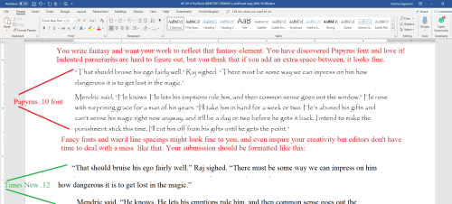
You don’t want fancy. Stick with the industry standard fonts: Times New Roman or Courier in 12 pt. These are called ‘Serif’ fonts and have little extensions that make them easier to read.

If you are using MS WORD, here are a few simple instructions for changing your fonts.

Open your manuscript document, and Click on the tab marked ‘Home.’  In the upper right-hand corner of the ribbon across the top of the page in the editing group, click:

select> select all. This will highlight the entire manuscript.

With the ms still highlighted, go to the font group, on the left-hand end of the ribbon. The default font, or predesigned setting, will probably say ‘Calibri (Body)’ and the size will be .11.

You can change this by opening the menu. Scroll down to Times New Roman or Courier (depending on the publisher’s guidelines). Click on that, and the font for the entire ms will be that font. If you have clicked on the wrong font, it can be undone by clicking the back-arrow (upper left hand corner).  Once you are satisfied with your changes, click save.

Now, with the ms still highlighted, we are going to format our paragraphs. Having it double-spaced allows for longer comments and is easier for an editor to read. The specific details for formatting paragraphs can be found in last week’s post, Formatting Your Paragraphs. It is a process that is absolutely critical.

Most publishers and editors want the header formatted. Each page should be clearly marked with your name and/or the title of the book as well as the page number. Many publishers will still accept print copies of manuscripts, but want them UNBOUND. No staples, not in a ring binder. You may use one large binder clip if you just can’t resist, but otherwise, they want the manuscript stacked and inserted in a manila envelope.

Accidents happen: if the printout of the manuscript accidentally falls off a desk, it can easily be reassembled, and the editor will always know that you wrote that story.

To make your header:

  • Open the “insert” tab.
  • Click on “page number.”  This opens a new menu.
  • Add the page numbers using the small dropdown menu.
  • Insert the title and your author name just before the page number.

That will be your header.

This is how the ribbon and menus look:Sometimes, a publisher will specify that the first (title) page have no header or page number, but they want the header and page numbers to begin on page two.

To make the page numbers begin on page two:

  1. Click anywhere in the document.
  2. On the Page Layout tab, click the Page Setup Dialog Box Launcher, and
  3. then click the Layout
  4. Under Headers and footers, select the Different first page check box, and then click OK.

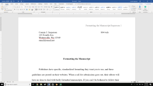
What goes on the first page? Your first page should include:

  • The name of the work.
  • The approximate word count, some will want it only to the nearest hundred.
  • In the upper left, your contact details formatted in the same font and size as the manuscript font.

Now your manuscript:

  1. is aligned left.
  2. has 1 in. margins.
  3. is double-spaced.
  4. has formatted indented paragraphs.
  5. The header contains the title, author name, and page numbers, and is aligned right.
  6. The first page contains your mailing address and contact information in the upper left hand corner.

Good luck with your submissions. Selling work to anthologies and magazines is the best way for an indie to build a reputation as an author. You will be competing with many other authors, all of them as creative and talented as you are, so making your work look as professional as is possible will give you an edge.

8 Comments

Filed under writing

#FineArtFriday: The Lamentation by Michiel Sweerts  

Michiel Sweerts:  The Lamentation

Date:   between 1643 and 1661

Medium:          Etching and engraving on paper

Dimensions:    Height: 28.7 cm (11.2 ″); Width: 34.6 cm (13.6 ″)

About the technique of Etching (From Wikipedia):

Etching is traditionally the process of using strong acid or mordant to cut into the unprotected parts of a metal surface to create a design in intaglio (incised) in the metal. As a method of printmaking, it is, along with engraving, the most important technique for old master prints, and remains in wide use today.

In traditional pure etching, a metal (usually copper, zinc or steel) plate is covered with a waxy ground which is resistant to acid. The artist then scratches off the ground with a pointed etching needle where he or she wants a line to appear in the finished piece, so exposing the bare metal. The échoppe, a tool with a slanted oval section, is also used for “swelling” lines. The plate is then dipped in a bath of acid, technically called the mordant (French for “biting”) or etchant, or has acid washed over it. The acid “bites” into the metal (it dissolves part of the metal) where it is exposed, leaving behind lines sunk into the plate. The remaining ground is then cleaned off the plate. The plate is inked all over, and then the ink wiped off the surface, leaving only the ink in the etched lines.

Etchings were, in the 17th century, the way an artist could ensure his work was seen by the growing middle-class who would otherwise be unable to afford art for their homes. Once an artist mastered the technique, it was the most reliable way to earn money from his work.

About the artist, via Wikipedia:

Michiel Sweerts was born in Brussels where he was baptized on 29 September 1618 in the St. Nicholas Church as the son of David Sweerts, a linen merchant, and Martina Ballu.  Little is known about the artist’s early life and nothing about his training.

The surviving works by Sweerts mostly date to the period of his residence in Rome. Due to the difficulty of attributing works to the artist who rarely signed his works the number of canvases given to the artist vary from 40 to 100. Some of Sweerts’ works were so popular in his time that contemporary copies were made, some by Sweerts himself, others by pupils or followers. It is not always easy to determine the level of Sweerts’ involvement (if any) in the making of these copies. For instance, there exist at least four early copies, of varying quality, of his Artist’s studio with a woman sewing (one copy at the Collection RAU – Fondation Unicef, Cologne). None of his paintings produced after he left Europe is known to survive.

The majority of his output falls into two categories: ‘genre scenes” of low-life subjects of country and street life and portraits or tronies. A third category are allegorical works, which are regarded as enigmatic and are the subject of ongoing interpretation by art historians. Sweerts reportedly painted compositions of Biblical subjects, several of which are mentioned in contemporary inventories. However, none of these are known to have survived. One of his religious paintings, a Lamentation is known from the print, which Sweerts himself made after his own painting. The composition is unusual for the Virgin’s comforting gesture towards the inconsolable Mary Magdalene.

Sweerts is an enigmatic and difficult artist to categorise, since he absorbed a variety of influences to create an eclectic style that adapted Netherlandish genre painting to early tenebrist styles as well as blended Baroque and classicist tendencies.

By December 1661 Sweerts had arrived in Marseilles from where his ship left for Palestine in January 1662.  Sweerts sailed for Alexandretta with bishop François Pallu, 7 priests and another lay brother. In Syria he is said to have produced some paintings. On the overland portion of the trip in Syria he became mentally unstable and was dismissed from the company somewhere between Isfahan and Tabriz in Persia. He then traveled on to the Portuguese Jesuits in Goa where he is reported to have died at the age of 46.


Credits and Attributions:

Wikipedia contributors, “Etching,” Wikipedia, The Free Encyclopedia, https://en.wikipedia.org/w/index.php?title=Etching&oldid=887368691 (accessed March 29, 2019).

Wikipedia contributors, “Michiel Sweerts,” Wikipedia, The Free Encyclopedia, https://en.wikipedia.org/w/index.php?title=Michiel_Sweerts&oldid=850063690  (accessed March 29, 2019).

Wikimedia contributors, “Michiel Sweerts,”  https://en.wikipedia.org/wiki/File:Michiel_Sweerts_-_The_lamentation.jpg (accessed March 29, 2019)


Comments Off on #FineArtFriday: The Lamentation by Michiel Sweerts  

Filed under #FineArtFriday

Formatting your paragraphs #amwriting

When we finish writing a short story, we feel the urge to immediately submit it to an anthology, a magazine, or contest. This urge can be overwhelming, but don’t do that just yet.

Set your manuscript aside for a week or so then come back to it and revise it.

Have the “Read Aloud” function of your word processing program read it to you as you go over it and look for editable flaws.

Check for words that spell check won’t find because they are spelled correctly but are wrong, little things such as “They went their for breakfast.”

Next, we want to format it for submission, which is a process with several steps, all of which are important. It is a bit too long for one post, so I am dividing it into digestible chunks and will finish this series next week.

First, you must look for extra spaces in odd places. They are most frequently found at the end of sentences. Nowadays, publishers and editors want one (1) space after each sentence. When I was learning to type in school, they taught us to hit the space bar twice (two spaces) after each sentence, but this is no longer acceptable as the extra spaces interfere with formatting for eBooks and other electronically uploaded applications. Other than at a few specialty printers, ALL books and magazines are uploaded electronically nowadays, even print books.

Tabs – I feel it’s important to revisit this subject, as I have seen many manuscripts where authors used the tab key to indent their paragraphs.

Using tabs to indent paragraphs screams “amateur.” The indents fail when the ms is uploaded to a mobi or ePub file, so publishers really hate it when this happens. Ninety percent of publications and publishing houses want electronic submissions. For this reason, make sure you have removed the tabs before you go any further with your manuscript. The following instructions only work if you have a ten-key pad on your keyboard.

To remove tabs from a manuscript in Word or most other word-processing programs, open the “Find” box (under “Edit” in Word). In the “Find” field, type in ^t. (press the alt key 94 to make ^ and key the t) This only works if you have a ten-key (number pad) at the right side of your keyboard. ^t.

Then click “Replace.” In this field, type nothing. One click on “Replace all” will remove every tab.

That will leave you with no indents whatsoever.

If you don’t have a ten-key pad on your keyboard, you will have to remove each one by hand which is a daunting task no publisher or editor has time for.

Once the tabs are all removed, the following instructions will help you format paragraphs.

You want your work to look professional, even if you are only submitting it to your writing group for a critique. You can format the paragraphs two ways.

The easiest way is to open the “home” tab, click on “select all,”  and choose “normal” from the “styles” tab on the ribbon.

 If your word processing program doesn’t have that option, you can format the paragraphs by using the simple formatting tool:

Step 1: On the home tab, look in the group labeled ‘Paragraph.’ On the lower right-hand side of that group is a small grey square. Click on it.  A pop-out menu will appear, and this is where you format your paragraphs.

Step 2: On the indents and spacing tab of the menu: Use standard alignment, align LEFT. The reason we use this format is we are not looking at a finished product here. We are looking at a rough draft that will be sliced, diced, and otherwise mutilated many times before we get to the final product.

Step 3: Indentation: leave that alone or reset both numbers to ‘0’ if you have inadvertently altered it.

Step 4: Where it says ‘Special’: on the drop-down menu select ‘first line.’ On the ‘By’ menu, select ‘0.5.’ (Some publishers will specify a different number, 0.3 or 0.2, but 0.5 is standard.)

Step 5: ‘Spacing’: set both before and after to ‘0.’

Step 6: ‘Line Spacing’: set to ‘double.’

To summarize, standard paragraph format has:

  • margins of 1 inch all the way around
  • indented paragraphs with no extra space between
  • double-spaced text
  • Align Left. This is critical.

Do not justify the text. In justified text, the spaces between words, and letters (known as “tracking”) are stretched or compressed. Justified text aligns with both the left and right margins. It gives you straight margins on both sides, but this type of alignment only comes into play when a manuscript is published, and at that point, the publisher will handle the formatting.

On Monday, we will look at the next step of formatting our manuscript—that of making it “submission ready.”

11 Comments

Filed under writing

Gaining strength through rejection #amwriting

We who are authors and artists are notoriously thin-skinned. When we are young in the profession and still consider our works to be the equivalent of our perfect children, we bleed profusely when you admit you didn’t really enjoy what we wrote (or sang, or painted). Some of us handle this kind of conversation with grace and dignity, and others not so well.

But what if the unloved thing was the best thing we ever wrote?

It does happen.

I get ten rejections at least for every one acceptance, but usually many more. I get so many that I hardly even notice them nowadays. I just keep the revolving door revolving. After all, if you don’t submit your work, you won’t get any acceptances.

When I first began shopping my work out, I would feel crushed upon receiving a rejection. However, when I look back at those efforts, I can clearly see why those particular pieces weren’t accepted.

First, I had no idea what a finished manuscript should look like. The internet wasn’t a thing yet, and I hadn’t heard of William Shunn or his instructions for how to properly format a manuscript. I knew my finished story had some problems, but I didn’t understand what those problems were or how to resolve them. I naively assumed an editor would fix them, because that’s what editors do, right?

Wrong.

I wasn’t as well educated as I thought I was. Typos, dropped and missing words, long, convoluted sentences, and hokey dialogue—all found their way into my first efforts.

I began to get past that stage when I found Orson Scott Card’s book, “How to Write Science Fiction and Fantasy.”

I still didn’t understand everything, or even most of anything. But I was on the road to learning more about what I didn’t know. Books on the craft of writing began to fill my shelves, and I took classes and went to seminars.

Nowadays my work is submission ready and as clean as I can make it. Sometimes my work is accepted, and believe me, I celebrate. Most of the time it is rejected, and not because it is bad. Most of the time, rejection means that I submitted something that wasn’t what the editor was looking for.

Editors usually have a certain kind of story in mind when they put out an open call, and only a few of the landslide of submissions will be accepted. Those that are accepted are the few that perfectly fit the editor’s original concept.

What I’m going to say next has been said before, many times. Sometimes we receive a form letter rejection that boils down to “Sorry, but no.” It isn’t personal, so don’t brood over it. Those kinds of rejections are bad only because they don’t tell us why the piece wasn’t acceptable.

Sometimes we receive a little encouragement: “Try us again.” That means exactly what it says, so the next time you have something you think will fit in that anthology or magazine, send them a submission.

I know this makes no sense, but when an editor explains their reasoning in a letter, it is very likely that some phrase will be like a knife to the chest for the author. This is because it’s a rejection and may contain detailed criticism.

I once got a rejection from an anthology along with a note that said the subject of my quest had been done before. I was a little surprised and hurt because I felt that comment was vague and meant they didn’t even bother to read the story.

I could have responded childishly, but that would have been foolish and self-defeating. The truth was the type of quest it involves has been done before. I felt that my story was original in its presentation, but it didn’t ring that editor’s bells.

I hauled myself off to a corner and licked my wounds. Then, I sent that editor a response thanking them for their time. An editor’s bluntness is valuable, so I will someday rework that tale with a different twist.

We live in a world that is always observing us. We are judged by the way we act and react in every professional interaction. If you’re in a writing group and your work isn’t as well received as you thought it would be, don’t respond to a peer’s criticism without thinking it through.

Even worse, if you fly off and send a flame mail to an editor, you risk doing irreparable damage to your career—you will be put on that editor’s “no way in hell” list.

Also, please don’t go bad-mouthing that editor on Twitter or Facebook. All that drama is just plain embarrassing, and unprofessional.

It’s easy to forget that editors are also authors. They are involved with the same forums in all the many social platforms you are, so be careful of what you say online. Editors are just like the rest of us, and they’ve experienced their share of rejection.

When an author has a public tantrum, the innocent bystanders remember it. Snide tweets about other authors, awkward Instagram photos, or Facebook rants don’t show a person in a good light.

I shouldn’t have to remind anyone of this, considering all the noise about Facebook and our personal information, but how we interact online with others is public information and is visible to the world.

We must always consider what an interested reader will find when they  Google our author name. Our online interactions at Goodreads, Twitter, and in every other public forum will be available for eternity.

What should you do if your work is accepted, but the editor would like a few revisions?

If the editor wants changes, they will make clear what they want you to do. This happens most often for submissions to an anthology. Editors know what their intended audience wants.  Trust that the editor knows their business.

Make whatever changes they request.

Never be less than gracious to any of the people at a publication when you communicate with them, whether they are the senior editor or the newest intern. Be a team player and work with them.

Negative feedback is a necessary part of growth. I keep a file of my rejection letters/emails. Most are simple: “We are not interested in this piece at this time.” Some have short notes attached with the words, “Try us again in the future.” Some contain the details of why a piece was rejected, and while those comments are sometimes painful, they are the ones I learn from.

Rejection is the most common kind of response an author will receive, sometimes for years. How we react to it is where each of us has the opportunity to cross the invisible line between amateur and professional. My next post will be on making your short-story manuscript “submission ready.”

5 Comments

Filed under writing

#FineArtFriday: Don Quixote in the Library by Adolf Schrödter, revisited

Today we are revisiting area of art which has often been a primary reason why I buy books, the illustrations. This post was first published here on August 3, 2018. The above image is one I love, a scene from  one of my favorite books. Don Quixote is a character that is near to my heart.

The artwork that went into many books in the 19th and early 20th centuries was sometimes exquisite. Yet, these illustrators remained unknown for the most part and unsung. Today’s image is from Wikimedia Commons and is by a German artist, Adolf Schrödter.

Little is known about Schrödter other than he was born on June 28, 1805, and died Dec. 9, 1875, and was a genre painter of the Düsseldorf school of painting. According to Wikipedia, the Fount of All Knowledge:

The Düsseldorf School had a significant influence on the Hudson River School in the United States, and many prominent Americans trained at the Düsseldorf Academy and show the influence of the Düsseldorf School, including George Caleb BinghamDavid Edward CroninEastman JohnsonWorthington WhittredgeRichard Caton WoodvilleWilliam Stanley HaseltineJames McDougal HartHelen Searle, and William Morris Hunt, as well as German émigré Emanuel LeutzeAlbert Bierstadt applied but was not accepted. His American friend Worthington Whittredge became his teacher while attending Düsseldorf.

However, some of Schrödter’s art survives in the form of illustrations and a few prints have been sold at auctions.

In today’s image what impresses me is the level of detail. Here we see Alonso Quixano reading, lounging in a room that is clearly a book lover’s sanctuary. He is a descendant of the family of “Gutierre Quijada” by direct lineage and is proud to be part of a long and noble tradition of knights. In the first part of the book, Alonso, later Don Quixote de la Mancha, is a dreamer, preferring to imagine himself as a superhero, living out a knightly story.

Books are strewn everywhere, beautiful, heavy leather-bound tomes. Schrödter shows him in a relaxed pose, deep into a book. The light of the room comes from a large window. He is a very human, ordinary middle-aged man, relaxing in the most cherished place in his universe: his library.

Alonso Quixano, the protagonist of the novel (though he is not named until much later in the book), is a retired country gentleman nearing fifty years of age, living in La Mancha with his niece and housekeeper. Although he is mostly a rational man, his excessive reading of books of chivalry has produced a skewed view of reality and what we might consider dementia. In keeping with the theories of the time, not sleeping adequately—because he was reading—has caused his brain to dry.

I love that notion.

As a result, Alonso is easily given to anger and believes every word of these fictional books of chivalry to be true. Don Quixote’s niece commits, what is to me, the most heinous crime–she and the Parrish curate burn his library, and lie to him, telling him it was the work of an evil magician.

He descends completely into his fantasy world and decides to become a knight-errant in search of adventure. Schrödter has captured the essence of the making of Don Quixote in this painting—the man who loves books is in his element, the one place where he fits. When that is taken from him, the story begins.


Credits and Attributions:

Don Quixote in the Library, by Adolf Schrödter, 1834 PD|100, via Wikimedia Commons.

Wikipedia contributors, “Düsseldorf school of painting,” Wikipedia, The Free Encyclopedia, https://en.wikipedia.org/w/index.php?title=D%C3%BCsseldorf_school_of_painting&oldid=822264175 (accessed August 3, 2018).

Comments Off on #FineArtFriday: Don Quixote in the Library by Adolf Schrödter, revisited

Filed under writing