If you are serious about writing and submitting short stories, you must learn to use the features that come with your word processing program.
Publishers have specific, standardized formatting they want you to use, and these guidelines are posted on their websites. When a call for submissions goes out, their editors will have no time to deal with badly formatted manuscripts.
If you can’t be bothered to follow their guidelines, they won’t be bothered to read your work.
For the most part, the requirements are basically the same from company to company with minor differences. To make sure your work conforms to the intended recipient’s requirements go to the publication’s website and read the standards they have laid out.
William Shunn has established a standard format that is acceptable to most publishers. All of the following steps will come into play when you make your document look like his. The link for his website where the example can be viewed is here: William Shunn: Proper Manuscript Format : Short Story Format
To get your paragraphs and line spacing right, you need to know a few simple tricks for using your word processing program. These tools come with the software and are there to make your documents look as professional as is possible.
First, you must open the toolbox.
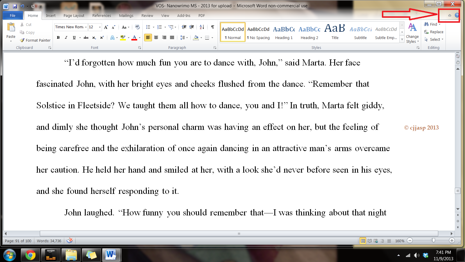
Open your document. I use Word, but most word processing programs (Open Office, Google Docs) follow a similar process as my program does. Running across the top of the page is something called the ribbon, and this is your toolbox. Everything you need to create a manuscript is right there, waiting for you to learn to use it. On the right-hand side, by the question mark is a tiny arrow for expanding or hiding the ribbon – and we are going to expand it so we have access to all the tools we will need.
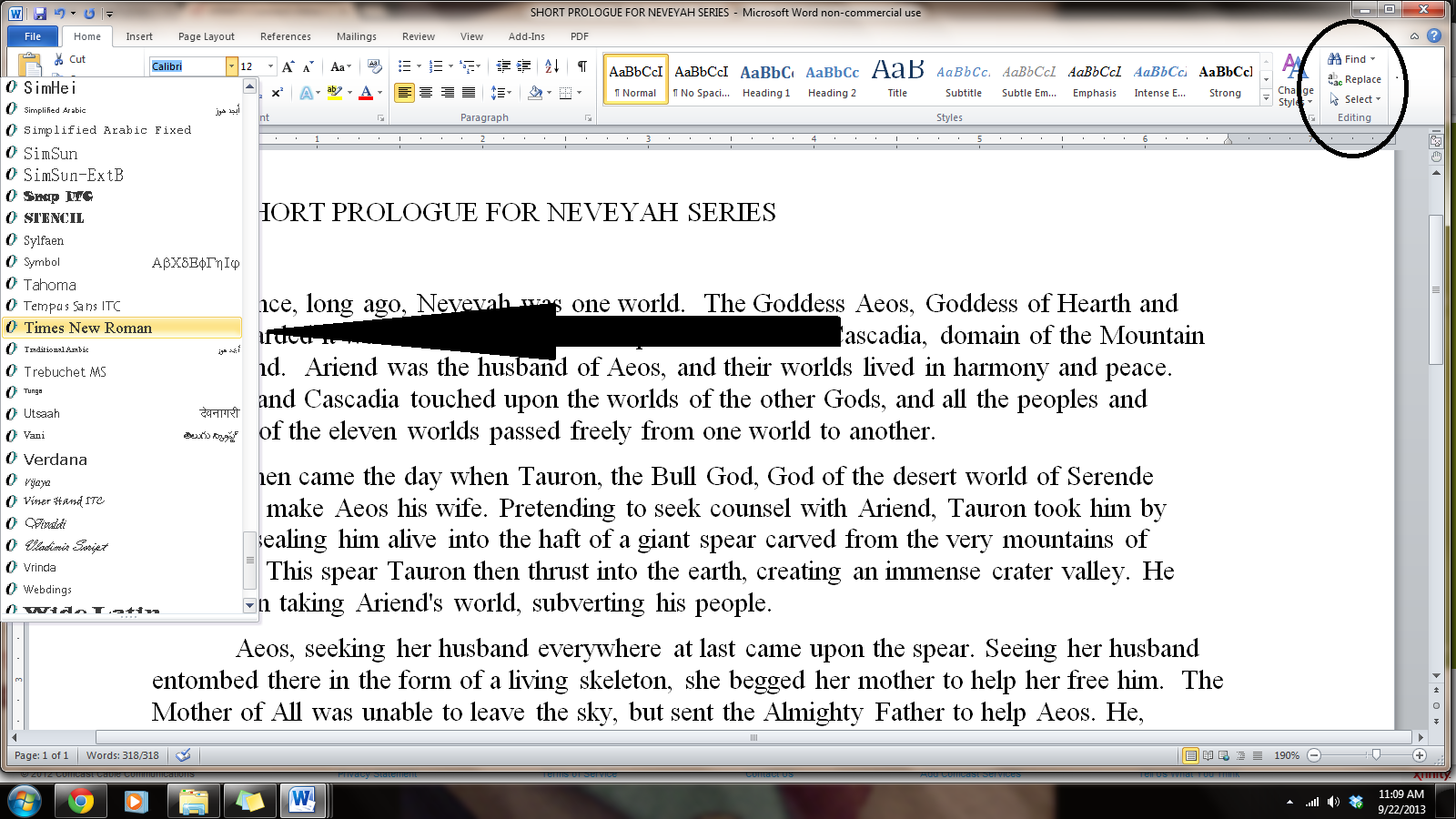
Now we must select the font. As I said before, I use Microsoft WORD, and like every other word-processing program, it has many fancy fonts you can choose from and a variety of sizes.
You don’t want fancy. Stick with the industry standard fonts: Times New Roman or Courier in 12 pt. These are called ‘Serif’ fonts and have little extensions that make them easier to read when in a wall of words.
If you are using MS WORD, here are a few simple instructions: to change your fonts, open your manuscript document, and Click on the tab marked ‘Home.’ In the upper right-hand corner of the ribbon across the top of the page in the editing group, click:
select> select all. This will highlight the entire manuscript.
With the ms still highlighted, go to the font group, on the left-hand end of the ribbon. The default font, or predesigned setting, will probably say ‘Calibri (Body)’ and the size will be .11.
You can change this by opening the menu. Scroll down to Times New Roman or Courier (depending on the publisher’s guidelines). Click on that, and the font for the entire ms will be that font. If you have clicked on the wrong font, it can be undone by clicking the back-arrow (upper left hand corner). Once you are satisfied with your changes, click save.
Now we are going to format our paragraphs and line spacing. Editors and publishers want their copies double-spaced so they can insert comments as needed in the reviewing pane, which will be on the right side of the page when you receive your work back for revisions. Having it double-spaced allows for longer comments and is easier for an editor to read.
Do NOT ever use the tab key or the space bar to indent your paragraphs.
You have no idea what a mess that makes out of an electronic manuscript. Too many extra spaces in an electronic document cause the formatting to fail when converted to electronic publishing formats (mobi, epub, etc.) so keep extra spaces to a minimum. Most publishers require manuscripts to be submitted electronically, so you will have to go in and remove these tabs by hand, and it’s a tedious job, but do it now, if you have been using the tab key.
You can format the paragraphs by either opening the home tab and choosing ‘normal’ from the styles tab on the ribbon. This is simplest, but what is ‘normal’ on your software may not be what your publisher requires. The best way is to format by using the formatting tool, which requires 6 steps, detailed below.

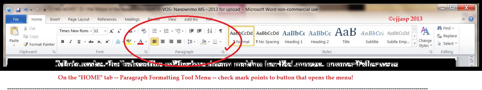
Step 1: Once again, select all to highlight the entire document. Then, on the home tab, look in the group labeled ‘Paragraph.’ On the lower right-hand side of that group is a small grey square. Click on it. A pop-out menu will appear, and this is where you format your paragraphs.
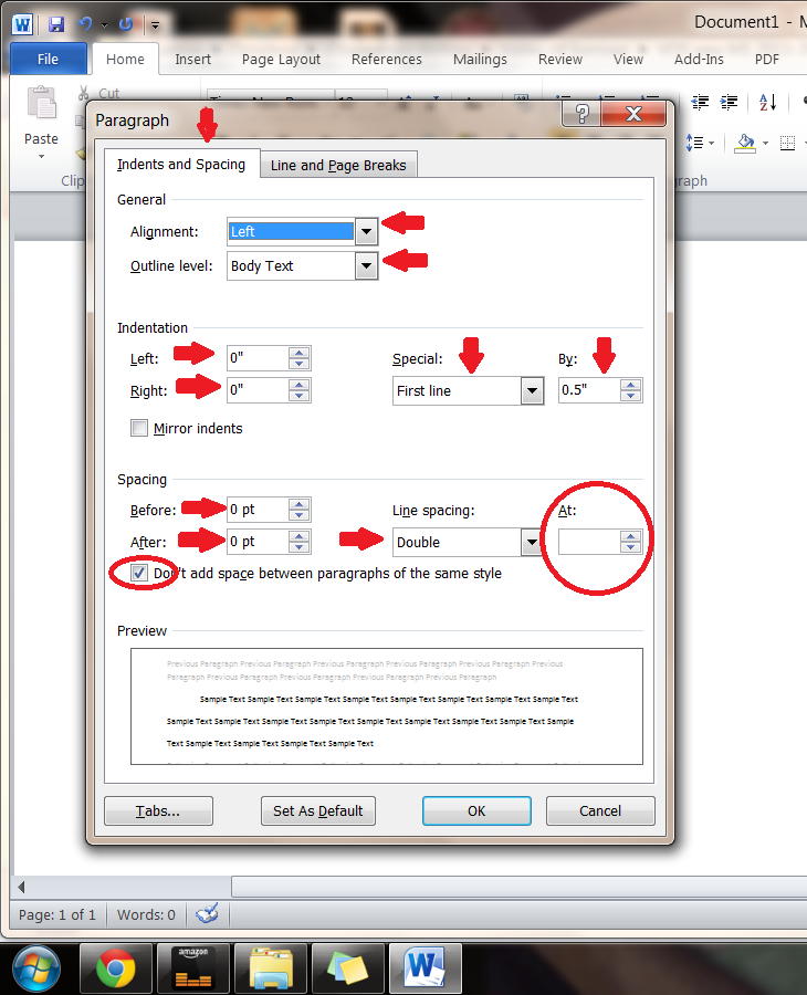
Step 2: On the indents and spacing tab of the menu: Use standard alignment, align LEFT. The reason we use this format is we are not looking at a finished product here. We are looking at a rough draft that will be sliced, diced, and otherwise mutilated many times before we get to the final product.
Step 3: Indentation: leave that alone or reset both numbers to ‘0’ if you have inadvertently altered it.
Step 4: Where it says ‘Special’: on drop-down menu select ‘first line.’ On the ‘By’ menu, select ‘0.5.’ (Some publishers will specify a different number, 0.3 or 0.2, but 0.5 is standard.)
Step 5: ‘Spacing’: set both before and after to ‘0.’
Step 6: ‘Line Spacing’: set to ‘double.’
To summarize, standard paragraph format has:
- margins of 1 inch all the way around
- indented paragraphs with no extra space between
- double-spaced text
- Align Left. This is critical.
Do not justify the text. In justified text, the spaces between words, and letters (known as “tracking”) are stretched or compressed. Justified text aligns with both the left and right margins. It gives you straight margins on both sides, but this type of alignment only comes into play when a manuscript is published, and at that point, the publisher will handle the formatting.
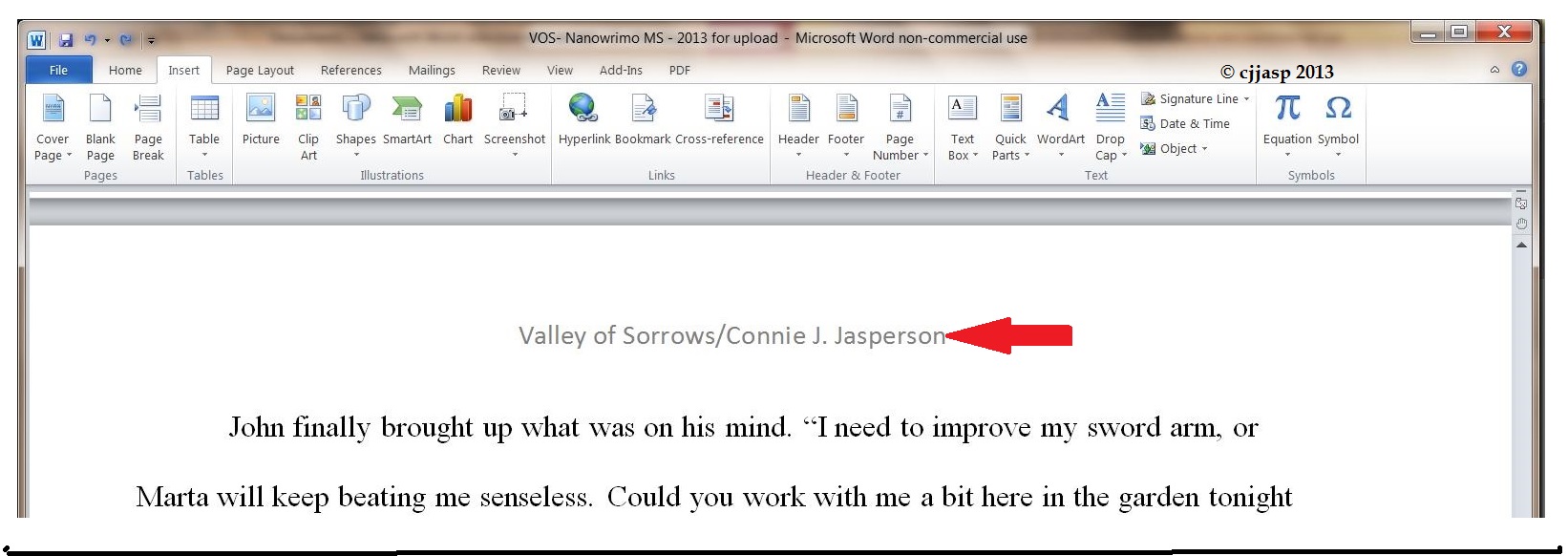
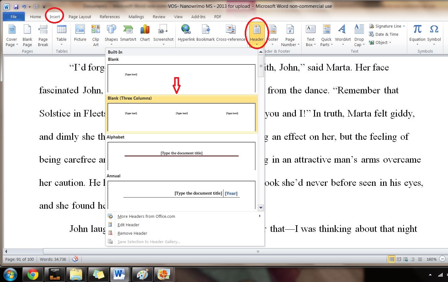
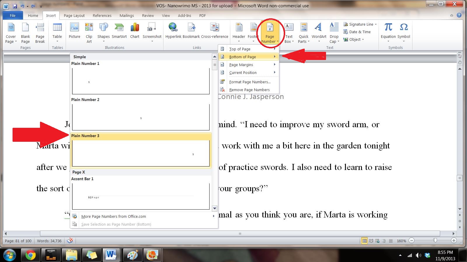
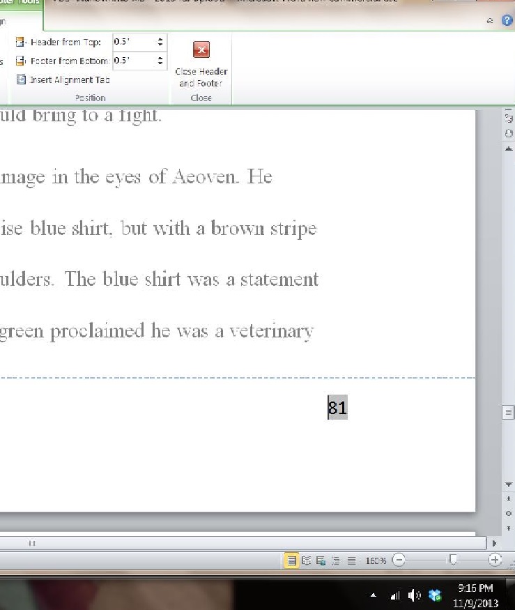
Now we need to make the “Header.” This is the heading at the top of each page of a word-processed or faxed document, consisting of the title and your name, followed by the page number.
Many publishers and editors want this because when they receive a print copy, each page is clearly marked with your name and/or the title of the book as well as the page number. Remember, they want print copies UNBOUND. Accidents happen: if the printout of the manuscript accidentally falls off a desk, it can easily be reassembled, and the editor will always know that you wrote that brilliant work.
We insert this by opening the “insert” tab, and clicking on “page number.” This opens a new menu. We add the page numbers using the small dropdown menu. We insert our title and author name just before the page number, and that will be our header.
This is how the ribbon and menus look:

Now you know how to use your software to make your manuscript submission ready. You have changed the font to Times New Roman or Courier .12 font and the body of the manuscript is
- Aligned left
- 1 in. margins
- Double-spaced
- Has formatted indented paragraphs
- Header contains title and author name
- The first page contains the author’s mailing address and contact information in upper left hand corner
This may seem like overkill to you, but I assure you, if you are serious about submitting your work to agents, editors, or publishers, it must be in as professional a format as is possible.
I hope these instructions will help you find the way to format properly in other word-processing programs. MS WORD is the one I use because it is easy and has all the tools I need. Just don’t get too fancy with formatting your work before you submit it. No matter how pretty you make that manuscript, if it doesn’t follow the submission guidelines for the place you are submitting it, you have wasted your time.