Over the last two weeks, we have talked about the nuts and bolts of formatting the body of a manuscript for submission to a contest. Most contests want “blind” submissions (work without the author’s identifying information on the document), so we haven’t yet discussed how to make a proper “header.”
 This is the heading at the top of each page of a word-processed or faxed document. It contains page numbers, the title, and the author’s name. You won’t need one for most contests. However, if you plan to submit work to a magazine or anthology, you will want your header to follow their guidelines.
The header is important because when an editor likes your work, they might print it out to look at it more closely. If the printout of the manuscript falls off a desk, it can easily be reassembled because the pages are numbered.
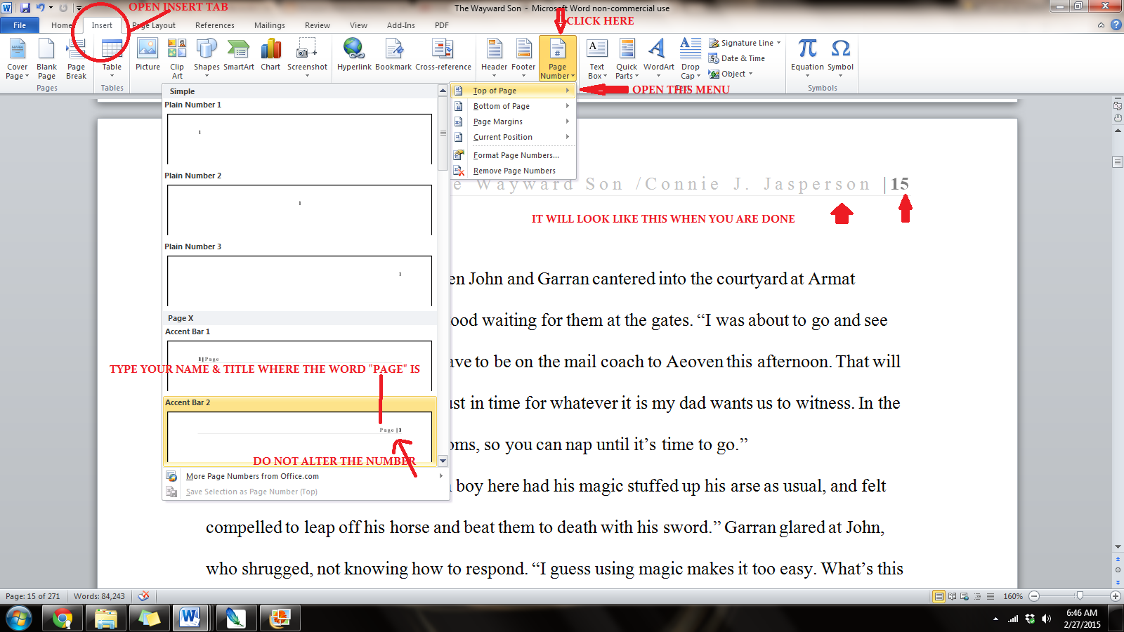
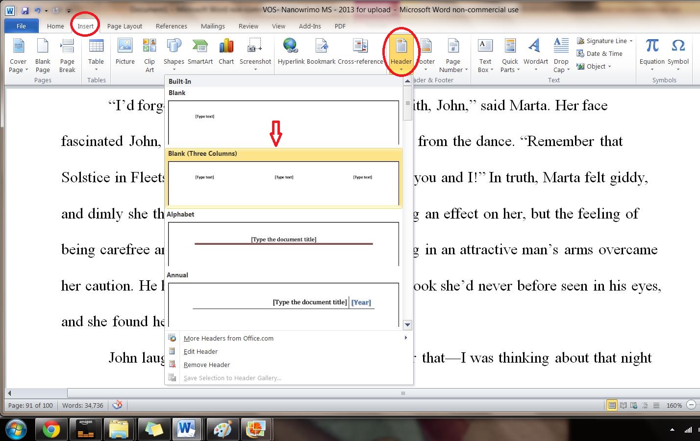
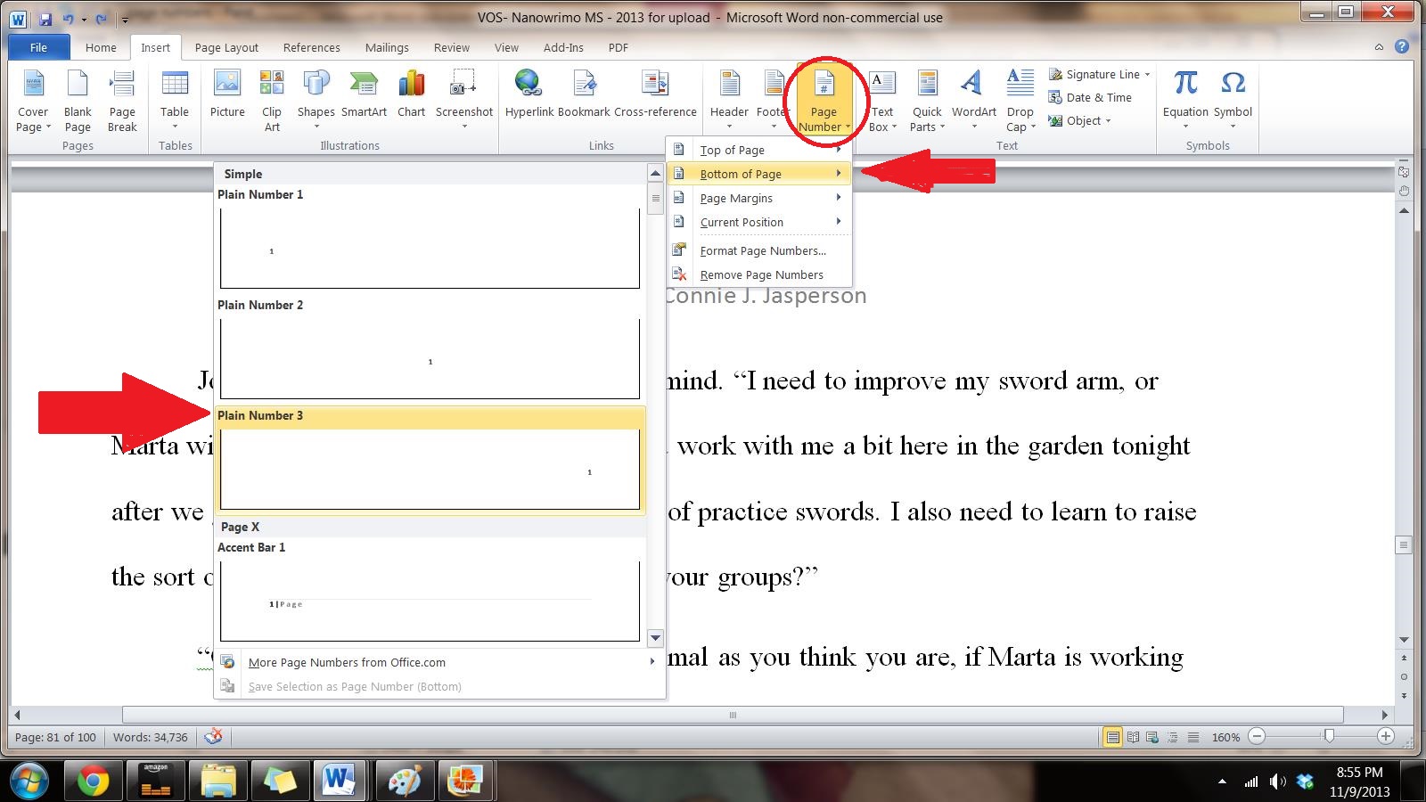
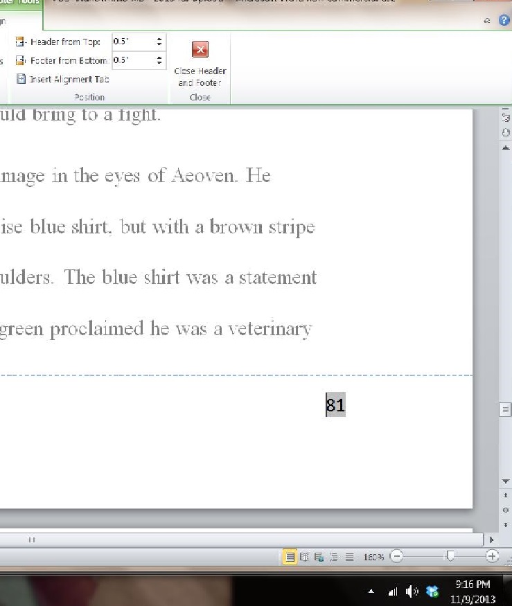
We insert the header by opening the “insert” tab and clicking on “page number.” This opens a new menu. We add the page numbers using the small dropdown menu.
This is how the ribbon and menus look:
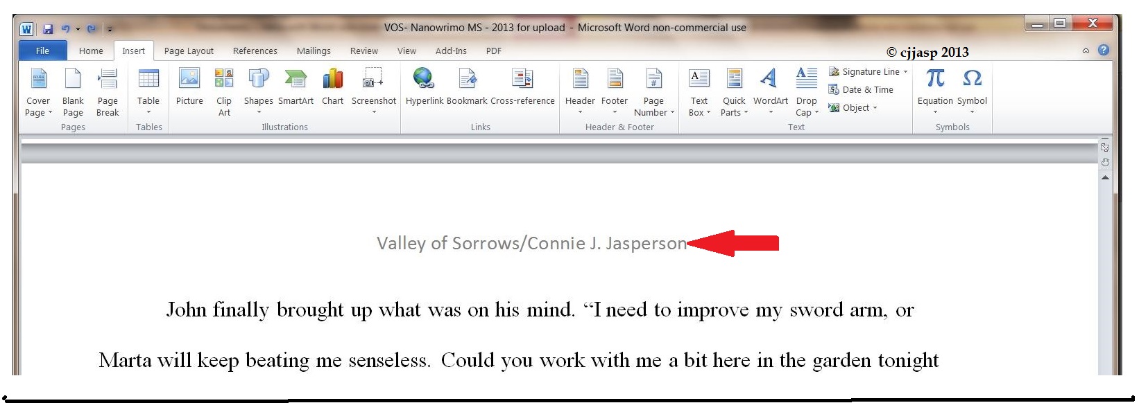
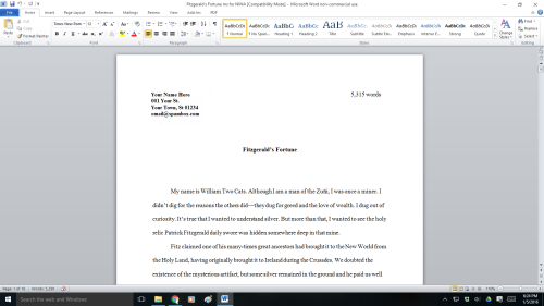
The header contains the title and your pen name. The first page contains your legal name, mailing address, contact information in the upper left-hand corner, and the word count on the right.
This may seem excessive, but if you are serious about submitting your work to agents, editors, or publishers, it must be as professionally formatted as possible.
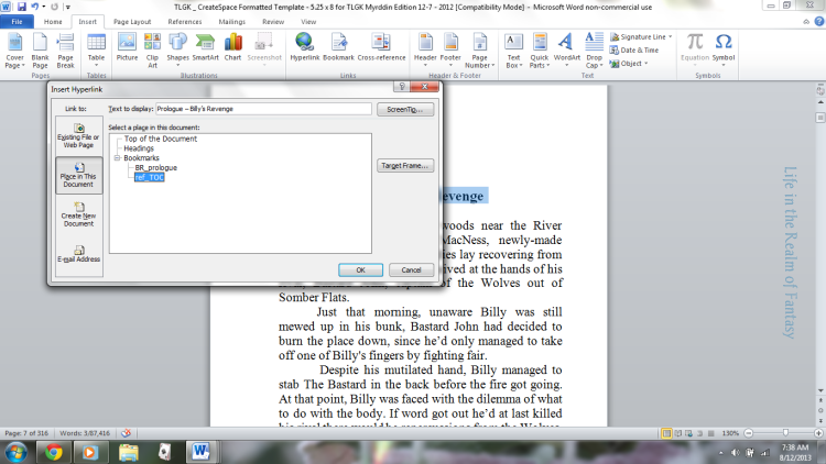
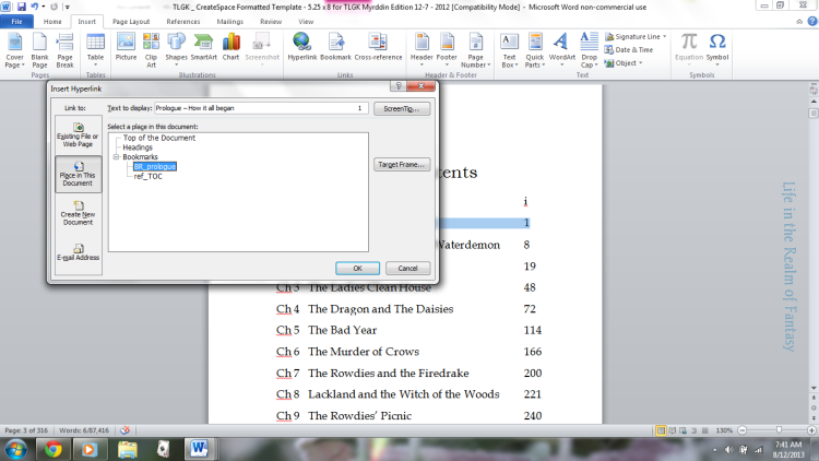
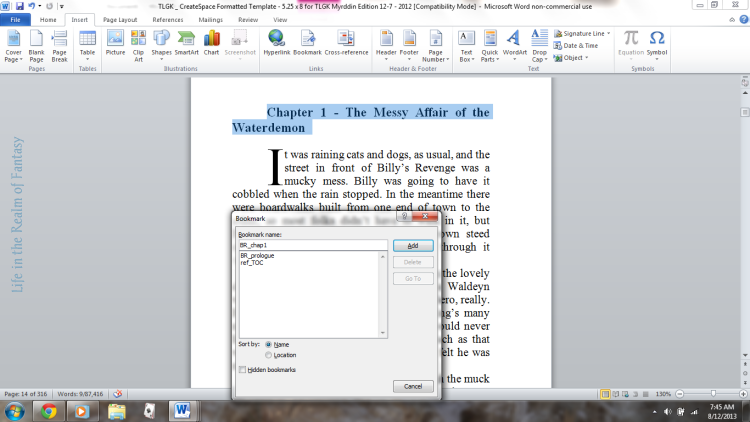
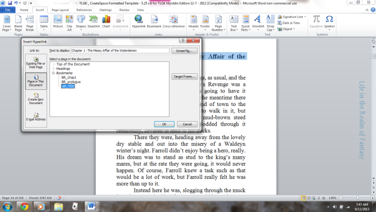
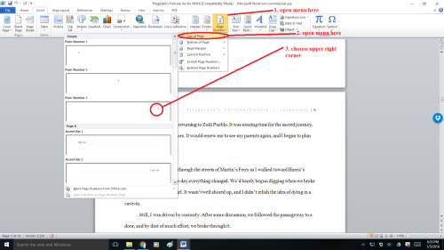
You will insert the Title of the Book and Your Author Name just before the page number. That way, it will look tidy and be aligned to the right. You can do this on the page number tab.
That is a simple process, but occasionally, a publisher will specify that the first (title) page should have no header or page number. Instead, they might want the header and page numbers to begin on page two.
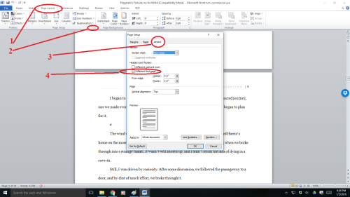
To make the page numbers begin on page two:
- Click anywhere in the document.
- On the Page Layout tab, click the Page Setup Dialog Box Launcher and
- then click the Layout
- Under Headers and Footers, select the Different first pagecheck box, and then click OK.
- The header contains the title, author name, and page numbers—all aligned right.
- The first page contains your mailing address and contact information in the upper left-hand corner.
So now we know how to make our submissions look professional—but where should we send them?
How do we find reputable publishers who are accepting submissions?
When I began this journey, I didn’t understand how specifically you must tailor your submissions for literary magazines, contests, and anthologies. Each publication has a specific market of readers, and their editors look for new works their target market will buy.
Magazine editors don’t have the time to teach you how to write. You have to learn that on your own. You have to ensure your work is clean and well-written before submitting it.
 So, what do they do if they don’t go over your work line-by-line? Magazine editors look for and bring new and marketable stories to the reading public.
Marketable is the keyword. If your submission doesn’t fit what that magazine’s readers expect, the editor will reject it. Perhaps the quality of your work isn’t the problem. Maybe you have selected a publication that features work in your chosen genre. But your subgenre may not match what the readers of that publication want to see.
After all, both spaghetti Bolognese and bruschetta are created out of ingredients made from wheat and tomatoes. But, a person who craves spaghetti Bolognese won’t be satisfied with an offering of bruschetta despite the fact they both feature wheat and tomatoes.
The genre may be Italian, and they feature the same ingredients. But the delivery method is a subgenre that may not appeal to every diner.
Another point I want to make is this. Once your story makes it through the publisher’s door and into the first part of their process, their editor may ask you for minor revisions. They may ask you to clear up small things you missed when self-editing.
But they won’t offer you technical advice.
 This is because they shouldn’t have to. Before submitting your work to an agent or submissions editor, you must have the technical skills down.
You must ensure you have a clean manuscript that is marketable to the readers of the publication you are courting. Ask someone in your writing group to proofread it before submitting it.
Professionals do the required work and don’t think twice about it—self-editing and proofreading are just part of the job.
Prominent publications have wide readerships, which helps the indie author as much as those who are traditionally published. The more people who read and enjoy your short story, the more potential readers you have for your novels. These people likely read books, and guess what? They might look for your novels when shopping for books at Amazon, Barnes & Noble, and other digital booksellers.
 When you have a story that you believe in, you must find the venue that publishes your sort of work. Read the magazines you hope to submit work to. That way, you will know what publishers are buying in your genre.
- In other words, if you write fantasy, google magazines featuring fantasy and sci-fi and buy them. Read the work that publishers are buying so you aren’t wasting your time.
An excellent place to start would be the website Worlds Without End, an author resource site listing magazines that publish fantasy and science fiction.
Not all publications will be accepting new work, but some will. Be warned—finding magazines with open calls for submissions is a lot of work.
Anthologies with open calls might be more plentiful, but you must know how to find them. You can connect with writers’ groups through the many forums on Facebook and other social media platforms.
 Those who can’t afford to buy magazines can go to websites like Literary Hub and read excellent pieces culled from various literary magazines for free. This will give you an idea of what you want to achieve in a story and where you might consider sending your work.
And may you have good luck with your submissions. Speaking as a reader, there is no such thing as too many stories. In fact, I’m going to curl up with a good book right now!
 Editors at magazines, contests, and publishing houses have no time to deal with poorly formatted manuscripts. Their inboxes are full of properly formatted work, so they will reject the amateurs without further consideration.
 First, we must select the font. Every word-processing program has many fancy fonts you can choose from and a variety of sizes.
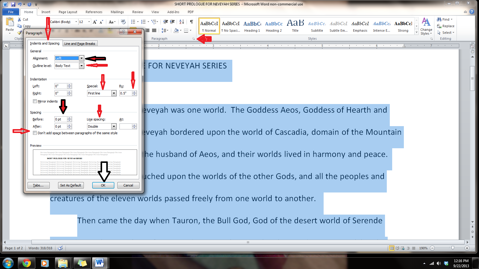
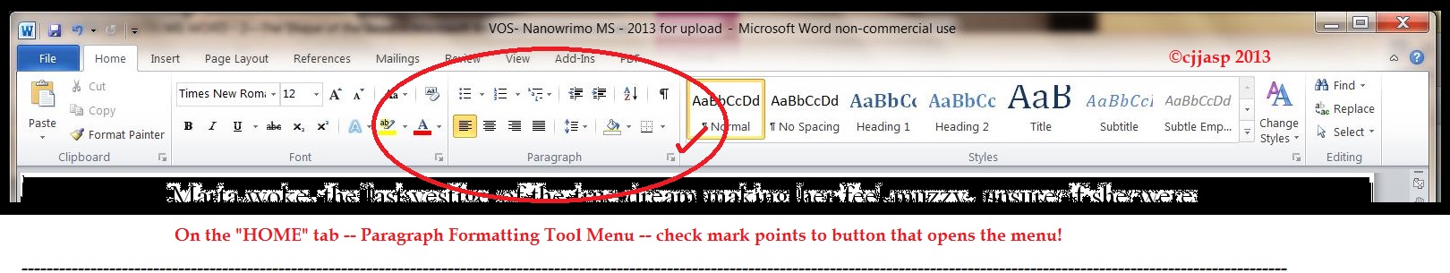
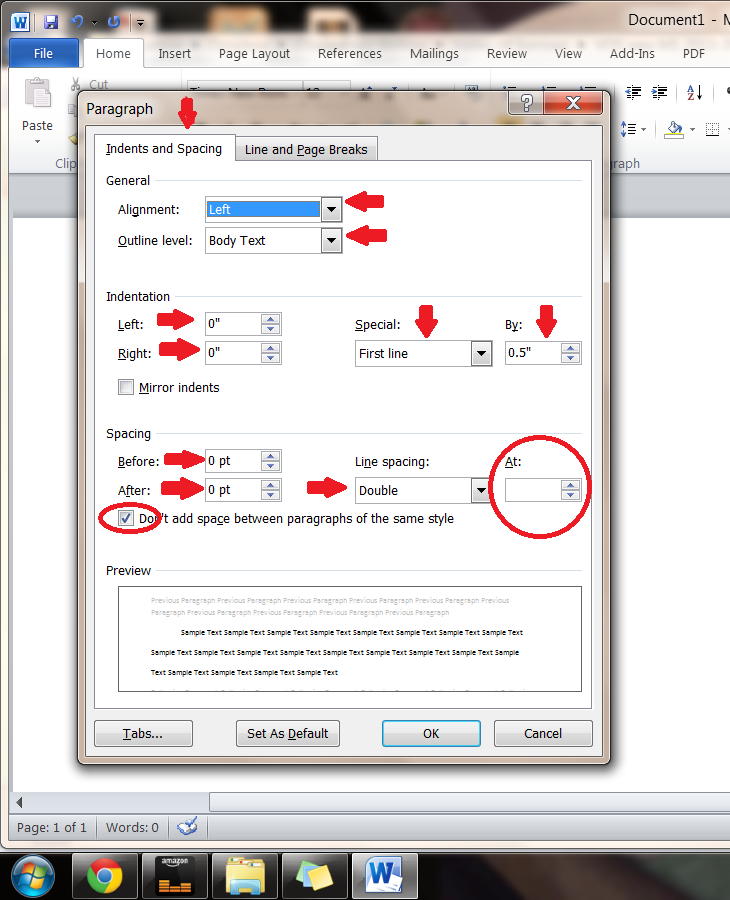
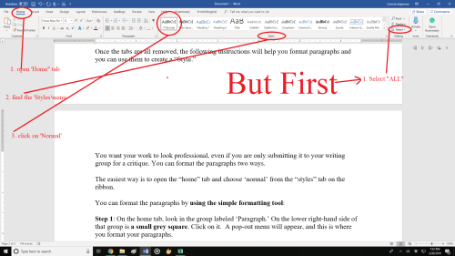
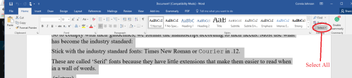 Step 1: On the Home tab, look in the group labeled ‘Paragraph.’ On the lower right-hand side of that group is a small grey square. Click on it. A pop-out menu will appear, and this is where you format your paragraphs.
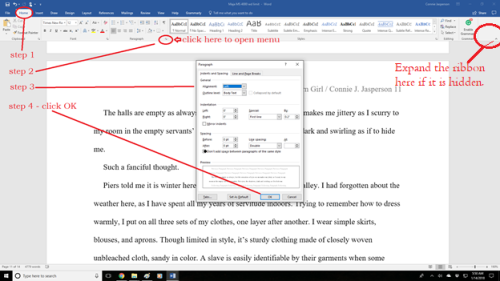 Do not justify the text. In justified text, the spaces between words and letters (known as “tracking”) are stretched or compressed. Justified text gives you straight margins on both sides. However, this type of alignment only comes into play when a manuscript is published. At that point, the publisher will handle the formatting.
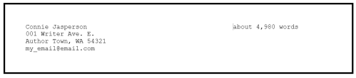 This may seem like overkill to you. If you are serious about submitting your work to agents, editors, or publishers, it must be as professionally formatted as is possible.


![Félix_Vallotton_Nature_morte_à_l_assiette_bleue_1922 Félix Vallotton [Public domain], via Wikimedia Commons](https://conniejjasperson.com/wp-content/uploads/2015/02/fc3a9lix_vallotton_nature_morte_c3a0_l_assiette_bleue_1922-fc3a9lix-vallotton-public-domain-via-wikimedia-commons.jpg)