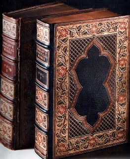
 Book covers. Remember when they were tooled, engraved leather, hand-made by monks? Yeah, me neither, but I do love good, well designed book covers.
We indies stress over them, and I suppose the Big 5 publishers do too, to a certain extent. But what, besides money and great designers who will make them for us, are elements that make a great book cover?
First up, in my opinion, a catchy cover has mystique. It expresses the central theme of the book, but it’s like a blurb–it can only capture one moment in time, so you have to choose what you will go for: mood, mystery, or great art.
Occam’s Razor (also known as Ockham’s Razor) comes into play here. According to iUniverse’s article on Cover Design Essentials, “…the essential theory is that unnecessary elements will decrease the overall efficiency and aesthetic appeal of a design. It can be a good indicator of why one design may succeed and another one will not. A good writer will spend hour after hour editing and re-editing their book, cutting words, paragraphs and so forth until it is “clean.” The cover designer’s method is not much different, other than it is a visual process rather than a written one.”
In my own limited experience this is so true.
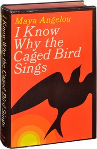 Book covers have really evolved since my childhood. They used to be quite simple, with the art kept to a minimum. In the 1950’s and 60’s, book covers were stark, modern–and in my opinion, boring, such as Maya Angelou’s I Know Why the Caged Bird Sings.
My great problem is, I have always known what catches my eye, but not how to achieve it. So what are the simple, affordable elements of a good, catchy cover?
Again, iUniverse says (and I quote) good covers:
- Fall within the norms for your genre but visually stand out among other books.
- Appeal to readers and convince them to take a closer look at your book with a strong visual presence.
- Reflect the content of your book and expose readers to your writing style.
- Convince a potential reader to invest in a literary journey with your story.
Well, that is a hell of a lot to pack into a cover. And it’s hard to do! I am struggling with this aspect of being an indie. I am an artist, but until 2010 my work has been mostly in pastels and pencil. But I love Photoshop, and have been spending a lot of time designing covers and and learning how to make the graphics and the title a part of the art that captures the eye, but does not detract from the cover art.
I have been examining a lot of wonderful book covers, trying to define what it was about them that I liked so that my next book cover will be more true to what I want it to be. Being an old dog learning a new trick, I must learn from the masters.
So, here are only a few of my all-time favorite book covers, in no particular order:
Simple and to the point: The Martian, by Andy Weir tells us everything we need to know–this is going to be a hell of an adventure.

♦♦♦♦
Grail Quest, by J.R. Rain, cover artist not credited–intriguing, and made me want to look inside.
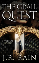
♦♦♦♦
To Green Angel Tower, Tad Williams, as painted by the brilliant Michael Whelan–representing the mood, characters, and setting of the book, and visually stunning. I can’t replicate this sort of beauty, but I can admire it, nonetheless.
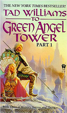
♦♦♦♦
Heart Search book three: Betrayed, Carlie M.A. Cullen, cover by Nicole Antonia Carro. Completely speaks to what is inside the book–dark, mysterious, and a bit vampiric.

♦♦♦♦
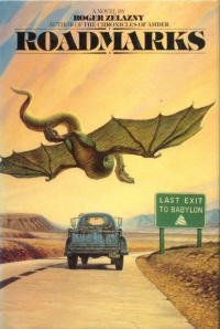
Roadmarks, Roger Zelazny, cover by the late Darrell K. Sweet. Simple, well-placed elements, promising a real roller-coaster ride inside.
♦♦♦♦
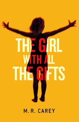
The Girl With All the Gifts, M.R. Carey–almost retro 1970s, yet intriguing.
♦♦♦♦
Children of the Elementi, Ceri Clark–this cover is a real winner, as much for the graphics as for the stunning yet simple art.

♦♦♦♦
Antithesis, Kacey Vanderkarr — cover art by Najla Qamber.

♦♦♦♦
For me, books that portray the features of the characters on the cover are a bit dicey. They never look the way I, as the reader, think they should. So, usually I find myself gravitating to the symbolic aspects of the cover and ignoring the artist’s conception of the characters. I want mystique, intrigue…the hint of danger and adventure. A book cover must flip the switch on my curiosity, make me wonder what is inside…and that particular trigger is subjective.
Each reader is lured by something different, which is what makes this aspect of indie publishing so difficult. However, I am beginning to understand what it is that I am looking for when I am drawn to a cover, so…I’ve been busy learning graphic design. I will be doing a cover reveal for my forthcoming book, Mountains of the Moon, a book based in the World of Neveyah, the same world as the as Tower of Bones series, and which is set to be released July 15, 2015.
My son, Dan, who is a graphic designer has really given me some pointers on this particular cover. I have been to “YouTube University,” and learned how to make vectors for this cover (I made two!) and I have learned several other unique little tricks of Photoshop. I have the layout finalized, and the graphics, and will be revealing it at the end of June.