Category Archives: #FineArtFriday

#FineArtFriday: Undergrowth with Two Figures, Vincent van Gogh 1890

Vincent_van_Gogh_-_Undergrowth_with_Two_Figures_(F773)
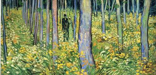
Artist: Vincent van Gogh (1853–1890)

Title: Undergrowth with Two Figures

Date: late June 1890

Medium: oil on canvas

Dimensions: height: 50 cm (19.6 in); width: 100.5 cm (39.5 in)

Collection: Cincinnati Art Museum

Today, Thursday, I was privileged to attend an immersive exhibit of Vincent van Gogh’s life through his work. I had hoped to write a post on my impressions of that exhibit when I arrived home, but frankly, words fail me, and so I hope you will forgive my settling for one of my favorites of his paintings.

We were inside an everchanging exhibit that flowed through many of his most famous works and zoomed in on bits one wouldn’t ordinarily notice. I managed a few shots with my cell phone that offer some idea of the exhibition, and here is the one that best shows what we experienced:

Van Gogh immersive 1 connie j jasperson LIRF04072022

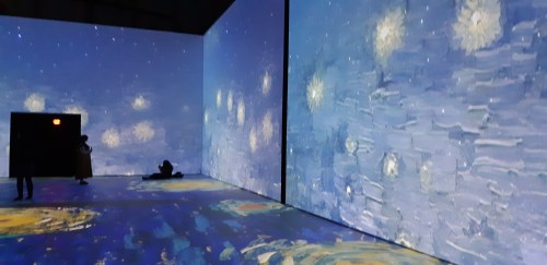
The exhibit was such a moving, emotional experience. It brings you into touch with the man as well as his art.

We were in, above, and surrounded by his work. The powerful soundtrack of classical music was paired perfectly to the images, complementing them like fine wine does good food.

The link to that exhibit is here: Van Gogh, The Immersive Experience.

What I love about Undergrowth with Two Figures:

This very late work was painted at the end of June 1890, a few weeks before Van Gogh’s death. It was one of several paintings in Auvers-sur-Oise, a commune on the northwestern outskirts of Paris, France. This was also the place where Vincent van Gogh died from injuries suffered in an attempted suicide.

This painting is one of several he made in the last weeks of his life, in an unusually elongated double-square format. The double-square painting is a painting made on uncommonly large canvases, which have one dimension that is twice the size of the other. His need to express his art couldn’t be contained on an ordinary canvas—he saw the world with a panoramic view.

One of the things I love about this painting is the use of violet and blue in the trunks of the poplars. They are tall, immense, like bars in a window framing the courting pair. The trees stand out against the black backdrop. They have power and are the soul of the painting, even more so than the flowers and undergrowth through which the couple walks.

It is a pleasing composition, with strong brush strokes and deep, dark colors. He saw the beauty in life and painted it.

[1] About this painting, via Google Arts and Culture:

In a letter to his younger brother, Theo, dated June 30, 1890, van Gogh explained the structure and brilliant colors of “Undergrowth with Two Figures”: “The trunks of the violet poplars cross the landscape perpendicularly like columns,” adding “the depth of Sous Bois is blue, and under the big trunks the grass blooms with flowers in white, rose, yellow, and green.”

“Undergrowth with Two Figures” has a silvery tonality characteristic of van Gogh’s works from Auvers. His brushwork may be swift and visceral, his colors strong and biting, his emotion raw and visible, but the composition reveals no hint of psychological torment.

It is painted on a double square canvas, twice as wide as it is high. Van Gogh explored the artistic possibilities of this panoramic format in several of his last paintings. [1]


Credits and Attributions:

[1] Google Arts and Culture Contributors, Undergrowth with two Figures, Vincent van Gogh 1890, Accessed April 7, 2022.

Wikimedia Commons contributors, “File:Vincent van Gogh – Undergrowth with Two Figures (F773).jpg,” Wikimedia Commons, the free media repository, https://commons.wikimedia.org/w/index.php?title=File:Vincent_van_Gogh_-_Undergrowth_with_Two_Figures_(F773).jpg&oldid=618842665 (accessed April 8, 2022).

View of Vincent’s Starry Night, © 2022 Connie J. Jasperson, own work,

4 Comments

Filed under #FineArtFriday

#FineArtFriday: Sailboats by Jacoba van Heemskerck

Sailboats by Jacoba van HeemskerckArtist: Jacoba van Heemskerck (1876–1923)

Title: Bild no. 15 (Segelboote) (English: Painting no, 15 – Sailboats)

Date: Circa 1914

Medium: oil on canvas

Dimensions: height: 97.5 cm (38.3 in); width: 113.5 cm (44.6 in)

Collection: Museum Boijmans Van Beuningen

What I love about this painting:

The sharp corners and geometry of this composition raises the viewer’s eye toward the horizon. It feels cubist, is abstract, and reflects a spiritual connection to her subject. I love the symbolism in this image. The sailboats are souls sailing toward the next life across a deep blue sea and beneath a golden sky. The island temple toward which the boats sail is shaped like a pyramid. The elongated sails of the many boats direct the eye up. Everything, including the island temple, points toward heaven.

In this painting, it is easy to see how she would later become involved in creating stained glass—the sharp black outlines and vivid colors of her paintings are perfect for that medium.

According to the Kunstmuseum Den Haag’s website:

“But whereas Mondrian’s artistic approach eventually became austerely geometrical, Van Heemskerck’s developed as a result of a variety of influences (including anthroposophy) into an open, unconstrained and intuitive style. Throughout her life, she would seek – like Kandinsky – to express spiritual experience. The recurring subjects in her oeuvre are therefore invariably symbolic in nature: sailing ships, bridges and trees, depicted in clear, vibrant colours and with firm outlines. Although she was never to abandon the representation of the real world, Van Heemskerck’s style was eventually so abstract that her subjects became virtually unrecognisable. This approach won her great success, especially in Germany, where she exhibited at the Berlin Expressionist gallery Der Sturm every year from 1913 until her death.” [1]

About the Artist, Via Wikipedia:

Jkvr. Jacoba Berendina van Heemskerck van Beest (1876-1923) was a Dutch painter, stained glass designer and graphic artist who worked in several modern genres. She specialized in landscapes and still-lifes.

Her first contact with Modern art came in Paris, where she took lessons from Eugène Carrière.[2][3] She remained in France until 1904, then went to live with her sister, Lucie, and was introduced to the art collector, Marie Tak van Poortvliet, who became her lifelong friend and later built a studio for her in the garden of her home.[1] After 1906, she spent her Summers in Domburg, where she came into contact with avant-garde painters such as Piet Mondrian[4] and Jan Toorop, who offered her advice. Around 1911, she was briefly interested in Cubism.

Shortly after, she became involved in Anthroposophy, possibly through the influence of her former teacher, Nibbrig, who was a Theosophist. She then became an avid follower of Der Sturm, an avant-garde art magazine founded by Herwarth Walden, and turned increasingly to Abstraction.[1] In 1913, she attended the Erster Deutscher Herbstsalon in Berlin, where she met Walden and started what would be a lifelong correspondence.[3] Thanks to his efforts, her work was popular in Germany, while it remained somewhat ignored in her home country.

After 1916, she developed an interest in stained glass windows, designing them for the naval barracks and the Municipal Health Department building in Amsterdam, as well as private residences.[1] From 1922, she lived in Domburg with her old friend and patron, Tak van Poortvliet.

She died suddenly, from an attack of angina.[3] Both Tak van Poortvliet and Walden mounted exhibitions of her work, in Amsterdam and Berlin respectively. In 2005, a major retrospective was held at the Gemeentemuseum Den Haag. [2]


Credits and Attributions:

[1] Kunstmuseum Den Haag contributors, “Jacoba van Heemskerck,” Jacoba van Heemskerck A REDISCOVERY, Jacoba van Heemskerck | Kunstmuseum Den Haag (accessed March 31, 2022).

[2]Wikipedia contributors, “Jacoba van Heemskerck,” Wikipedia, The Free Encyclopedia, https://en.wikipedia.org/w/index.php?title=Jacoba_van_Heemskerck&oldid=1078279427 (accessed March 31, 2022).

Comments Off on #FineArtFriday: Sailboats by Jacoba van Heemskerck

Filed under #FineArtFriday, writing

#FineArtFriday: The Lacemaker by Nicolaes Maes ca. 1656 (revisited)

The Lacemaker

  • Artist   Nicolaes Maes
  • Year    c. 1656
  • Medium           oil paint, canvas
  • Dimensions     45 cm (18 in) × 53 cm (21 in)

What I love about this painting:

Working from home is nothing new. Women have sewn, made lace, or taken in laundry to earn coins for as long as they have been mothers. Finding ways to earn a living and still raise the family has always been a struggle. Maes painted real women doing real work to support their families. Other artists painted women of the taverns and streets, but Maes had respect for the women he painted.

About this image, via Wikipedia:

The Lacemaker (circa 1656) is an oil on canvas painting by the Dutch painter Nicolaes Maes. It is an example of Dutch Golden Age painting and is part of the collection of the Metropolitan Museum of Art.

This painting is typical of many paintings of women in interiors painted by Maes in the 1650s. The woman is making bobbin lace using a lace pillow that can be seen in other Maes paintings of lacemakers.

The child in a highchair was a popular subject for many Dutch genre painters, and this painting shows how it was used as a safe place to play as well as for eating. The empty bowl of porridge is on the floor along with some other items the boy has let fall. He is wearing a red valhoed or falling cap, which seems to indicate that confinement in the chair is necessary if any lacemaking is going to get done.

baby bumper headguard cap, also known as a falling cap, or pudding hat, is a protective hat worn by children learning to walk, to protect their heads in case of falls.

Known as a pudding or black pudding, a version used during the early 17th century until the late 18th century was usually open at the top and featured a sausage-shaped bumper roll that circled the head like a crown. It was fastened with straps under the chin.

About the Artist via Wikipedia

From Wikipedia: Nicolaes Maes, also known as Nicolaes Maas (January 1634 – November 24, 1693 (buried)) was a Dutch Golden Age painter of genre and portraits. In about 1648 he went to Amsterdam, where he entered Rembrandt‘s studio. Before his return to Dordrecht in 1653 Maes painted a few Rembrandtesque genre pictures, with life-size figures and in a deep glowing scheme of colour, like the Reverie at the Rijksmuseum in Amsterdam, the Card Players at the National Gallery, and the Children with a Goat Carriage. So closely did his early style resemble that of Rembrandt, that the last-named picture, and other canvases in the Leipzig and Budapest galleries and in the collection of Lord Radnor, were or are still ascribed to Rembrandt.

In his best period, from 1655 to 1665, Maes devoted himself to domestic genre on a smaller scale, retaining to a great extent the magic of colour he had learnt from Rembrandt. Only on rare occasions did he treat scriptural subjects, as in Hagar’s Departure, which has been ascribed to Rembrandt. His favorite subjects were women spinning, or reading the Bible, or preparing a meal. He had a particular fascination with the subject of lacemaking and made almost a dozen versions on this subject.

While he continued to reside in Dordrecht until 1673, when he settled in Amsterdam, he visited or even lived in Antwerp between 1665 and 1667. His Antwerp period coincides with a complete change in style and subject. He devoted himself almost exclusively to portraiture, and abandoned the intimacy and glowing color harmonies of his earlier work for a careless elegance which suggests the influence of Van Dyck. So great indeed was the change, that it gave rise to the theory of the existence of another Maes, of Brussels. His registered pupils were Justus de GelderMargaretha van GodewijkJacob Moelaert, and Johannes Vollevens.[1] Maes died in Amsterdam.


Credits and Attributions:

Wikipedia contributors, “The Lacemaker (Maes),” Wikipedia, The Free Encyclopedia, https://en.wikipedia.org/w/index.php?title=The_Lacemaker_(Maes)&oldid=799625637 (accessed December 12, 2019).

Wikipedia contributors, “Baby bumper headguard cap,” Wikipedia, The Free Encyclopedia, https://en.wikipedia.org/w/index.php?title=Baby_bumper_headguard_cap&oldid=914539353 (accessed December 12, 2019).

Wikipedia contributors, “Nicolaes Maes,” Wikipedia, The Free Encyclopedia, https://en.wikipedia.org/w/index.php?title=Nicolaes_Maes&oldid=815679835 (accessed July 12, 2018).

2 Comments

Filed under #FineArtFriday

#FineArtFriday: The Proposition by Judith Leyster 1631 (revisited)

What I love about this painting is how honest Judith Leyster is when detailing the realities of life in her time and in her city. Here, a young woman is pressured to enter into a relationship with a man she has no interest in. He clearly feels he has the right to compel her to sell her virtue, and she clearly ignores him. It is as if she refuses to notice him.

Male artists of the time, Leyster’s husband, Jan Meinse Molenaer included, rarely painted genre pictures of young women other than in taverns or other low-life situations. Commissioned portraits of noble and merchant class women they painted in great abundance, but simple, modest women of good virtue?

Rarely. They had to sell paintings to feed their families, and then as today, virtue did not sell all that well.

Leyster, on the other hand, had the talent and (because she was a woman) the freedom to paint whatever she wanted. After all, as long as she managed the house, made sure food was served, and raised the children, she could paint whatever moved her.

The artistic talent of women has been so disregarded historically that, despite her signature, her paintings and her talent were attributed (after her death) to her husband and to Franz Hals.

About the Painting (Via Wikipedia):

“The Proposition” is a genre painting of 1631 by Judith Leyster, now in the Mauritshuis in The Hague, who title it “Man offering money to a young woman.” It depicts a woman, sewing by candlelight, as a man leans over her, touching her right shoulder with his left hand. He is offering her coins in his right hand, but she is apparently ignoring the offer and concentrating intently upon her sewing.

The man wears dark clothing, and the dark tones, as well as his shadow cast behind him and across his face from the angle of the candlelight, give him a looming appearance. In contrast, the woman is lit fully in the face by the candlelight and wears a white blouse.

It is an early work by Leyster, who was only 22 years old in 1631.

Also, From Wikipedia:

(The painting’s) most distinctive feature is how different it is to other contemporary Dutch and Flemish “sexual proposition” paintings, many falling into the Merry company genre. The convention for the genre, a common one at the time, was for the characters to be bawdy, and clearly both interested in sex, for money. The dress would be provocative, the facial expressions suggestive, and sometimes there would be a third figure of an older woman acting as a procuress. Indeed, in The Procuress by Dirck van Baburen, an example of the genre, that is exactly the case.

In contrast, in The Proposition the woman is depicted not as a whore but as an ordinary housewife, engaged in a simple everyday domestic chore. She isn’t dressed provocatively. She does not display her bosom (but rather her blouse covers her all of the way to her neck). No ankles are visible. She displays no interest in sex or even in the man at all.

Contemporary Dutch literature stated the sort of activity in which she is engaged to be the proper behaviour for virtuous women in idle moments. Kirstin Olsen observed that male art critics “so completely missed the point” that the woman is, in contrast to other works, not welcoming the man’s proposition that they mistakenly named the painting The Tempting Offer.

The foot warmer, whose glowing coals are visible beneath the hem of the woman’s skirt, was a pictorial code of the time, and represented the woman’s marital status. A foot warmer wholly under the skirt indicated a married woman who was unavailable, as it does in The Proposition. A foot warmer projecting halfway out from under the skirt with the woman’s foot visible on it indicated one who might be receptive to a male suitor. And, a foot warmer that is not under the woman at all, and empty of coals, indicated a single woman. This code can also be seen in Vermeer’s The Milkmaid and Dou’s The Young Mother.

About the Artist:

Judith Jans Leyster (also Leijster) (c. July 28, 1609[1]– February 10, 1660) was a Dutch Golden Age painter. She painted genre works, portraits, and still lifes. Her entire oeuvre was attributed to Frans Hals or to her husband, Jan Miense Molenaer, until 1893 when Hofstede de Groot first attributed seven paintings to her, six of which are signed with her distinctive monogram ‘JL*’. Misattribution of her works to Molenaer may have been because after her death many of her paintings were inventoried as “the wife of Molenaer”, not as Judith Leyster.

She signed her works with a monogram of her initials “JL” with a star attached: JL* This was a play on words; “Leister” meant “Lead star” in Dutch and was for Dutch mariners of the time the common name for the North Star. The Leistar was the name of her father’s brewery in Haarlem.

(Only occasionally did she sign her works with her full name.)

She specialized in portrait-like genre scenes of, typically, one to three figures, who generally exude good cheer, and are shown against a plain background. Many are children; others men with drink. Leyster was particularly innovative in her domestic genre scenes. These are quiet scenes of women at home, often with candle- or lamplight, particularly from a woman’s point of view


Sources and Attributions:

Wikipedia contributors, “The Proposition (painting),” Wikipedia, The Free Encyclopedia, https://en.wikipedia.org/w/index.php?title=The_Proposition_(painting)&oldid=851982429 (accessed February 1, 2019).

Wikipedia contributors, “Judith Leyster,” Wikipedia, The Free Encyclopedia, https://en.wikipedia.org/w/index.php?title=Judith_Leyster&oldid=820769951(accessed February 1, 2019).

2 Comments

Filed under #FineArtFriday

#FineArtFriday: Two Paintings by H. A. Brendekilde

H. A. Brendekilde is one of my favorite artists. There is a story in the above painting. I particularly like the details—the patched trousers of the gardener, the mud on his clogs, the other man’s wooden leg—juxtaposed against the lush spring garden and prosperous village life of Denmark in 1912. Their hands and clothes indicate they have stopped work to read the newspaper. Both men seem stunned. Are they perhaps reading of the death of King Frederick VIII, who died on 14 May 1912? Whatever they are reading, the cat remains undisturbed by the news.

H. A. Brendekilde was a forerunner of the social realist style, embraced by Diego Rivera. His early work often depicted the daily lives of the rural working class. One of his most famous paintings, “Worn Out” (1889) shows an elderly man lying fallen on his back in the plowed field. He has collapsed while picking stones, preparing a field for planting. The stones he had gathered have scattered across the ground, and one of his clogs has fallen off his foot.

Has he worked himself to death? Will he recover? His entire world is this rocky barren field.  A story is in this stark painting.


About the Artist via Wikipedia (be patient–this was written by a non-native English-speaker. We should all speak a foreign language so well!)

[1] Hans Andersen Brendekilde (7 April 1857 – 30 March 1942) was a Danish painter.

Brendekilde’s influence was great not only on society, but also on his many friends among painters and potters. Among the painters especially on L.A. Ring. During their young and poor years they were sharing room and studio in Copenhagen for periods. They painted similar themes, both had the family name Andersen and they were therefore often confused with one another.[1] So in 1884 they changed their family names Andersen to the names of their native villages instead, Brendekilde and Ring. Brendekilde was always in a good mood, was deeply committed to paint life in the small villages, and furthermore was an ardent socialist. Ring was of a more depressive disposition and Brendekilde encouraged him to continue painting and join exhibitions. Brendekilde also introduced Ring to Lars Ebbesen, who had a farm “Petersminde” in “Raagelund” close to Odense. In 1883, Ring was living in extreme poverty in Copenhagen, but the introduction to Lars Ebbesen meant that he could live and paint without worrying about the cost of rent and food for long periods. Both Brendekilde and Ring remained lifelong friends with farm owner Ebbesen.[2] Several of Brendekilde’s paintings became very famous and won medals e.g. at the World Expositions in Paris 1889, in Chicago 1893 and at the “Jahresausstellung” im Glaspalast in München 1891. He also inspired painters like his friends Julius PaulsenPeder MønstedHans SmidthPaul FischerSøren Lund [da] and H. P. Carlsen.

Brendekilde was the first painter bringing the arts and crafts movement to Denmark when from about 1884 he designed and made integrated frames around his paintings, the frames being part of the paintings and their story. Some frames were symbolistic and others more ornamental.

Many of his paintings are obviously related to those by Anna and Michael AncherP.S. Krøyer and the Swedish painters Carl Larsson and Anders Zorn. All of these displayed their paintings at the international exhibitions in Copenhagen 1888, Paris 1889, Munich 1891 and Chicago 1893. [1]


Credits and Attributions:

[1] Wikipedia contributors, “H. A. Brendekilde,” Wikipedia, The Free Encyclopedia, https://en.wikipedia.org/w/index.php?title=H._A._Brendekilde&oldid=1019433991 (accessed March 11, 2022). Translated from Dutch.

While reading the newspaper news by H. A. Brendekilde 1912 [Public domain], via Wikimedia Commons

Worn Out by H. A. Brendekilde [Public domain], via Wikimedia Commons

4 Comments

Filed under #FineArtFriday

#FineArtFriday: Snow Storm: Steam-Boat off a Harbour’s Mouth J.M.W. Turner 1842

J.M.W. Turner

Title: Snow Storm: Steam-Boat off a Harbour’s Mouth

Artist: J. M. W. Turner

Year: 1842

Medium: oil on canvas

Dimensions: 91 cm × 122 cm (36 in × 48 in)

Location: Tate, London, Great Britain

About this Picture, Via Wikipedia:

The painting depicts a paddle steamer caught in a snow storm. This marine painting is showing a Romantic era’s painter’s depiction of a snowstorm on water at its best, fully developing the bold, daring Romantic fantasy of Turner. Turner was unrivaled in depicting the natural world unmastered by mankind and exploring the effects of the elements and the battle of the forces of the nature. Turner worked first as a watercolorist, and he started to work much later with oils. He later applied the techniques he learned in watercolour onto oil paintings.

It is typical of the late style of Turner. Turner’s tints and shades of colours are painted in different layers of colour, the brushstrokes adding texture to the painting. The colours are monochromatic, only a few shades of grey, green and brown are present, having the same tone of colours. The silvery pale light that surrounds the boat creates a focal point, drawing the viewer into the painting. The smoke from the steamboat spreads out over the sky, creating abstract shapes of the same quality like the waves.

An inscription on the painting relates that The Author was in this Storm on the Night the “Ariel” left Harwich. Turner later recounted a story about the background of the painting:

“I did not paint it to be understood, but I wished to show what such a scene was like; I got the sailors to lash me to the mast to observe it; I was lashed for four hours, and I did not expect to escape, but I felt bound to record it if I did.”

He was 67 years old at the time. Some later commentators doubt the literal truth of this account. Other critics accept Turner’s account, and one wrote, “He empathized completely with the dynamic form of sovereign nature.”  This inscription allows us to better understand the scene represented and the confusion of elements.

Turner had investigated the interactions between nature and the new technology of steamboats in at least five paintings in the previous decade. Throughout his career, Turner engaged with issues of urbanism, industry, railroads and steam power. [1]

About the Artist, Via Wikipedia:

Joseph Mallord William Turner RA (23 April 1775 – 19 December 1851), known in his time as William Turner, was an English Romantic painter, printmaker and watercolourist. He is known for his expressive colourisations, imaginative landscapes and turbulent, often violent marine paintings. He left behind more than 550 oil paintings, 2,000 watercolours, and 30,000 works on paper. He was championed by the leading English art critic John Ruskin from 1840, and is today regarded as having elevated landscape painting to an eminence rivalling history painting.

Turner was born in Maiden Lane, Covent Garden, London, to a modest lower-middle-class family. He lived in London all his life, retaining his Cockney accent and assiduously avoiding the trappings of success and fame. A child prodigy, Turner studied at the Royal Academy of Arts from 1789, enrolling when he was 14, and exhibited his first work there at 15. During this period, he also served as an architectural draftsman. He earned a steady income from commissions and sales, which due to his troubled, contrary nature, were often begrudgingly accepted. He opened his own gallery in 1804 and became professor of perspective at the academy in 1807, where he lectured until 1828. He travelled to Europe from 1802, typically returning with voluminous sketchbooks.

Intensely private, eccentric and reclusive, Turner was a controversial figure throughout his career. He did not marry, but fathered two daughters, Eveline (1801–1874) and Georgiana (1811–1843), by his housekeeper Sarah Danby. He became more pessimistic and morose as he got older, especially after the death of his father, when his outlook deteriorated, his gallery fell into disrepair and neglect, and his art intensified. In 1841, Turner rowed a boat into the Thames so he could not be counted as present at any property in that year’s census. He lived in squalor and poor health from 1845, and died in London in 1851 aged 76. Turner is buried in Saint Paul’s Cathedral, London. [2]


Credits and Attributions:

[1] Wikipedia contributors, “Snow Storm: Steam-Boat off a Harbour’s Mouth,” Wikipedia, The Free Encyclopedia, https://en.wikipedia.org/w/index.php?title=Snow_Storm:_Steam-Boat_off_a_Harbour%27s_Mouth&oldid=1000619190 (accessed March 3, 2022).

[2] Wikipedia contributors, “J. M. W. Turner,” Wikipedia, The Free Encyclopedia, https://en.wikipedia.org/w/index.php?title=J._M._W._Turner&oldid=1075008053 (accessed March 3, 2022).

Wikimedia Commons contributors, “File:Joseph Mallord William Turner – Snow Storm – Steam-Boat off a Harbour’s Mouth – WGA23178.jpg,” Wikimedia Commons, the free media repository, https://commons.wikimedia.org/w/index.php?title=File:Joseph_Mallord_William_Turner_-_Snow_Storm_-_Steam-Boat_off_a_Harbour%27s_Mouth_-_WGA23178.jpg&oldid=618892271 (accessed March 3, 2022).

2 Comments

Filed under #FineArtFriday, writing

#FineArtFriday: A Guardroom by Abraham Teniers (revisited)

Today we are revisiting A Guardroom, an allegorical painting attributed to Abraham Teniers. This painting is worthy of a second look, for both the allegory and the quality of the composition.

I have often said that to write about medieval and pre-industrial revolution societies, you must go to art to get the facts. This painting is a symbolic piece showing the transience of life and the certainty of death.

He shows us a guardroom. Abraham Teniers served as a captain of the local civil militia of Antwerp and was fond of painting guardroom scenes.

This particular scene is intriguing to me, because of the way the jumble of disjointed metal armor completely dominates the painting. In the foreground, in the light, we see flintlock pistols, muskets, breast plates, leg guards, vambraces, a drum, swords and other steel weaponry, and several helmets—all cast into a corner.

Almost unnoticed in the background, peasant soldiers are shown smoking and drinking before a fireplace. They are deliberately kept in the background of the picture, an allegory for the fleetingness of life.

One reason renaissance painters liked to paint armor was the way the light fell on all the angles. Getting the light just right is the sign of an observant painter.  All the various shapes and sheens–armor offered an artist so many interesting surfaces, so many opportunities to show their skill.

The armor depicted in the picture was of a style no longer in use at the time it was painted. Metal armor was falling out of use by the time Abraham Teniers was born. Plate had lost its effectiveness as guns became the weaponry of choice.

In most paintings of this era, armor is an allegory, a symbol representing death. The deliberately chaotic positioning of the many pieces portrays the violence of the battlefield. A lone suit of armor, empty of life, stands guard over the dead.

Abraham is not the most famous of the Teniers family, but he was a talented and skilled painter. In this scene, he makes good use of chiaroscuro, strong contrasts between light and dark.

About the artist (from Wikipedia):

Abraham Teniers (1 March 1629 – 26 September 1670) was a Flemish painter and engraver who specialized in genre paintings of villages, inns and monkey scenes. He was a member of artist family Teniers which came to prominence in the 17th century. He was also active as a publisher. He was responsible for the publication of the Theatrum Pictorium (‘Theatre of Paintings’), the project initiated by his brother David to make a set of engravings of the entire art collection of Archduke Leopold Wilhelm.

Like his brother David before him, Abraham found appreciation at the court in Brussels and the art-loving Archduke Leopold Wilhelm of Austria – then the governor of the Southern Netherlands and a resident of Brussels – appointed him as court painter.


Credits and Attributions:

Wikimedia Commons contributors, “File:Abraham Teniers – Een wachtlokaal, 1 (Prado).jpg,” Wikimedia Commons, the free media repository, https://commons.wikimedia.org/w/index.php?title=File:Abraham_Teniers_-_Een_wachtlokaal,_1_(Prado).jpg&oldid=267098550 (accessed January 3, 2019).

Wikipedia contributors, “Abraham Teniers,” Wikipedia, The Free Encyclopedia, https://en.wikipedia.org/w/index.php?title=Abraham_Teniers&oldid=871305163 (accessed January 3, 2019).

7 Comments

Filed under #FineArtFriday

#FineArtFriday: Saint Cecilia (revisited) by Edward Burne-Jones

Saint Cecilia, by Edward Burne-Jones

Date: circa 1900

Medium: Stained and painted glass

Dimensions: Height: 213.5 cm (84 in); Width: 75.5 cm (29.7 in) frame: Height: 235 cm (92.5 in); Width: 88.7 cm (34.9 in); Depth: 4 cm (1.5 in)

Collection: Princeton University Art Museum

About this image:

Today we are revisiting an image of a masterpiece in glass: Saint Cecilia, by Edward Burne-Jones. She is the patroness of musicians, and her feast day is traditionally celebrated on November 22. The above image is my favorite rendering of her, as it is so vividly colored.

One of the most beautiful forms of art is stained glass, and the many works of Sir Edward Burne-Jones are without peer.

I may have said before that I’m not a fan of some of the art produced by the Pre-Raphaelite Brotherhood. I understand the heroic and dramatic stories they attempted to tell. Unfortunately, the more hyper-romanticized, physically impossible contortions in which they sometimes posed their heroes and heroines don’t engage my imagination in a good way.

Burne-Jones, however, ranks high on my list of favorite artists because (in my untutored opinion) his best medium was stained glass. The concept and execution of Burne-Jones’s artistic visions in glass are stunning. Vivid, intense colors, romantic subjects – his windows are glorious and seem illuminated even when not backlit by the sun.

About Saint Cecilia, From Wikimedia Commons:

One of nearly thirty versions of a window designed by Burne-Jones and executed by the company founded by William Morris (1834–1896), Saint Cecilia is a product of the Arts and Crafts movement they initiated. Friends at Oxford, Morris and Burne-Jones became disciples of John Ruskin and the Pre-Raphaelite movement and put into practice his vision for the renewal of art. They sought to counter the effects of the machine age by reviving medieval crafts, abolishing distinctions between fine and decorative arts, and beautifying objects of everyday life. Morris wrote on the philosophy of art and founded a company to execute textiles, wallpaper, and other objects, while Burne-Jones, in addition to painting and sculpting, studied with the Pre-Raphaelite painter Dante Gabriel Rossetti and designed murals, tapestries, and stained glass for Morris’s company.

The Gothic Revival style in architecture created a market for stained glass, especially in the 1870s, when Burne-Jones was a particularly prolific designer of windows. The first Saint Cecilia window, at Christ Church, Oxford (1875), shows the influence of the early Renaissance art he had seen in central Italy, most recently in 1871. The flat, abstracted, linear style and the wilting pose of the impossibly tall, graceful woman make reference to the work of Botticelli (Florentine, ca. 1445–1510), while the tapestry-like screen of pomegranate trees and fruits and the richly patterned brocade fabric recall the latest Gothic phase of Italian art, about 1400.

Saint Cecilia, an early Christian Roman virgin martyr, became the patron saint of music and was portrayed with an organ — here, a portable organ of the fifteenth century. Although water organs existed in the ancient world, pipe organs date from the fourteenth century, so we must assume Cecilia is singing the praises of God in heaven, not during her earthly life. In the window at Christ Church, she is flanked by lancet windows with music-making angels; scenes from the life of a fellow martyr saint, Valerian, and her own martyrdom are shown below. In Chicago, a Saint Cecilia window was included in the stained glass of the Second Presbyterian Church (1904); there, the fabric behind the saint is blue, and the tree bears lemons, demonstrating the permutations that could occur among these windows.

About the artist, from Wikipedia:

Sir Edward Coley Burne-Jones, 1st Baronet ARA (28 August 1833 – 17 June 1898) was an English artist and designer closely associated with the later phase of the Pre-Raphaelite movement, who worked closely with William Morris on a wide range of decorative arts as a founding partner in Morris, Marshall, Faulkner & Co. Burne-Jones was closely involved in the rejuvenation of the tradition of stained glass art in Britain.


Credits and Attributions:

Saint Cecilia, Edward Burne-Jones [Public domain], Stained and painted glasss, ca. 1900

Wikipedia contributors, “Edward Burne-Jones,” Wikipedia, The Free Encyclopedia, https://en.wikipedia.org/w/index.php?title=Edward_Burne-Jones&oldid=868174553 (accessed November 16, 2018).

Wikimedia Commons contributors, “File:Burne-Jones, Sir Edward, Saint Cecilia, ca. 1900.jpg,” Wikimedia Commons, the free media repository, https://commons.wikimedia.org/w/index.php?title=File:Burne-Jones,_Sir_Edward,_Saint_Cecilia,_ca._1900.jpg&oldid=303427881 (accessed November 16, 2018).

2 Comments

Filed under #FineArtFriday, writing

#FineArtFriday: The Great Fish Market by Jan Brueghel the Elder 1603 (revisited)

Title: Great Fish Market

Artist: Jan Brueghel the Elder  (1568–1625)

Date: 1603

Medium: oil on canvas

Dimensions:  Height: 59 cm (23.2 in); Width: 92 cm (36.2 in)

Collection: Alte Pinakothek  Current location: room 19

Inscriptions: Signature and date, bottom left: BRVEGHEL 1603

What I love about this painting:

This is one of my all-time favorite paintings. Here we see a composite of all the places Jan Brueghel the Elder had visited. The scene is a fusion of his Flemish homeland and impressions of places he’d sketched on his travels.

In the middle of the picture is the Neapolitan Castel dell’ Ovo, on the right, in the distance, is St. Peter’s Basilica in Rome. We have a little of Italy thrown in with the Flemish, his effort to create the feeling of a busy, prosperous market. He shows his imaginary city from a high perspective, the god-like view.

In writing, this would be the omniscient point of view.

The elements presented in this painting, the harborscape, the ruins, and even the sections that are simply landscapes are all features that later became genres in their own right.

The scene contains many elements of Mannerist landscape painting. According to the Tate website, mannerist is a sixteenth-century style of art and design characterized by artificiality, elegance, and an aesthetic portrayal of the human figure.

In other words, they painted fantasy. And why not?

Flemish genre painting is strongly tied to the traditions of Pieter Bruegel the Elder. It was a style that continued directly into the 17th century through copies and new compositions made by his sons Pieter Brueghel the Younger and Jan Brueghel the Elder.

In this painting, the story opens with a view across a downward-sloping foreground. It teems with life, hundreds of figures of many races, grouped around the stalls and booths of a fish market. The group at the center of the foreground is thought to be a self-portrait of the artist and his family. It was common for artists to insert self-portraits in their works, and Jan often included his family.

One of Jan Brueghel’s most significant contributions to the craft of painting landscapes was how he depicted perspective. The eye is drawn towards the harbor in the background. We look out across the bay, along the coastline, and see entire towns, with ruins, wharves, and castles. Beyond that, we see distant mountains, painted with a blue that merges with the blue of the sea.

This blending of shape and color into the distance is how a landscape appears in real life.

These painters, and the Brueghel family in particular, were the generation who paved the way for artists like Rembrandt. Their works were the foundation upon which the masterpieces of the middle-to-late 17th century were built.

About the Artist, via Wikipedia:

Jan Brueghel was the son of the eminent Flemish Renaissance painter Pieter Brueghel the Elder.  A close friend and frequent collaborator with Peter Paul Rubens, the two artists were the leading Flemish painters in the first three decades of the 17th century.

He was born in Brussels as the son of Pieter Brueghel the Elder and Maria Coecke van Aelst. His mother was the daughter of the prominent Flemish Renaissance artists Pieter Coecke van Aelst and Mayken Verhulst. His father died about a year after Jan’s birth in 1569. It is believed that after the death of his mother in 1578, Jan, together with his brother Pieter Brueghel the Younger and sister Marie, went to live with their grandmother Mayken Verhulst, who was by then widowed. Mayken Verhulst was an artist in her own right. The early Flemish biographer Karel van Mander wrote in his Schilder-boeck published in 1604 that Mayken was the first art teacher of her two grandsons. She taught them drawing and watercolor painting of miniatures. Jan and his brother may also have trained with local artists in Brussels who were active as tapestry designers.

Jan Brueghel the Elder is regarded as an important innovator of landscape art. By introducing greater naturalism in his Alpine mountain settings, his father had expanded on the world landscape tradition that had been founded mainly by Joachim Patinir. Some of Pieter the Elder’s works also foreshadowed the forest landscape that would start to dominate landscape painting around the turn of the 16th century. Pieter the Elder also developed the village and rural landscape, placing Flemish hamlets and farms in exotic prospects of mountains and river valleys.

Jan developed on the formula he learned from his father of arranging country figures traveling a road, which recedes into the distance. He emphasized the recession into space by carefully diminishing the scale of figures in the foreground, middle-ground, and far distance. To further the sense of atmospheric perspective, he used varying tones of brown, green, and blue progressively to characterize the recession of space. His landscapes with their vast depth are balanced through his attention to the peasant figures and their humble activities in the foreground.

Like his father, Jan Brueghel also painted various village landscapes. He used the surrounding landscapes as the stage for the crowds of anecdotal, colorfully dressed peasants who engage in various activities in the market, the country roads and during the rowdy kermesses. Jan Brueghel’s landscape paintings with their strong narrative elements and attention to detail had a significant influence on Flemish and Dutch landscape artists in the second decade of the 17th century. His river views were certainly known to painters working in Haarlem, including Esaias van de Velde and Willem Buytewech, whom Brueghel may have met there when he accompanied Peter Paul Rubens on a diplomatic mission to the Dutch Republic in 1613.

Jan Brueghel was, along with artists such as Gillis van Coninxloo one of the prime developers of the dense forest landscape in the 17th century. Jan Breughel in fact experimented with such works before Coninxloo’s first dated wooded landscape of 1598. In his forest landscapes Brueghel depicted heavily wooded glades in which he captured the verdant density, and even mystery, of the forest. Although on occasion inhabited by humans and animals, these forest scenes contain dark recesses, virtually no open sky and no outlet for the eye to penetrate beyond the thick trees.


Credits and Attributions:

Wikimedia Commons contributors, “File:Jan Brueghel the Elder-Great Fish market.jpg,” Wikimedia Commons, the free media repository, https://commons.wikimedia.org/w/index.php?title=File:Jan_Brueghel_the_Elder-Great_Fish_market.jpg&oldid=406069557 (accessed July 9, 2020).

Wikipedia contributors, “Jan Brueghel the Elder,” Wikipedia, The Free Encyclopedia, https://en.wikipedia.org/w/index.php?title=Jan_Brueghel_the_Elder&oldid=963723468 (accessed July 9, 2020).

Comments Off on #FineArtFriday: The Great Fish Market by Jan Brueghel the Elder 1603 (revisited)

Filed under #FineArtFriday

#FineArtFriday: Fishermen at Sea by J. M. W. Turner 1796

Joseph_Mallord_William_Turner_-_Fishermen_at_Sea_-_Google_Art_ProjectArtist: J. M. W. Turner (1775–1851)

Title: Fishermen at Sea

Genre: marine art

Depicted place: The Needles, off the Isle of Wight

Date: 1796

Medium: oil on canvas

Dimensions: Height: 914 mm (35.98 in); Width: 1,222 mm (48.11 in)

What I love about this painting:

I love seascapes, in all their many forms. This particular painting is dark in many ways beyond the obvious. It is a night scene, and it tells us a story of the dangers that fishermen face. Fish don’t care about the weather and some fish can only be caught at night.

If you must go out in the stormy dark, sometimes the catch is death.

We see an event unfolding by moonlight, observed by three seagulls sailing on the wind. Two boats, one a small vessel and the other a larger boat, tossing upon the rough sea, both with their sails furled. This tells us they fear being driven onto the rocks known as the Needles.

A line has been cast toward the larger boat, but no one is tending it. Nearly all the art scholars say it is a fishing line, but it seems rather stout for a fishing line, and there is only one line in the water although two ships are braving the storm. Waves threaten to wash everything overboard on both boats.

I’m a storyteller; to my imagination this scene looks less like a fishing expedition and more like a rescue, as if the rope has been cast toward the other vessel to bring it close.

This is the beauty of great art. It inspires the imagination to think beyond the obvious, to look outside the accepted view and to find new ways of looking at things.

The warm glow of lantern in the stern of the smaller boat casts little light and is the only warmth in this scene. The moon has emerged from behind the clouds and illuminates the action.

Whether this is merely a rough night of fishing or a rescue at sea, this a powerful moment of fear and bravery.

About this painting via Wikipedia:

Fishermen at Sea, sometimes known as the Cholmeley Sea Piece, is an early oil painting by English artist J. M. W. Turner. It was exhibited at the Royal Academy in 1796 and has been owned by the Tate Gallery since 1972. The painting measures 36 by 48.125 inches (91.44 cm × 122.24 cm). It was the first painting by Turner to be exhibited at the Royal Academy. It was praised by contemporary critics and founded Turner’s reputation, as both an oil painter and a painter of maritime scenes. Art historian Andrew Wilton has commented that the image: “Is a summary of all that had been said about the sea by the artists of the 18th century.”

The painting depicts a moonlit view of fishermen on rough seas near the Needles, of the Isle of Wight. It juxtaposes the fragility of human life, represented by the small boat with its flickering lamp, and the sublime power of nature, represented by the dark clouded sky, the wide sea, and the threatening rocks in the background. The cold light of the Moon at night contrasts with the warmer glow of the fishermen’s lantern. [1]

About the Artist, via Wikipedia:

Joseph Mallord William Turner RA (23 April 1775 – 19 December 1851), known in his time as William Turner,[a] was an English Romantic painter, printmaker and watercolourist. He is known for his expressive colourisations, imaginative landscapes and turbulent, often violent marine paintings. He left behind more than 550 oil paintings, 2,000 watercolours, and 30,000 works on paper. He was championed by the leading English art critic John Ruskin from 1840, and is today regarded as having elevated landscape painting to an eminence rivalling history painting.

Turner was born in Maiden Lane, Covent Garden, London, to a modest lower-middle-class family. He lived in London all his life, retaining his Cockney accent and assiduously avoiding the trappings of success and fame. A child prodigy, Turner studied at the Royal Academy of Arts from 1789, enrolling when he was 14, and exhibited his first work there at 15. During this period, he also served as an architectural draftsman. He earned a steady income from commissions and sales, which due to his troubled, contrary nature, were often begrudgingly accepted. He opened his own gallery in 1804 and became professor of perspective at the academy in 1807, where he lectured until 1828. He travelled to Europe from 1802, typically returning with voluminous sketchbooks.

Intensely private, eccentric and reclusive, Turner was a controversial figure throughout his career. He did not marry, but fathered two daughters, Eveline (1801–1874) and Georgiana (1811–1843), by his housekeeper Sarah Danby. He became more pessimistic and morose as he got older, especially after the death of his father, after which his outlook deteriorated, his gallery fell into disrepair and neglect, and his art intensified. In 1841, Turner rowed a boat into the Thames so he could not be counted as present at any property in that year’s census. He lived in squalor and poor health from 1845, and died in London in 1851 aged 76. Turner is buried in Saint Paul’s Cathedral, London. [2]


Credits and Attributions:

Fishermen at Sea, J. M. W. Turner, Public domain, via Wikimedia Commons

[1] Wikipedia contributors, “Fishermen at Sea,” Wikipedia, The Free Encyclopedia, https://en.wikipedia.org/w/index.php?title=Fishermen_at_Sea&oldid=1000617338 (accessed January 21, 2022).

[2] Wikipedia contributors, “J. M. W. Turner,” Wikipedia, The Free Encyclopedia, https://en.wikipedia.org/w/index.php?title=J._M._W._Turner&oldid=1062349164 (accessed January 21, 2022).

2 Comments

Filed under #FineArtFriday, writing