
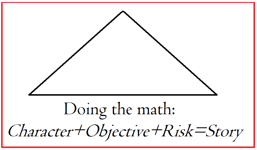
Severe weather, fires, famines, and floods are terrible to live through, and many harrowing stories emerge from these experiences. Stories of apocalyptic catastrophes resonate because disaster drives humanity to strive for greater things. Those who survive and rise above it become heroes.
 One disaster we may all face at some point is famine driven by climate change. Hunger exists in this world, and famine is an enemy that takes no prisoners.
Food deprivation can have a lasting impact on a person. People can survive on very little, and unfortunately, many do. To go without adequate food for any length of time changes you, makes you determined to never go hungry again. You stockpile preserved foods in times of plenty as a shield against the next famine.
Unfortunately, for some, hunger will lead them to make choices that challenge the accepted morality of those who have no concept of what hunger truly is.
If you are looking for the seeds of a good story, consider the small tragedies people face each day, deeply personal catastrophes. These disasters happen on what seems an unimportant level to people who have resources.
 I have used this example before, but it’s a real-life situation, one that may be familiar to you and your community. A young widow is working two part-time jobs and raising her two small children. How would you write her story? Perhaps she lives in an area with no public transportation. She struggles to pay for fuel, but what if her car breaks down? How will she get to work?
All her money goes to fuel, childcare, rent, and utilities. What little she has left after those bills are paid goes to food. She has no resources and no means to pay for car repairs. Without her car, she will lose both jobs. That is a profoundly personal disaster, one from which she and her children might not recover.
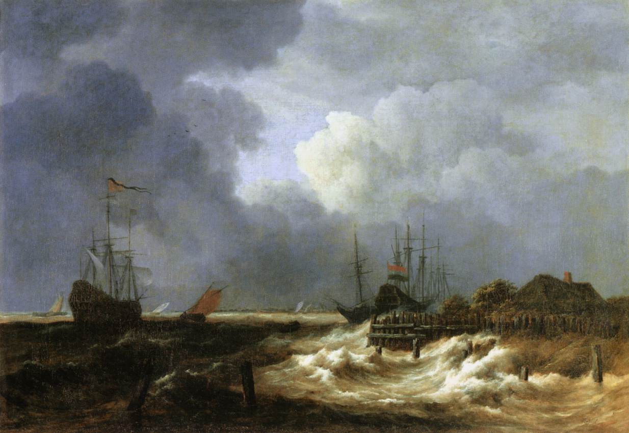
But maybe that plot isn’t big enough to inspire you to write a book about it. Perhaps you want to write about a disaster that inspires heroics in the face of widespread devastation. The world itself can provide us with plenty of drama. Wildfires, floods, tornadoes, hurricanes, earthquakes, tsunamis – these catastrophes regularly destroy thousands of communities.
courtesy Office360 graphics
Once we have introduced our characters and set the scene, it’s time to bring on the natural disaster. When you begin writing the story, it will be chaotic. Just get the bones of the events down as well as you can and move on. You must get the entire story down while it is fresh.
In the first draft, write each scene as fast as you can, and don’t worry about fine-tuning it because you will come back to it later. The second draft is where you will iron out the rough spots and make things logical.
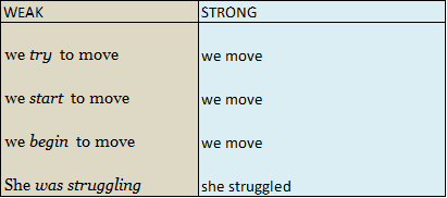
In the second draft, we take apart the scenes where we have told the story and reword them. We show the events as if we were painting with words. We use power words to inject real, believable emotion into the experience.
The window shatters, and a two-by-four impales itself in the wall beside David amid a shower of glass shards. I stare, dumbstruck, as the wind tears the door from my hand and slams it against the wall.
Verbs in that scene are: stare, impales, shatter, tears, and slams. Show the bones of the event by using verbs with powerful visuals, and the reader’s mind will fill in the rest.
 I suggest you open a new document and describe the disaster in great detail. Then save it as background material for that story and walk away from it. Let it rest, and move on to something else. When you return to it, read it aloud and see what you can cut and condense and still have the bones of the action. As always, verbs and power words are action’s best friend.
Droughts often cause famines and worse. To go without water is to die. Thirst is a more immediate pain than hunger. The human animal can survive for up to three weeks without food but only three to four days without water. Rarely, one might survive up to a week.
Even brackish water must taste sweet when one suffers from a lack of potable water. And when one is starving, foods they would consider repugnant under other circumstances will fill their belly.
Look at the continual strife in some third-world countries. You will see how long-term droughts have precipitated widespread famine, leading to civil unrest. Gang wars are fought over the right to own a water source, and these conflicts can erupt into revolution.
 We often forget this when we have plenty to eat and never have to worry about whether we will have water in our faucet as long as we can pay the bills. However, if we learned anything from the empty grocery store shelves in 2020 and the subsequent supply chain crisis, it is that our well-fed lives are standing on a one-legged stool.
Once the events of the disaster are on paper the way we want them, we have the opportunity to ratchet up the reader’s emotions by the way we portray the aftermath. Who finds strength through the calamity, and who is broken by it? What roadblocks do they face, and how do they recover?
We must complete the story and provide the reader with some closure by ending with our characters in a place of comparative happiness and security.
 Drama, heartache, disaster, and violence are the backdrop against which humanity’s story plays out. The most powerful books in the Western Canon of Great Literature explore both the good and evil of the human experience.
We connect with these stories across the centuries because the fundamental concerns of human life aren’t unique to one society, one technological era, or one point in time. We all want enough food, enough water, and reliable shelter.
When we contrast ease with hardship, we add emotional texture to our narrative. I love a good story featuring courage in the face of personal disasters. Readers like me will think about the story and those characters long after it has ended.

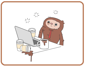
 When prepping a novel to send to Irene, I use a three-part method. This requires specific tools that come with Microsoft Word, my word-processing program. I believe these tools are available for Google Docs and every other word-processing program. Unfortunately, I am only familiar with Microsoft’s products as they are what the companies that I worked for used.
 Part two: Once I have ironed out the rough spots noticed by my beta readers, this second stage is put into action. Yes, on the surface the manuscript looks finished, but it has only just begun the journey.
 The most frustrating part is the continual stopping, making corrections, and starting.
 I am wary of relying on
  If you read as much as I do (and this includes books published by large Traditional publishers), you know that a few mistakes and typos can and will get through despite their careful editing. So, don’t agonize over what you might have missed. If you’re an indie, you can upload a corrected file.
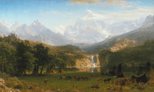


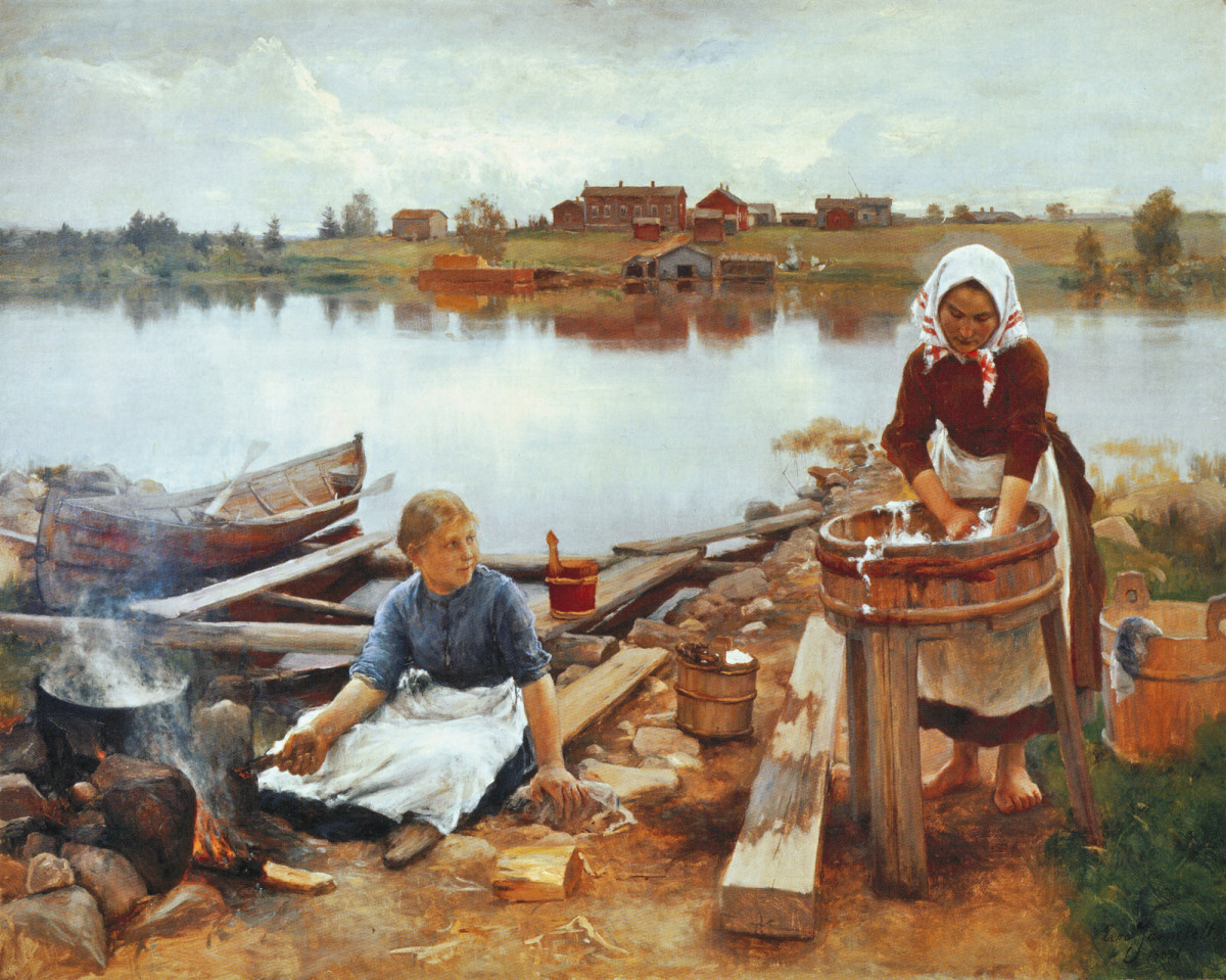
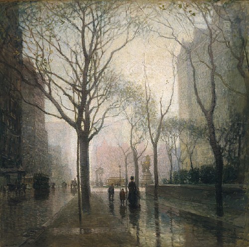 Artist: Paul Cornoyer (1864–1923)


