Tag Archives: Fine Art Friday

#FineArtFriday: Shrovetide Revelers by Frans Hals ca. 1616

Frans_Hals,_Merrymakers_at_Shrovetide,_The_Metropolitan_Museum_of_Art
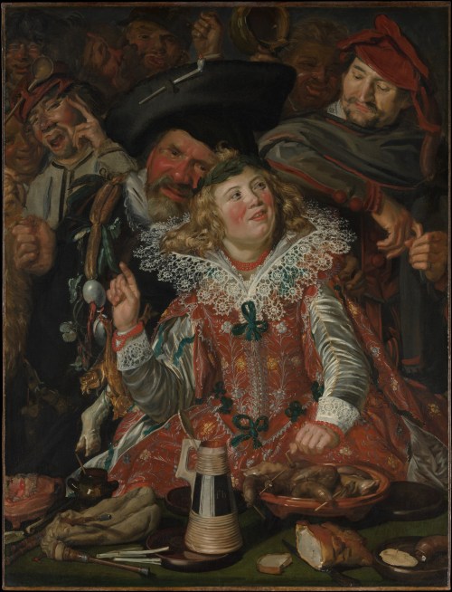
Artist: Frans Hals  (1582/1583–1666)

Title: Shrovetide Revelers

Genre: genre painting

Date: circa 1616–17

Medium: oil on canvas

Dimensions: 51 ¾ × 39 ¼ in. (131.4 × 99.7 cm)

Collection: Metropolitan Museum of Art

What I think about this painting:

This was a lurid scene at the time it was painted and is still lurid today. The sole female portrayed is a girl dressed in the finest of garments, surrounded by men. She is well-fed, has abundant blonde hair, and represents the concept of “plenty.” The party will go on for as long as she lasts–when she is gone, the party is over.

The color of her hair is gold, an allegory for an abundance of coins. The men posed around her represent the human tendency toward gluttony, drunkenness, and greed.

Frans Hals depicted the embroideries on the fabric of her dress and the intricate lace at her neck and cuffs with exquisite care and attention to detail. The sheen of her satin sleeves gleams in the candlelight, showing off the strings of beads at her neck and wrist. Perhaps the beads are carnelians. Her brightly flushed cheeks give evidence to her inebriation.

All the characters, including the serving man, are shown as having overindulged. The foods on the table are those any person could acquire, but they are shown being wasted, used as decorations for fools.

Food was an incredibly popular subject for paintings during the renaissance–still lifes were exceedingly good sellers for most artists. Food of all varieties was carefully staged and shown with superb realism and minute detail. Those artists we now call the Dutch and Flemish masters used food as an allegory, and even in genre paintings, they loved to paint lavish food displays.

As in the scene above, the foods depicted in scenes of drunkenness and revelry conveyed symbolic meanings, often implying immorality and debauchery.

Mostly, the imagery was intended to be a reminder that great wealth can vanish overnight. Also, they show us that gluttony is both unappealing to look at and unhealthy for the glutton.

But when I see an image such as this painting, I have to think these artists, whose own morals were often quite elastic, were exercising their broad senses of humor.

About this painting, via The Met Museum:

Shrovetide, now better known as Mardi Gras, is the traditional period of indulgence before the fasting and self-discipline of Lent. In the seventeenth-century Netherlands, it was also the occasion for theatrical performances by the painters’ guilds.

Here, Hals depicts two stock figures from these plays, Hans Wurst, with a sausage dangling from his cap, and Pekelharing, who sports a garland of salted fish and eggs.

They flank a richly dressed girl (probably a boy in drag, as women were not permitted to perform on these occasions).

Still life elements litter the foreground, evoking both the traditional foods of the festival and an abundance of erotic innuendo. [1]

About this painting, via Wikipedia:

Shrovetide Revellers, also known as Merrymakers at Shrovetide, is a painting by the Dutch Golden Age painter Frans Hals, painted in around 1616–17. It is one of the earliest surviving works by Hals, and has been held by the Metropolitan Museum of Art, New York City since 1913. The painting shows people festivities at Shrovetide (DutchCarnaval), an annual carnival of food and jollity which takes place before the Christian fasting season of Lent.

The painting shows the face of an elegantly dressed smiling woman raising her right finger to make a point, while a man grabs her shoulder to whisper in her ear: he has a string of herring, eggs and mussels around his neck, with a pig’s trotter and a fox tail, symbols of gluttony and foolishness respectively. Another amused gentleman, with a wurst hanging from his cap, leans on the first man’s shoulder and listens to their banter. Some claim these are the Baroque theatre characters Peeckelhaeringh and Hans Wurst. Behind them other people are talking and laughing. The flagon Bears the initials “fh”. [2]


Credits and Attributions:

[1] Shrovetide Revellers or Merrymakers at Shrovetide by Frans Hals, Met Museum Contibutors © 2000–2022 The Metropolitan Museum of Art. Frans Hals | Merrymakers at Shrovetide | The Metropolitan Museum of Art (metmuseum.org) (Accessed April 14, 2022).

[2] Wikipedia contributors, “Shrovetide Revellers,” Wikipedia, The Free Encyclopedia, https://en.wikipedia.org/w/index.php?title=Shrovetide_Revellers&oldid=1070869013 (accessed April 14, 2022).

4 Comments

Filed under #FineArtFriday, writing

#FineArtFriday: Undergrowth with Two Figures, Vincent van Gogh 1890

Vincent_van_Gogh_-_Undergrowth_with_Two_Figures_(F773)Artist: Vincent van Gogh (1853–1890)

Title: Undergrowth with Two Figures

Date: late June 1890

Medium: oil on canvas

Dimensions: height: 50 cm (19.6 in); width: 100.5 cm (39.5 in)

Collection: Cincinnati Art Museum

Today, Thursday, I was privileged to attend an immersive exhibit of Vincent van Gogh’s life through his work. I had hoped to write a post on my impressions of that exhibit when I arrived home, but frankly, words fail me, and so I hope you will forgive my settling for one of my favorites of his paintings.

We were inside an everchanging exhibit that flowed through many of his most famous works and zoomed in on bits one wouldn’t ordinarily notice. I managed a few shots with my cell phone that offer some idea of the exhibition, and here is the one that best shows what we experienced:

Van Gogh immersive 1 connie j jasperson LIRF04072022

The exhibit was such a moving, emotional experience. It brings you into touch with the man as well as his art.

We were in, above, and surrounded by his work. The powerful soundtrack of classical music was paired perfectly to the images, complementing them like fine wine does good food.

The link to that exhibit is here: Van Gogh, The Immersive Experience.

What I love about Undergrowth with Two Figures:

This very late work was painted at the end of June 1890, a few weeks before Van Gogh’s death. It was one of several paintings in Auvers-sur-Oise, a commune on the northwestern outskirts of Paris, France. This was also the place where Vincent van Gogh died from injuries suffered in an attempted suicide.

This painting is one of several he made in the last weeks of his life, in an unusually elongated double-square format. The double-square painting is a painting made on uncommonly large canvases, which have one dimension that is twice the size of the other. His need to express his art couldn’t be contained on an ordinary canvas—he saw the world with a panoramic view.

One of the things I love about this painting is the use of violet and blue in the trunks of the poplars. They are tall, immense, like bars in a window framing the courting pair. The trees stand out against the black backdrop. They have power and are the soul of the painting, even more so than the flowers and undergrowth through which the couple walks.

It is a pleasing composition, with strong brush strokes and deep, dark colors. He saw the beauty in life and painted it.

[1] About this painting, via Google Arts and Culture:

In a letter to his younger brother, Theo, dated June 30, 1890, van Gogh explained the structure and brilliant colors of “Undergrowth with Two Figures”: “The trunks of the violet poplars cross the landscape perpendicularly like columns,” adding “the depth of Sous Bois is blue, and under the big trunks the grass blooms with flowers in white, rose, yellow, and green.”

“Undergrowth with Two Figures” has a silvery tonality characteristic of van Gogh’s works from Auvers. His brushwork may be swift and visceral, his colors strong and biting, his emotion raw and visible, but the composition reveals no hint of psychological torment.

It is painted on a double square canvas, twice as wide as it is high. Van Gogh explored the artistic possibilities of this panoramic format in several of his last paintings. [1]


Credits and Attributions:

[1] Google Arts and Culture Contributors, Undergrowth with two Figures, Vincent van Gogh 1890, Accessed April 7, 2022.

Wikimedia Commons contributors, “File:Vincent van Gogh – Undergrowth with Two Figures (F773).jpg,” Wikimedia Commons, the free media repository, https://commons.wikimedia.org/w/index.php?title=File:Vincent_van_Gogh_-_Undergrowth_with_Two_Figures_(F773).jpg&oldid=618842665 (accessed April 8, 2022).

View of Vincent’s Starry Night, © 2022 Connie J. Jasperson, own work,

4 Comments

Filed under #FineArtFriday

#FineArtFriday: Sailboats by Jacoba van Heemskerck

Sailboats by Jacoba van HeemskerckArtist: Jacoba van Heemskerck (1876–1923)

Title: Bild no. 15 (Segelboote) (English: Painting no, 15 – Sailboats)

Date: Circa 1914

Medium: oil on canvas

Dimensions: height: 97.5 cm (38.3 in); width: 113.5 cm (44.6 in)

Collection: Museum Boijmans Van Beuningen

What I love about this painting:

The sharp corners and geometry of this composition raises the viewer’s eye toward the horizon. It feels cubist, is abstract, and reflects a spiritual connection to her subject. I love the symbolism in this image. The sailboats are souls sailing toward the next life across a deep blue sea and beneath a golden sky. The island temple toward which the boats sail is shaped like a pyramid. The elongated sails of the many boats direct the eye up. Everything, including the island temple, points toward heaven.

In this painting, it is easy to see how she would later become involved in creating stained glass—the sharp black outlines and vivid colors of her paintings are perfect for that medium.

According to the Kunstmuseum Den Haag’s website:

“But whereas Mondrian’s artistic approach eventually became austerely geometrical, Van Heemskerck’s developed as a result of a variety of influences (including anthroposophy) into an open, unconstrained and intuitive style. Throughout her life, she would seek – like Kandinsky – to express spiritual experience. The recurring subjects in her oeuvre are therefore invariably symbolic in nature: sailing ships, bridges and trees, depicted in clear, vibrant colours and with firm outlines. Although she was never to abandon the representation of the real world, Van Heemskerck’s style was eventually so abstract that her subjects became virtually unrecognisable. This approach won her great success, especially in Germany, where she exhibited at the Berlin Expressionist gallery Der Sturm every year from 1913 until her death.” [1]

About the Artist, Via Wikipedia:

Jkvr. Jacoba Berendina van Heemskerck van Beest (1876-1923) was a Dutch painter, stained glass designer and graphic artist who worked in several modern genres. She specialized in landscapes and still-lifes.

Her first contact with Modern art came in Paris, where she took lessons from Eugène Carrière.[2][3] She remained in France until 1904, then went to live with her sister, Lucie, and was introduced to the art collector, Marie Tak van Poortvliet, who became her lifelong friend and later built a studio for her in the garden of her home.[1] After 1906, she spent her Summers in Domburg, where she came into contact with avant-garde painters such as Piet Mondrian[4] and Jan Toorop, who offered her advice. Around 1911, she was briefly interested in Cubism.

Shortly after, she became involved in Anthroposophy, possibly through the influence of her former teacher, Nibbrig, who was a Theosophist. She then became an avid follower of Der Sturm, an avant-garde art magazine founded by Herwarth Walden, and turned increasingly to Abstraction.[1] In 1913, she attended the Erster Deutscher Herbstsalon in Berlin, where she met Walden and started what would be a lifelong correspondence.[3] Thanks to his efforts, her work was popular in Germany, while it remained somewhat ignored in her home country.

After 1916, she developed an interest in stained glass windows, designing them for the naval barracks and the Municipal Health Department building in Amsterdam, as well as private residences.[1] From 1922, she lived in Domburg with her old friend and patron, Tak van Poortvliet.

She died suddenly, from an attack of angina.[3] Both Tak van Poortvliet and Walden mounted exhibitions of her work, in Amsterdam and Berlin respectively. In 2005, a major retrospective was held at the Gemeentemuseum Den Haag. [2]


Credits and Attributions:

[1] Kunstmuseum Den Haag contributors, “Jacoba van Heemskerck,” Jacoba van Heemskerck A REDISCOVERY, Jacoba van Heemskerck | Kunstmuseum Den Haag (accessed March 31, 2022).

[2]Wikipedia contributors, “Jacoba van Heemskerck,” Wikipedia, The Free Encyclopedia, https://en.wikipedia.org/w/index.php?title=Jacoba_van_Heemskerck&oldid=1078279427 (accessed March 31, 2022).

Comments Off on #FineArtFriday: Sailboats by Jacoba van Heemskerck

Filed under #FineArtFriday, writing

#FineArtFriday: The Lacemaker by Nicolaes Maes ca. 1656 (revisited)

The Lacemaker

  • Artist   Nicolaes Maes
  • Year    c. 1656
  • Medium           oil paint, canvas
  • Dimensions     45 cm (18 in) × 53 cm (21 in)

What I love about this painting:

Working from home is nothing new. Women have sewn, made lace, or taken in laundry to earn coins for as long as they have been mothers. Finding ways to earn a living and still raise the family has always been a struggle. Maes painted real women doing real work to support their families. Other artists painted women of the taverns and streets, but Maes had respect for the women he painted.

About this image, via Wikipedia:

The Lacemaker (circa 1656) is an oil on canvas painting by the Dutch painter Nicolaes Maes. It is an example of Dutch Golden Age painting and is part of the collection of the Metropolitan Museum of Art.

This painting is typical of many paintings of women in interiors painted by Maes in the 1650s. The woman is making bobbin lace using a lace pillow that can be seen in other Maes paintings of lacemakers.

The child in a highchair was a popular subject for many Dutch genre painters, and this painting shows how it was used as a safe place to play as well as for eating. The empty bowl of porridge is on the floor along with some other items the boy has let fall. He is wearing a red valhoed or falling cap, which seems to indicate that confinement in the chair is necessary if any lacemaking is going to get done.

baby bumper headguard cap, also known as a falling cap, or pudding hat, is a protective hat worn by children learning to walk, to protect their heads in case of falls.

Known as a pudding or black pudding, a version used during the early 17th century until the late 18th century was usually open at the top and featured a sausage-shaped bumper roll that circled the head like a crown. It was fastened with straps under the chin.

About the Artist via Wikipedia

From Wikipedia: Nicolaes Maes, also known as Nicolaes Maas (January 1634 – November 24, 1693 (buried)) was a Dutch Golden Age painter of genre and portraits. In about 1648 he went to Amsterdam, where he entered Rembrandt‘s studio. Before his return to Dordrecht in 1653 Maes painted a few Rembrandtesque genre pictures, with life-size figures and in a deep glowing scheme of colour, like the Reverie at the Rijksmuseum in Amsterdam, the Card Players at the National Gallery, and the Children with a Goat Carriage. So closely did his early style resemble that of Rembrandt, that the last-named picture, and other canvases in the Leipzig and Budapest galleries and in the collection of Lord Radnor, were or are still ascribed to Rembrandt.

In his best period, from 1655 to 1665, Maes devoted himself to domestic genre on a smaller scale, retaining to a great extent the magic of colour he had learnt from Rembrandt. Only on rare occasions did he treat scriptural subjects, as in Hagar’s Departure, which has been ascribed to Rembrandt. His favorite subjects were women spinning, or reading the Bible, or preparing a meal. He had a particular fascination with the subject of lacemaking and made almost a dozen versions on this subject.

While he continued to reside in Dordrecht until 1673, when he settled in Amsterdam, he visited or even lived in Antwerp between 1665 and 1667. His Antwerp period coincides with a complete change in style and subject. He devoted himself almost exclusively to portraiture, and abandoned the intimacy and glowing color harmonies of his earlier work for a careless elegance which suggests the influence of Van Dyck. So great indeed was the change, that it gave rise to the theory of the existence of another Maes, of Brussels. His registered pupils were Justus de GelderMargaretha van GodewijkJacob Moelaert, and Johannes Vollevens.[1] Maes died in Amsterdam.


Credits and Attributions:

Wikipedia contributors, “The Lacemaker (Maes),” Wikipedia, The Free Encyclopedia, https://en.wikipedia.org/w/index.php?title=The_Lacemaker_(Maes)&oldid=799625637 (accessed December 12, 2019).

Wikipedia contributors, “Baby bumper headguard cap,” Wikipedia, The Free Encyclopedia, https://en.wikipedia.org/w/index.php?title=Baby_bumper_headguard_cap&oldid=914539353 (accessed December 12, 2019).

Wikipedia contributors, “Nicolaes Maes,” Wikipedia, The Free Encyclopedia, https://en.wikipedia.org/w/index.php?title=Nicolaes_Maes&oldid=815679835 (accessed July 12, 2018).

2 Comments

Filed under #FineArtFriday

#FineArtFriday: The Proposition by Judith Leyster 1631 (revisited)

What I love about this painting is how honest Judith Leyster is when detailing the realities of life in her time and in her city. Here, a young woman is pressured to enter into a relationship with a man she has no interest in. He clearly feels he has the right to compel her to sell her virtue, and she clearly ignores him. It is as if she refuses to notice him.

Male artists of the time, Leyster’s husband, Jan Meinse Molenaer included, rarely painted genre pictures of young women other than in taverns or other low-life situations. Commissioned portraits of noble and merchant class women they painted in great abundance, but simple, modest women of good virtue?

Rarely. They had to sell paintings to feed their families, and then as today, virtue did not sell all that well.

Leyster, on the other hand, had the talent and (because she was a woman) the freedom to paint whatever she wanted. After all, as long as she managed the house, made sure food was served, and raised the children, she could paint whatever moved her.

The artistic talent of women has been so disregarded historically that, despite her signature, her paintings and her talent were attributed (after her death) to her husband and to Franz Hals.

About the Painting (Via Wikipedia):

“The Proposition” is a genre painting of 1631 by Judith Leyster, now in the Mauritshuis in The Hague, who title it “Man offering money to a young woman.” It depicts a woman, sewing by candlelight, as a man leans over her, touching her right shoulder with his left hand. He is offering her coins in his right hand, but she is apparently ignoring the offer and concentrating intently upon her sewing.

The man wears dark clothing, and the dark tones, as well as his shadow cast behind him and across his face from the angle of the candlelight, give him a looming appearance. In contrast, the woman is lit fully in the face by the candlelight and wears a white blouse.

It is an early work by Leyster, who was only 22 years old in 1631.

Also, From Wikipedia:

(The painting’s) most distinctive feature is how different it is to other contemporary Dutch and Flemish “sexual proposition” paintings, many falling into the Merry company genre. The convention for the genre, a common one at the time, was for the characters to be bawdy, and clearly both interested in sex, for money. The dress would be provocative, the facial expressions suggestive, and sometimes there would be a third figure of an older woman acting as a procuress. Indeed, in The Procuress by Dirck van Baburen, an example of the genre, that is exactly the case.

In contrast, in The Proposition the woman is depicted not as a whore but as an ordinary housewife, engaged in a simple everyday domestic chore. She isn’t dressed provocatively. She does not display her bosom (but rather her blouse covers her all of the way to her neck). No ankles are visible. She displays no interest in sex or even in the man at all.

Contemporary Dutch literature stated the sort of activity in which she is engaged to be the proper behaviour for virtuous women in idle moments. Kirstin Olsen observed that male art critics “so completely missed the point” that the woman is, in contrast to other works, not welcoming the man’s proposition that they mistakenly named the painting The Tempting Offer.

The foot warmer, whose glowing coals are visible beneath the hem of the woman’s skirt, was a pictorial code of the time, and represented the woman’s marital status. A foot warmer wholly under the skirt indicated a married woman who was unavailable, as it does in The Proposition. A foot warmer projecting halfway out from under the skirt with the woman’s foot visible on it indicated one who might be receptive to a male suitor. And, a foot warmer that is not under the woman at all, and empty of coals, indicated a single woman. This code can also be seen in Vermeer’s The Milkmaid and Dou’s The Young Mother.

About the Artist:

Judith Jans Leyster (also Leijster) (c. July 28, 1609[1]– February 10, 1660) was a Dutch Golden Age painter. She painted genre works, portraits, and still lifes. Her entire oeuvre was attributed to Frans Hals or to her husband, Jan Miense Molenaer, until 1893 when Hofstede de Groot first attributed seven paintings to her, six of which are signed with her distinctive monogram ‘JL*’. Misattribution of her works to Molenaer may have been because after her death many of her paintings were inventoried as “the wife of Molenaer”, not as Judith Leyster.

She signed her works with a monogram of her initials “JL” with a star attached: JL* This was a play on words; “Leister” meant “Lead star” in Dutch and was for Dutch mariners of the time the common name for the North Star. The Leistar was the name of her father’s brewery in Haarlem.

(Only occasionally did she sign her works with her full name.)

She specialized in portrait-like genre scenes of, typically, one to three figures, who generally exude good cheer, and are shown against a plain background. Many are children; others men with drink. Leyster was particularly innovative in her domestic genre scenes. These are quiet scenes of women at home, often with candle- or lamplight, particularly from a woman’s point of view


Sources and Attributions:

Wikipedia contributors, “The Proposition (painting),” Wikipedia, The Free Encyclopedia, https://en.wikipedia.org/w/index.php?title=The_Proposition_(painting)&oldid=851982429 (accessed February 1, 2019).

Wikipedia contributors, “Judith Leyster,” Wikipedia, The Free Encyclopedia, https://en.wikipedia.org/w/index.php?title=Judith_Leyster&oldid=820769951(accessed February 1, 2019).

2 Comments

Filed under #FineArtFriday

#FineArtFriday: Snow Storm: Steam-Boat off a Harbour’s Mouth J.M.W. Turner 1842

J.M.W. Turner

Title: Snow Storm: Steam-Boat off a Harbour’s Mouth

Artist: J. M. W. Turner

Year: 1842

Medium: oil on canvas

Dimensions: 91 cm × 122 cm (36 in × 48 in)

Location: Tate, London, Great Britain

About this Picture, Via Wikipedia:

The painting depicts a paddle steamer caught in a snow storm. This marine painting is showing a Romantic era’s painter’s depiction of a snowstorm on water at its best, fully developing the bold, daring Romantic fantasy of Turner. Turner was unrivaled in depicting the natural world unmastered by mankind and exploring the effects of the elements and the battle of the forces of the nature. Turner worked first as a watercolorist, and he started to work much later with oils. He later applied the techniques he learned in watercolour onto oil paintings.

It is typical of the late style of Turner. Turner’s tints and shades of colours are painted in different layers of colour, the brushstrokes adding texture to the painting. The colours are monochromatic, only a few shades of grey, green and brown are present, having the same tone of colours. The silvery pale light that surrounds the boat creates a focal point, drawing the viewer into the painting. The smoke from the steamboat spreads out over the sky, creating abstract shapes of the same quality like the waves.

An inscription on the painting relates that The Author was in this Storm on the Night the “Ariel” left Harwich. Turner later recounted a story about the background of the painting:

“I did not paint it to be understood, but I wished to show what such a scene was like; I got the sailors to lash me to the mast to observe it; I was lashed for four hours, and I did not expect to escape, but I felt bound to record it if I did.”

He was 67 years old at the time. Some later commentators doubt the literal truth of this account. Other critics accept Turner’s account, and one wrote, “He empathized completely with the dynamic form of sovereign nature.”  This inscription allows us to better understand the scene represented and the confusion of elements.

Turner had investigated the interactions between nature and the new technology of steamboats in at least five paintings in the previous decade. Throughout his career, Turner engaged with issues of urbanism, industry, railroads and steam power. [1]

About the Artist, Via Wikipedia:

Joseph Mallord William Turner RA (23 April 1775 – 19 December 1851), known in his time as William Turner, was an English Romantic painter, printmaker and watercolourist. He is known for his expressive colourisations, imaginative landscapes and turbulent, often violent marine paintings. He left behind more than 550 oil paintings, 2,000 watercolours, and 30,000 works on paper. He was championed by the leading English art critic John Ruskin from 1840, and is today regarded as having elevated landscape painting to an eminence rivalling history painting.

Turner was born in Maiden Lane, Covent Garden, London, to a modest lower-middle-class family. He lived in London all his life, retaining his Cockney accent and assiduously avoiding the trappings of success and fame. A child prodigy, Turner studied at the Royal Academy of Arts from 1789, enrolling when he was 14, and exhibited his first work there at 15. During this period, he also served as an architectural draftsman. He earned a steady income from commissions and sales, which due to his troubled, contrary nature, were often begrudgingly accepted. He opened his own gallery in 1804 and became professor of perspective at the academy in 1807, where he lectured until 1828. He travelled to Europe from 1802, typically returning with voluminous sketchbooks.

Intensely private, eccentric and reclusive, Turner was a controversial figure throughout his career. He did not marry, but fathered two daughters, Eveline (1801–1874) and Georgiana (1811–1843), by his housekeeper Sarah Danby. He became more pessimistic and morose as he got older, especially after the death of his father, when his outlook deteriorated, his gallery fell into disrepair and neglect, and his art intensified. In 1841, Turner rowed a boat into the Thames so he could not be counted as present at any property in that year’s census. He lived in squalor and poor health from 1845, and died in London in 1851 aged 76. Turner is buried in Saint Paul’s Cathedral, London. [2]


Credits and Attributions:

[1] Wikipedia contributors, “Snow Storm: Steam-Boat off a Harbour’s Mouth,” Wikipedia, The Free Encyclopedia, https://en.wikipedia.org/w/index.php?title=Snow_Storm:_Steam-Boat_off_a_Harbour%27s_Mouth&oldid=1000619190 (accessed March 3, 2022).

[2] Wikipedia contributors, “J. M. W. Turner,” Wikipedia, The Free Encyclopedia, https://en.wikipedia.org/w/index.php?title=J._M._W._Turner&oldid=1075008053 (accessed March 3, 2022).

Wikimedia Commons contributors, “File:Joseph Mallord William Turner – Snow Storm – Steam-Boat off a Harbour’s Mouth – WGA23178.jpg,” Wikimedia Commons, the free media repository, https://commons.wikimedia.org/w/index.php?title=File:Joseph_Mallord_William_Turner_-_Snow_Storm_-_Steam-Boat_off_a_Harbour%27s_Mouth_-_WGA23178.jpg&oldid=618892271 (accessed March 3, 2022).

2 Comments

Filed under #FineArtFriday, writing

#FineArtFriday: A Sunday on La Grande Jatte by Georges Seurat circa 1884 (revisited)

A Sunday Afternoon on the Island of La Grande Jatte by Georges Seurat (1884–1886) is a landmark painting. Art historians agree that with this image, Seurat changed the direction of modern art and began the era of Neo-impressionism. It is one of the most recognizable of late 19th-century paintings.

About this painting from Wikipedia: In summer 1884, Seurat began work on A Sunday Afternoon on the Island of La Grande Jatte.

The painting shows members of each of the social classes participating in various park activities. The tiny juxtaposed dots of multi-colored paint allow the viewer’s eye to blend colors optically, rather than having the colors physically blended on the canvas. It took Seurat two years to complete this 10-foot-wide (3.0 m) painting, much of which he spent in the park sketching in preparation for the work (there are about 60 studies). It is now in the permanent collection of the Art Institute of Chicago.

What I love about this painting is the preciseness of each component. This painting proudly declares it is not “real”—it is instead an impression of a moment in time, a summer day spent on the River Seine. It is both sharply delineated and dreamlike. That is a neat trick.

Seurat used individual dots of only primary colors (Red, green, yellow, blue) but the way he places them, they seem muted and blended into shades of rose and purple, and even pale pink. I’m captivated by a technicality – obsessed by the way the primary colors of each dot are juxtaposed with other primary colors, tricking the eye into believing it sees light and dark, and all shades between.

About the Artist, via Wikipedia: (Seurat) is noted for his innovative use of drawing media and for devising the painting techniques known as chromoluminarism and pointillism. Seurat’s artistic personality was compounded of qualities which are usually supposed to be opposed and incompatible: on the one hand, his extreme and delicate sensibility; on the other, a passion for logical abstraction and an almost mathematical precision of mind.

This technique is one I hadn’t given much thought to until I ran across a postcard with an image of Seurat’s painting on it. Other notable artists who explored this method were Paul Signac and Vincent van Gogh.

For me, studying these images of masterpieces for the Friday posts on art teaches me how to be creative with my words. Artists both push the limits of their color palettes and yet force external constraints on themselves to create images that fool the eye.

Authors must do the same with how we shape our words to show ideas and form stories.

About the Pointillist technique of painting, from Wikipedia: If red, blue, and green light (the additive primaries) are mixed, the result is something close to white light. Painting is inherently subtractive, but Pointillist colors often seem brighter than typical mixed subtractive colors. This may be partly because subtractive mixing of the pigments is avoided, and partly because some of the white canvas may be showing between the applied dots.

The painting technique used for Pointillist color mixing is at the expense of the traditional brushwork used to delineate texture.

The majority of Pointillism is done in oil paint. Anything may be used in its place, but oils are preferred for their thickness and tendency not to run or bleed.


Sources and Attributions:

Wikimedia Commons contributors, “File:Georges Seurat – A Sunday on La Grande Jatte — 1884 – Google Art Project.jpg,” Wikimedia Commons, the free media repository, https://commons.wikimedia.org/w/index.php?title=File:Georges_Seurat_-_A_Sunday_on_La_Grande_Jatte_–_1884_-_Google_Art_Project.jpg&oldid=90112845 (accessed January 10, 2019).

Wikipedia contributors, “A Sunday Afternoon on the Island of La Grande Jatte,” Wikipedia, The Free Encyclopedia,https://en.wikipedia.org/w/index.php?title=A_Sunday_Afternoon_on_the_Island_of_La_Grande_Jatte&oldid=875941354 (accessed January 10, 2019).

Wikipedia contributors, “Georges Seurat,” Wikipedia, The Free Encyclopedia, https://en.wikipedia.org/w/index.php?title=Georges_Seurat&oldid=877532379 (accessed January 10, 2019).

Wikipedia contributors, “Pointillism,” Wikipedia, The Free Encyclopedia, https://en.wikipedia.org/w/index.php?title=Pointillism&oldid=874469961(accessed January 10, 2019).

1 Comment

Filed under writing

#FineArtFriday: A Guardroom by Abraham Teniers (revisited)

Today we are revisiting A Guardroom, an allegorical painting attributed to Abraham Teniers. This painting is worthy of a second look, for both the allegory and the quality of the composition.

I have often said that to write about medieval and pre-industrial revolution societies, you must go to art to get the facts. This painting is a symbolic piece showing the transience of life and the certainty of death.

He shows us a guardroom. Abraham Teniers served as a captain of the local civil militia of Antwerp and was fond of painting guardroom scenes.

This particular scene is intriguing to me, because of the way the jumble of disjointed metal armor completely dominates the painting. In the foreground, in the light, we see flintlock pistols, muskets, breast plates, leg guards, vambraces, a drum, swords and other steel weaponry, and several helmets—all cast into a corner.

Almost unnoticed in the background, peasant soldiers are shown smoking and drinking before a fireplace. They are deliberately kept in the background of the picture, an allegory for the fleetingness of life.

One reason renaissance painters liked to paint armor was the way the light fell on all the angles. Getting the light just right is the sign of an observant painter.  All the various shapes and sheens–armor offered an artist so many interesting surfaces, so many opportunities to show their skill.

The armor depicted in the picture was of a style no longer in use at the time it was painted. Metal armor was falling out of use by the time Abraham Teniers was born. Plate had lost its effectiveness as guns became the weaponry of choice.

In most paintings of this era, armor is an allegory, a symbol representing death. The deliberately chaotic positioning of the many pieces portrays the violence of the battlefield. A lone suit of armor, empty of life, stands guard over the dead.

Abraham is not the most famous of the Teniers family, but he was a talented and skilled painter. In this scene, he makes good use of chiaroscuro, strong contrasts between light and dark.

About the artist (from Wikipedia):

Abraham Teniers (1 March 1629 – 26 September 1670) was a Flemish painter and engraver who specialized in genre paintings of villages, inns and monkey scenes. He was a member of artist family Teniers which came to prominence in the 17th century. He was also active as a publisher. He was responsible for the publication of the Theatrum Pictorium (‘Theatre of Paintings’), the project initiated by his brother David to make a set of engravings of the entire art collection of Archduke Leopold Wilhelm.

Like his brother David before him, Abraham found appreciation at the court in Brussels and the art-loving Archduke Leopold Wilhelm of Austria – then the governor of the Southern Netherlands and a resident of Brussels – appointed him as court painter.


Credits and Attributions:

Wikimedia Commons contributors, “File:Abraham Teniers – Een wachtlokaal, 1 (Prado).jpg,” Wikimedia Commons, the free media repository, https://commons.wikimedia.org/w/index.php?title=File:Abraham_Teniers_-_Een_wachtlokaal,_1_(Prado).jpg&oldid=267098550 (accessed January 3, 2019).

Wikipedia contributors, “Abraham Teniers,” Wikipedia, The Free Encyclopedia, https://en.wikipedia.org/w/index.php?title=Abraham_Teniers&oldid=871305163 (accessed January 3, 2019).

7 Comments

Filed under #FineArtFriday

#FineArtFriday: Road from Market by Thomas Gainsborough ca. 1768 (revisited)


Title: Road from Market by Thomas Gainsborough  (1727–1788)

Date: between 1767 and 1768

Medium: oil on canvas

Dimensions: Height: 1,213 mm (47.75 ″); Width: 1,702 mm (67 ″

What I love about this painting:

Thomas Gainsborough is one of Great Britain’s most famous portrait artists. His best-known painting is the “Blue Boy.”  But while portraits may have paid his bills (handsomely), Thomas Gainsborough loved painting landscapes and did so whenever he was able.

This painting shows us a road, and while it looks to our modern eyes to be nothing more than a dirt track fading into the forest, it was typical of the main roads one had to travel in both Great Britain and America. They were dirt tracks, barely passable at certain times. Traveling these roads while riding in a carriage was both dangerous and arduous.

Four people are depicted in this painting, three men and a woman. All but one of the farmers is seated sideways on the horses. This tells us that side-saddle was a common way for all people to ride at the time of the American Revolution, not just women.

Gainsborough did manage to romanticize the bucolic countryside in this pleasant, homey painting.

His horses are heroic, the peasants look well-fed, and even the cattle look prosperous. The fields just beyond the trees are lush and green.

Thomas Gainsborough is credited, along with Richard Wilson, as one of the originators of the 18th-century British landscape school. Gainsborough was a founding member of the Royal Academy of Arts.


Credits and Attributions:

Wikimedia Commons contributors, “File:Thomas Gainsborough – Road from Market – Google Art Project.jpg,” Wikimedia Commons, the free media repository, https://commons.wikimedia.org/w/index.php?title=File:Thomas_Gainsborough_-_Road_from_Market_-_Google_Art_Project.jpg&oldid=354218025 (accessed October 11, 2019).

6 Comments

Filed under writing

#FineArtFriday: Saint Cecilia (revisited) by Edward Burne-Jones

Saint Cecilia, by Edward Burne-Jones

Date: circa 1900

Medium: Stained and painted glass

Dimensions: Height: 213.5 cm (84 in); Width: 75.5 cm (29.7 in) frame: Height: 235 cm (92.5 in); Width: 88.7 cm (34.9 in); Depth: 4 cm (1.5 in)

Collection: Princeton University Art Museum

About this image:

Today we are revisiting an image of a masterpiece in glass: Saint Cecilia, by Edward Burne-Jones. She is the patroness of musicians, and her feast day is traditionally celebrated on November 22. The above image is my favorite rendering of her, as it is so vividly colored.

One of the most beautiful forms of art is stained glass, and the many works of Sir Edward Burne-Jones are without peer.

I may have said before that I’m not a fan of some of the art produced by the Pre-Raphaelite Brotherhood. I understand the heroic and dramatic stories they attempted to tell. Unfortunately, the more hyper-romanticized, physically impossible contortions in which they sometimes posed their heroes and heroines don’t engage my imagination in a good way.

Burne-Jones, however, ranks high on my list of favorite artists because (in my untutored opinion) his best medium was stained glass. The concept and execution of Burne-Jones’s artistic visions in glass are stunning. Vivid, intense colors, romantic subjects – his windows are glorious and seem illuminated even when not backlit by the sun.

About Saint Cecilia, From Wikimedia Commons:

One of nearly thirty versions of a window designed by Burne-Jones and executed by the company founded by William Morris (1834–1896), Saint Cecilia is a product of the Arts and Crafts movement they initiated. Friends at Oxford, Morris and Burne-Jones became disciples of John Ruskin and the Pre-Raphaelite movement and put into practice his vision for the renewal of art. They sought to counter the effects of the machine age by reviving medieval crafts, abolishing distinctions between fine and decorative arts, and beautifying objects of everyday life. Morris wrote on the philosophy of art and founded a company to execute textiles, wallpaper, and other objects, while Burne-Jones, in addition to painting and sculpting, studied with the Pre-Raphaelite painter Dante Gabriel Rossetti and designed murals, tapestries, and stained glass for Morris’s company.

The Gothic Revival style in architecture created a market for stained glass, especially in the 1870s, when Burne-Jones was a particularly prolific designer of windows. The first Saint Cecilia window, at Christ Church, Oxford (1875), shows the influence of the early Renaissance art he had seen in central Italy, most recently in 1871. The flat, abstracted, linear style and the wilting pose of the impossibly tall, graceful woman make reference to the work of Botticelli (Florentine, ca. 1445–1510), while the tapestry-like screen of pomegranate trees and fruits and the richly patterned brocade fabric recall the latest Gothic phase of Italian art, about 1400.

Saint Cecilia, an early Christian Roman virgin martyr, became the patron saint of music and was portrayed with an organ — here, a portable organ of the fifteenth century. Although water organs existed in the ancient world, pipe organs date from the fourteenth century, so we must assume Cecilia is singing the praises of God in heaven, not during her earthly life. In the window at Christ Church, she is flanked by lancet windows with music-making angels; scenes from the life of a fellow martyr saint, Valerian, and her own martyrdom are shown below. In Chicago, a Saint Cecilia window was included in the stained glass of the Second Presbyterian Church (1904); there, the fabric behind the saint is blue, and the tree bears lemons, demonstrating the permutations that could occur among these windows.

About the artist, from Wikipedia:

Sir Edward Coley Burne-Jones, 1st Baronet ARA (28 August 1833 – 17 June 1898) was an English artist and designer closely associated with the later phase of the Pre-Raphaelite movement, who worked closely with William Morris on a wide range of decorative arts as a founding partner in Morris, Marshall, Faulkner & Co. Burne-Jones was closely involved in the rejuvenation of the tradition of stained glass art in Britain.


Credits and Attributions:

Saint Cecilia, Edward Burne-Jones [Public domain], Stained and painted glasss, ca. 1900

Wikipedia contributors, “Edward Burne-Jones,” Wikipedia, The Free Encyclopedia, https://en.wikipedia.org/w/index.php?title=Edward_Burne-Jones&oldid=868174553 (accessed November 16, 2018).

Wikimedia Commons contributors, “File:Burne-Jones, Sir Edward, Saint Cecilia, ca. 1900.jpg,” Wikimedia Commons, the free media repository, https://commons.wikimedia.org/w/index.php?title=File:Burne-Jones,_Sir_Edward,_Saint_Cecilia,_ca._1900.jpg&oldid=303427881 (accessed November 16, 2018).

2 Comments

Filed under #FineArtFriday, writing