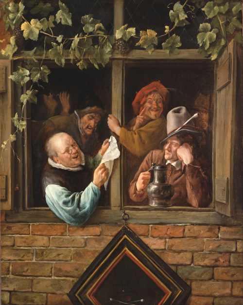
Category Archives: #FineArtFriday

#FineArtFriday: The Baker by Job Adriaenszoon Berckheyde, circa 1681

Title: The Baker

Genre: self-portrait

Artist: Job Adriaenszoon Berckheyde

Date: 1681

Medium: oil on canvas

Collection: Worcester Art Museum

What I like about this painting:

Berckheyde painted several pictures of bakery shops. These genre paintings of bakeries were popular as a subject for Dutch artists from around 1650.

When I first saw this image, I wondered why our baker is blowing a horn. I discovered that was how some bakers announced the morning’s freshly baked bread.

Like most merchants in 17th century Holland, bakers often worked out of their own homes. However, their ovens were well-known fire threats. Entire cities would go up in a raging conflagration that no one could out run or stop, often burning for days. For this reason, many neighbors didn’t really want a baker going into business next door to them.

To minimize the fire risk, some towns and cities required bakers to live and do business in stone buildings. This law explains the artist’s rather monumental choice of architecture as the background for The Baker. It looks the the entrance to a cathedral.

Berckheyde chose to make this a self-portrait. I like this decision, for he was honest in how he presented himself, He is not too handsome, but is surrounded by a wide, tempting assortment of goods, including pretzels. The wooden rack they’re displayed on would be at home in any bakery shop today.

I would definitely buy my family’s bread from this baker.


About the Artist, via Wikipedia:

Job Berckheyde, baptized 27 January 1630 and died 23 November 1693, was born in Haarlem and was the older brother of the painter Gerrit who he later taught to paint.

He was apprenticed on 2 November 1644 to Jacob Willemszoon de Wet. His master’s influence is apparent in his first dated canvas, “Christ Preaching to the Children” (1661), one of his few biblical scenes.

Golden-age historian Arnold Houbraken claimed that Job had been trained as a bookbinder by his father, and could not discover who taught him to paint.

What is not in doubt is that Gerrit learned from his older brother. Job’s teacher must have been a Haarlem master, and some claim it was Frans Hals, but Houbraken claimed he travelled as a journeyman between Leiden and Utrecht offering his services as a portrait painter and learned by doing.

During the 1650s the two brothers, Job and Gerrit, made an extended trip along the Rhine to Germany, stopping off at Cologne, Bonn, Mannheim and finally Heidelberg, following the example of their fellow guild member Vincent van der Vinne.

The brothers worked in Heidelberg for Charles I Louis, Elector Palatine (with Job producing portraits and hunting scenes, and receiving a gold chain from the Elector in reward) but were ultimately unable to adapt to court life and so returned to Haarlem, where they shared a house and perhaps a studio.

He became a member of the Haarlem rederijkersgilde ‘De Wijngaardranken’ in 1666–1682. He is registered in Amsterdam 1682–1688, where he became a member of the Guild of St Luke there in 1685–1688. Berckheyde was buried in Haarlem.

He could paint landscapes in the same style as his brother, but seems to have preferred interiors and genre works, whereas his brother’s oeuvre consists mostly of outdoor scenes. The Elector’s gold chain may be the one he wears in his early Self-portrait (1655), his only documented work from the 1650s.

Job is better known for his later work, which consists mainly of interior views of the Sint-Bavokerk in Haarlem and simple genre scenes recalling those of his Haarlem contemporaries Adriaen van Ostade and Jan Steen.

Less prolific than his brother, but more varied in his output, Job produced bible and genre scenes as well as cityscapes. Confusion between their works may have resulted from the similarity of their signatures, where Job’s j resembles Gerrit’s g. Job also signed his work with an H (for Hiob or Job) and with the monogram HB.


Credits and Attributions:

Wikimedia Commons contributors, “File:Berckheyde, Job – The Baker – 1681.jpg,” Wikimedia Commons, the free media repository, https://commons.wikimedia.org/w/index.php?title=File:Berckheyde,_Job_-_The_Baker_-_1681.jpg&oldid=463054921 (accessed September 17, 2020).

Wikipedia contributors, “Job Adriaenszoon Berckheyde,” Wikipedia, The Free Encyclopedia, https://en.wikipedia.org/w/index.php?title=Job_Adriaenszoon_Berckheyde&oldid=947928424 (accessed September 17, 2020).

Wikipedia contributors, “Gerrit Berckheyde,” Wikipedia, The Free Encyclopedia, https://en.wikipedia.org/w/index.php?title=Gerrit_Berckheyde&oldid=933563068 (accessed September 17, 2020).

Comments Off on #FineArtFriday: The Baker by Job Adriaenszoon Berckheyde, circa 1681

Filed under #FineArtFriday

#FineArtFriday: Rhetoricians at a Window by Jan Steen ca. 1666

Artist: Jan Steen  (1625/1626–1679)

Title: Rhetoricians at a Window

Genre: genre art

Date: c. 1661-66

Medium: oil on canvas

English: Oil on canvas

Dimensions: Height: 759.46 mm (29.90 in); Width: 586.23 mm (23.07 in)

Collection: Philadelphia Museum of Art

What I love about this painting:

The reading of a poem or play was clearly the opportunity for the performers to have a good time. From the drinker in the shadows of the background to the grapevines growing around the window, Steen tells us that wine and rhetoric are clearly entwined.

I love the inclusion of both “the critic” who leans his head on his hand and listens analytically, and the man behind him, who is clearly “a little over the limit,” and supports himself by grasping the window frame and heartily agreeing with some point.

The reader is clearly enjoying himself, as are the others.

About the Artist (Via Wikipedia):

Jan Havickszoon Steen (c. 1626 – buried 3 February 1679) was a Dutch Golden Age painter, one of the leading genre painters of the 17th century. His works are known for their psychological insight, sense of humour and abundance of colour.

Daily life was Jan Steen’s main pictorial theme. Many of the genre scenes he portrayed, as in The Feast of Saint Nicholas, are lively to the point of chaos and lustfulness, even so much that “a Jan Steen household”, meaning a messy scene, became a Dutch proverb (een huishouden van Jan Steen). Subtle hints in his paintings seem to suggest that Steen meant to warn the viewer rather than invite him to copy this behaviour. Many of Steen’s paintings bear references to old Dutch proverbs or literature. He often used members of his family as models, and painted quite a few self-portraits in which he showed no tendency of vanity.

Steen did not shy from other themes: he painted historical, mythological and religious scenes, portraits, still lifes and natural scenes. His portraits of children are famous. He is also well known for his mastery of light and attention to detail, most notably in Persian rugs and other textiles.

Steen was prolific, producing about 800 paintings, of which roughly 350 survive. His work was valued much by contemporaries and as a result he was reasonably well paid for his work. He did not have many students—only Richard Brakenburgh is recorded—but his work proved a source of inspiration for many painters. [2]

About this painting, Via Wikipedia:

Chambers of rhetoric (Dutch: rederijkerskamers) were dramatic societies in the Low Countries. Their members were called Rederijkers (singular Rederijker), from the French word ‘rhétoricien’, and during the 15th and 16th centuries were mainly interested in dramas and lyrics. These societies were closely connected with local civic leaders and their public plays were a form of early public relations for the city. [1]

In 1945, Sturla Gudlaugsson, a specialist in Dutch seventeenth-century painting and iconography and Director of the Netherlands Institute for Art History and the Mauritshuis in The Hague, wrote The Comedians in the work of Jan Steen and his Contemporaries, which revealed that a major influence on Jan Steen’s work was the guild of the Rhetoricians or Rederijkers and their theatrical endeavors.

It is often suggested that Jan Steen’s paintings are a realistic portrayal of Dutch 17th-century life. However, not everything he did was a purely realistic representation of his day-to-day environment. Many of his scenes contain idyllic and bucolic fantasies and a declamatory emphasis redolent of theater.

Jan Steen’s connection to theater is easily verifiable through his connection to the Rederijkers. There are two kinds of evidence for this connection. First, Jan Steen Steen’s uncle belonged to the Rhetoricians in Leiden, where Steen was born and lived a substantial part of his life. Second, Jan Steen portrayed many scenes from the lives of the Rederijkers, an example being the painting Rhetoricians at a Window of 1658–65. The piece is currently held in the Philadelphia Museum of Art which was established in February 1876. The humanity, humor and optimism of the figures suggest that Jan Steen knew these men well and wanted to portray them positively.

With his lavish and moralising style, it is logical that Steen would employ the stratagems from theater for his purposes. There is conclusive evidence that the characters in Steen’s paintings are predominantly theatrical characters and not ones from reality. [2]


Credits and Attributions:

[1] Wikipedia contributors, “Jan Steen,” Wikipedia, The Free Encyclopedia, https://en.wikipedia.org/w/index.php?title=Jan_Steen&oldid=950709901 (accessed September 10, 2020).

[2] Wikipedia contributors, “Chamber of rhetoric,” Wikipedia, The Free Encyclopedia, https://en.wikipedia.org/w/index.php?title=Chamber_of_rhetoric&oldid=975283829 (accessed September 10, 2020).

Wikimedia Commons contributors, “File:Jan Steen, Dutch (active Leiden, Haarlem, and The Hague) – Rhetoricians at a Window – Google Art Project.jpg,” Wikimedia Commons, the free media repository, https://commons.wikimedia.org/w/index.php?title=File:Jan_Steen,_Dutch_(active_Leiden,_Haarlem,_and_The_Hague)_-_Rhetoricians_at_a_Window_-_Google_Art_Project.jpg&oldid=355150081 (accessed September 10, 2020).

2 Comments

Filed under #FineArtFriday

#FineArtFriday: The Arnolfini Portrait by Jan van Eyck 1434

Artist: Jan van Eyck  (circa 1390 –1441)

Title: The Arnolfini Portrait

Genre: portrait

Date: 1434

Medium: oil on panel

Dimensions: Height: 82 cm (32.2 in); Width: 59.5 cm (23.4 in)

Collection: National Gallery

About this painting, via Wikipedia:

The Arnolfini Portrait (or The Arnolfini WeddingThe Arnolfini Marriage, the Portrait of Giovanni Arnolfini and his Wife, or other titles) is a 1434 oil painting on oak panel by the Early Netherlandish painter Jan van Eyck. It forms a full-length double portrait, believed to depict the Italian merchant Giovanni di Nicolao Arnolfini and his wife, presumably in their residence at the Flemish city of Bruges.

What I love about this painting:

The painting is signed, inscribed, and dated on the wall above the mirror: “Johannes de eyck fuit hic 1434” (Jan van Eyck was here 1434).  This signature, made to look as if it were an inscription explaining the mirror over which it is centered, is a shining example of the sharp wit the later Netherlandish painters frequently inserted into their pictures.

I suspect his inclusion of subtle humor in his works gave permission to those painters who followed in his footsteps, such as the great Bruegel dynasty.

The colors of the garments are deep and rich. These were expensive clothes, completely befitting a wealthy merchant and his wife. In regard to the controversy which is explained below – yes, this painting is steeped in allegory and symbolism, down to the clogs in the left hand corner placed as if they are going out of the picture. In some cultures, a pair of shoes placed like that symbolizes an imminent departure, usually death.

All van Eyck’s work was heavily symbolic. But she appears to be in the late stages of a pregnancy. To me, given the societal norms of the Netherlands in the year 1434, this means the picture shows a married couple. If they were not actually married, it seems unlikely they would have commissioned a portrait showing her in that condition. In fact, and this will probably expose my self-taught ignorance of art history, it makes me wonder why there is a controversy about their marital status at all.

And the mirror…oh my. That mirror is brilliant.

The Controversy, via Wikipedia:

In 1934 Erwin Panofsky published an article entitled Jan van Eyck’s ‘Arnolfini’ Portrait in the Burlington Magazine, arguing that the elaborate signature on the back wall, and other factors, showed that it was painted as a legal record of the occasion of the marriage of the couple, complete with witnesses and a witness signature. Panofsky also argues that the many details of domestic items in the painting each have a disguised symbolism attached to their appearance. While Panofsky’s claim that the painting formed a kind of certificate of marriage is not accepted by all art historians, his analysis of the symbolic function of the details is broadly agreed, and has been applied to many other Early Netherlandish paintings, especially a number of depictions of the Annunciation set in richly detailed interiors, a tradition for which the Arnolfini Portrait and the Mérode Altarpiece by Robert Campin represent the start (in terms of surviving works at least).

Since then, there has been considerable scholarly argument among art historians on the occasion represented. Edwin Hall considers that the painting depicts a betrothal, not a marriage. Margaret D. Carroll argues that the painting is a portrait of a married couple that alludes also to the husband’s grant of legal authority to his wife. Carroll also proposes that the portrait was meant to affirm Giovanni Arnolfini’s good character as a merchant and aspiring member of the Burgundian court. She argues that the painting depicts a couple, already married, now formalizing a subsequent legal arrangement, a mandate, by which the husband “hands over” to his wife the legal authority to conduct business on her own or his behalf (similar to a power of attorney). The claim is not that the painting had any legal force, but that van Eyck played upon the imagery of legal contract as a pictorial conceit. While the two figures in the mirror could be thought of as witnesses to the oath-taking, the artist himself provides (witty) authentication with his notarial signature on the wall.


Credits and Attributions:

Wikimedia Commons contributors, “File:Van Eyck – Arnolfini Portrait.jpg,” Wikimedia Commons, the free media repository, https://commons.wikimedia.org/w/index.php?title=File:Van_Eyck_-_Arnolfini_Portrait.jpg&oldid=446521642 (accessed September 4, 2020).

Wikimedia Commons contributors, “File:The Arnolfini Portrait, détail (2).jpg,” Wikimedia Commons, the free media repository, https://commons.wikimedia.org/w/index.php?title=File:The_Arnolfini_Portrait,_d%C3%A9tail_(2).jpg&oldid=428220496 (accessed September 4, 2020).

Wikimedia Commons contributors, “File:Arnolfini Portrait 3.jpg,” Wikimedia Commons, the free media repository, https://commons.wikimedia.org/w/index.php?title=File:Arnolfini_Portrait_3.jpg&oldid=428554231 (accessed September 4, 2020).

2 Comments

Filed under #FineArtFriday, writing

#FineArtFriday: Spanish Blacksmiths by Ernst Josephson 1882 (revisited)

Spanish Blacksmiths, by Ernst Josephson

  • Date: 1882
  • Medium: oil on canvas
  • Dimensions : width: 107 x height: 128.5 cm

What I love about this image:

This powerful painting is one of my all-time favorites. Josephson captures the boundless self-confidence and personalities of these young men. He has managed to portray their cock-of-the-walk swagger, and he has shown us the truth of their craft: that sparks fly and ruin their clothes; that the work is hard and their muscles strong. These men are full of life.

The influence of Josephson’s having studied Rembrandt’s works closely can be seen here in the style with which he has painted their features. He has painted the men with truth—they are not classically handsome, but they are in the prime of life and have immense charisma. They wear their burned and ragged hats with pride. These men are good at what they do, and they know it. Their eyes dance and flirt outrageously with you across the years—they are full to bursting with machismo, daring you to just try to walk past and not notice them.

About the Artist, Via Wikipedia

(Ernst Josephson) was born to a middle-class family of merchants of Jewish ancestry. His uncle, Ludvig O. Josephson (1832-1899) was a dramatist and his uncle Jacob Axel Josephson (1818-1880) was a composer. When he was ten, his father Ferdinand Semy Ferdinand Josephson (1814-1861) left home and he was raised by his mother, Gustafva Jacobsson (1819-1881) and three older sisters.

At the age of sixteen, he decided to became an artist and, with his family’s support, enrolled at the Royal Swedish Academy of Fine Arts. His primary instructors there were Johan Christoffer Boklund and August Malmström. He was there until 1876, when he received a Royal Medal for painting.

After leaving the Academy, he and his friend and fellow artist Severin Nilsson (1846-1918) visited Italy, Germany and the Netherlands, where they copied the Old Masters. His breakthrough came in Paris, where he was able to study with Jean-Léon Gérôme at the École des Beaux-Arts. He soon began concentrating on portraits, including many of his friends and fellow Swedes in France. For a time, he shared a studio with Hugo Birger (1854–1887). His personal style developed further during a trip to Seville with his friend, Anders Zorn, from 1881 to 1882.

His private life did not go well, however. By his late twenties, he was afflicted with syphilis. His romantic life suffered as a consequence, as he was forced to break off a promising relationship with a young model named Ketty Rindskopf.


Credits and Attributions:

Spanish Blacksmiths by Ernst Josephson 1882 PD|100,  First published on Life in the Realm of Fantasy on August 16, 2019

Wikimedia Commons contributors, “File:Ernst Josephson – Spanish Blacksmiths – Google Art Project.jpg,” Wikimedia Commons, the free media repository, https://commons.wikimedia.org/w/index.php?title=File:Ernst_Josephson_-_Spanish_Blacksmiths_-_Google_Art_Project.jpg&oldid=354761584 (accessed August 16, 2019).

Wikipedia contributors, “Ernst Josephson,” Wikipedia, The Free Encyclopedia, https://en.wikipedia.org/w/index.php?title=Ernst_Josephson&oldid=888815743 (accessed August 16, 2019).

Comments Off on #FineArtFriday: Spanish Blacksmiths by Ernst Josephson 1882 (revisited)

Filed under #FineArtFriday

#FineArtFriday: Landscape with the Fall of Icarus, Pieter Bruegel the Elder, c. 1560

Artist: Pieter Bruegel the Elder

Year: c. 1560

Medium: oil on canvas

Dimensions: 73.5 cm × 112 cm (28.9 in × 44 in)

Location: Royal Museums of Fine Arts of Belgium, Brussels

The story depicted in this painting, via Wikipedia, The Free Encyclopedia:

In Greek mythologyIcarus succeeded in flying, with wings made by his father Daedalus, using feathers secured with beeswax. Ignoring his father’s warnings, Icarus chose to fly too close to the sun, melting the wax, and fell into the sea and drowned. His legs can be seen in the water just below the ship. The sun, already half-set on the horizon, is a long way away; the flight did not reach anywhere near it. Daedalus does not appear in this version of the painting.

The ploughman, shepherd and angler are mentioned in Ovid’s account of the legend; they are: “astonished and think to see gods approaching them through the aether”, which is not entirely the impression given in the painting. The shepherd gazing into the air, away from the ship, may be explained by another version of the composition. In the original work there was probably also a figure of Daedalus in the sky to the left, at which he stares.

There is also a Flemish proverb (of the sort imaged in other works by Bruegel): “And the farmer continued to plough…” The painting may, as Auden’s poem suggests, depict humankind’s indifference to suffering by highlighting the ordinary events which continue to occur, despite the unobserved death of Icarus.

What I love about this painting:

This is a wonderful painting, despite its disputed provenance. Pieter Bruegel the Elder tells us a story bluntly: Icarus flew too close to the sun and the wax holding his wings together melted. He fell into the sea and drowned.

Bruegel’s earthy sense of humor comes to the fore in this painting as it does in his other works depicting Flemish proverbs. Always ready to point out humanity’s failings, the artist makes him look ridiculous showing us only his pale, thrashing legs.

In saying that humankind shouldn’t try to fly too high, Bruegel tells us to stop trying to be what we aren’t. He says that one should be content with one’s place in life.

The controversy surrounding this painting, via Wikipedia, The Free Encyclopedia:

Landscape with the Fall of Icarus is a painting in oil on canvas measuring 73.5 by 112 centimetres (28.9 in × 44.1 in) in the Royal Museums of Fine Arts of Belgium in Brussels. It was long thought to be by the leading painter of Dutch and Flemish Renaissance paintingPieter Bruegel the Elder. However, following technical examinations in 1996 of the painting hanging in the Brussels museum, that attribution is regarded as very doubtful, and the painting, perhaps painted in the 1560s, is now usually seen as a good early copy by an unknown artist of Bruegel’s lost original, perhaps from about 1558. According to the museum: “It is doubtful the execution is by Bruegel the Elder, but the composition can be said with certainty to be his”, although recent technical research has re-opened the question.

Since its acquisition by the Royal Museums of Fine Arts of Belgium in 1912, its authenticity has been challenged by several specialists, mainly for two reasons: (i) the relatively weak quality of the painting compared to other Bruegels, although this question is complicated by later overpainting; (ii) it is an oil painting on canvas, an exception in the work of Peter Bruegel the Elder who made all his oil paintings on panel.

In 1963, Philippe Roberts-Jones, curator at the museum, and the Bruegel specialist Georges Marlier, hypothesized that an original panel painting had been later moved onto canvas, as was once common.

In 1998, a mixed team of scientists from the Belgian Royal Institute for Cultural Heritage and the University of Utrecht[7] attempted to solve the authenticity problem by a radiocarbon dating of the canvas that was supposed to be the original support. As mentioned here above, the conclusion of this dating was that P. Bruegel the Elder cannot have painted on this canvas. Later, in 2006, Prof. J. Reisse (Université libre de Bruxelles) challenged this dating on technical grounds.

A sample of blue paint taken from the right edge in 1973 was re-examined by performing analysis such as scanning electron microscopy (SEM) coupled to the energy dispersive X-ray spectroscopy (EDX), which in connection with optical microscopy revealed the following structure and composition. From bottom to top:

  1. Canvas (from transposition);
  2. Oily lead white (adhesive);
  3. Thick oily layer with azurite (repaint);
  4. Chalk ground;
  5. Oily lead white with scarce particles of charcoal;
  6. Oily blue with azurite;

with layers 4 to 6 being original.

The presence of chalk ground under the original blue proves that this is a panel painting transposed on a canvas. The original blue layer is lead white with azurite containing a few grains of ochre and charcoal. These structure and composition match perfectly those found on other certified panels of Peter Bruegel. Moreover, it is noticeable that the wood charcoal particles are very peculiar, being very long and acicular, exactly the same as those found only in The Census from the same Museum.

Recently, a study of the underdrawing using infrared reflectography has been published.

Reflectography is based on the fact that the infrared light penetrates all colors except black. As a result, the drawing, mostly black, can be made visible. The interpretation of these reflectograms is of course more subjective, but in a global way, the drawing from the Fall of Icarus is not really different from other certified works from Peter Bruegel the Elder. This drawing is generally limited to a layout of the elements. Probably because the thin, weakly covering paint on white ground would hide imperfectly a detailed graphism.

A re-interpretation of the reflectograms in agreement with the other analysis suggested the conclusion that the work in the Museum of Fine Arts in Brussels is a panel painting transferred to canvas. The paint layer and maybe also the underdrawing have been severely damaged by this intervention as well as by two more relinings, responsible for the heavy overpainting. In the paint sample remains a fragment with structure and composition matching perfectly the technique of the large panels attributed to Peter Bruegel the Elder. It is therefore unlikely that this version of the Fall of Icarus might be from the hand of a copyist, except perhaps from P. Bruegel the Younger. Conversely, the Van Buuren copy with a different technique cannot be attributed to either Peter Bruegel.


Transfer of panel paintings, via Wikipedia, The Free Encyclopedia:

The practice of conserving an unstable painting on panel by transferring it from its original decayed, worm-eaten, cracked, or distorted wood support to canvas or a new panel has been practised since the 18th century. It has now been largely superseded by improved methods of wood conservation.

The process is described by Henry Mogford in his Handbook for the Preservation of Pictures. Smooth sheets of paper were pasted over the painted surface of the panel, and a layer of muslin over that. The panel was then fixed, face down, to a table, and the wood planed away from the back until it was “as thin as a plane may safely go”, and the remainder scraped off with a sharp instrument such as a razor. The ground of the painting was then removed by solvents or scraping, until nothing remained but a thin skin of colour, pasted over with paper and held together by the muslin. A prepared canvas was then attached to the back of the paint layer, using the same method as was used for lining pictures. When the glue had dried, the paper and muslin were removed by careful damping.


Credits and Attributions:

“Landscape with the Fall of Icarus,” Pieter Brueghel the Elder ca.1558 / Public domain

Wikipedia contributors, “Landscape with the Fall of Icarus,” Wikipedia, The Free Encyclopedia, https://en.wikipedia.org/w/index.php?title=Landscape_with_the_Fall_of_Icarus&oldid=963660790 (accessed August 14, 2020).

Wikipedia contributors, “Transfer of panel paintings,” Wikipedia, The Free Encyclopedia, https://en.wikipedia.org/w/index.php?title=Transfer_of_panel_paintings&oldid=945009923 (accessed August 14, 2020).

2 Comments

Filed under #FineArtFriday

#FineArtFriday: A Back Road, by Childe Hassam 1884 (reprise)

We have been talking about world-building all this week. World-building can be a challenge at times. Some days, we need a visual boost to get our minds working. Historical fiction and fantasy authors have a marvelous resource in the images of great art that has been compiled and is available for viewing on Wikimedia Commons.

For instance, if you want to know what a road looked like to travelers before the advent of blacktop and concrete made the modern freeways and highways possible, turn to art.

The above painting by Frederick Childe Hassam, shows what a good road looked like.  It goes across the land, cut into the earth by the travelers who use it. Along the better roads, such as this one, ditches were dug to enable drainage.

No bridge crosses the small creek–travelers must cross the water on foot or in the wagon. In winter it becomes a mushy, muddy track, and in summer it’s sun baked and hard. In spring, the grass grows green, making it a pleasant place.

A Back Road (1884) was painted in his early years, while Hassam was still influenced by the works of William Morris Hunt, who like the great French landscape painter Jean-Baptiste-Camille Corot, emphasized the Barbizon tradition of working directly from nature.

From Wikipedia: In 1885, a noted critic, in part responding to Hassam’s early oil painting A Back Road (1884), stated that “the Boston taste for landscape painting, founded on this sound French school, is the one vital, positive, productive, and distinctive tendency among our artists today…the truth is poetry enough for these radicals of the new school. It is a healthy, manly muscular kind of art.”

I like the composition of this piece, the way the land is larger than the sky. The grass feels damp and the clouds herald more spring rain–this painting has life.

In his later years, Hassam moved away from realism and became known as one of the best of the American impressionists.


Credits and Attributions:

A Back Road, Childe Hassam 1884 [No restrictions or Public domain], via Wikimedia Commons

Wikipedia contributors, “Childe Hassam,” Wikipedia, The Free Encyclopedia, https://en.wikipedia.org/w/index.php?title=Childe_Hassam&oldid=831999910 (accessed April 6, 2018).

2 Comments

Filed under #FineArtFriday

#FineArtFriday: The Gleaners by Jean-François Millet 1857

Title: The Gleaners by Jean-François Millet  (1814–1875)

Genre: genre art

Date: 1857

Medium: oil on canvas

Dimensions: Height: 83.5 cm (32.8 in); Width: 110 cm (43.3 in)

***

Wikipedia says: Gleaning is the act of collecting leftover crops from farmers’ fields after they have been commercially harvested or on fields where it is not economically profitable to harvest.

In nearly all paintings showing this labor, artists painted poor women doing the work of gleaning. Historically, the majority of impoverished families were headed by single, usually widowed, working women, who had few opportunities for employment and were paid less for their labor than men. This trend of lower pay for women overall continues, with the US Census reporting on Sep 10, 2019 that the median income for households maintained by single women  was $45,128,  as compared to households maintained by single men, who had a median income of $61,518 in 2018.

***

About the Artist: 

Jean-François Millet (October 4, 1814 – January 20, 1875) was a French artist and one of the founders of the Barbizon school in rural France. Millet is noted for his paintings of peasant farmers and can be categorized as part of the Realism art movement. Toward the end of his career he became increasingly interested in painting pure landscapes. He is known best for his oil paintings but is also noted for his pastels, conte crayon drawings, and etchings.

About The Gleaners (1857) via Wikipedia:

This is one of the most well known of Millet’s paintings. While Millet was walking the fields around Barbizon, one theme returned to his pencil and brush for seven years—gleaning—the centuries-old right of poor women and children to remove the bits of grain left in the fields following the harvest. He found the theme an eternal one, linked to stories from the Old Testament. In 1857, he submitted the painting The Gleaners to the Salon to an unenthusiastic, even hostile, public.

(Earlier versions include a vertical composition painted in 1854, an etching of 1855–56 which directly presaged the horizontal format of the painting now in the Musée d’Orsay.)

A warm golden light suggests something sacred and eternal in this daily scene where the struggle to survive takes place. During his years of preparatory studies, Millet contemplated how best to convey the sense of repetition and fatigue in the peasants’ daily lives. Lines traced over each woman’s back lead to the ground and then back up in a repetitive motion identical to their unending, backbreaking labor. Along the horizon, the setting sun silhouettes the farm with its abundant stacks of grain, in contrast to the large shadowy figures in the foreground. The dark homespun dresses of the gleaners cut robust forms against the golden field, giving each woman a noble, monumental strength.


Credits and Attributions:

The Gleaners, by Jean-François Millet / Public domain. Wikimedia Commons contributors, “File:Jean-François Millet – Gleaners – Google Art Project 2.jpg,” Wikimedia Commons, the free media repository, https://commons.wikimedia.org/w/index.php?title=File:Jean-Fran%C3%A7ois_Millet_-_Gleaners_-_Google_Art_Project_2.jpg&oldid=371550893 (accessed July 31, 2020).

Wikipedia contributors, “Gleaning,” Wikipedia, The Free Encyclopedia, https://en.wikipedia.org/w/index.php?title=Gleaning&oldid=952834082 (accessed July 31, 2020).

Wikipedia contributors, “Jean-François Millet,” Wikipedia, The Free Encyclopedia,  https://en.wikipedia.org/w/index.php?title=Jean-Fran%C3%A7ois_Millet&oldid=956877005 (accessed July 31, 2020).

2 Comments

Filed under #FineArtFriday

#FineArtFriday: Kidd’s Omnibus outside the Angel Inn, Brentford, c. 1840, by James Pollard

Title: Kidd’s Omnibus Outside the Angel Inn, Brentford

Artist: James Pollard

Genre: Genre Calendar Illustrations

Medium: Aquatint

Date: circa 1840 [1]

Today’s Fine Art Friday offering is Genre Art, a scene originally published in a calendar. In most working class homes, the only secular art that was hung on the walls were prints, many of which originated in calendars, as most people couldn’t afford to buy original art.

Since the mid-1700s, printed wall calendars have historically been a good source of advertising for small to large businesses. To this day, many supermarkets and hardware companies give illustrated wall calendars away for free to customers as promotional merchandise.

About the Artist, via artnet and Wikipedia:

James Pollard was a British painter best known for his depictions of horse-drawn carriages, fox hunting, and other equestrian scenes. Born in 1792 in Islington, United Kingdom to the painter and publisher Robert Pollard the Elder, he went on to work for his father’s firm as a draftsman and engraver. While working for his father, he was commissioned by a print seller named Edward Orme to paint an inn’s signboard, which would depict a mail-coach with horses and passengers. This commission launched the artist’s career, for the signpost was seen by many prospective patrons. Pollard went on to exhibit his work at the Royal Academy and the British Institution in London. Today, his works are in the collections of the Art Institute of Chicago, the National Gallery of Art in Washington, D.C., the Tate Gallery in London, and the Denver Art Museum, among others. Pollard died in 1867 in London, United Kingdom. [2]

Between 1821 and 1839, James Pollard exhibited at the Royal Academy. He exhibited at the British Institution in 1824 and 1844. During his career, he also worked with John Frederick Herring, Sr. on several horse racing paintings in which he painted the backgrounds and spectators while Herring painted the horses. [3]

What I like about this image:

This painting of Kidd’s Omnibus was created for a circa 1840 calendar by James Pollard, who was considered an adequate draftsman and illustrator in his day. It was most likely printed in his father, painter and publisher, Robert Pollard’s, printshop, as he was his father’s primary illustrator. [4]

In this illustration, we see the historical origination of urban public transportation – the Horsebus, or Omnibus. We have shortened the term to just ‘bus’ in the context of public transportation. Most  omnibuses were like cabs, in that they were owned by the drivers. However, since the drivers plied their trade on a regular route, they could carry more people. They could charge a lesser fare that the working class could afford, and still make a living.

According to Wikipedia:

horse-bus or horse-drawn omnibus was a large, enclosed and sprung horse-drawn vehicle used for passenger transport before the introduction of motor vehicles. It was mainly used in the late 19th century in both the United States and Europe and was one of the most common means of transportation in cities. In a typical arrangement, two wooden benches along the sides of the passenger cabin held several sitting passengers facing each other. The driver sat on a separate, front-facing bench, typically in an elevated position outside the passengers’ enclosed cabin. In the main age of horse buses, many of them were double-decker buses. On the upper deck, which was uncovered, the longitudinal benches were arranged back to back. [5]


Credits and Attributions

[1] Kidd’s Omnibus outside the Angel Inn, Brentford, c. 1840, by James Pollard, via Wikimedia Commons contributors, “File:Kidd’s Omnibus outside the Angel Inn, Brentford, c. 1840, by James Pollard.jpg,” Wikimedia Commons, the free media repository, https://commons.wikimedia.org/w/index.php?title=File:Kidd%27s_Omnibus_outside_the_Angel_Inn,_Brentford,_c._1840,_by_James_Pollard.jpg&oldid=195379488 (accessed July 23, 2020).

James Pollard (Life time: (1792–1867) – Transferred from en.wikipedia to Commons. (Original text: Original publication: UK Immediate source: Sammlung Fane de Salis: ephemera, from an old calendar.) This work is in the public domain in the United States because it was published (or registered with the U.S. Copyright Office) before January 1, 1925.

[2] James Pollard, Biography, artnet contributor, via artnet: http://www.artnet.com/artists/james-pollard/ accessed 23 July 2020.

[3] James Pollard, Wikipedia contributors, “James Pollard,” Wikipedia, The Free Encyclopedia, https://en.wikipedia.org/w/index.php?title=James_Pollard&oldid=838787787 (accessed July 23, 2020).

[4] Wikipedia contributors, “Robert Pollard (engraver),” Wikipedia, The Free Encyclopedia, https://en.wikipedia.org/w/index.php?title=Robert_Pollard_(engraver)&oldid=918903796 (accessed July 23, 2020).

[5] Wikipedia contributors, “Horsebus,” Wikipedia, The Free Encyclopedia, https://en.wikipedia.org/w/index.php?title=Horsebus&oldid=956355839 (accessed July 23, 2020).


Comments Off on #FineArtFriday: Kidd’s Omnibus outside the Angel Inn, Brentford, c. 1840, by James Pollard

Filed under #FineArtFriday

#FineArtFriday: Forest Landscape by Jan Brueghel the Elder

Title: Forest landscape

Artist: Jan Brueghel the Elder

Genre: landscape art

Date: between circa 1605 and circa 1610

Medium: oil on oak panel

Dimensions: 40 x 32 cm

What I love about this painting:

Today’s Fine Art Friday offering is a further exploration of the works of the Flemish artist, Jan Brueghel the Elder. I began this two part series last Friday with his painting, the Great Fish Market.

The level of detail down to the leaves and the bark on the trees is amazing, but the rich colors are what attracted me, drawing me in. The heron on the rock seems poised to take flight.  Beyond the heron, on the other side of the creek, a path leads deeper into the forest, calling to us to cross over and see where it leads. The scene is beautiful the way a fantasy is, likely because it is, in a way. Brueghel most probably painted it from sketches and memory.

I quoted this last week when discussing the Great Fish Market, but it bears repeating:

“In his forest landscapes Brueghel depicted heavily wooded glades in which he captured the verdant density, and even mystery, of the forest. Although on occasion inhabited by humans and animals, these forest scenes contain dark recesses, virtually no open sky and no outlet for the eye to penetrate beyond the thick trees.” via Wikipedia.

In many ways, Jan Brueghel’s paradise landscapes paved the way for the great plein air painters of the 18th and 19th centuries. This is most definitely a Mannerist landscape painting, as it is highly romanticized.

About the Artist, via Wikipedia:

Jan Brueghel (also Bruegel or Breughelthe Elder  (1568 – 13 January 1625) was a Flemish painter and draughtsman. He was the son of the eminent Flemish Renaissance painter Pieter Brueghel the Elder. A close friend and frequent collaborator with Peter Paul Rubens, the two artists were the leading Flemish painters in the first three decades of the 17th century.

Brueghel worked in many genres including history paintings, flower still lifes, allegorical and mythological scenes, landscapes and seascapes, hunting pieces, village scenes, battle scenes and scenes of hellfire and the underworld.

He was an important innovator who invented new types of paintings such as flower garland paintings, paradise landscapes, and gallery paintings in the first quarter of the 17th century.

He also created genre paintings that were imitations, pastiches and reworkings of his father’s works, in particular his father’s genre scenes and landscapes with peasants.  Brueghel represented the type of the pictor doctus, the erudite painter whose works are informed by the religious motifs and aspirations of the Catholic Counter-Reformation as well as the scientific revolution with its interest in accurate description and classification.  He was court painter of the Archduke and Duchess Albrecht and Isabella, the governors of the Habsburg Netherlands.

The artist was nicknamed “Velvet” Brueghel, “Flower” Brueghel, and “Paradise” Brueghel. The first is believed to have been given him because of his mastery in the rendering of fabrics. The second nickname is a reference to his specialization in flower still lifes and the last one to his invention of the genre of the paradise landscape.


Credits and Attributions:

Forest Landscape by Jan Brueghel the Elder / Public domain

Wikipedia contributors, “Jan Brueghel the Elder,” Wikipedia, The Free Encyclopedia, https://en.wikipedia.org/w/index.php?title=Jan_Brueghel_the_Elder&oldid=963723468 (accessed July 17, 2020).

Wikimedia Commons contributors, “File:Jan Brueghel (I) – Forest landscape.jpg,” Wikimedia Commons, the free media repository, https://commons.wikimedia.org/w/index.php?title=File:Jan_Brueghel_(I)_-_Forest_landscape.jpg&oldid=354133728 (accessed July 17, 2020).

Comments Off on #FineArtFriday: Forest Landscape by Jan Brueghel the Elder

Filed under #FineArtFriday

#FineArtFriday: The Great Fish Market by Jan Brueghel the Elder 1603

Title: Great Fish Market

Artist: Jan Brueghel the Elder  (1568–1625)

Date: 1603

Medium: oil on canvas

Dimensions:  Height: 59 cm (23.2 in); Width: 92 cm (36.2 in)

Collection: Alte Pinakothek  Current location: room 19

Inscriptions: Signature and date, bottom left: BRVEGHEL 1603

What I love about this painting:

Here we see a composite of all the places Jan Brueghel the Elder had visited. The scene is a fusion of his Flemish homeland and impressions of places he’d sketched on his travels.

In the middle of the picture is the Neapolitan Castel dell’ Ovo, on the right, in the distance, is St. Peter’s Basilica in Rome. We have a little of Italy thrown in with the Flemish, his effort to create the feeling of a busy, prosperous market. He shows his imaginary city from a high perspective, the god-like view.

In writing, this would be the omniscient point of view.

The elements presented in this painting, the harborscape, the ruins, and even the sections that are simply landscapes are all features that later became genres in their own right.

The scene contains many elements of Mannerist landscape painting. According to the Tate website, mannerist is a sixteenth-century style of art and design characterized by artificiality, elegance, and an aesthetic portrayal of the human figure.

In other words, they painted fantasy. And why not?

Flemish genre painting is strongly tied to the traditions of Pieter Bruegel the Elder. It was a style that continued directly into the 17th century through copies and new compositions made by his sons Pieter Brueghel the Younger and Jan Brueghel the Elder.

In this painting, the story opens with a view across a downward-sloping foreground. It teems with life, hundreds of figures of many races, grouped around the stalls and booths of a fish market. The group at the center of the foreground is thought to be a self-portrait of the artist and his family. It was common for artists to insert self-portraits in their works, and Jan often included his family.

One of Jan Brueghel’s most significant contributions to the craft of painting landscapes was how he depicted perspective. The eye is drawn towards the harbor in the background. We look out across the bay, along the coastline, and see entire towns, with ruins, wharves, and castles. Beyond that, we see distant mountains, painted with a blue that merges with the blue of the sea.

This blending of shape and color into the distance is how a landscape appears in real life.

These painters, and the Brueghel family in particular, were the generation who paved the way for artists like Rembrandt. Their works were the foundation upon which the masterpieces of the middle-to-late 17th century were built.

About the Artist, via Wikipedia:

Jan Brueghel was the son of the eminent Flemish Renaissance painter Pieter Brueghel the Elder.  A close friend and frequent collaborator with Peter Paul Rubens, the two artists were the leading Flemish painters in the first three decades of the 17th century.

He was born in Brussels as the son of Pieter Brueghel the Elder and Maria Coecke van Aelst. His mother was the daughter of the prominent Flemish Renaissance artists Pieter Coecke van Aelst and Mayken Verhulst. His father died about a year after Jan’s birth in 1569. It is believed that after the death of his mother in 1578, Jan, together with his brother Pieter Brueghel the Younger and sister Marie, went to live with their grandmother Mayken Verhulst, who was by then widowed. Mayken Verhulst was an artist in her own right. The early Flemish biographer Karel van Mander wrote in his Schilder-boeck published in 1604 that Mayken was the first art teacher of her two grandsons. She taught them drawing and watercolor painting of miniatures. Jan and his brother may also have trained with local artists in Brussels who were active as tapestry designers.

Jan Brueghel the Elder is regarded as an important innovator of landscape art. By introducing greater naturalism in his Alpine mountain settings, his father had expanded on the world landscape tradition that had been founded mainly by Joachim Patinir. Some of Pieter the Elder’s works also foreshadowed the forest landscape that would start to dominate landscape painting around the turn of the 16th century. Pieter the Elder also developed the village and rural landscape, placing Flemish hamlets and farms in exotic prospects of mountains and river valleys.

Jan developed on the formula he learned from his father of arranging country figures traveling a road, which recedes into the distance. He emphasized the recession into space by carefully diminishing the scale of figures in the foreground, middle-ground, and far distance. To further the sense of atmospheric perspective, he used varying tones of brown, green, and blue progressively to characterize the recession of space. His landscapes with their vast depth are balanced through his attention to the peasant figures and their humble activities in the foreground.

Like his father, Jan Brueghel also painted various village landscapes. He used the surrounding landscapes as the stage for the crowds of anecdotal, colorfully dressed peasants who engage in various activities in the market, the country roads and during the rowdy kermesses. Jan Brueghel’s landscape paintings with their strong narrative elements and attention to detail had a significant influence on Flemish and Dutch landscape artists in the second decade of the 17th century. His river views were certainly known to painters working in Haarlem, including Esaias van de Velde and Willem Buytewech, whom Brueghel may have met there when he accompanied Peter Paul Rubens on a diplomatic mission to the Dutch Republic in 1613.

Jan Brueghel was, along with artists such as Gillis van Coninxloo one of the prime developers of the dense forest landscape in the 17th century. Jan Breughel in fact experimented with such works before Coninxloo’s first dated wooded landscape of 1598. In his forest landscapes Brueghel depicted heavily wooded glades in which he captured the verdant density, and even mystery, of the forest. Although on occasion inhabited by humans and animals, these forest scenes contain dark recesses, virtually no open sky and no outlet for the eye to penetrate beyond the thick trees.


Credits and Attributions:

Wikimedia Commons contributors, “File:Jan Brueghel the Elder-Great Fish market.jpg,” Wikimedia Commons, the free media repository, https://commons.wikimedia.org/w/index.php?title=File:Jan_Brueghel_the_Elder-Great_Fish_market.jpg&oldid=406069557 (accessed July 9, 2020).

Wikipedia contributors, “Jan Brueghel the Elder,” Wikipedia, The Free Encyclopedia, https://en.wikipedia.org/w/index.php?title=Jan_Brueghel_the_Elder&oldid=963723468 (accessed July 9, 2020).

1 Comment

Filed under #FineArtFriday